The Ultimate Guide to Choosing the Right Color Palette for Your Home
This site contains affiliate links. We may earn a small commission, at no extra cost to you. Article may contain some images for illustrative purposes only .
Few things are more paralyzing than staring at hundreds of color swatches in the paint aisle. And yet, 78% of homeowners delay their interior design projects for this very reason.
If you’ve ever felt stumped, confused, or frustrated when faced with making interior color choices, we don’t blame you.
The right palette is more than just picking colors you like. It’s about crafting a sense of flow from room to room while also making sure that each space is conducive to its actual purpose. Your bedroom should look and feel different from your home office, for instance. But once you start to think about color strategically, that overwhelm will turn into epiphany. And before you know it, you’ll be decorating with intention, creating spaces that actually make you happy.
What Is a Color Palette in Home Design?
A home color palette is your personal selection of colors to use throughout your living space. It typically includes a selection of primary colors that will dominate large areas of a room, as well as secondary colors and accent colors.
The idea of a home color palette is to use these colors together to create a balanced effect, while also allowing you to create contrast and interest in each room.
Your palette is essentially your cohesive blueprint that will guide your decisions from wall paint colors and furniture to textiles and decorative accents.
So instead of just selecting random colors for each room on your own, a thoughtfully designed color palette will help your home flow more naturally from space to space.
In addition, a home color palette also helps make sure that your interior design reflects your personal style and creates the right emotional effect in each room.
Primary, secondary, and accent colors

You should use 60% of your primary color on a room – like on your walls and large furniture.
Secondary colors should cover the remaining 30%. These are your supporting cast, like couches, curtains, or area rugs. They should complement your main act without stealing the show.
Accent colors get a fun 10%. This is where you throw in those eye-catching pillows, a piece of art, or some quirky decor items. They’re there to jazz things up and add personality.
Balance these out and you’ve got a room that looks cohesive, not like a mismatched mess.
Difference between a color palette and individual paint choices
Choosing paint colors is more focused on selecting what goes where – for instance, on a specific wall or in one room.
Your color palette, on the other hand, is the thing that creates flow through out your whole house. Its about selecting colors that go well together and blend from one space to the next
How Color Affects Mood, Space, and Perception
Color in our homes is more than just a visual element – it also has the power to impact our emotions and even how we perceive space.
For example, colors like blues and greens can create a sense of calm and relaxation, while warmer colors like reds and oranges can be more energizing and even stimulate appetite.
Did you know that yellow can make you feel happy, but overuse of it can make you anxious?
Purple has a luxurious feel to it, and of course, neutral colors create a sense of stability and grounding.
In addition, lighter colors can make your rooms feel bigger and more spacious, while darker shades are often more intimate and cozy. Alot of people are scared of dark colors because they think it’ll make there space feel cramped. But in big rooms, dark walls actually add character and make the space feel more inviting instead of cold and sterile.
Your choice between warm tones (oranges, yellows) and cool tones (blues, greens) will determine whether a room feels inviting and energetic or serene and relaxing.
The Scandinavian neutral palette demonstrates how whites, greys, and soft beiges can create a calm and serene atmosphere that enhances emotional well-being and visual spaciousness.
Warm vs cool tones and their effect on comfort

You can think about your interior design color palette choices as falling into two categories – warm and cool colors.
Warm colors like oranges and yellows are often more energizing and create a welcoming and lively feeling in a room.
Cool colors like blues and greens, on the other hand, are often more calming and help create a serene and relaxing atmosphere.
Start With Your Home’s Fixed Elements
When selecting your home’s color palette, first examine your permanent fixtures like flooring, countertops, and cabinetry to establish your base colors.
You should also take a look at any large furniture pieces you aren’t planning on replacing anytime soon as these will be big color commitments as well.
So walk around your home and really study what you have. For instance, your flooring might be more on the warm side with yellow or orangey undertones or on the cool side with grayer and more blueish undertones. Same with your counters, cabinets, and backsplash.
Don’t forget to also take note of any architectural features and finishes in your home like crown molding or window frames. The materials you used in these areas of your home will also interact with your chosen colors throughout your home.
The color wheel explained in an easy way
Okay so the color wheel is basically your cheat sheet for picking colors that actually work together. You’ve got your primary colors which are red, yellow, and blue – those are like the building blocks.
Secondary colors are the result of mixing two primary colors together, like orange, green, and purple.
And tertiary colors are the kids in the middle that happen when you mix a primary with a secondary color.
Colors directly opposite each other on the wheel are called complementary colors, and they create high contrast and pop when used together. Think Christmas colors like red and green.
Colors that are next to each other on the wheel are called analogous colors, and they blend together easily.
Monochromatic colors are different shades and tints of the same color and are often more sophisticated.
Each of these three color schemes creates a very different mood, from bold and vibrant to smooth and easy to look at to more elegant and pulled together.
But regardless of which scheme you prefer, you’ll want to use a combination of contrast and harmony to make each room in your home feel both interesting and balanced.
How contrast and harmony work together
Now that you’ve explored the three major color schemes, lets talk about how contrast and harmony actually work together in your home.
Good color palettes balance these two things out. Contrast makes rooms interesting by using colors that are different from each other – whether thats different shades, brightness levels, or how intense the colors are. Harmony pulls everything together by using colors that relate to each other somehow.
The trick is using both at the same time. Like you could have some bold colorful pieces that pop against a more neutral, calming background. Thats how you get a room that feels exciting but also put-together.
How Natural Light Impacts Your Color Palette
Natural light also impacts your chosen color palette, as colors can look dramatically different in rooms with north-facing windows (cooler, bluer light) compared to those with south-facing exposures (warm, yellower tones).
Your east-facing rooms will be full of vibrant morning light, while west-facing rooms will be washed in the golden glow of the afternoon sun.
All of these lighting changes throughout the day mean that you need to be thoughtful about your color selection.
LED lighting options can strategically enhance or modify the perceived color palette by providing additional ambient illumination with customizable color temperatures and mood-setting capabilities.
Differences between north-, south-, east-, and west-facing rooms
Each room of your home receives different types of light based on the orientation of the room. The quality of light will also have a profound impact on the way your chosen paint color appears.
North-facing rooms can be more difficult to work with because the light is usually bluish in color, which can make paint colors appear duller and more washed out. This is why designers always recommend warmer paint colors for north-facing rooms.
South-facing rooms are the easiest to design because they have the most direct, bright, consistent sunlight all day long, which makes colors appear more vivid. You will also need to take into consideration that the color you choose will appear even more saturated on your walls.
East-facing rooms receive all their light in the morning, which has yellow undertones and will make your room appear cheerful and warm. But by the afternoon, your room will be darker.
West-facing rooms are the opposite; they receive the warmest, most orange sunlight in the afternoon and evening. The light can be really dramatic and will make colors appear very different from the way they do in the morning light.
Artificial lighting and its effect on paint colors
Artificial light has a very different effect on your chosen paint colors.
Warm bulbs such as incandescent or warm LED lights will make reds and yellows appear more vivid while muting blues.
Cool fluorescent lights do the opposite; they will make blues and greens look brighter while making warm colors appear muddy.
Halogen lights are actually closest to natural sunlight.
The only solution is to test your paint samples under the type of light you will have in the room. It will make all the difference, I promise you.
Choosing a Color Palette Based on Room Function
Pay attention to how color can impact mood and behavior when choosing a color palette for your living room, bedroom, kitchen, bathroom, or home office. The right paint colors can turn a living room into an inviting space for entertaining guests or family, a bedroom into a calming retreat for winding down, a kitchen into a stimulating cooking and eating area, a bathroom into a spa-like oasis, or a home office into an efficient workspace.
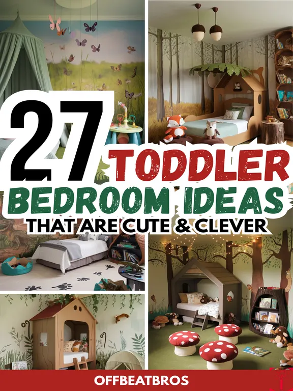
Choosing the right bedroom color palette can make all the difference in your emotional and relaxation response to your space. Bedrooms can be inspired by color palette styles such as Sage Green Sanctuary or Scandinavian Serenity which use soothing nature-inspired hues to create a calm and restful space.
Living rooms and shared spaces
Living rooms and dining rooms are spaces where families spend time together and entertain guests.
Choose warm neutrals such as beige or light gray for your walls and main furniture pieces and add some accent pieces in coordinating colors.
Use a color scheme that reflects your style. If you have children and pets in your home, you may want to be more careful about the type of fabric and finishes you choose.
It’s often a good idea to select materials that are easy to clean, durable, and can withstand the wear and tear.

Bedrooms and relaxation areas

Bedrooms require a different type of color palette compared to other rooms in the home.
Soft blues, lavenders, and muted greens are soothing colors that will actually help you relax and sleep better at night.
Choose colors that you love and that make you feel at peace.
Neutrals in cool grays or warm taupe can help balance everything.
If you’re looking for a more dramatic feel, go for a deeper tone but don’t go too dark as this can make the room feel stuffy.
Use your accent colors more sparingly in bedrooms and consider sticking to neutrals.
Kitchens and dining spaces
Kitchens and dining rooms are shared family spaces where everyone comes together.
Warm, inviting colors like terracotta and softer yellows or even softer reds will encourage people to socialize more and, as a plus, make them hungrier.
If you have a more modern kitchen design, white or gray are great neutrals to pair with more vibrant accent colors.
Blues can be a calming color in kitchens, and greens are a good option since people associate it with nature and fresh ingredients.

Bathrooms and spa-like settings

If you want your bathroom to feel like a spa or relaxing getaway, stick with cool blues, soft greens, or crisp whites. Bathrooms are smaller, more intimate spaces so dark colors will make your room feel cozy but smaller.
Lighter colors are a good idea if your bathroom is on the small side, as lighter colors help the space look bigger. Pick a paint color that is moisture-resistant and has a matte finish.
Home offices and productivity zones
Setting up a home office is a whole different ball game. Blue and green are good colors for workspaces, as they are more calming, proven to reduce stress, and will help you focus better.
Yellow can add more creativity, while purple can bring out innovative energy. Avoid bright reds in your home office, as they tend to make people more anxious.
The best approach for office color is to keep the walls more neutral and add in color through accent pieces and accessories. This will give you a more balanced workspace that you will enjoy being in instead of a space you want to avoid.
The 60–30–10 Rule Explained
The 60-30-10 rule is a simple method for creating a balanced color scheme. It involves assigning percentages to three categories of colors: 60% for the dominant color, usually your walls; 30% for secondary color on your furniture; and 10% for the accent colors in accessories and decor..
When you spread these percentages around your room the right way, everything just kind of comes together and looks balanced but still interesting at the same time. For instance, when designing a bedroom, you might apply this rule to create a cohesive color scheme that incorporates elements from your chosen decor, like matching curtains, bedding, and accent pieces.
Creating a Cohesive Whole-Home Color Palette
It’s recommended that you don’t paint every room in the same color. You can, however, maintain a cohesive whole-home color palette by using the same undertone across all the rooms in your house and varying the intensity of your colors from room to room.
Hallways and open floor plans are transition spaces that work well with softer neutrals. If you’re repeating accent colors from one room to another, do it in a subtle way by repeating accent colors in artwork or other decor. You can also reuse your key colors throughout your home.
You might use them as accent colors in some rooms and as the main color in others. The important thing is to use the same color family but don’t make every room in your house look the same.
Popular Color Palette Styles for Homes
Serene neutrals and minimalist schemes, warm earthy tones, crisp modern black-white-gray palettes, breezy coastal pastels, and dramatic dark palettes are popular color palette styles you can choose for your home.. Mid-century color palettes offer a vibrant alternative, featuring bold turquoise, mustard yellow, and playful geometric patterns that can instantly transform a room’s aesthetic.
Each style will create a different mood and feeling in your home, so take the time to choose the colors that best reflect your style.
Neutral and minimalist palettes
Neutral and minimalist color palettes are some of the most classic and easy to use color schemes. The most popular neutral colors are those that are not easily tied to a particular season or year. They will never go out of style and make your room feel more relaxed and zen.
The basics of this style are pale whites, beiges, gray and taupe. You can add in some accents of softer accent colors but nothing too bold. These color schemes are also great for small spaces. It will give you a timeless look that doesn’t try too hard.
Warm earthy color schemes
Warm, earthy color palettes are more fun and can add some character to your space. Some popular earthy tones are terracotta, burnt orange, ochre, olive green, and clay.
Earthy colors are inspired by nature and will make your home feel more connected to the great outdoors. Living rooms and dining rooms are two good rooms in the house to use warm, earthy tones, as they are more grounding colors that make people feel at ease and encourage conversation. These colors have more energy than neutral palettes.
Modern black, white, and gray palettes
Black, white, and gray are the color combination that will never go out of style. It’s a palette that goes with just about everything, which is why interior designers use them so often.
You can also add some chrome fixtures for an ultra-modern look, or add some wood if you want your space to feel a little more cozy.
Use black to ground your room, white to brighten and open it up, and fill in the rest with various shades of gray. It’s a very easy color scheme to work with too. If you’re not sure about colors, this is a great safe choice that will look very put together.

Coastal and soft pastel palettes
Coastal and soft pastel color palettes are on the opposite end of the spectrum compared to stark modern colors.
Soft pastels bring lighter, airy, calming feelings into your home. Colors like seafoam green, pale blues, and sandy beiges will make your home feel more tranquil and relaxed.
To achieve an authentic coastal color scheme, you can mix and match soft pastels with natural materials like jute, rattan, and distressed wood pieces.

Dark and moody color palettes
Dark and moody colors have recently become more popular as more people want their homes to feel more sophisticated and dramatic.
Deep blues, emerald greens, and charcoal grays are popular choices for a moody color palette.
Dark colors make a room feel cozier and more intimate than brighter, paler shades. Dark colors are best used in rooms with lots of natural light or spaces you use in the evenings, such as dining rooms and home bars.
How to Use Accent Colors Effectively

You may have already noticed that some rooms naturally draw your attention more than others. The rooms that stand out are usually the ones that use accent colors more effectively.
The 60-30-10 rule is a popular design formula used by interior designers. The principle is that 60% of the room should be your dominant color, 30% should be your secondary color, and 10% should be your accent color.
The key is where you place those pops of accent color. Throw pillows on your sofa are a great place for accent colors. So is a statement wall, or artwork on your walls, or even one statement piece of furniture.
The rule of thumb here is to not go overboard with accent colors. Less is more when it comes to accent colors, and they work best when you’re a little more strategic about placement.
Testing Your Color Palette Before Committing
Stop yourself from rushing out and painting your entire home at once. Purchase those sample paint pots, and paint large swaths on different walls. You need to see how the colors look during different parts of the day, as the light changes.
Test your color palette, and consider all your large format flooring, fabric swatches, and wall paint samples together on a mood board to see if they all work well together. Its much easier to tell what doesnt look good before you’ve spent money on everything.
Conclusion
Just as you know in your heart that you should never buy a shirt that matches your eyes, you will know when you’ve stumbled on your home’s perfect color palette.
Trust your gut and don’t ignore the basics of color theory. You now have all the tools and information you need to curate a cohesive color scheme that effortlessly flows from one room to the next.
The colors you choose for your home are more than just paint on your walls, they are a reflection of who you are and how you choose to live.