31 Teen Girl Bedroom Decor Ideas
This site contains affiliate links. We may earn a small commission, at no extra cost to you. Article may contain some images for illustrative purposes only .
The fairy lights are drooping off the curtain rod again. That sad, sagging string has probably been up there since seventh grade, and the mismatched throw pillows on the bed aren’t helping either. Sound familiar? A teen girl’s bedroom is part sanctuary, part mood board, part rebellion against whatever her little sister’s room looks like — and it deserves more than leftover string lights and a poster taped crooked to the wall. Below, you’ll find 31 bedroom decor ideas that actually feel current, from moody wall treatments and canopy beds to clever storage hacks, gallery walls, and cozy reading nooks that make homework feel slightly less tragic. Some are weekend projects. Others are quick swaps. All of them are built to grow with her.
Black Iron Headboard With Soft Bedding
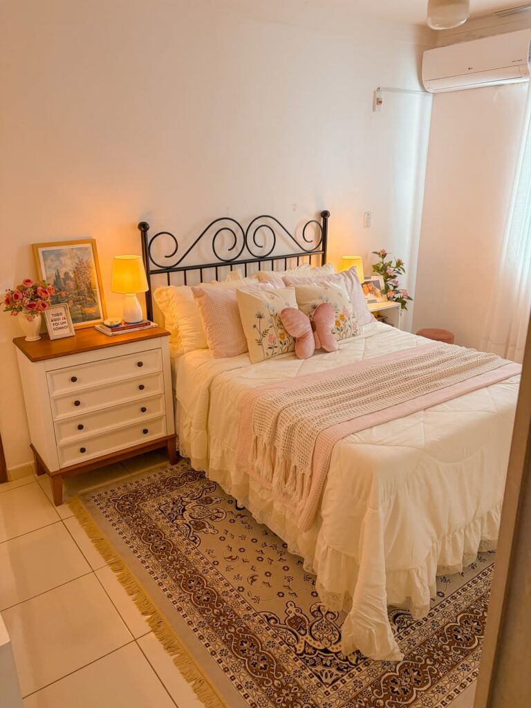
The scrolled iron headboard is doing a lot of the heavy lifting here, and the trick is that everything around it goes deliberately soft — ruffled white duvet, pink gingham pillows, a floral embroidered cushion in the centre. That contrast between hard metal and fabric-heavy bedding is what makes the whole thing read as intentional rather than just pink. If you already have a plain iron or metal headboard, you don’t need to replace it.
Layer up the pillows, add a waffle-knit throw in a blush tone, and let the bedding do the work. The bedside chest with dark knobs against white paint is worth copying too — it keeps things from feeling too matchy. One fragment worth noting: the rug underneath.
A vintage-style one anchors the tile floor without much effort.
Graphic Red Bedding
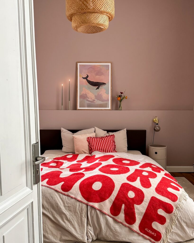
That red blanket is doing most of the work here, so let one loud piece sit on top of plain bedding instead of mixing five different prints. Keep the sheets quiet. Cream, white, or light beige gives the pattern room to look intentional, especially if the wall color is already soft like this dusty pink.
The striped cushion helps because it repeats the red without copying the blanket exactly. A small ledge above the bed is useful too; lean one framed print there, add a thin vase, and stop before it turns into a storage shelf. I would skip real candles in a teen room and use battery tapers for the same height.
Pink on Pink on Pink
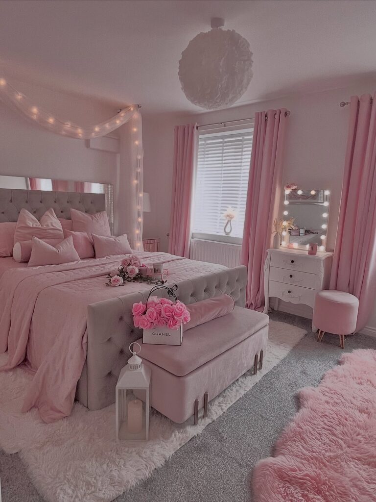
Committing fully to one colour is harder than it sounds. This room works because the pink shows up in about six different textures — velvet ottoman, satin bedding, fluffy sheepskin, matte curtains, glossy roses, the powdery ceiling pendant. That’s the trick. If everything were the same pink cotton, it would flatten out and start to look like a hotel room from 2007.
Pick your pink and then hunt for it in different materials. A shaggy rug near a smooth headboard. Blush blinds behind heavier drapes.
The fairy lights draped over the bedposts are doing a lot of work here too, softening what could feel like a showroom. One thing I’d skip: the Chanel shopping bag as a vase. Fresh roses in a plain glass jug would age better.
Pink with white trim
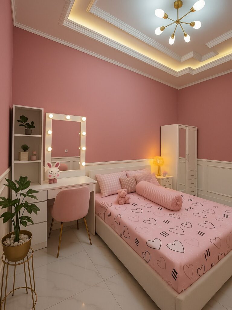
Start with the walls. That dusty pink works because the room doesn’t stop there, it gets broken up by the white panel molding, the white bed frame, and the white wardrobe, so the color reads clean instead of sugary.
Keep the bigger pieces plain. Then bring in the playful part through the bedding, like the heart print here, and one or two soft shapes such as a round bolster or a plush toy on the bed.
The vanity mirror bulbs matter. If your teen actually uses the desk for getting ready, copying that setup makes more sense than adding random decor that just eats surface space.
I’d skip the extra tiny accessories. In a room with pink walls, lit mirror bulbs, a table lamp, and ceiling lighting, too many little cute things can start to feel more busy than fun.
Mix Soft Color With Attitude
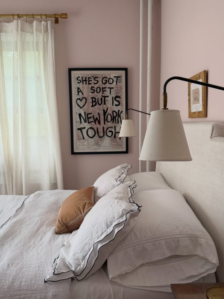
Blush pink walls could easily tip into overly precious territory, which is where a framed print like this one earns its place — bold block lettering, black outline, zero sweetness. It cuts right through. The ruffled pillow shams with black edging do the same thing, keeping the softness from going too far.
If you want to try this, pick one piece that has some edge to it and let everything else stay quiet around it. The art doesn’t need to match the room’s palette. That’s actually the point.
For a teen who likes feminine colors but doesn’t want a bedroom that reads too young, this balance — dusty pink behind something a little loud — tends to work better than chasing a theme all the way through.
Gingham Bedding Mix
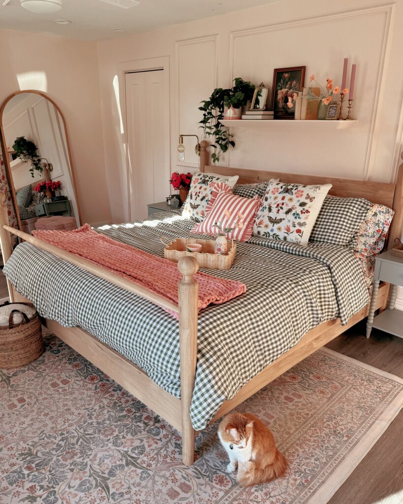
With a gingham duvet doing most of the work, you can add floral pillows without the bed looking too busy. Keep the palette tight. In this room, the black-and-white check, pink throw, and flower prints all repeat enough that they feel planned, even though the patterns are different sizes.
A chunky blanket across the foot of the bed is also a good move for a teen room because it can hide a slightly messy duvet during the day. I’d skip real candles on the shelf above the bed and use battery ones instead, especially if the shelf is close to pillows or curtains.
Layer Prints Without Matching
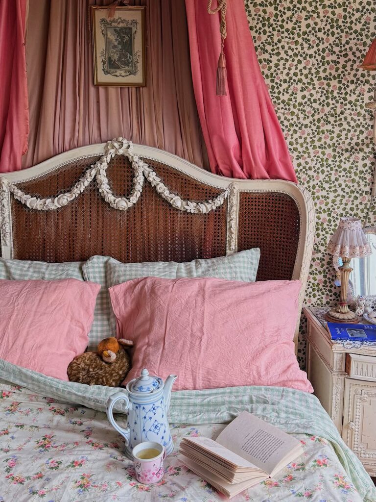
The trick here is committing to pattern on pattern. Rose wallpaper, floral sheets, gingham pillowcases underneath the pink ones — none of them match, but they share a scale and a softness. Pick three prints max. One small floral, one check or stripe, one larger motif. Keep them in the same color family and you can basically throw them together.
The pink pillowcases sitting in front of the green gingham ones are doing a lot of work here. They break up the prints so your eye has somewhere to rest.
If you’re a teen worried your parents won’t sign off on wallpaper, a printed sheet set and mismatched pillowcases get you 70% of the way there. The caned headboard is lovely but skippable. A plain wooden one works just as well under all this.
Floral attic corner
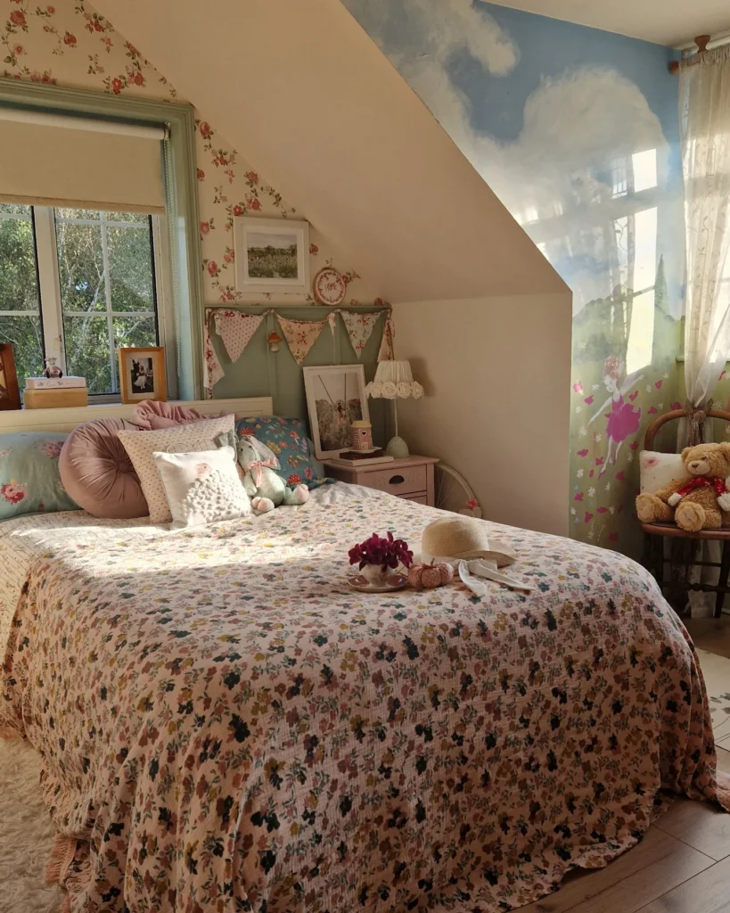
Start with the slope. A low attic wall like this can look awkward unless you treat the bed as part of it, so push the headboard right under the angle and let the room shape do the framing for you. Then keep the main fabric story tight: one small floral on the wallpaper, another on the quilt, and a painted headboard in a faded green that sits between them instead of fighting both.
The bunting works because it breaks up the headboard line. Nice touch.
If this is for a teen who likes softer vintage pieces but doesn’t want the room to feel too precious, bring in one unexpected thing like the sky mural or cloud print on the wall. I’d probably skip adding many more cushions though, because a bed this full starts looking harder to use every day.
Attic Room With Granny Square Blanket
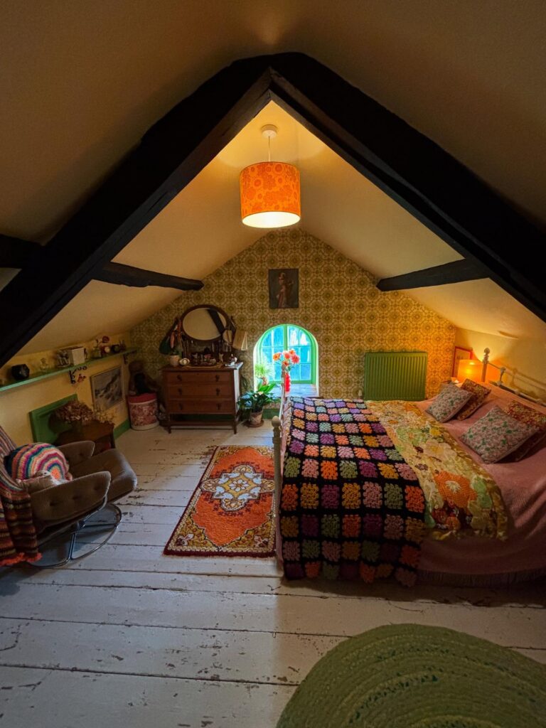
That crocheted blanket is doing most of the work here. It pulls the orange lampshade, the patterned rug, and the green radiator into something that actually looks deliberate rather than random. If you’re decorating a sloped-ceiling room for a teen, a granny square throw is one of the cheaper ways to anchor a whole colour palette — you can find them secondhand pretty easily, or there are kits if she wants to make one herself.
The arched window helps too, but that’s structural. What you can actually copy is the layering: printed bedding underneath, the crochet blanket folded across the lower half, mismatched pillows at the top. None of it matches exactly.
That’s the point. I’d skip the wallpaper behind the bed if the ceiling is already this busy — it’s close to too much.
Patchwork Cottage Bedding
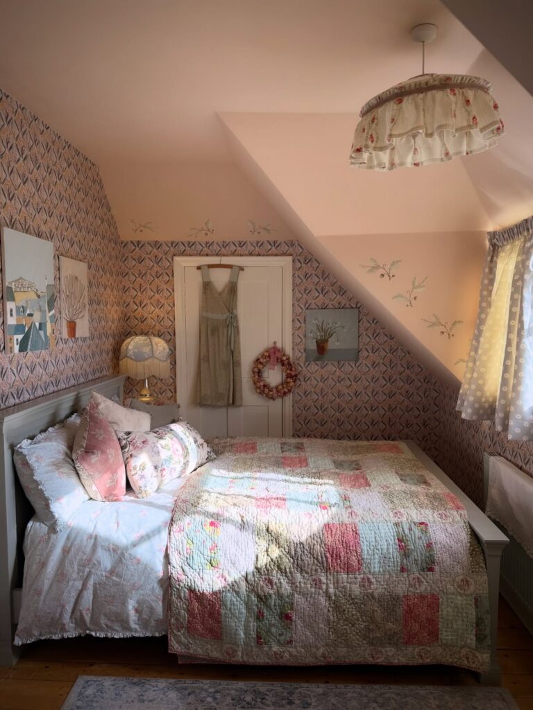
Start with the quilt if the room already has sloped ceilings or patterned walls, because it gives the bed enough weight without needing a huge headboard. The patchwork here works because the colors repeat in the pillows, curtain, and little lampshade, so nothing looks thrown in from another room. Keep the bed low.
For a teen who likes vintage pieces, add one handmade-looking thing on the door, like the wreath here, instead of filling every wall with prints. I’d skip too many matching florals though, as the wallpaper and quilt are already doing plenty.
Pink Bedding With Garden Views
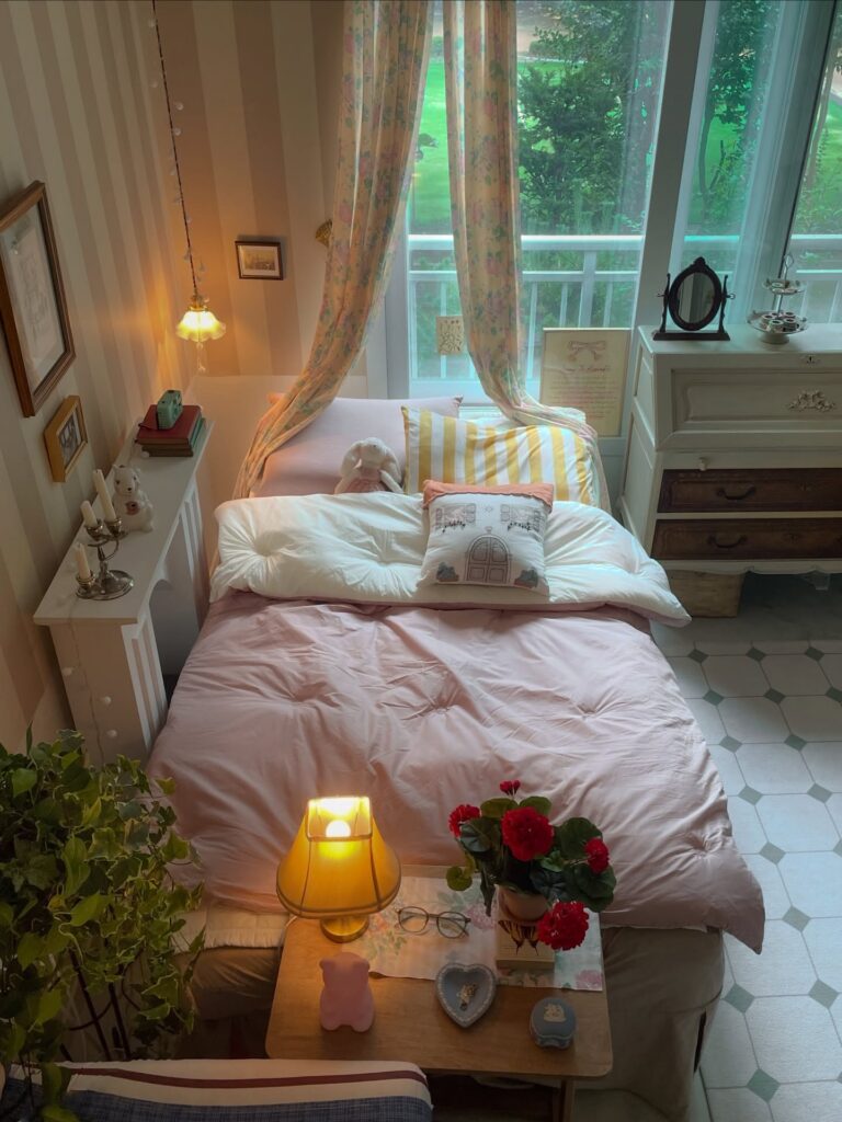
The whole room leans on that dusty pink duvet paired with a striped yellow pillow and a floral curtain pulled back like a canopy. It works because the window does half the job — all that green outside becomes part of the palette.
If your window looks onto a parking lot, skip this exact setup. You need the view for the curtains to make sense.
Pull it off with one soft pink as your base, then bring in yellow through a single pillow or a lampshade. The little embroidered cushion, the geranium in a pot, the ceramic dog on the radiator cover — these are the details doing the real work. Thrifted, mostly. Not matched.
The tulip lamp on the nightstand I’d swap for something less yellow-heavy. Two warm lights in one corner is a lot.
Lace canopy corner
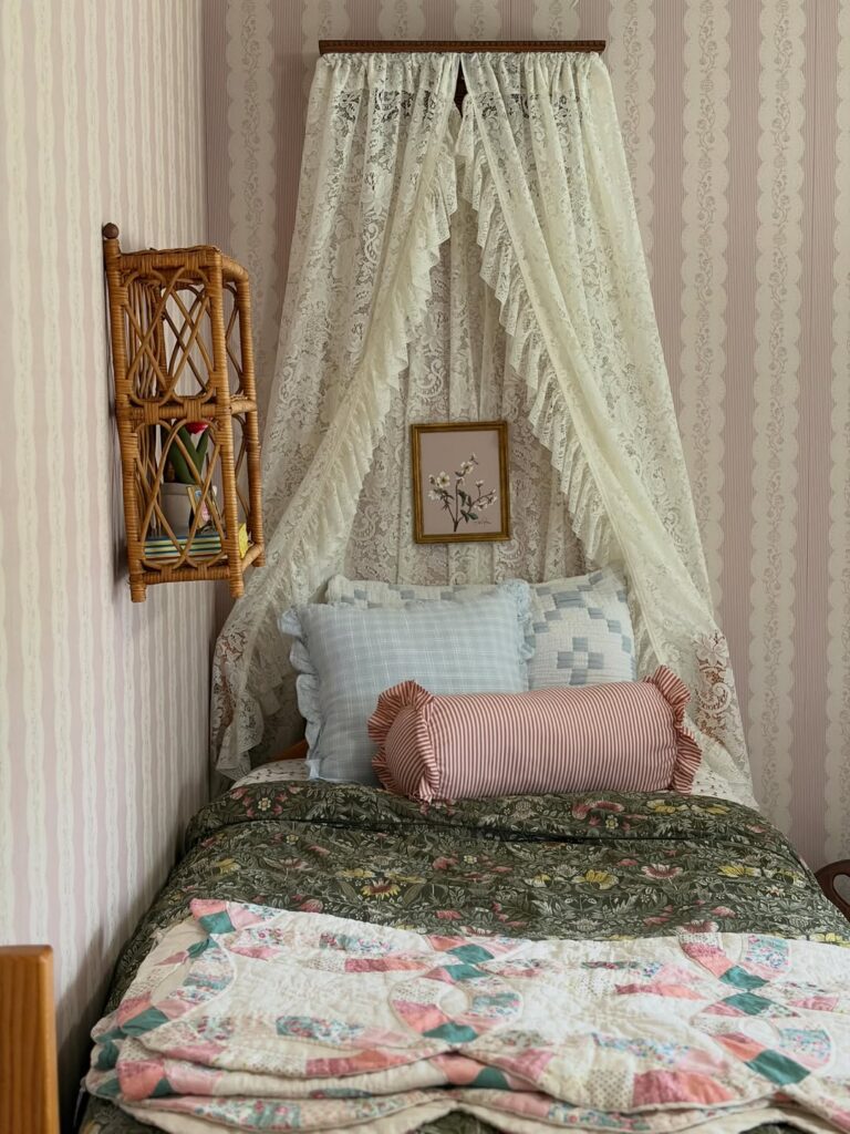
Start with the canopy. A length of lace pinned from a narrow shelf or board above the bed gives the whole setup that tucked-in look without needing a four-poster frame, and it works especially well if the bed is pushed into a corner. Keep the bedding underneath a bit mixed rather than matched, like a faded floral quilt with one checked pillow and one striped bolster, because that slight mismatch stops the lace from feeling too precious.
The wallpaper matters too. Vertical stripe paper behind the bed makes a small single bed look taller, which is useful in narrow rooms where there is not much floor space to work with. I’d skip anything too bright here.
Pastel prints, wicker, framed botanicals, all of that sits together more naturally.
The Ballerina and Floral Bedroom
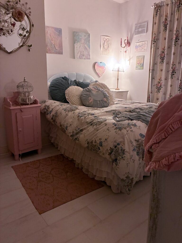
Round velvet pillows in dusty teal do a lot of the work here — they pull the headboard color down onto the bed and give the floral duvet something to land against. The ruffled hem on that duvet is worth hunting for specifically, because it adds detail without needing anything else on the lower half of the bed. Ballet art prints clustered together like that work better than spacing them out individually across the wall.
Keep them roughly the same size or one noticeably larger. The pink nightstand looks painted, probably a DIY — if you already have a small cabinet, that’s the first thing to repaint. I’d skip the birdcage on top personally, but a small lamp or a stack of books does the same job with less fuss.
Gingham Bedding Mix
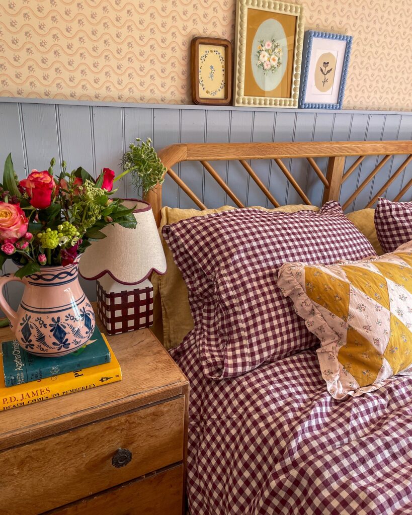
If the room already has floral wallpaper, a gingham duvet is a good way to keep the bed from looking too plain. Use one main check, like the burgundy one here, then bring in a smaller floral pillow or a mustard quilt so the bed has layers without turning into a full pattern mess. Keep the headboard wood if you can.
It breaks up all the fabric and makes the setup feel less like a matching catalog set. For a teen bedroom, this works well because she can swap the pillow covers later without changing the whole room. I’d skip an oversized flower arrangement by the bed if the nightstand is tiny.
Books and a small lamp are enough.
Sage Green With Plaid
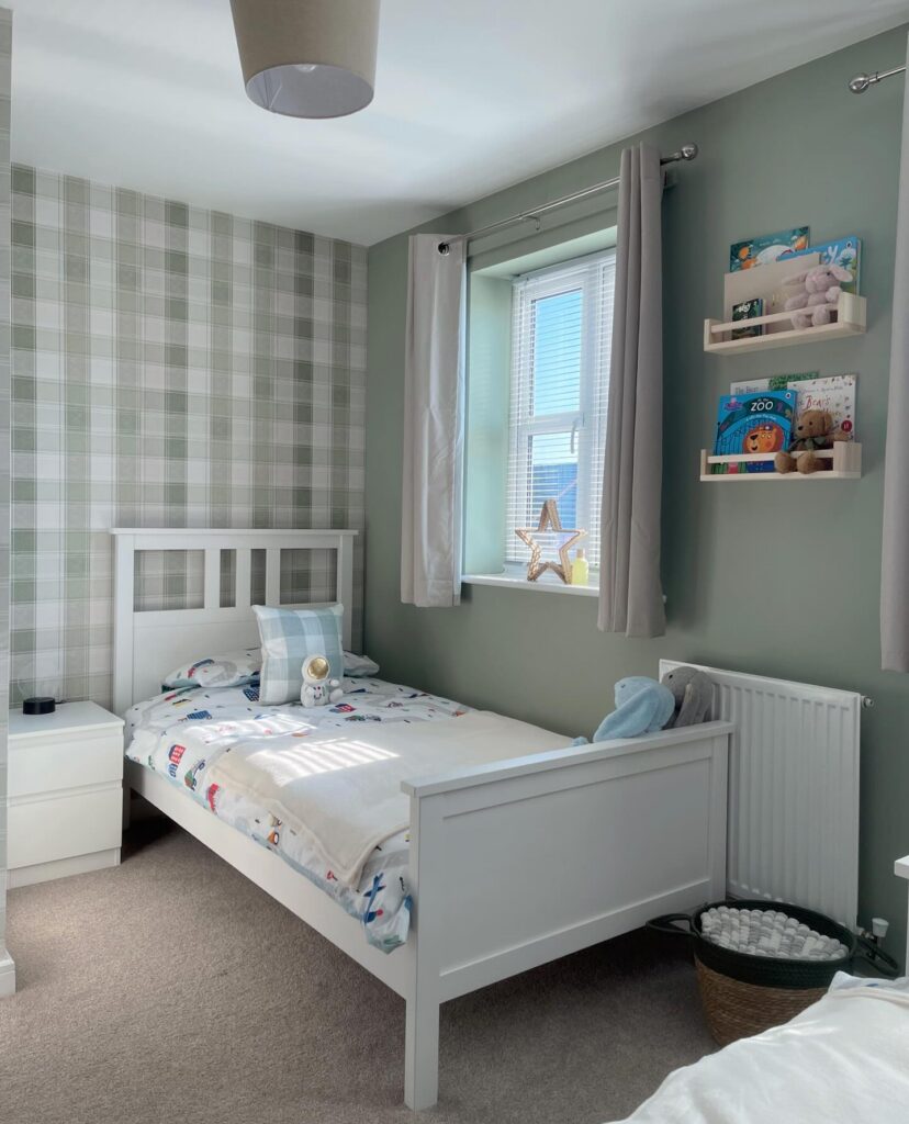
The plaid wallpaper only lives on one wall here, and that’s the move. Four walls of check would feel like a hunting lodge. Pair it with a flat sage on the adjacent walls in the same green family so the pattern reads as a feature, not a fight.
For a teen girl, swap the transport bedding for something plainer — waffle linen in oat, or a washed cotton in white. Keep the picture ledges. They’re useful past age ten because paperbacks, polaroids, and small ceramics all sit on them.
One thing I’d change: the grey curtains. A softer bone or a pale sage in a longer drop, puddling slightly, would pull the window into the scheme instead of cutting it off at the sill.
Bed Nook With Vines
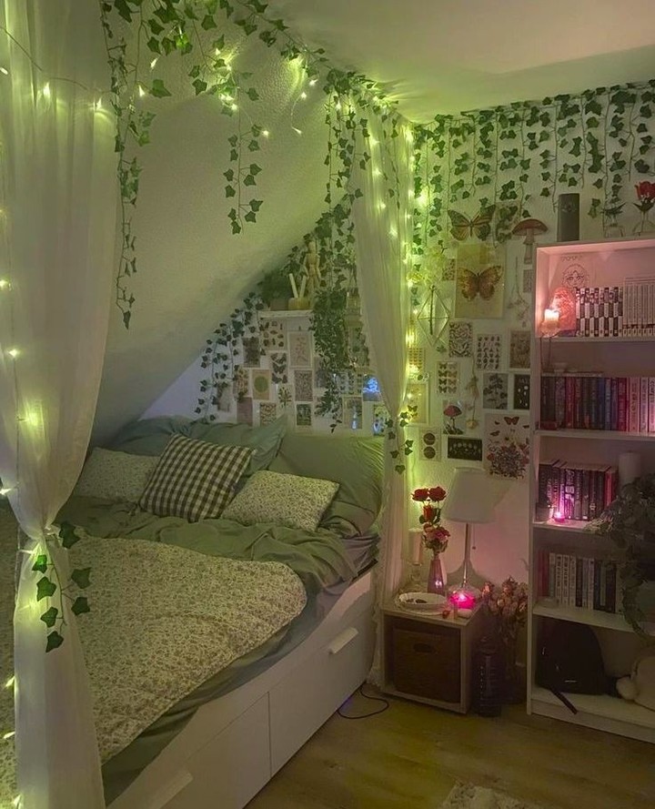
Tuck the bed into the odd corner. That sloped wall does half the work for you, because once the mattress sits under it, the whole spot starts to feel separate from the rest of the room without needing a full canopy or built-in frame. Run one strand of fairy lights along the ceiling line first, then weave faux ivy around it instead of hanging the vines on their own, which usually looks flatter and a bit messy.
Keep the bedding in the same green family, then break it up with one check pillow or a tiny floral print so it doesn’t turn into one block of color. The butterfly prints and bookcase help this suit someone who likes a bedroom that leans a little woodland, a little collector-ish. I’d skip real vines here. Too much upkeep near books and fabric.
Mix Floral Patterns Without Overthinking It
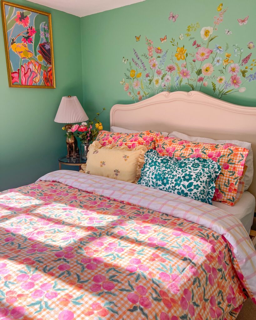
The duvet, the pillowcases, and the throw cushions here are all different floral prints — orange gingham with pink blooms, teal on white, yellow gingham with embroidered bees — and none of them match exactly, which is kind of the whole point. What keeps it from looking chaotic is that the colors overlap. Pink shows up in nearly every piece, so your eye moves around without getting lost.
Start with your duvet and pull two accent colors from it, then shop cushions in those shades but different scales — one small print, one bigger. The wall mural works because the green wall behind it is a solid, not another pattern. If you’re not painting a mural, a framed floral print in the corner does something similar without the commitment.
Floral Wall With Checks
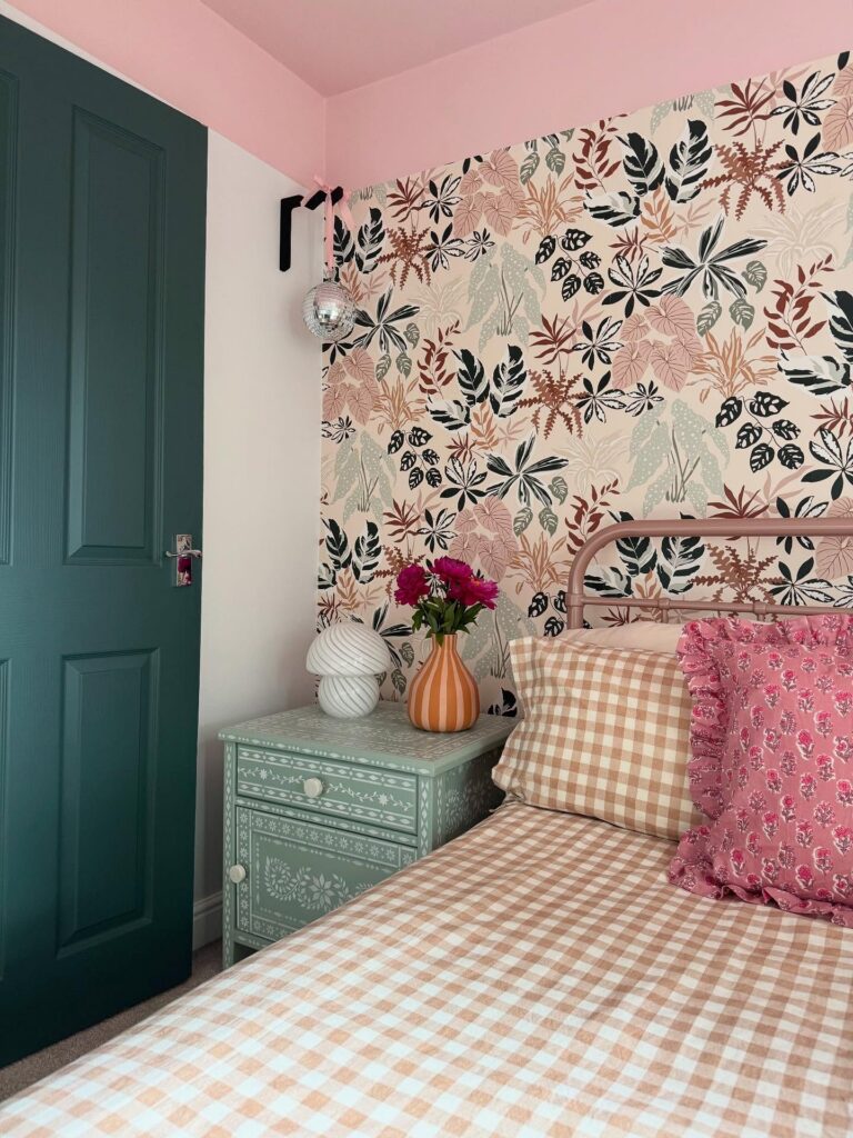
Behind the bed, a busy leaf print can do most of the work if the rest of the room follows its colors instead of fighting it. Pick one shade from the wallpaper for the bedding, like the peach check here, then repeat another shade in a small piece, maybe a green cabinet or painted door. Keep the metal bed frame plain, because a carved or bulky headboard would make this corner feel too packed.
Checks are useful here. They break up the floral pattern without adding another themed print. I’d skip extra wall art on this wall, honestly, because the wallpaper already has enough going on and posters would probably just look stuck on.
Canopy Over the Bed
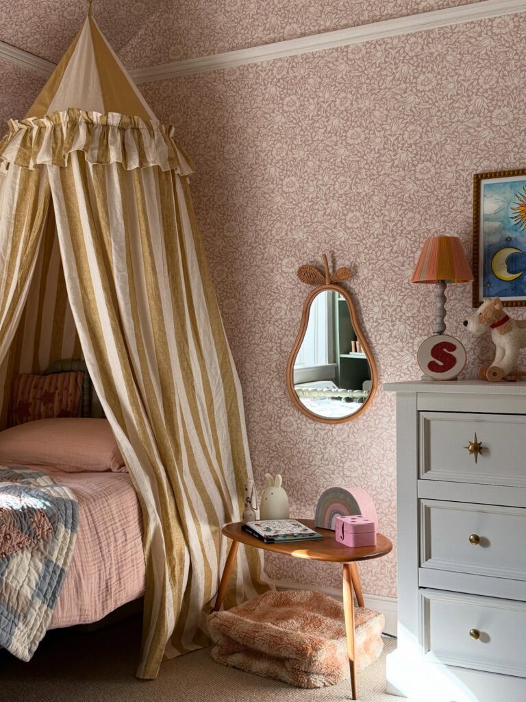
The striped canopy is doing most of the heavy lifting here. It hangs from a single point on the ceiling and drapes down around the pillow end, which is easier to install than a full four-poster frame and works even in a rental if you use a ceiling hook you can patch later. Pick a fabric with some weight so it falls properly — thin voile just looks limp.
The mustard and cream stripe works against the pink floral wallpaper because the scales are different: big stripes, tiny flowers. If I were doing this, I’d skip matching the canopy to the bedding. Let it be the loudest thing in the room and keep the sheets plain.
Paint the ceiling too
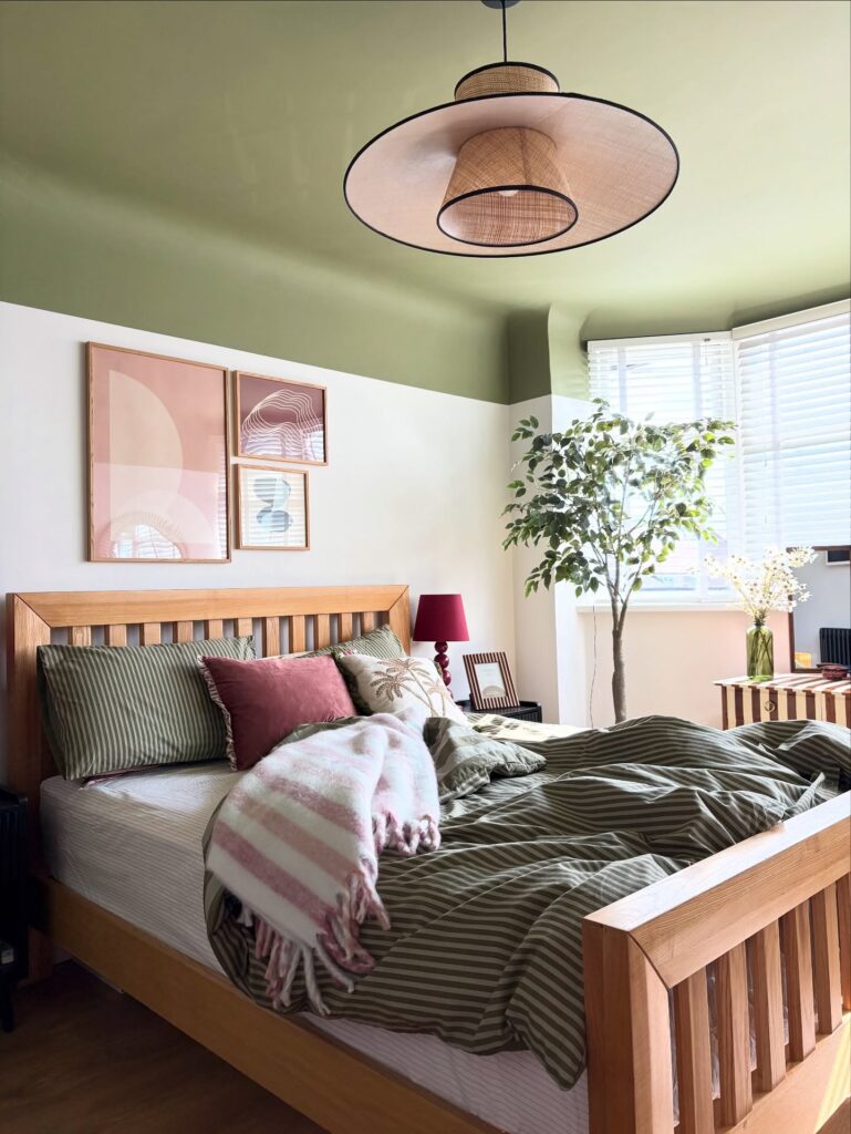
Start with the ceiling. Taking that olive green down just far enough to create a band above the walls gives the room a clearer shape, and it feels more thought-through than doing four plain walls and stopping there. Keep the lower walls light so the bed frame and art don’t get buried.
The wood bed does a lot here. If you already have a basic pine or oak frame, lean into it with striped bedding in muted green, then break it up with one dusty rose cushion or throw so the whole room doesn’t turn flat.
Three small prints work better than one huge poster. They sit neatly above the headboard and keep the layout looking tidy without much effort. I’d skip overly bright accessories here, because the ceiling color is already doing the heavy lifting.
Built-In Bed Alcove With Storage
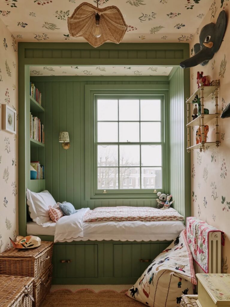
The scalloped trim along the base of that platform is doing a lot — it keeps the whole thing from looking like a builder’s afterthought. If you’re having a joiner build something similar, that detail is worth asking for specifically. The under-bed drawers are the real practical win here, especially in a small room where a separate dresser would eat half the floor.
Paint the alcove a single colour, panels and frame included, so it reads as one deliberate thing rather than a collection of bits. The wallpaper stopping at the alcove edge actually helps — the contrast is what makes the built-in pop. Shelves on one side only.
Two sides gets crowded fast.
Sage Bedding Wall
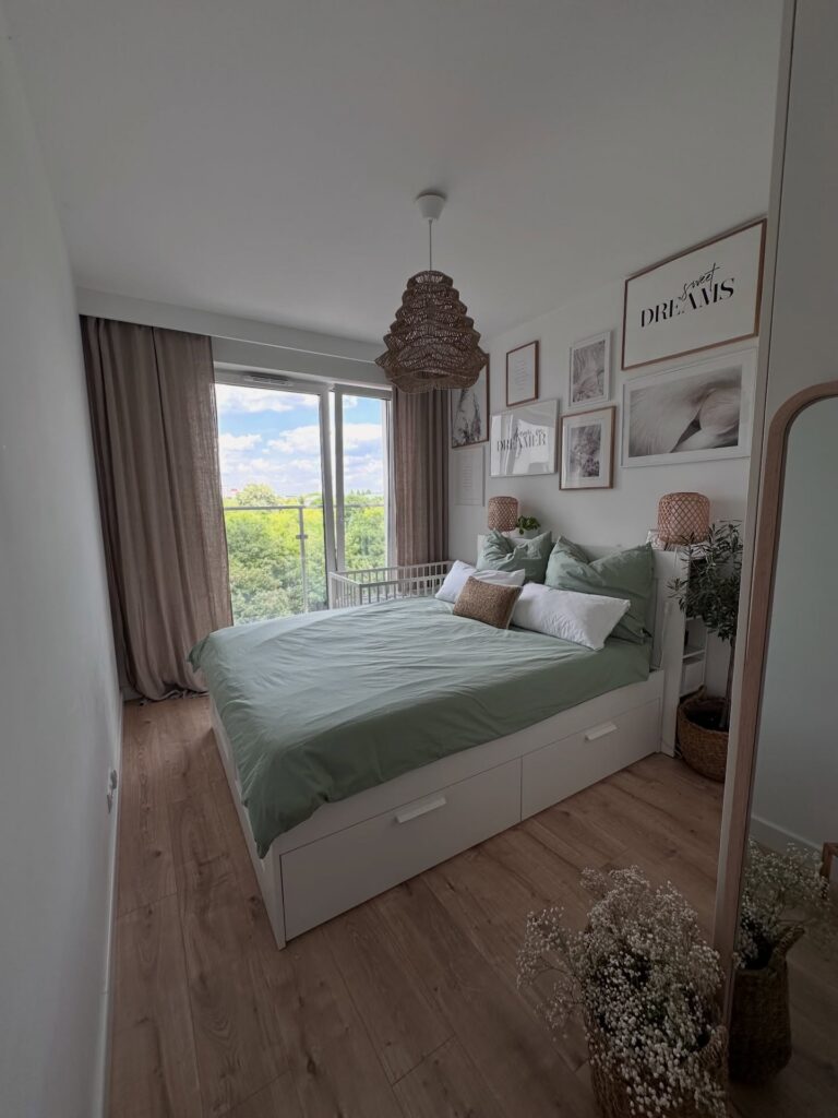
Start with the bedding if you want this look without repainting the whole room. A muted green duvet gives the bed enough color, while the white frame and drawers keep it from feeling too heavy in a small room. The wall above can carry the personality part, especially with thin frames, quote prints, soft sketches, and one larger piece placed higher than the rest.
Keep the frames close. If they spread too far, the wall starts looking unfinished. The rattan lamps beside the bed also help break up all the flat white surfaces, so one woven shade or basket is worth adding if the room feels a bit plain.
I would skip too many tiny pillows here, since they mostly end up on the floor.
Paint The Ceiling Terracotta
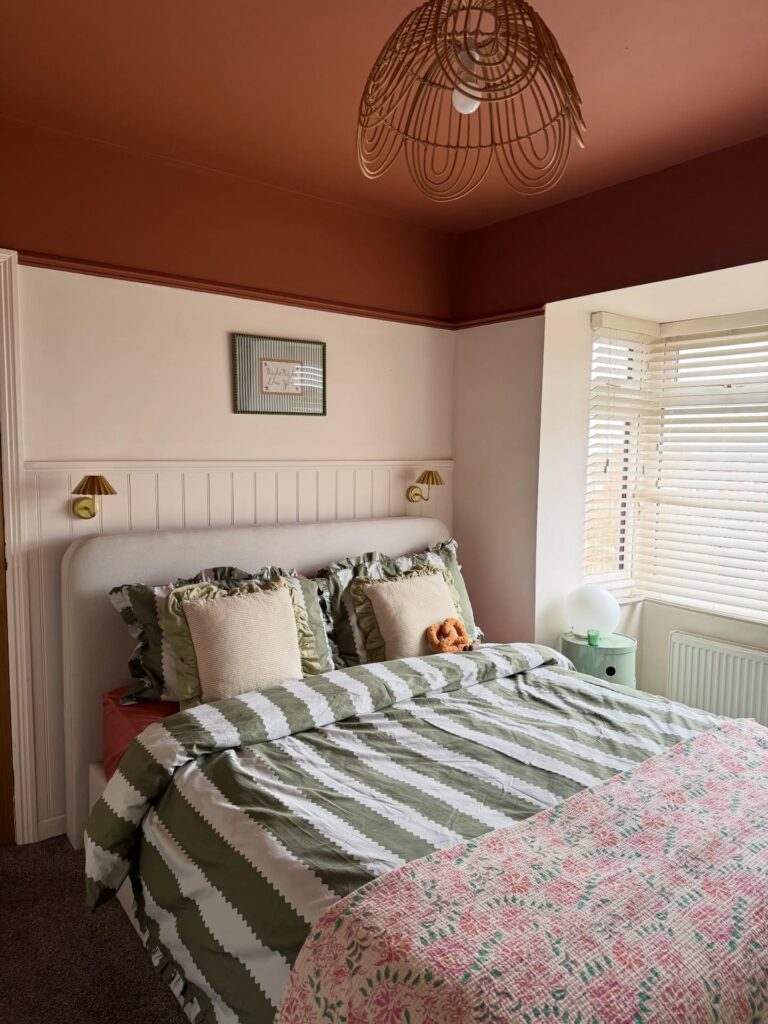
The terracotta ceiling here does most of the heavy lifting. It drops down onto the top few inches of the wall too, which is the part people forget — carrying the colour past the ceiling line makes it look intentional instead of like you ran out of paint. Below that, the walls stay pale, so the room doesn’t close in.
Pick a shade with some brown in it rather than a true orange. Test it at night under a warm bulb before committing. The rattan pendant works because it echoes the ceiling tone without matching it exactly.
One thing I’d skip: painting the woodwork or headboard wall the same terracotta. You lose the contrast that makes the ceiling feel like a deliberate choice.
Olive walls with prints
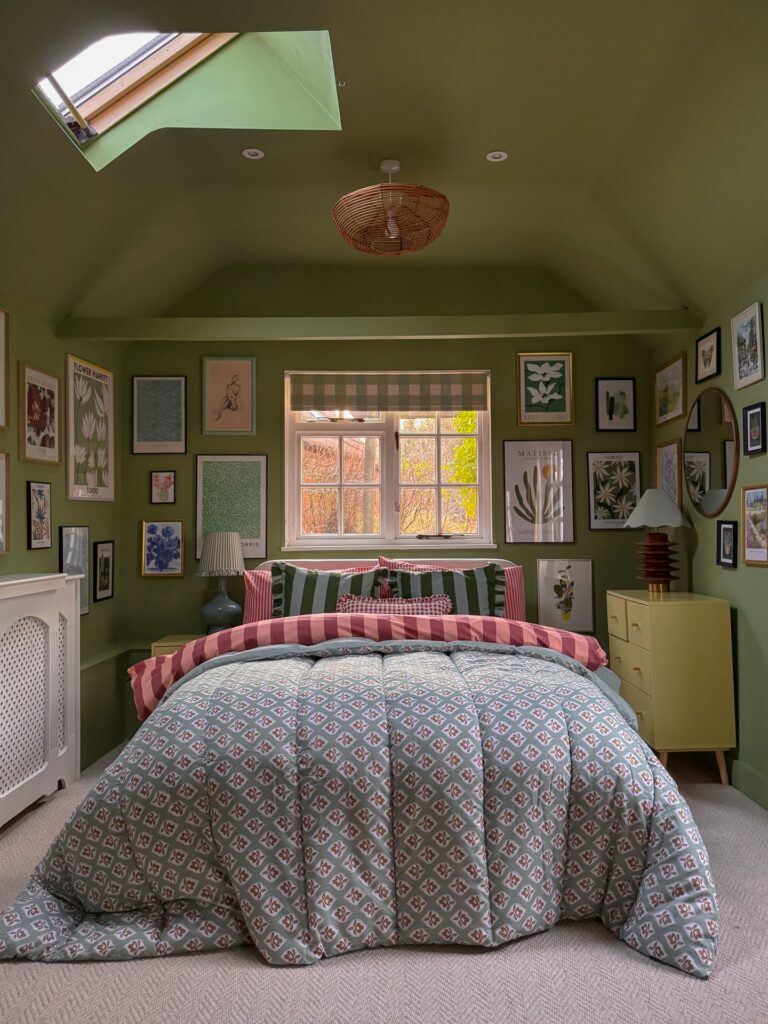
Start with the wall color. That muted olive does a lot of the work here because it lets the framed art, checked blind, and mixed bedding sit together without the room looking sugary or overdone. If your teen likes color but gets bored fast, this is a good route.
Keep the gallery wall tight around the bed and window rather than scattering frames everywhere, and mix botanical prints with a few smaller pieces so it feels collected instead of bought in one go. The striped and patterned bedding works because the colors repeat. That part matters.
I’d also copy the small painted chest rather than a standard bedside table, since the room already has plenty happening on the walls and the cleaner shape helps. One thing I’d skip is adding more than two bedding patterns unless she really likes a busier look.
Sage Green Walls With Moulding Panels
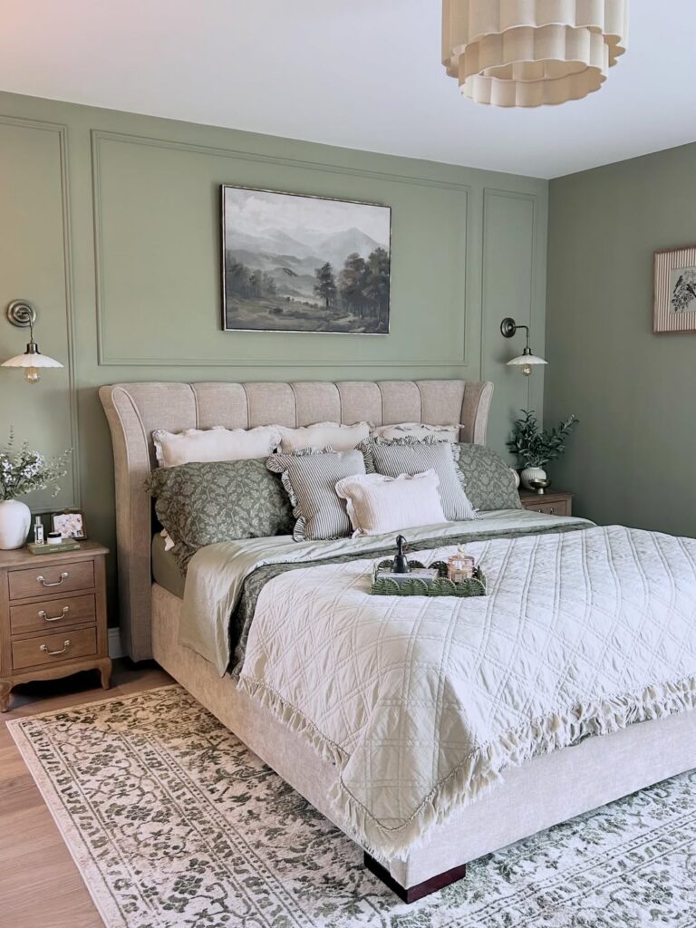
The panel moulding behind the bed is doing a lot of work here — it gives the sage paint somewhere to live rather than just sitting flat on the wall. If you’re renting, that’s obviously off the table, but for anyone who owns their space, peel-and-stick moulding strips are genuinely close to the real thing. The landscape painting sits centered inside one of the panels, which is worth copying exactly.
Centering art inside a panel rather than just hanging it anywhere on the wall makes the whole thing look more deliberate. Sage also reads differently depending on light — north-facing rooms tend to pull it greener, south-facing rooms keep it softer. Worth grabbing a few sample pots first.
This look suits a teen who wants something that doesn’t feel juvenile but isn’t trying too hard either.
Half Wall Panels
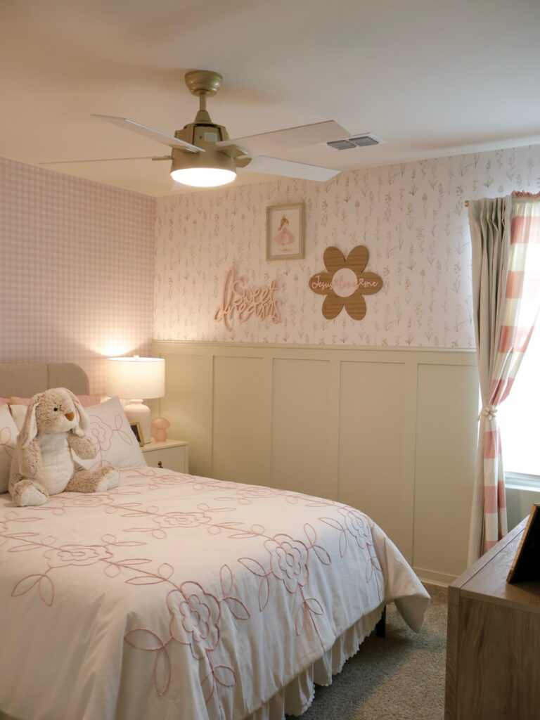
Start with the lower half of the wall if a full wallpapered room feels too busy. The paneling gives the bed area a cleaner break, while the small floral paper above still keeps the room from looking plain. Easy win.
For a teen room, this works well when the bedding already has a pattern, like the pink line flowers here, because the wall is split instead of having print from floor to ceiling. I’d keep the panel color muted, somewhere between cream and soft green, so posters, frames, or a name sign can still sit above it without fighting everything else. Skip glossy paint on the panels; it shows every bump.
Green On Green Layered Bed
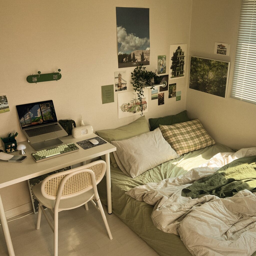
The mattress sits directly on the floor here, which is the move if your room is small and a frame would eat the walking space. Stick to one color family and vary the texture instead. Sage sheets, a striped duvet, a plaid pillow, a solid darker green at the back. Four pillows, not two. That’s what makes it look like a proper nest rather than a made bed.
One thing I’d change. The bedding puddling onto the floor picks up every bit of dust, so I’d tuck the bottom edge under the mattress or size the duvet closer to the bed.
The postcard wall above works because it stays in the same green-and-paper palette. Random prints in loud colors would fight the bed.
Half wall color trick
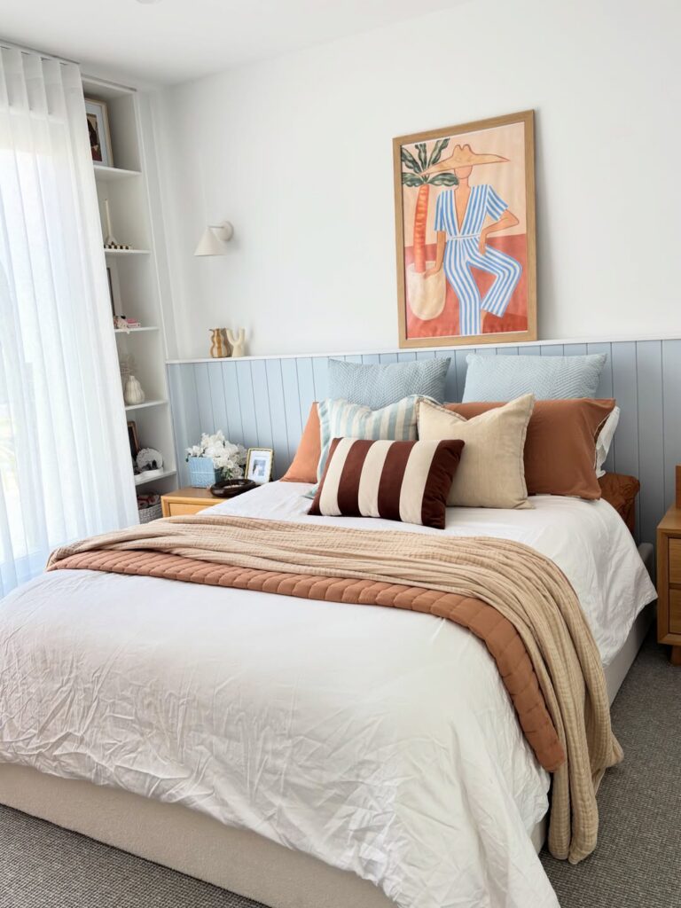
Try paneling or even a fake panel effect on just the lower half of the wall, then paint it a pale blue-grey so the bed has something to sit against without making the whole room feel boxed in. It works well in a teen room because you can keep the bedding mostly white, then change the look with a rust throw, striped lumbar pillow, or different pillowcases when tastes shift again in six months. The oversized art helps too.
One big piece above the bed is usually easier than building a gallery wall, and it keeps the room from looking too busy once the shelves start filling up. For small rooms, this is useful. I’d skip piling on more patterns here, because the blue stripe cushion and brown striped pillow already do enough.
Mix Storage With Wall Color
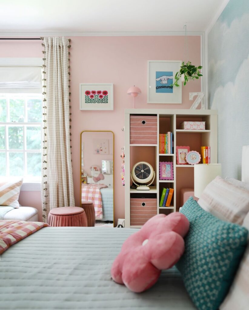
That pink bookcase unit works because it doesn’t fight the wall — it almost disappears into it. If you’re going this route, pull your wall color first, then find shelving in the same family. White shelves on a pink wall would have broken the whole thing up.
The striped fabric bins are doing real work here too; they hide the mess without adding another color to manage. A gold-framed floor mirror leaning against the wall is a genuinely easy add — no drilling, moves whenever you want it to. One thing worth knowing: a room this saturated in one color needs at least one break.
The teal pillow on the bed is probably the only reason this doesn’t feel like too much.
Pink Door Match
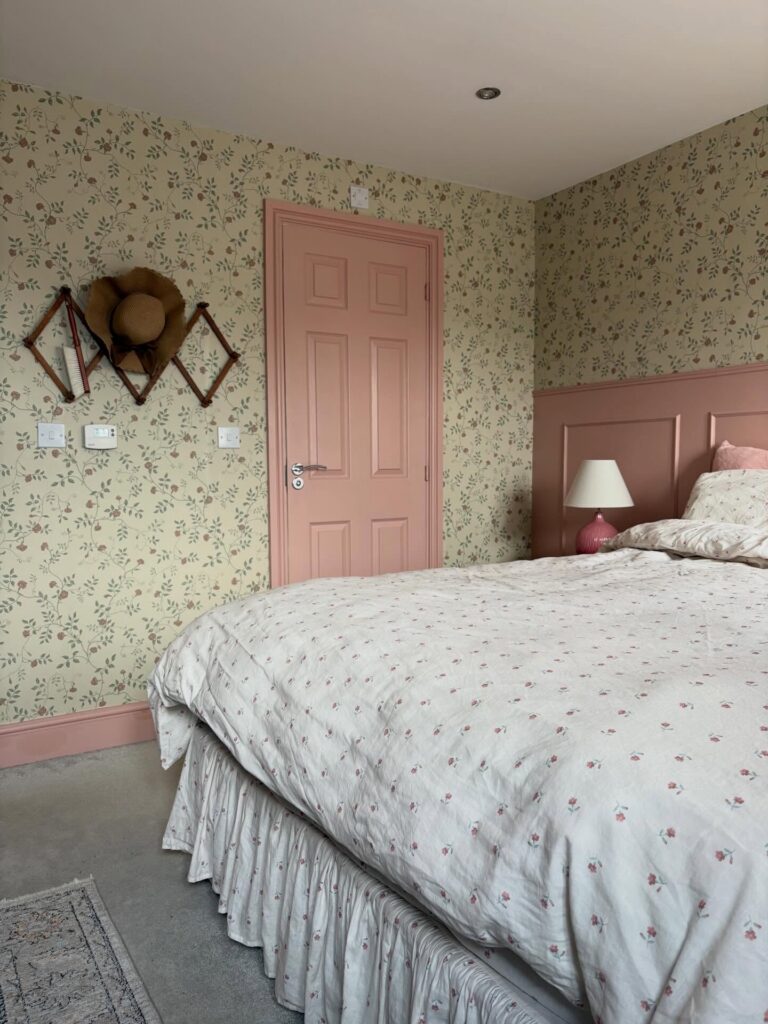
Paint the door first. If the room already has floral wallpaper, taking the same dusty pink onto the door, skirting, and headboard makes the pattern feel planned instead of random. The trick is staying close.
Pick one shade from the wallpaper, like the muted rose in the tiny flowers, then repeat it on the lamp base or pillow covers. The ruffled bed skirt helps too. It hides a basic bed frame and gives the whole bed more shape without needing extra furniture.
I’d skip adding many wall prints here, because the wallpaper and that folding peg rack already give the wall enough detail.
Layer A Vintage Cottage Mix
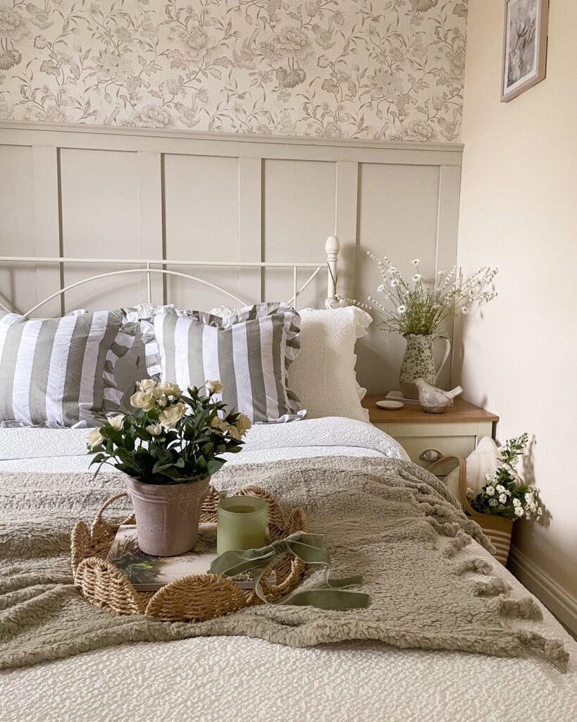
The wallpaper is doing a lot of work here. A soft floral toile above panelled wainscoting gives the room a grown-up feel without pushing it into grandma territory, which is the risk with anything florals-adjacent. Balance is what saves it. The striped ruffle pillows keep things from getting too sweet, and the woven tray with a potted rose on the bed adds something you can actually move around when you want to change the mood.
If you’re doing this for a teen, I’d skip the ceramic bird figurine on the nightstand. It reads older than the rest. Swap in a stack of paperbacks or a small lamp with a pleated shade instead. The jug of dried flowers can stay. It’s the kind of thing she’ll still like in three years.