25 Colorful Teen Girl Bedroom Ideas
This site contains affiliate links. We may earn a small commission, at no extra cost to you. Article may contain some images for illustrative purposes only .
The lava lamp on the nightstand has been glowing since 9 p.m. Beside it: a stack of Polaroids, a half-burned vanilla candle, and a hot pink bookshelf that shouldn’t work but absolutely does. This is what a teen girl’s bedroom looks like when color gets a real seat at the table—not the sad, beige, “she’ll grow into it” version parents keep pinning. Below, 25 bedroom ideas that lean into personality instead of apologizing for it. Think coral walls, lilac ceilings, checkerboard rugs, and gallery walls that read like a mood ring. Some are bold. Some are quiet. All of them prove that “colorful” doesn’t have to mean chaotic—it just has to feel like her.
Rattan Headboard With a Pink Base Wall
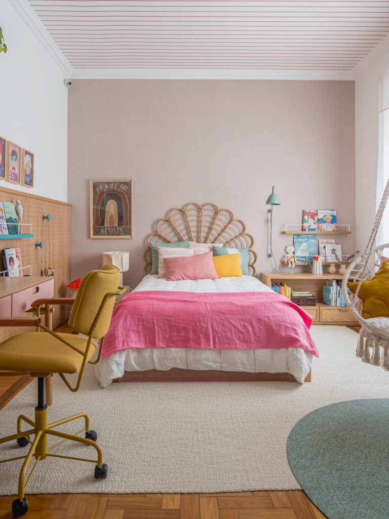
That fan-shaped rattan headboard only works because the wall behind it is a muted dusty pink — not white, not hot pink. The flatness of the wall colour lets the woven texture do the talking. Pillows in teal, yellow and soft pink are piled in front of it, and none of them match, which is kind of the whole point.
If you can’t find a fan headboard, a regular rattan or cane one does a similar job. The ceiling here has thin red stripes painted on white — honestly I’d skip that part, it’s a lot of effort for something you barely notice once the room is furnished. Focus the colour on the wall behind the bed and keep everything else in wood tones.
Pink Bed Base
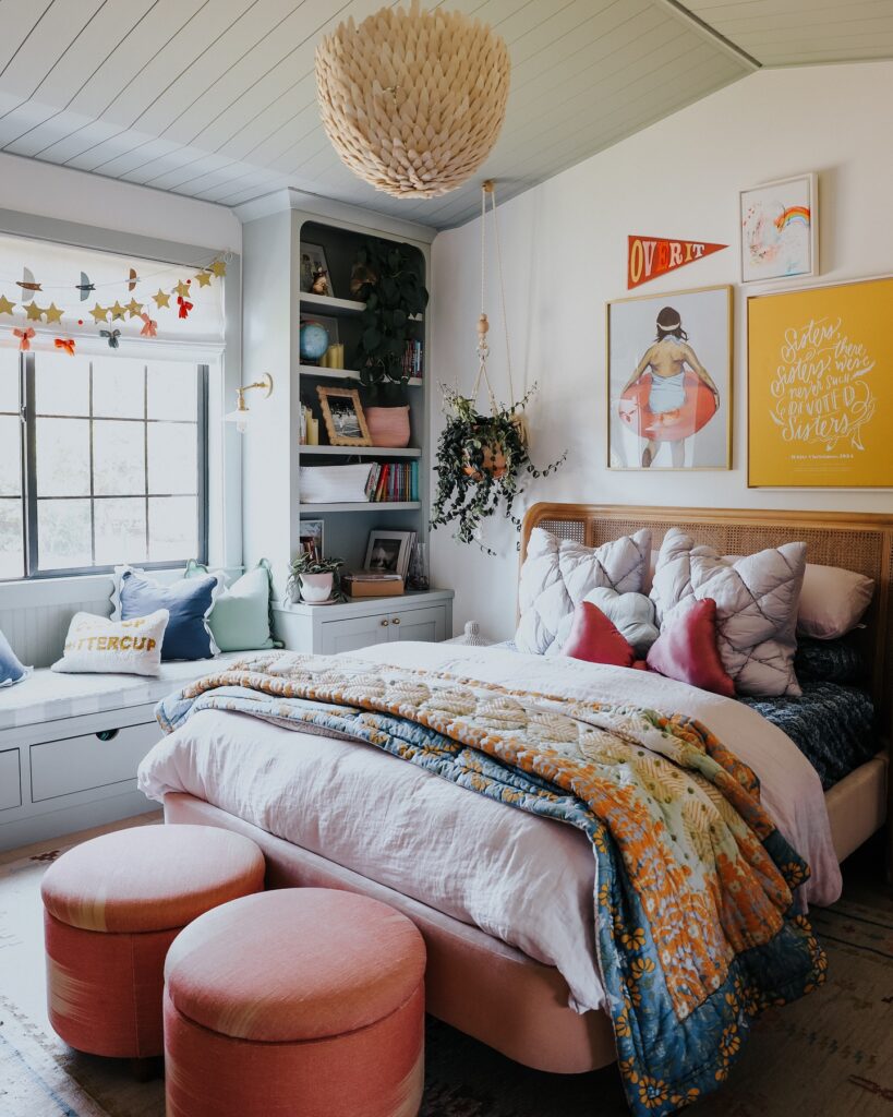
Put the color low in the room, like this pink bed base with the two round stools, so the walls can carry art without looking too busy. That part matters. A teen room usually ends up with posters, school stuff, books, random gifts, and the lower furniture can hold the palette together when everything else changes.
Keep the bedding pale, then throw one patterned quilt across the end for the louder print. The yellow wall art works because it repeats the cheerful side of the quilt without needing every pillow to match. I’d skip too many extra cushions here, though.
They look nice for five minutes, then they live on the floor.
Squiggle Frame Gallery Wall
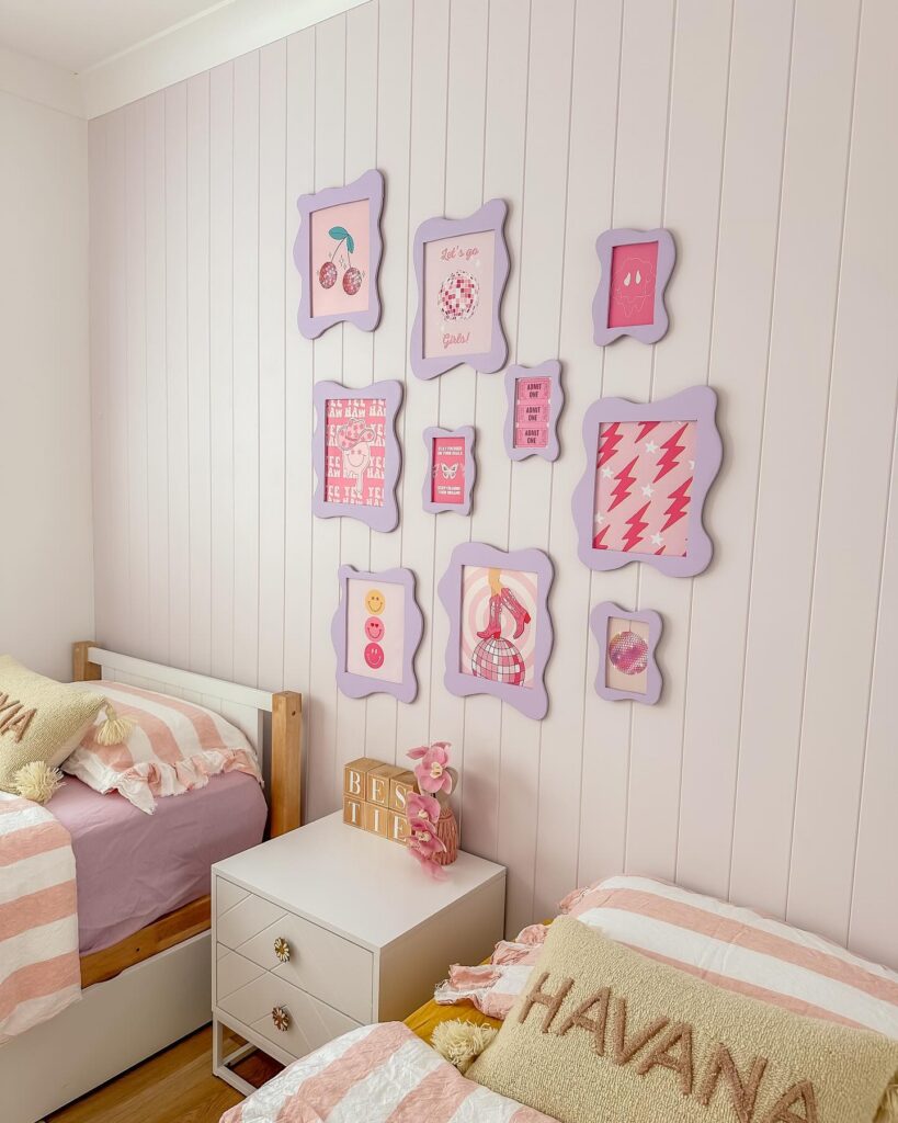
The lilac wavy frames are doing the heavy lifting here. Ten of them, all the same colour, holding a mix of cherry prints, disco balls, lightning bolts and ticket stubs. That’s the trick. When the frame colour stays consistent, you can put almost anything inside and it still reads as one piece.
Pull free printables off Pinterest, print them at home, done. The frames themselves you’ll find at Kmart or on Temu for a few dollars each, then spray paint them whatever shade matches the room.
One thing I’d change. The arrangement leans a bit heavy on the right side with that big lightning bolt print. Shifting one of the smaller frames over would balance it. Good for tween sisters sharing, which is clearly what’s happening in this room.
Gingham with soft pink
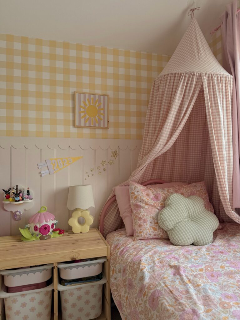
Start with the wallpaper, honestly. That large yellow gingham sets the whole room before you add anything else, and it works because the check is broad enough to read from across the room without making the walls look too busy. Then bring in one fabric repeat, not five. Here the pink gingham canopy does that job, and the bed underneath can stay in a mixed floral because the colors are kept in the same faded range.
The scalloped wall trim helps break up the patterns. Useful detail.
If you want this look for a teen girl, keep the storage low and plain like the wood unit here, then use a couple of playful pieces on top instead of filling every surface. I’d probably skip adding more printed cushions, since the canopy, wallpaper, and quilt are already doing plenty.
Mix Prints With a Shared Color
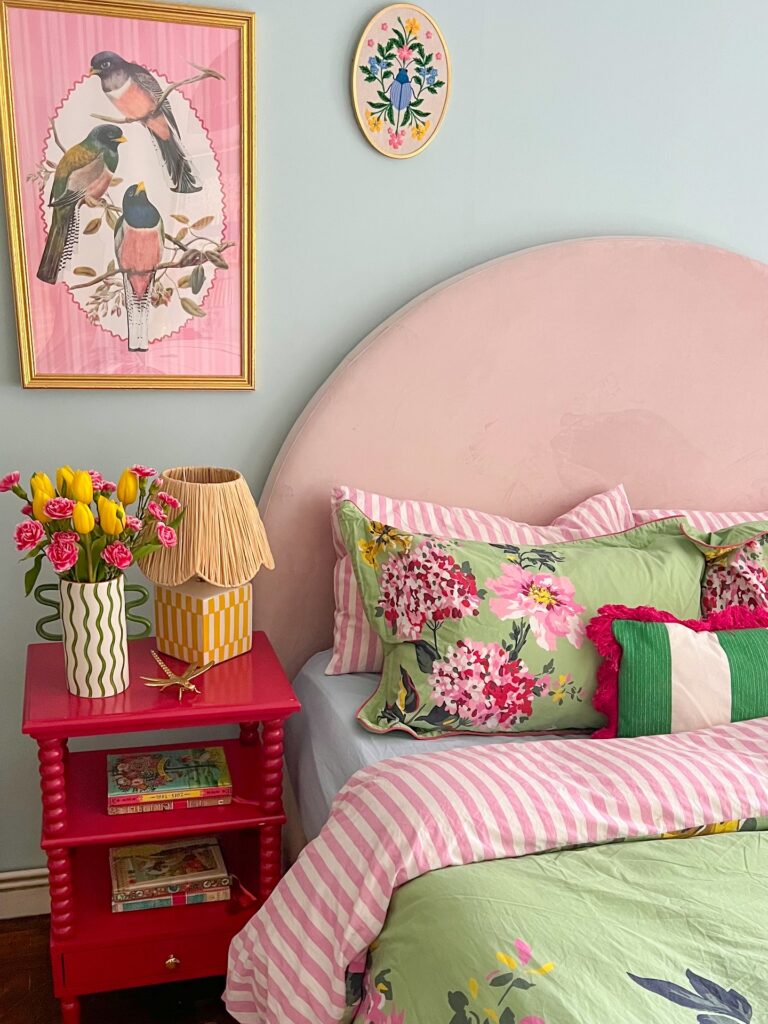
Stripes, florals, and a solid all on the same bed — it shouldn’t work, but it does because every piece pulls from the same pink-and-green range. That’s the trick. When you’re layering patterns like this, pick two anchor colors and let everything reference at least one of them.
The floral euro shams here carry both, so they act as the bridge between the striped duvet and the green quilt underneath. For the nightstand, painting it a saturated hot pink rather than matching the soft headboard gives the whole corner something to push against. I’d skip the bobbin style if you’re going budget — a plain side table painted the same shade does the same job.
Works best for someone who finds neutral rooms a little flat.
Pastel Layers With Rattan
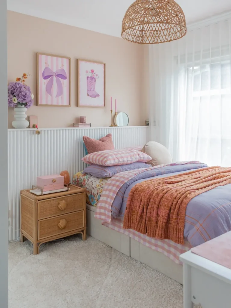
Start with the bedding before you touch the walls. A lilac quilt, pink gingham sheets, and one rust throw give the room color without making every surface fight for attention. That matters.
Keep the bigger pieces plain, like the white bed base and ribbed paneling. The rattan pendant and cane bedside table stop all the pink from feeling too flat, especially if your teen likes a bit of vintage detail. Let the framed bow prints and pink candles handle the sweeter side.
I’d skip extra patterned cushions here; the checks, florals, and wall art are already doing enough.
Hot Pink Ikat With Dark Green
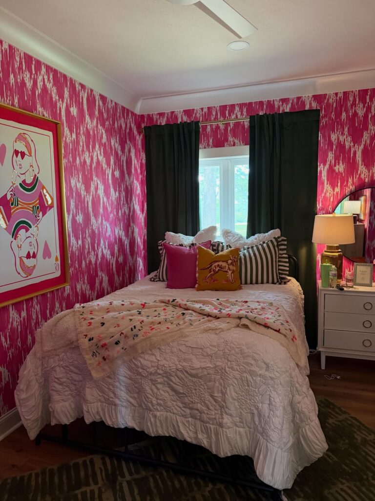
The pink ikat wallpaper is doing all the work here, so everything else gets to play a supporting role. Notice how the curtains are almost black-green — that’s what keeps the room from feeling like a candy shop. You need a heavy anchor color when your walls are this loud.
The striped pillows and mustard dog cushion break up the pink without competing with it. If your teen loves pink but you’re worried about it being too sweet, this is the formula. Skip the matching pink bedding.
White works better. One thing I’d change: that framed pop-art print leans a little young, and she’ll outgrow it before the wallpaper. Pick art she can keep into her twenties.
Canopy with punchy color
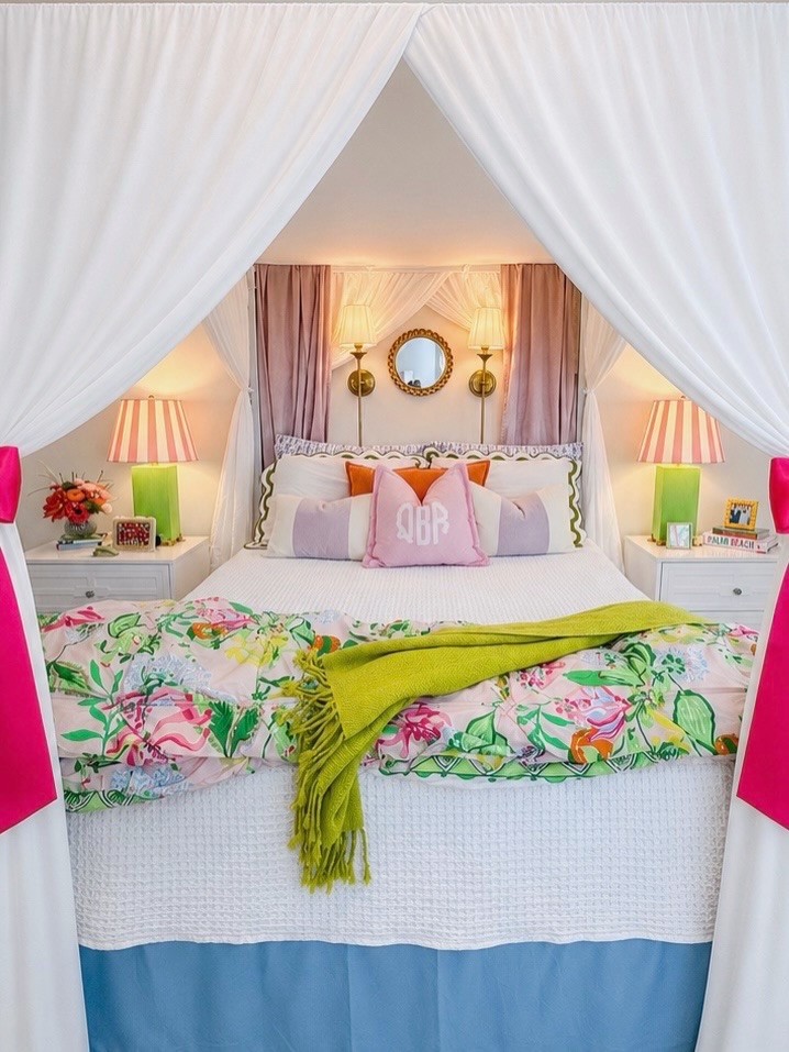
Start with the white canopy panels and keep the bed itself fairly plain, because that soft frame lets the sharper colors land without the whole room turning noisy. Then bring in two or three bright notes only: a lime throw, hot pink side accents, and a floral duvet with the same greens and pinks running through it so nothing feels dropped in at random.
The matching lamps do a lot. One base color, one striped shade, repeated on both nightstands, and suddenly all the mixed textiles look more settled.
This suits a teen who likes color but still wants the room to feel put together. If you want to copy it on a smaller budget, skip the full custom bed and use ceiling-mounted curtain panels with tiebacks, then pile the color onto pillows and the end-of-bed blanket. I’d probably lose one or two accent pillows.
Match Your Headboard to the Wall
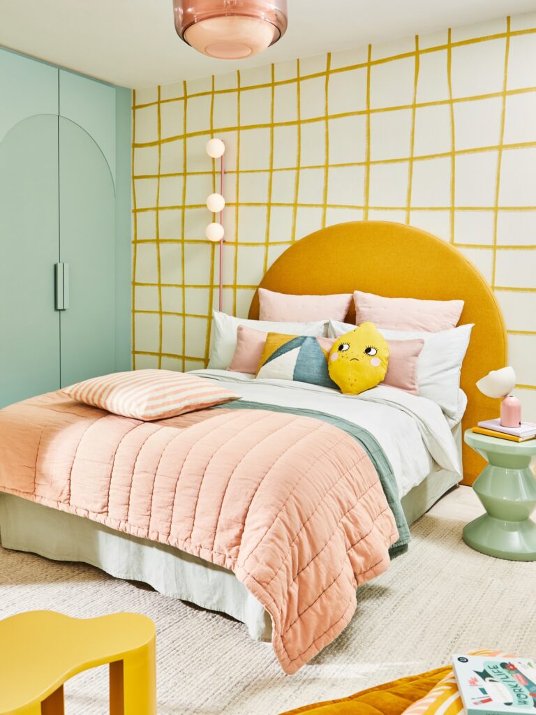
The mustard headboard works here because the grid wallpaper behind it uses almost the exact same yellow — so the two read as one deliberate decision rather than two things fighting. That’s the move. Pick your statement color first, then find wallpaper that shares it, even loosely.
The rounded headboard shape against a geometric pattern is doing a lot of the heavy lifting in this room. If the wallpaper had florals or something busy, that headboard would get lost. For teens who don’t want to repaint later, the mint wardrobe and sage bedding show how much a secondary color can quietly anchor things without needing to match exactly.
Peel-and-stick grid wallpaper exists now and it’s decent enough for a room that’ll probably get redesigned in three years anyway.
Mixed art wall
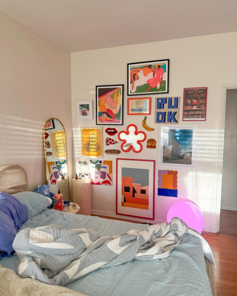
Above the bed, let one oversized print sit low and then build around it with smaller pieces, like the red-framed poster and the blue letter art here. Leave some gaps. The wall works because every item has a different job: a mirror catches light, a tiny banana breaks the square shapes, and the fabric-looking pieces add texture without needing another shelf.
Keep frames in two or three repeat colors so it doesn’t turn into a random pinboard. I’d skip adding fairy lights here, honestly. The pink globe lamp already gives that extra glow, and more wires on a crowded wall would be annoying to clean around.
Layer patterns in one palette
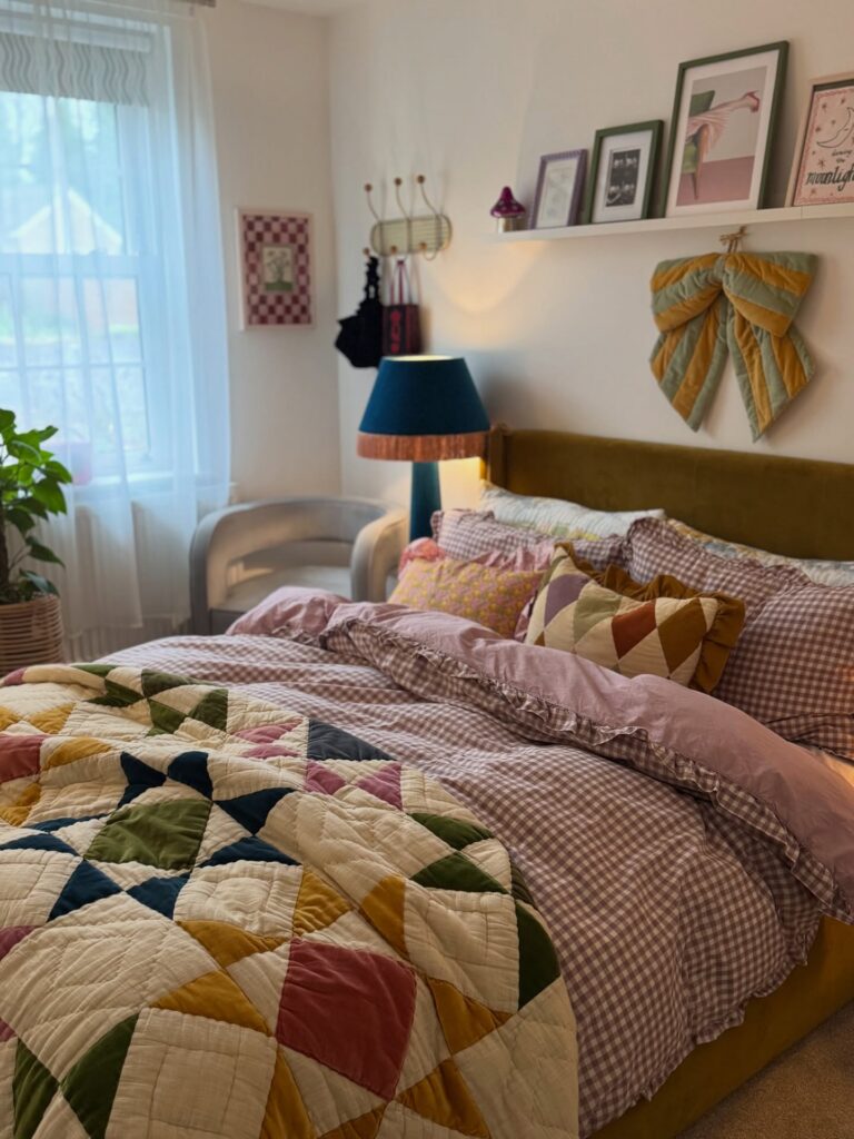
The trick with this room is that everything clashes but nothing fights. Gingham duvet, patchwork quilt, checkerboard art on the wall. They all pull from the same muted range — mustard, dusty pink, sage, a bit of burgundy — so your eye reads it as one idea instead of chaos.
Start with the quilt. Build the rest around those exact colors. A gingham cover in one of the shades, then throw pillows that repeat two or three more.
The teal lamp is the outlier and it works because it’s the only cool tone in the mix. One deliberate odd-one-out beats matching everything.
What I’d skip is the fabric bow on the wall. The picture ledge above the bed is already doing that job.
Stripes with soft lilac
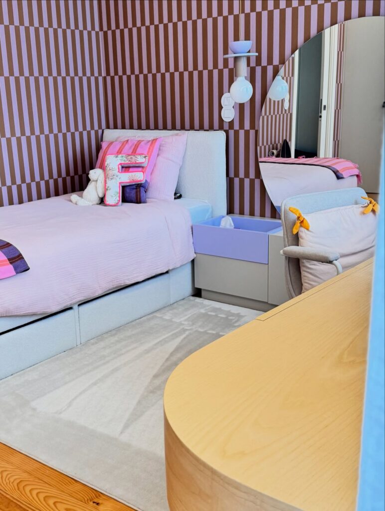
Start with the wall. Those narrow brown and lilac stripes do most of the work here, so keep the bed and rug plain or the room will get busy fast. A padded bed in pale grey or off-white helps break up the pattern, and the same goes for a simple nightstand in one block color.
The pink bedding makes sense because it sits close to the lilac without matching it exactly, which keeps the room from looking too planned. That part matters.
Then bring in one playful piece. The letter pillow does that job well, and so does the bow-tied chair cushion, but I’d stop at one or two novelty details max because they date a room quicker than the larger pieces. For a teen who likes color but still wants the room to feel tidy, this mix is a good middle ground.
Paint the Wall One Bold Color
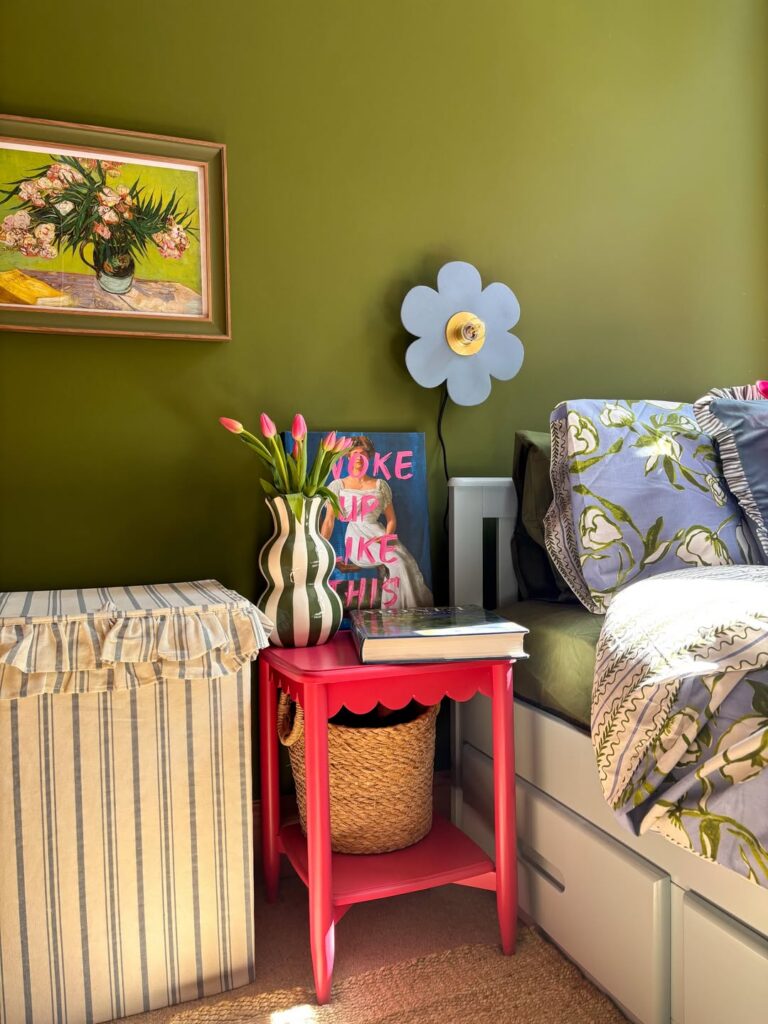
Olive green does a lot of heavy lifting here. Because the whole wall is one deep, committed shade, everything placed in front of it — the red scalloped nightstand, the striped vase, the flower-shaped wall sconce — reads clearly instead of competing. For a teen’s room, this matters more than people think, because the stuff on the surfaces tends to be colorful already.
Pick a wall color that’s saturated enough to hold its own against pink tulips and patterned bedding. Sage or dusty green won’t quite do it — you want something with depth. The scalloped nightstand painted red is a good example of how one punchy accent piece lands better against a strong backdrop than it ever would against white or beige.
Stripes With Poster Grid
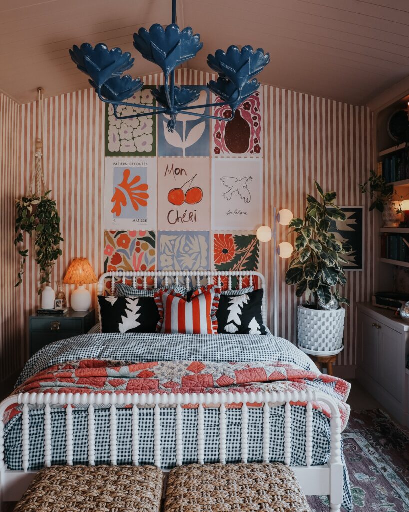
Behind the bed, narrow stripes give all those art prints a place to sit, instead of letting them float around like random posters taped up after school. Pick one wall first, then build a neat grid with six or nine prints that share a few colors from the bedding. Keep the bed busy too.
A gingham cover, red quilt, and two graphic pillows can handle this much pattern because the furniture stays mostly white. If you use a statement light like that blue flower fixture, I would skip extra ceiling decor and let it be the odd thing in the room.
Pink Velvet Desk Corner
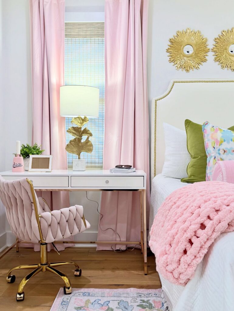
The pink curtains do a lot of work here. They soften the whole corner and pull the eye up, which matters when your desk sits under a window. If you’re copying this setup, the velvet tufted chair is the piece I’d actually invest in. It’s the anchor. Everything else — the white desk, the gold ginkgo lamp, the sunburst mirrors above the bed — can be swapped or thrifted.
One thing I’d change. Those exposed cords running down the back of the desk are visible from the doorway. A quick cord sleeve in white would fix it in ten minutes.
The green velvet pillow against all that pink is what keeps the room from feeling like cotton candy. Add one color that fights the palette a little. It reads more grown-up that way.
Floral wall, simple bed
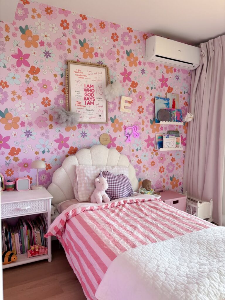
Start with the wall. A pink floral wallpaper like this does most of the work, so keep the bigger pieces plain and rounded, like a shell-shaped cream headboard and light pink curtains that don’t fight for attention.
The reason this setup works is the pattern feels busy, but the bed itself is straightforward, and that stops the room from tipping into looking cluttered. Even the bedding sticks to two or three shades. Much better.
For a teen room, copy the small shelf ledges and use them for art, notes, or little craft pieces instead of loading up a whole gallery wall. It keeps things changeable, which matters at that age because tastes move fast and peeling off wallpaper every year is not happening.
I’d skip adding more prints on the bed. Stripes are enough here.
Build Around a Smiley Face Pillow
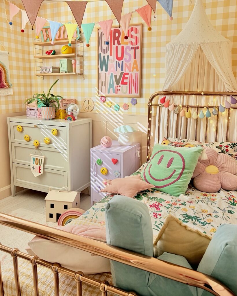
The large green smiley face cushion is basically doing all the heavy lifting here — pull one statement pillow like that and everything else just needs to follow its color temperature rather than match it exactly. The floral bedding underneath works because it reads warm and busy in a way that doesn’t compete, it just fills space. Yellow gingham wallpaper behind it all ties the yellows in the smiley face back to the wall without anyone having to plan it too precisely.
The brass bed frame is worth hunting for — it keeps the room from feeling purely juvenile in a way a painted wooden frame wouldn’t. Swap the canopy for string lights alone if the full drape feels like too much to maintain.
Striped Quilt With Florals
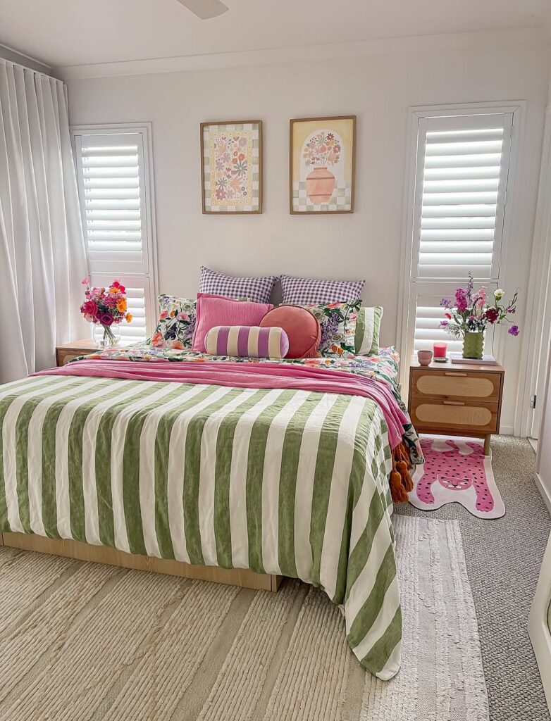
Start with the striped quilt first, because it gives the bed enough color before you even add the pillows. Keep the base plain. A green stripe works well with floral sheets when the flowers repeat one of the same tones, then a pink throw can sit across the middle without looking random.
The trick is not making every pillow fight for attention. Use two gingham pillows at the back, one floral pillow in front, then one odd shaped cushion if your teen likes a more playful bed. I would skip too many tiny cushions here, since they end up on the floor by the second night.
The framed flower prints above the bed help the bedding feel planned, especially with the pale checked background.
Pink and Teal Split Wall
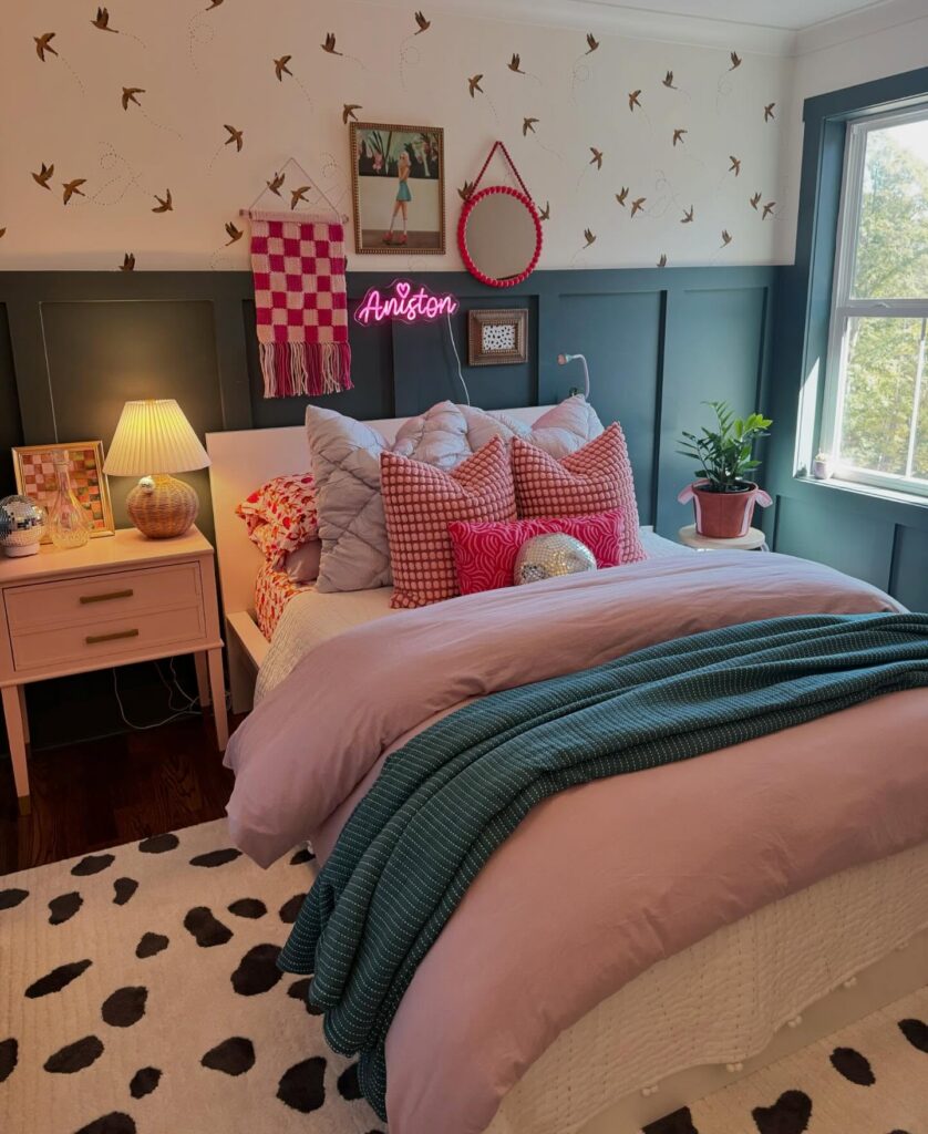
The two-tone wall does most of the heavy lifting here. Teal wainscoting on the bottom, cream with those little bird decals up top, and the split line sits right around headboard height. That’s the trick. Paint the lower two-thirds a saturated color and let the top breathe, otherwise the whole room closes in on you.
The pink bedding plays off the teal directly across the color wheel, which is why it doesn’t feel random. A neon name sign is a fun touch for a teen but I’d skip it — they outgrow their own name in signage form faster than you’d think. Swap in a small framed print instead.
Keep the decals sparse. Crowding them ruins the effect.
Pink checks and mustard
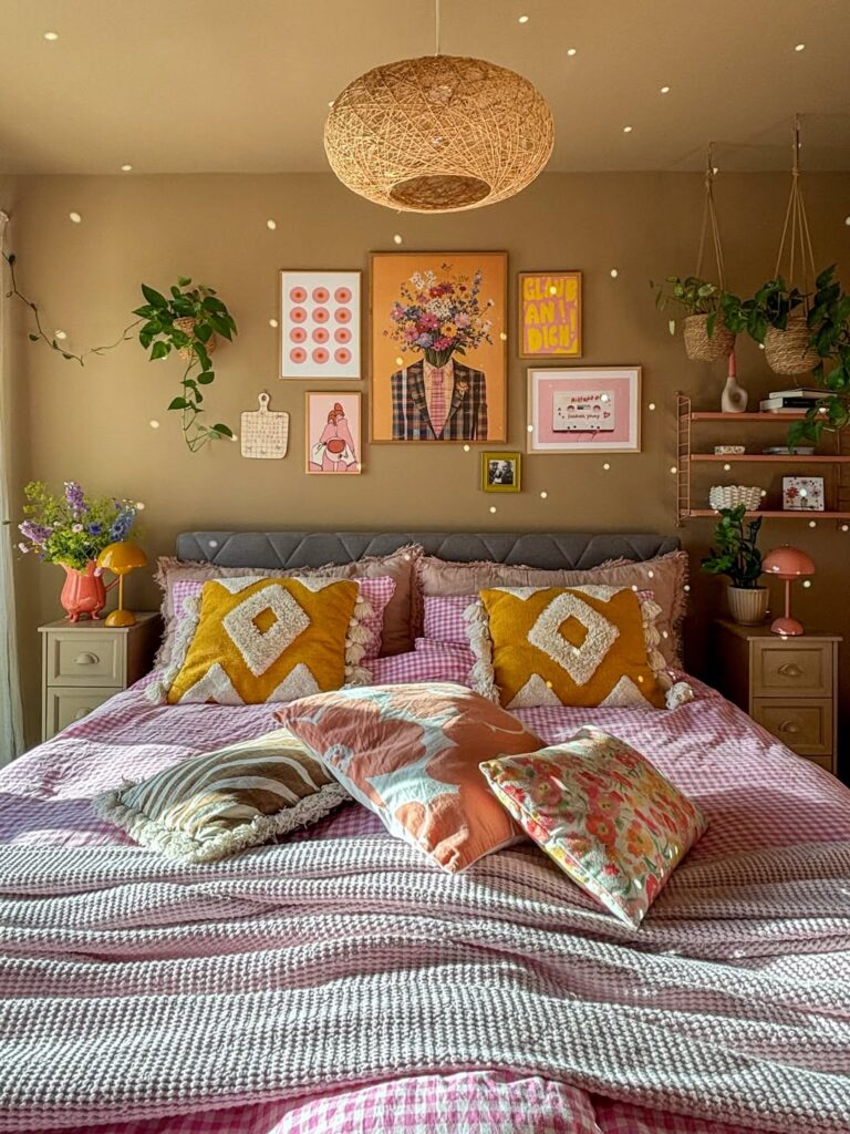
Start with the bedding here. A pink gingham duvet gives you the whole color direction fast, and then those mustard tufted cushions stop it from turning too sugary. That contrast is why this setup works.
Keep the wall fairly plain, then hang a tight cluster of art above the headboard instead of spreading frames around the room, because the bed is already doing a lot with pattern, texture, and loose throw pillows. It feels collected.
The woven pendant matters too. It breaks up all the printed fabric and adds a rougher surface, which is useful when a teen room starts leaning too polished or shop-bought.
For a smaller room, skip the extra pillows on the foot of the bed. They look good for photos, but most teens will toss them on a chair by night two.
Built-In Storage With Printed Panels
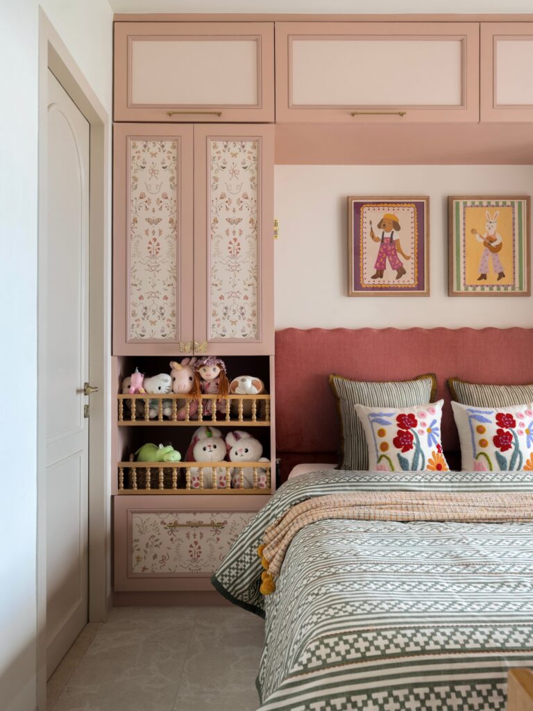
The floral-printed cabinet inserts here are doing a lot — they break up what would otherwise be a flat wall of dusty pink cabinetry that runs floor to ceiling. You can get this look by having a carpenter route out the center of standard flat doors and insert a framed fabric panel or printed paper behind glass. Wallpaper remnants work well for this.
The open spindle shelf in the middle is worth copying specifically — stuffed animals actually stay visible and accessible rather than getting buried in a drawer. If the all-pink palette feels too much, keep the cabinetry one tone and pull in olive or mustard through bedding the way this room does. Works best for a kid transitioning toward teen years, where the storage needs are real but the room can still be playful.
Oversized Art Print
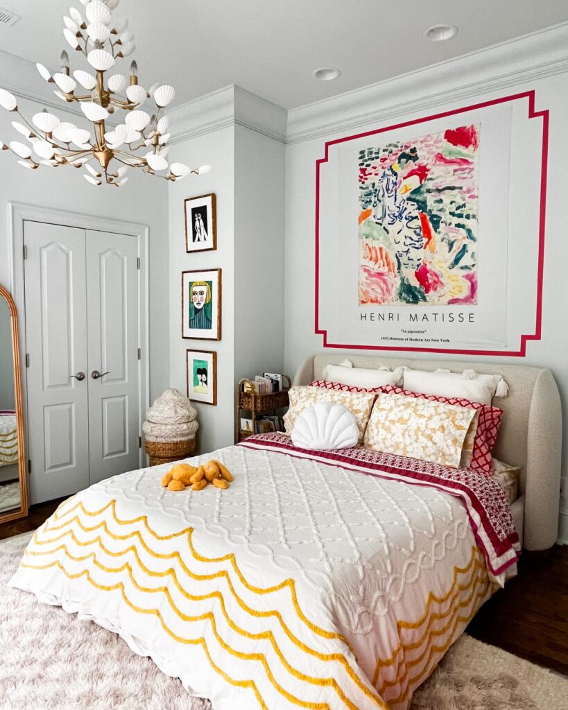
That big Matisse print is doing most of the color work here, so treat the wall art as the starting point. Pull one strong color from the poster into the bedding, like the red trim, then add a second color in a smaller dose, like the yellow scallop on the quilt. Keep the rest plain.
White bedding helps the pattern sit down instead of fighting everything around it, especially when the headboard and walls are light too. If you want the same look without framing a huge print, use a poster and paint a border straight on the wall with removable tape. I’d skip adding more art around the bed, since the side wall already has enough going on.
Vintage Botanical Gallery Wall
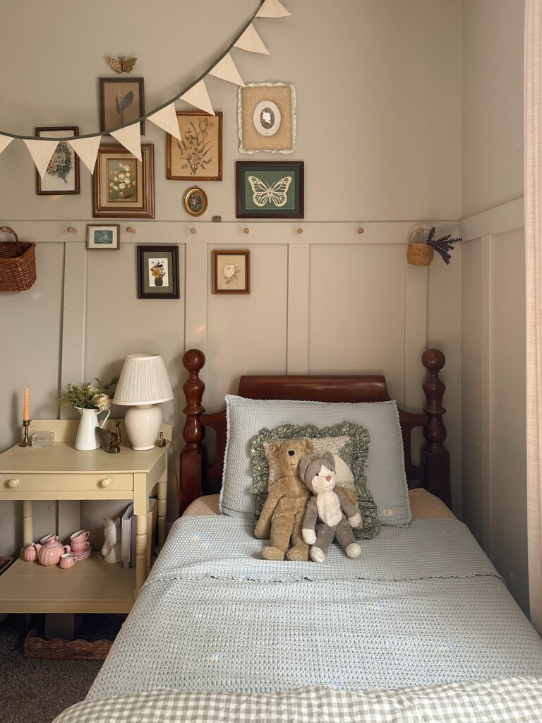
A gallery wall like this one leans on old framed botanicals, a pressed butterfly print, and small oval portraits — the kind of thing you find at estate sales for a few dollars each. Mix the frame finishes. Dark wood next to gilt next to a chunky cream mat is what keeps it from looking like a matched set from a catalog.
The fabric bunting strung above softens the whole arrangement, and I think that’s the part most people would skip and shouldn’t. It breaks up the rectangles.
If your teen isn’t into muted florals, swap in concert ticket stubs, postcards, pressed flowers she’s actually collected. The formula holds. One thing I’d change here — the frames climb a bit high above the peg rail, and hanging them tighter to the pegs would feel more intentional.
Trim and pattern mix
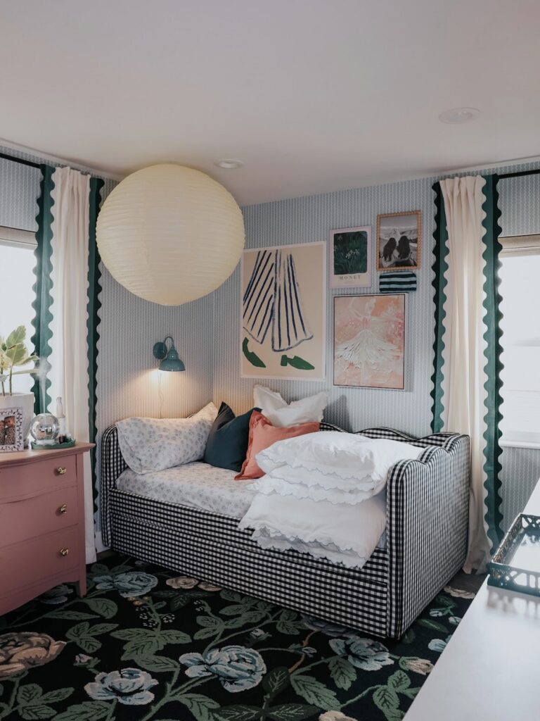
Start with the curtains. That dark wavy trim does most of the color work here, and it’s a smart move if your teen likes color but doesn’t want every wall painted in something loud. Then bring in one strong second pattern, like the black-and-white check daybed, and keep the rest smaller or softer so the room doesn’t turn busy in a tiring way.
The reason this works is that the trim, bed, and rug all repeat dark lines in different sizes, which makes the pink dresser and blush art feel placed instead of random. Very doable.
If you want to copy it, pick three colors max beyond the base neutrals. I’d keep the white bedding, but I might skip the extra ruffle if the room gets used hard, because that kind of edge can start looking crushed pretty fast.
Let the Wallpaper Do Everything
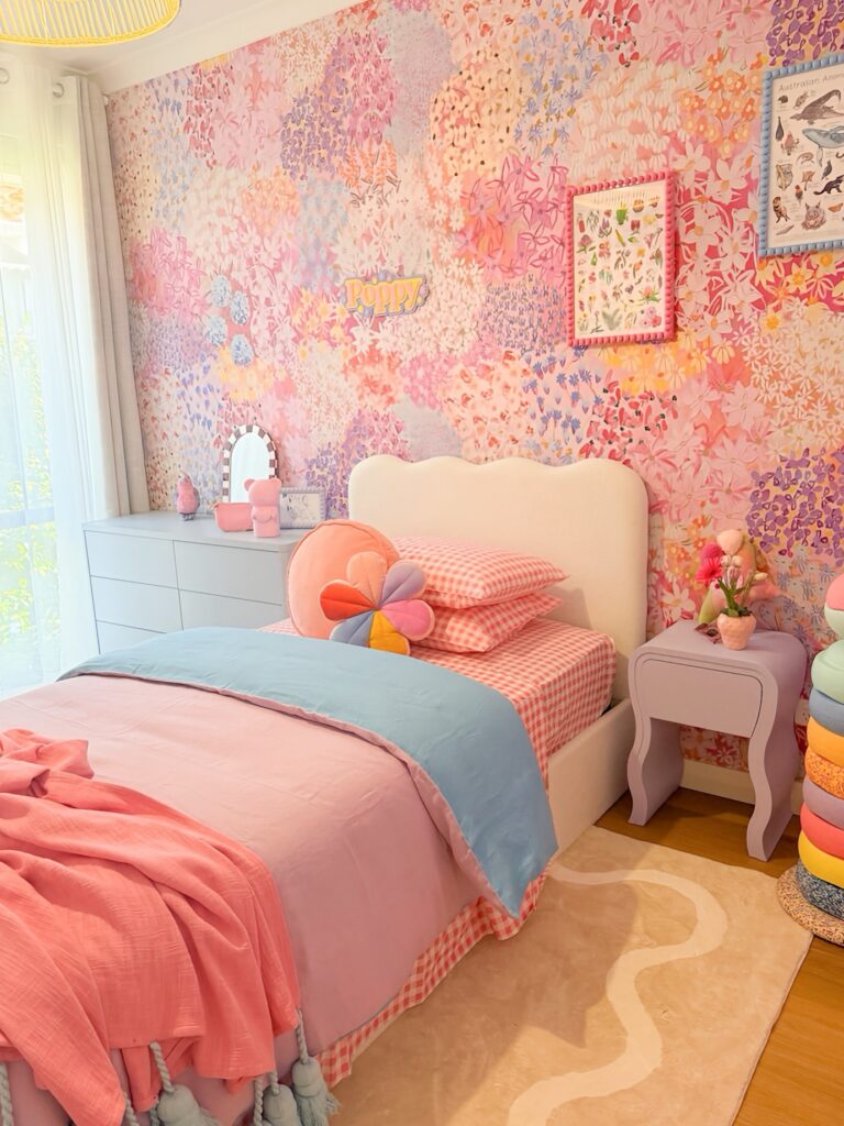
When the wall is already carrying pink, lavender, orange, and white all at once, the rest of the room just needs to pick up what’s already there. The gingham pillowcase, the powder blue blanket, the lavender nightstand — none of those are bold choices on their own, but against that floral mural they land exactly right. Pale and muted furniture actually works better here than anything bright would.
The cloud-shaped headboard in off-white is a good call specifically because it doesn’t compete. If you can’t do a full mural, a large floral peel-and-stick panel behind the bed gets you most of the way there. Keep bedding to two or three colors pulled straight from the print.
That’s the whole method, really.