27 Cottagecore bedroom decor ideas
This site contains affiliate links. We may earn a small commission, at no extra cost to you. Article may contain some images for illustrative purposes only .
There’s a chipped enamel pitcher on my nightstand right now, stuffed with foxgloves I cut yesterday morning. The water’s already gone cloudy. I don’t care. Something about that slightly-wilted, slightly-wild arrangement is exactly why cottagecore bedrooms have wormed their way into every corner of Pinterest and refuse to leave. Below, you’ll find 27 ways to build that same lived-in softness into your own space—from ditsy floral wallpaper and pressed-flower frames to iron bedsteads, patchwork quilts your grandmother would recognize, and the kind of reading nook that makes 9 p.m. feel like a reasonable bedtime.
Mix Your Checks and Stripes Boldly
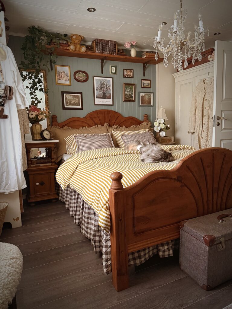
Most people stop at one pattern per bed and that’s exactly where this look falls flat. The mustard stripe duvet paired with brown gingham pillowcases and a matching bed skirt works because the patterns share the same color family — pull from two or three different scales of check and stripe, keep the palette tight, and it reads intentional rather than chaotic. A fluffy cat on top is optional but does help.
The pine bed frame is doing a lot of heavy lifting here too; that warm honey-toned wood keeps everything from feeling cold. If you don’t have a wooden bed, lean harder on the warm tones in your bedding to compensate. Crisp white or grey sheets would kill the whole effect.
Gingham Bedding Layers
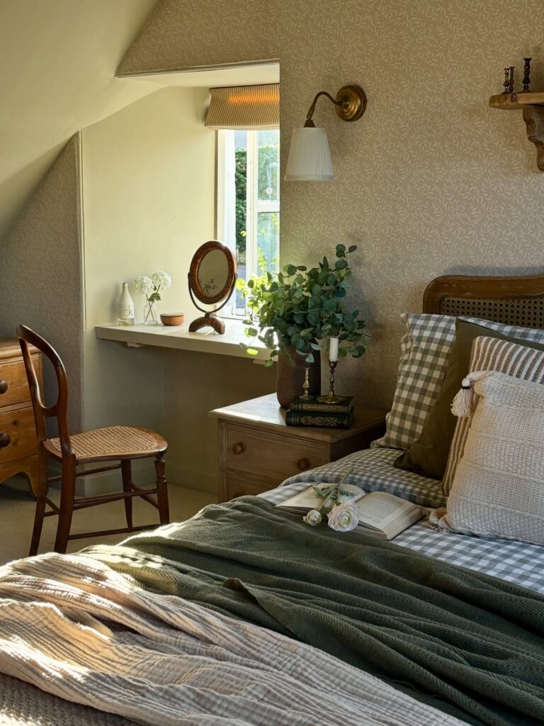
Start with gingham if you want the room to feel cottage without filling every corner with flowers. A checked fitted sheet or pillowcase gives enough pattern, especially when it sits beside a plain green throw like this one. Keep the quilt rumpled.
It helps. The trick is to let the checks stay slightly faded, not bright picnic-table red or blue, because that can start looking more kitchen than bedroom. I’d skip matching gingham curtains here, since the bedding already does the job and the window area is better left lighter.
A cane or wooden headboard works well with this setup because it adds texture without asking for another print.
Mix Florals With Gingham
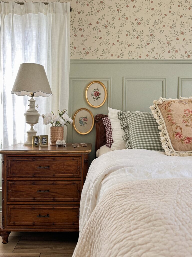
The gingham pillows do a lot of work here. Without them, the room would tip fully into grandmother territory — floral wallpaper, needlepoint frames, a tapestry cushion with tassels, all pulling the same direction. Gingham breaks it up. It’s a simpler pattern, so your eye gets somewhere to rest.
If you’re building this yourself, start with one busy floral (wallpaper or bedding) and then bring in a check or a stripe in a color pulled from it. The sage green gingham echoes the panelling below the wallpaper, which is why it settles in instead of fighting.
One thing I’d skip: the matching red gingham and green gingham together. Pick one. Two checks in different colors on the same bed reads more costume than collected.
Layered prints in earth tones
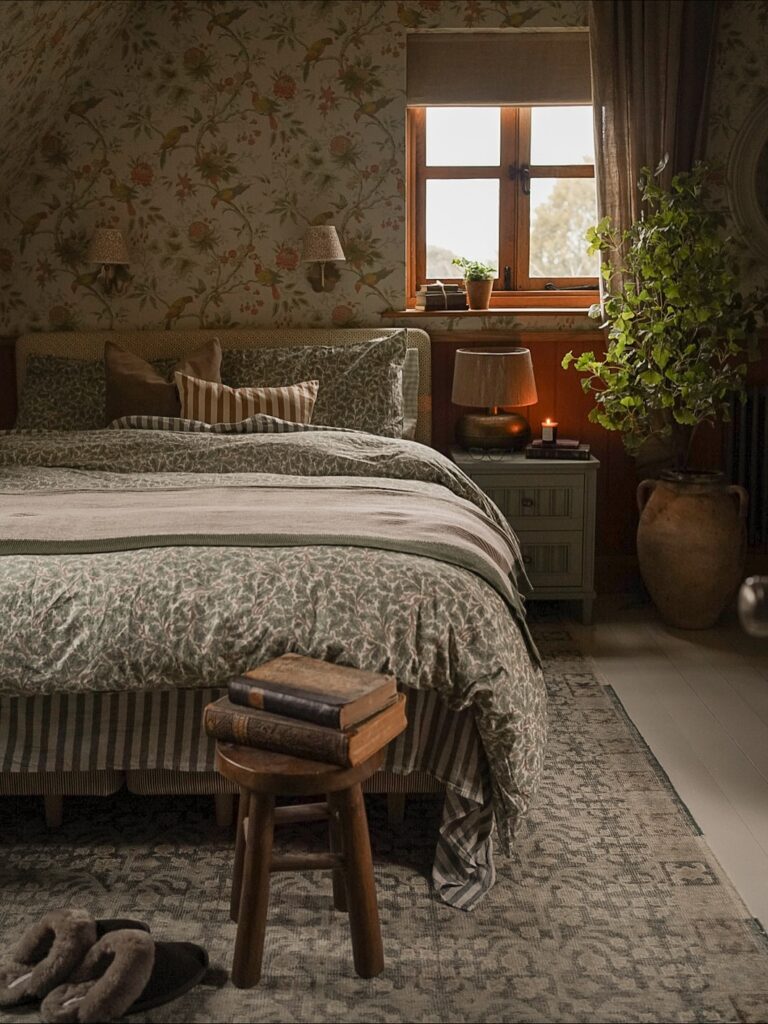
Start with the wall and duvet talking to each other. Here, both carry a small-scale botanical print, but the palette stays close—olive, faded rose, brown, cream—so it doesn’t turn into a fabric shop sample board.
Keep the bed base quieter. A striped valance or ticking-style base works because it gives the eye one straight pattern under all those winding leaves and stems. Then add one break in the middle, like the narrow striped lumbar pillow, so the whole bed doesn’t blur into one print.
Lighting matters here. Skip harsh white bulbs. A shaded bedside lamp and a candle-like glow pull these older-looking patterns together and stop them feeling busy at night.
If your room is plain rental white, peel-and-stick floral wallpaper behind just the bed can do enough. I’d skip matching every cushion to the wallpaper though. That part gets fussy fast.
Wallpaper That Does the Heavy Lifting
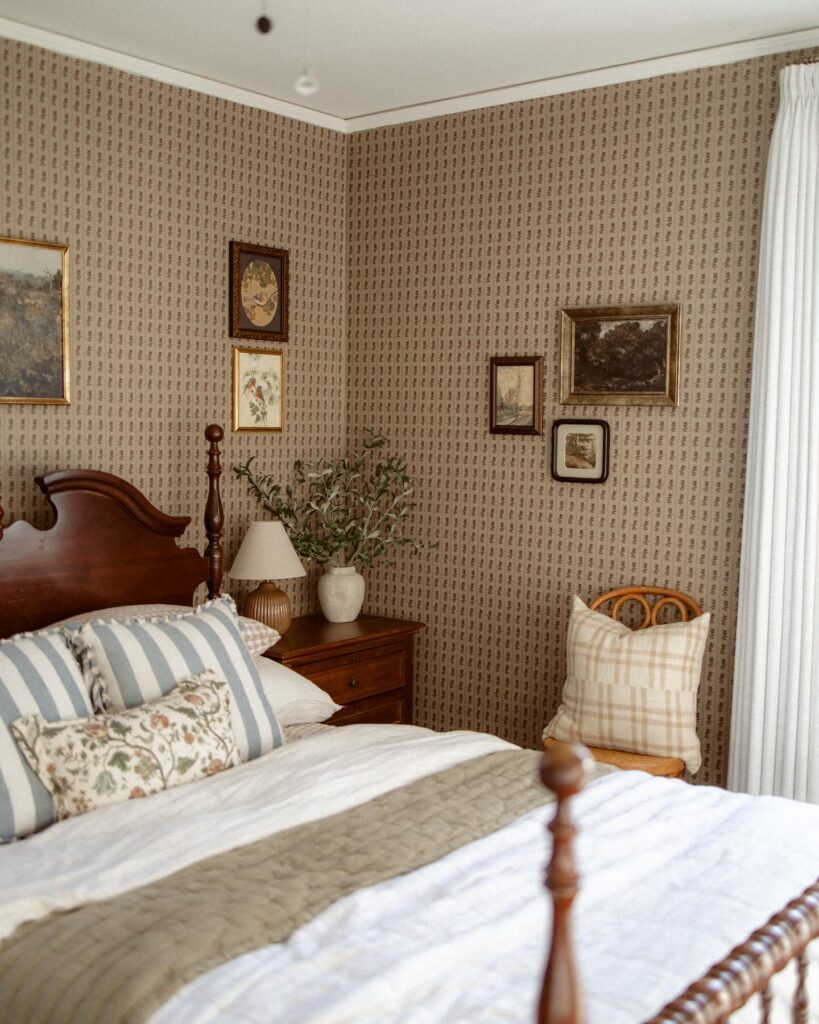
The small repeating print covering every wall here is doing most of the work — the furniture and art just have to show up. Block-print or ditsy floral patterns in muted tones are the ones to look for, nothing too bold or the room starts feeling busy fast. Dark wood furniture like that carved headboard reads really well against a taupe-toned wallpaper because the contrast is there without either one fighting for attention.
If you can’t wallpaper the whole room, one wall behind the bed gets you most of the effect. The gallery of mismatched frames in different sizes on the side wall works specifically because the wallpaper pulls everything together — without it, those frames would just look random.
Layer Gingham Bedding
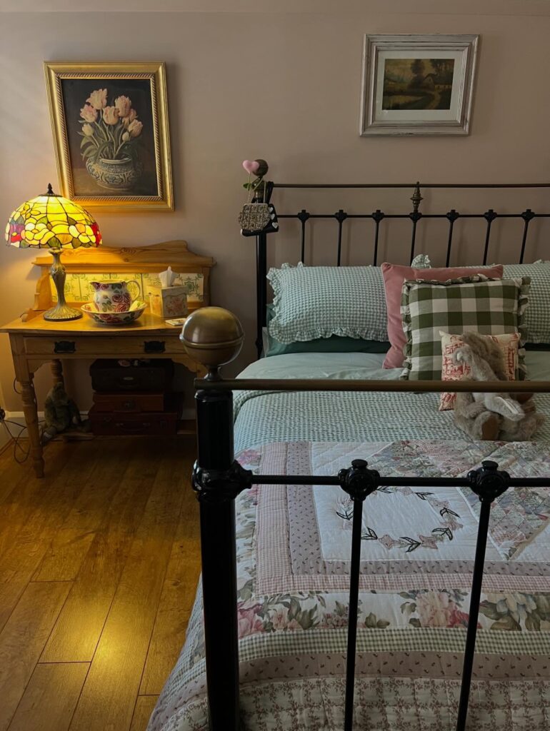
Start with one gingham piece, preferably the pillow shams or a folded quilt at the foot, then build the rest of the bed around it. Keep the metal frame visible. Cottagecore can get heavy fast when every surface has a print, so let the dark bed rails cut through the florals and checks a little.
The pink cushion works because it breaks up the green without fighting the pattern. I would skip five or six extra throw pillows here, unless you truly enjoy moving them every night. A stuffed rabbit or one small textile toy is enough.
Pair the bedding with a side table that has real use, like the writing desk in the picture, not just a prop table.
Layer Patterns That Shouldn’t Match
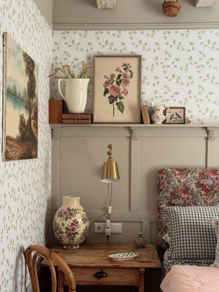
The floral headboard, gingham pillow, floral vase, and sprigged wallpaper are all doing their own thing here. Somehow it holds together. The trick is a shared palette — dusty pinks, muted greens, cream — running through every pattern, even when the scales and motifs clash.
Pick one anchor pattern first. The wallpaper, probably, since it’s hardest to swap. Then let everything else pull one color from it. A gingham in the same green as the leaves. A floral cushion echoing the pink.
What I’d skip: matching your throw pillows to your headboard fabric. That’s the move that makes a room look staged instead of collected. You want things that look like they arrived separately, over years, and happened to get along.
Mix checks with quilting
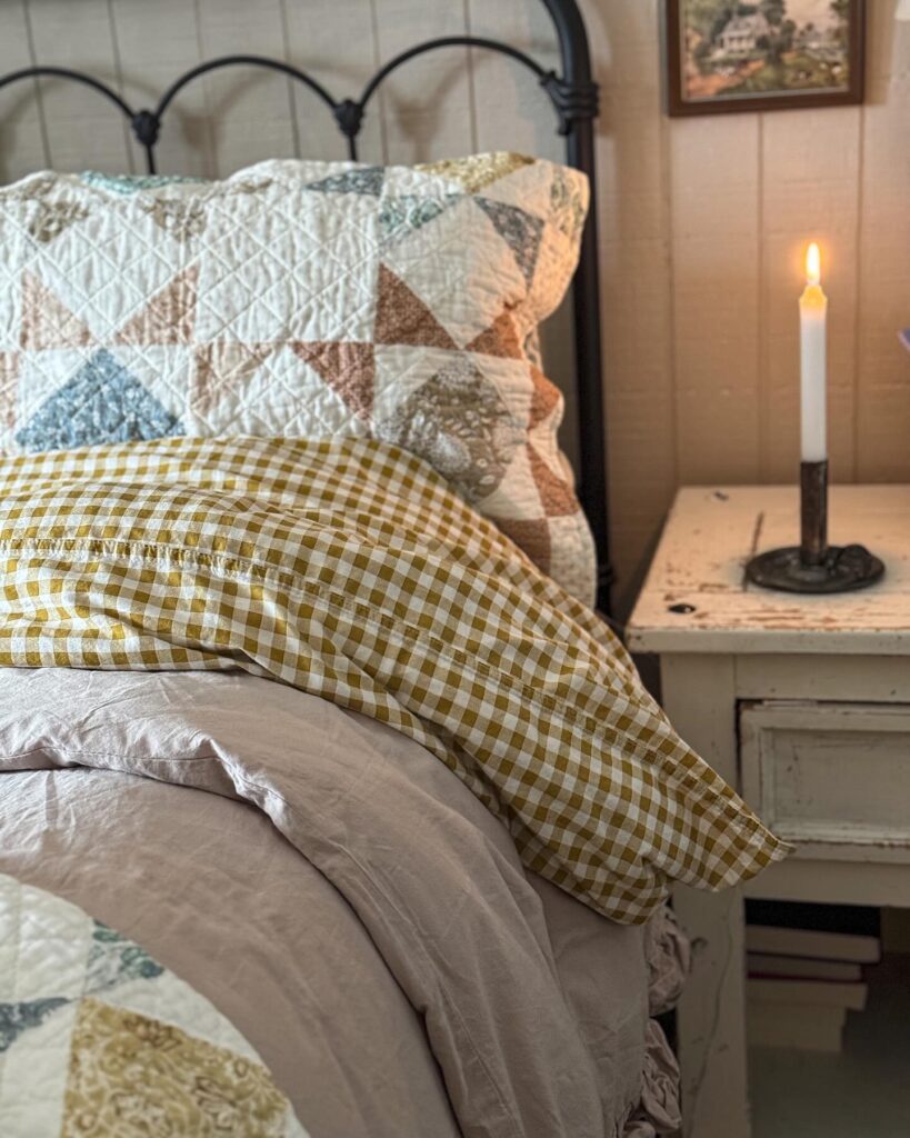
Start with the pillow stack. A faded patchwork quilt sham behind a mustard gingham pillow gives you that cottagecore look without having to cover the whole bed in florals, and that balance matters if you want it to feel lived-in rather than themed.
The trick is scale. Keep one print small, like the gingham, and let the other read more broken-up and irregular, like quilting with scattered triangles or worn fabric pieces, so they don’t fight each other from across the room.
Plain bedding helps. A washed beige or dusty oatmeal duvet lets both patterns sit on top without turning the bed busy, especially if your headboard already has a bit of shape like black iron.
I’d skip anything too crisp here. If the fabrics look heavily pressed or brand new, the whole thing loses the point a bit.
Match Your Prints Across the Room
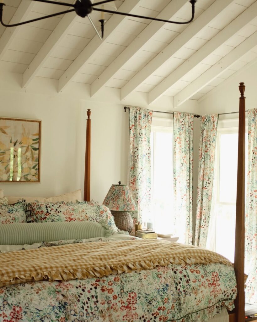
Running the same floral fabric across both the curtains and the bedding is what holds this whole thing together — without it, the four-poster bed and the beamed ceiling would feel like separate decisions. It’s a commitment, but not an expensive one if you buy fabric by the yard and sew simple panels. The lamp shade here is covered in the same print too, which most people wouldn’t bother with.
Worth it. If full matching feels like too much, use the floral on the duvet and curtains only, then pull one background color from the print — that sage green — for a solid pillow or throw. Works better than mixing in a second pattern.
Gingham With Florals
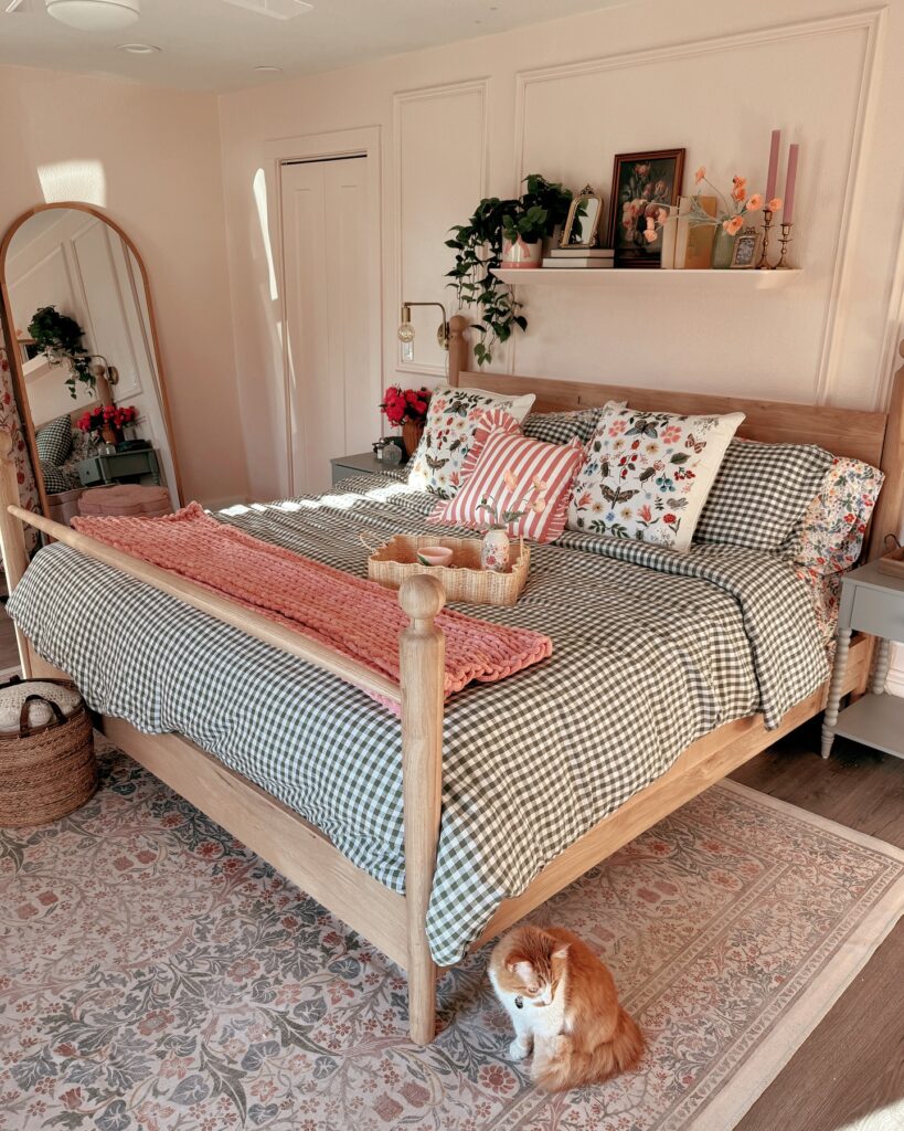
Start with the checked duvet before adding flowers, because gingham gives the bed a pattern that can take a few softer prints without looking messy. Keep the check small. The floral pillows can be larger in scale, and one striped cushion in the middle helps break up all the garden print.
A knitted throw across the lower half is enough; pulling it to the top usually makes the bed feel overloaded. I’d skip patterned curtains here if your rug already has a floral border, since the bed is doing most of the talking.
Wallpaper the ceiling too
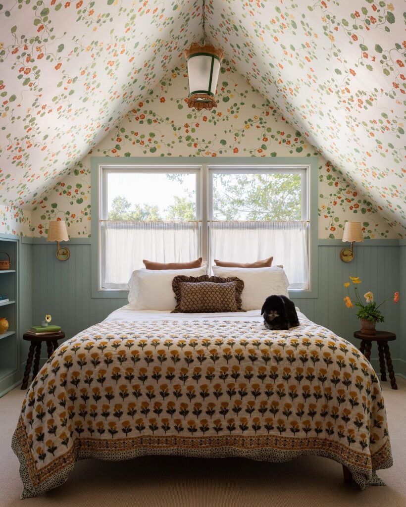
The nasturtium print climbing right up over the pitched ceiling is what makes this room. If you stopped the paper at the wall line, you’d have a nice bedroom. Running it across the slope turns the whole top half into a canopy.
This works best in attic rooms with awkward angles, where painted drywall usually just highlights how uneven everything is. Pair it with painted tongue-and-groove on the lower half in something quiet — the sage here does the job. One thing I’d reconsider: a busy floral overhead can feel like a lot when you’re lying flat staring up at it.
If you’re a light sleeper, pick a smaller-scale print or something with more negative space than this one has.
Paint paneling halfway
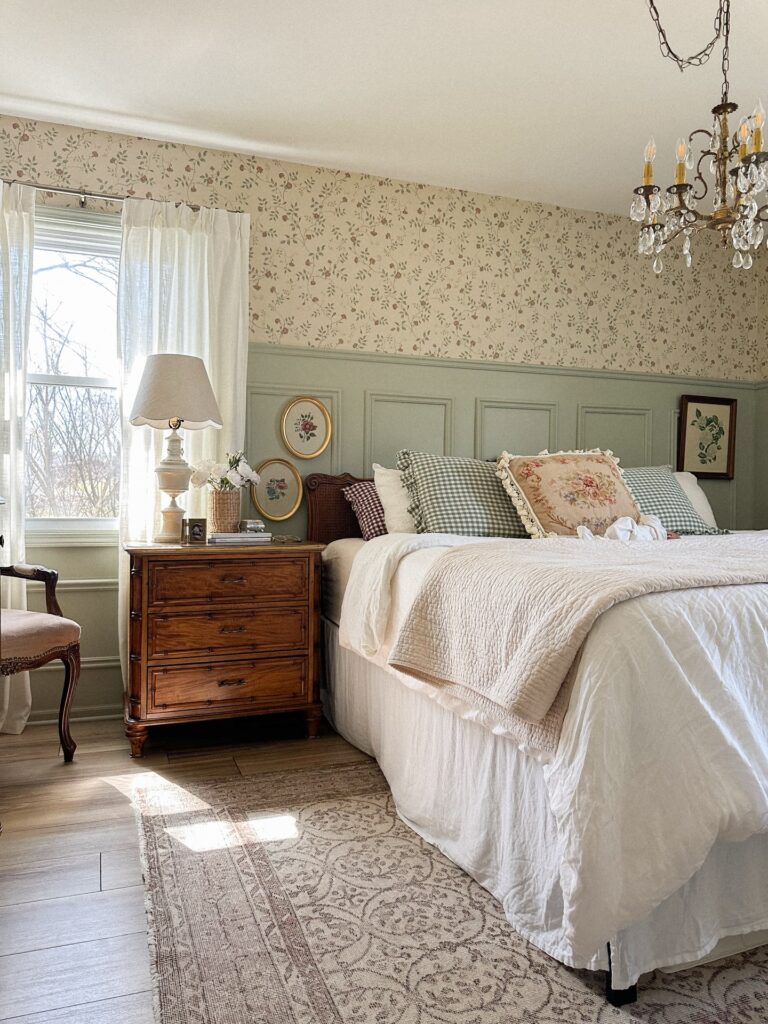
Run the wall treatment only halfway up, then cap it with a narrow trim so the bed has something solid behind it without making the room feel boxed in. That soft sage-green paneling works because it holds the busier floral wallpaper above it in place, and the two parts don’t fight for attention.
Keep the wallpaper small scale. Tiny vines, scattered buds, anything that reads faded rather than sharp. It matters.
Then bring in one darker wood piece, like the nightstand here, because all pale finishes can start looking a bit flat once you add white bedding and light curtains. I’d also stick to two or three pillows with pattern, not a whole pile, and let one floral cushion do the decorative work instead of mixing five prints for no reason.
Use an Armoire as Open Display
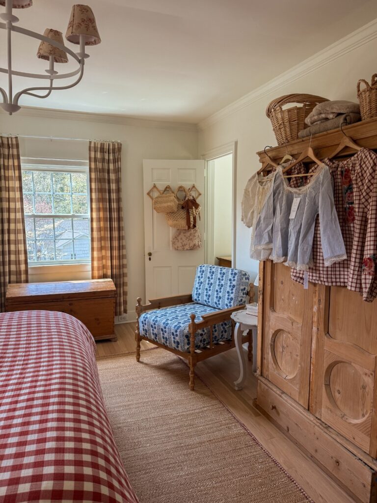
Hanging clothes on the outside of a wardrobe rather than inside it sounds odd until you see it done — a few blouses on wooden hangers, a gingham top, something with embroidery, and suddenly the armoire becomes part of the room instead of just storage. The pine one here has wicker baskets stacked on top, which fills that awkward dead space above. If you’ve got a solid wood wardrobe, try keeping three or four pieces on the outside, things you actually reach for often.
Vintage or vintage-adjacent clothing works best. A fleece hoodie hung there would kill the whole effect pretty fast. The chair nearby with its blue floral cushion helps break up all the warm wood tones — worth thinking about if your armoire dominates one wall.
Brass bed with florals
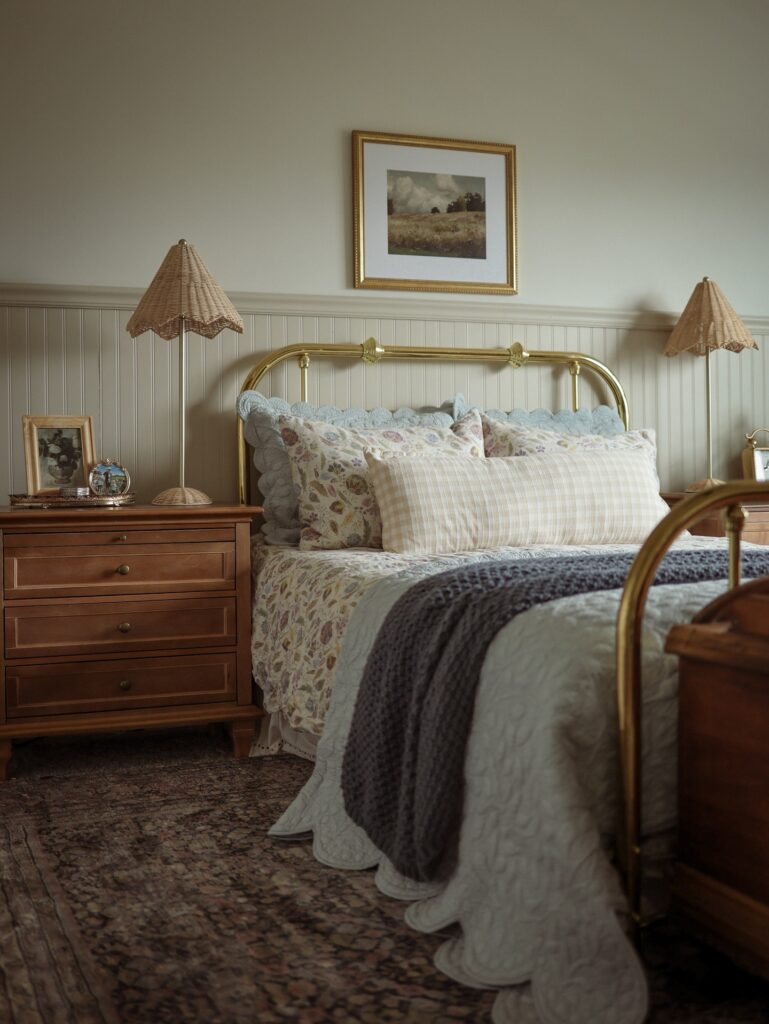
With a brass bed frame, you already have half the cottage look in place. Keep the bedding a little mixed, like a floral sheet set with one checked pillow and a plain quilt pulled over the top. That mix feels collected over time, especially if the prints share soft faded tones instead of fighting each other.
Add wicker lampshades if you want the bedside tables to feel less heavy against the metal frame. Small detail, big result. I’d skip piling on too many cushions though, because this style can turn fussy very quickly when the bed takes ten minutes to clear every night.
Mix Every Pattern You Own
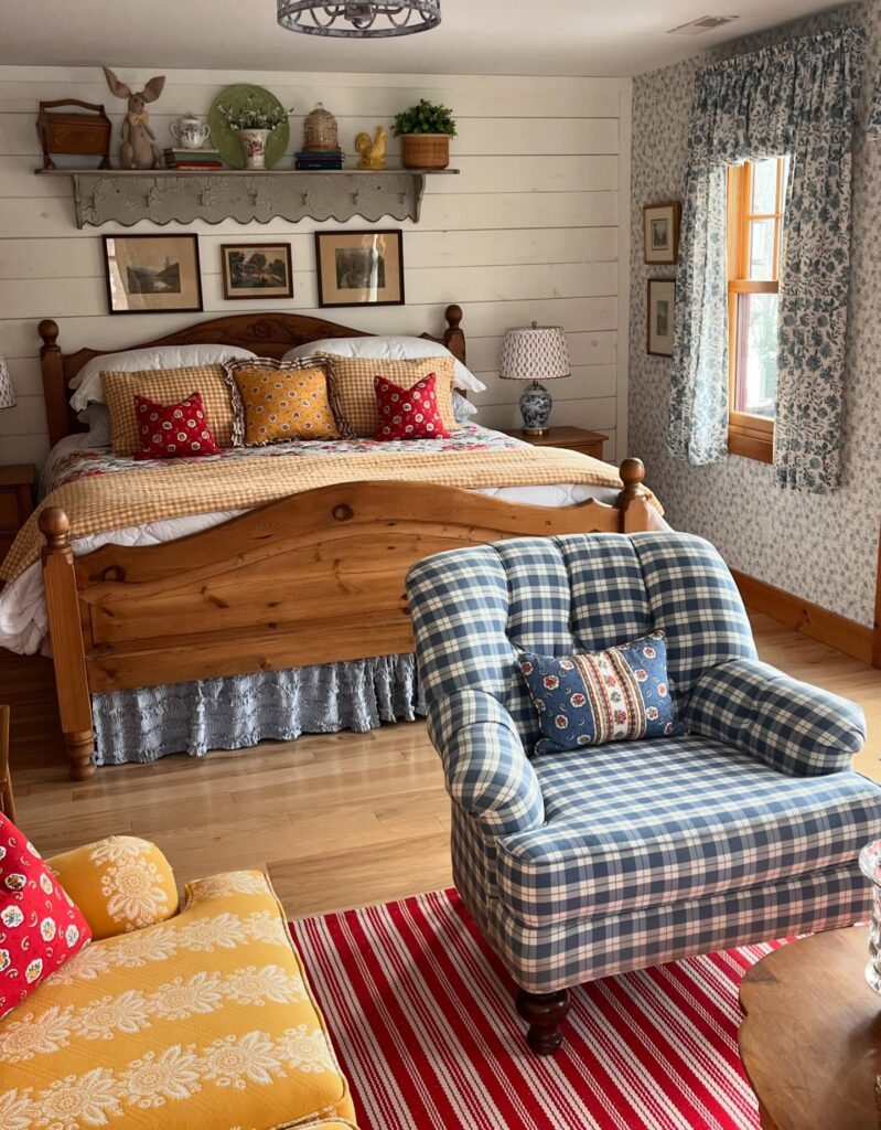
Count the patterns in this room. Gingham pillows, a floral coverlet, plaid armchair, striped rug, damask on the yellow chair, toile curtains — and somehow none of it fights. The trick is holding the palette tight. Red, mustard, and blue repeat across every fabric, so the eye reads it as one story instead of a jumble.
If you’re nervous about going this far, start with three patterns in different scales: a small check, a medium floral, a wide stripe. Same three or four colors throughout. That’s the whole formula.
The one thing I’d rethink is the plaid armchair being that large and that busy in the foreground. A solid chair in the blue would let the bed do the talking. But if maximalism is the point, then commit like this.
Floral curtains and soft layers
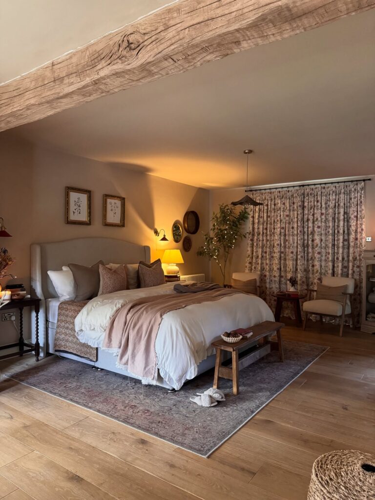
Start with the curtains here. Full-length floral drapes give the room that old-country feel fast, especially if the print looks a little faded instead of sharp and graphic. Keep the wall colour plain and quiet so the pattern has somewhere to sit.
Then build the bed in soft layers. A tall upholstered headboard, white bedding, a narrow printed runner at the foot, and one throw tossed across the middle will do more than a lot of small decorative bits ever will. It looks lived in. That matters.
The bench at the end helps too, because cottagecore bedrooms can get overly sweet if every piece feels dainty, and a plain wooden bench pulls things back down. If I were changing one thing, I’d use slightly shorter curtains if they collect dust on the floor.
Mix Patterns Without Matching Them
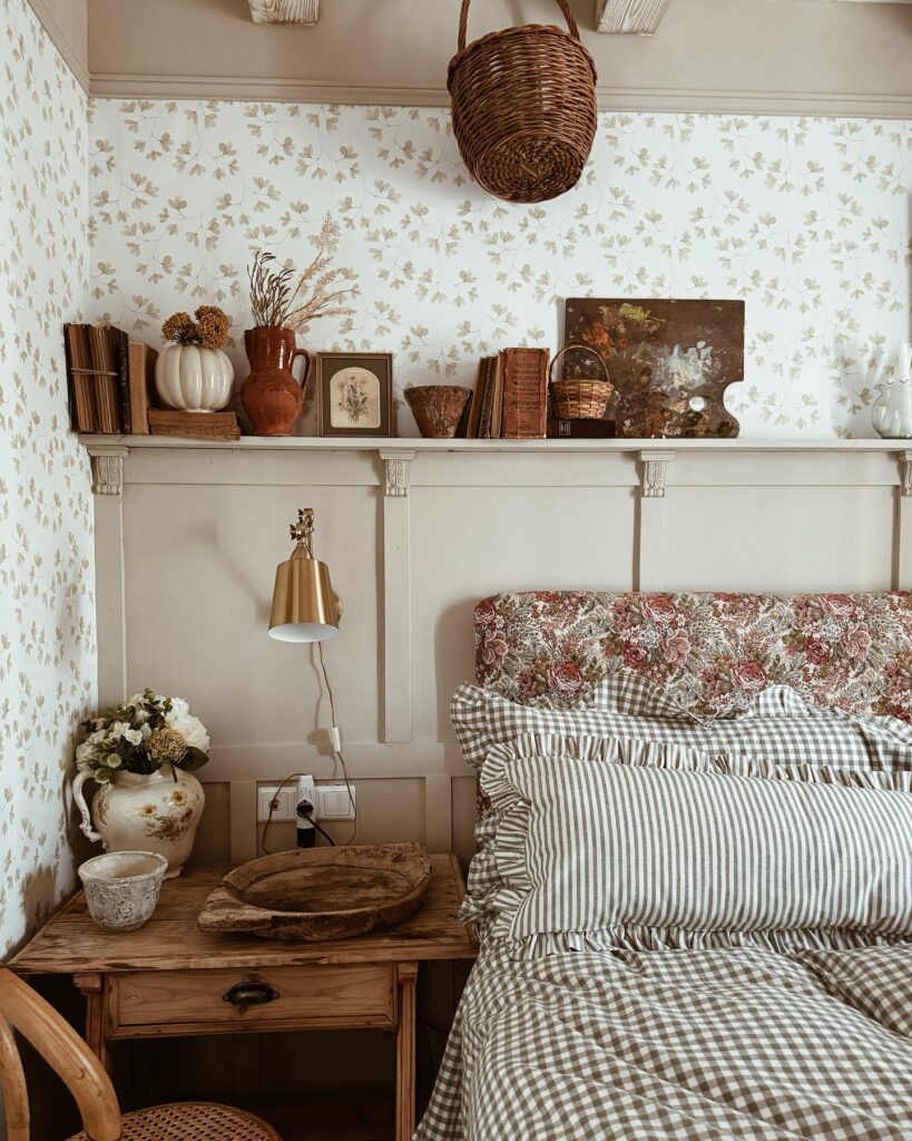
The striped ruffle pillowcases and the floral headboard fabric have no business working together on paper, but they do. The trick is keeping the colours in the same tonal range — dusty greens, muted reds, off-whites — so the patterns don’t fight each other even when the scales are completely different. Stripes against florals is a reliable pairing for this aesthetic.
The shelf above the headboard does a lot of work here too; old books, a ceramic pumpkin, a terracotta jug, things that look gathered rather than bought as a set. If you’re starting from scratch, I’d skip buying a “cottagecore shelf kit” from anywhere. Sourcing three or four objects separately from markets or charity shops will always look less staged than anything sold as a collection.
Gingham Bedding Layers
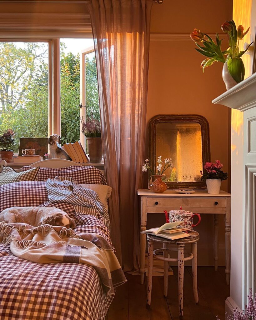
Start with the checked duvet if you want the room to feel more cottage than themed, because gingham already carries that old farmhouse look without needing much help. Keep it a bit rumpled. A striped shirt, a wool blanket, or even a plain cream sheet thrown over the edge makes the bed look used in a good way, not staged for a catalog.
The trick is to stay close in color, like faded red, beige, brown, and cream, so the pattern does not fight everything around it. I would skip matching gingham curtains here, though. That can go too nursery-room very fast, while a sheer brown curtain gives the bed some breathing space.
Mix wood tones freely
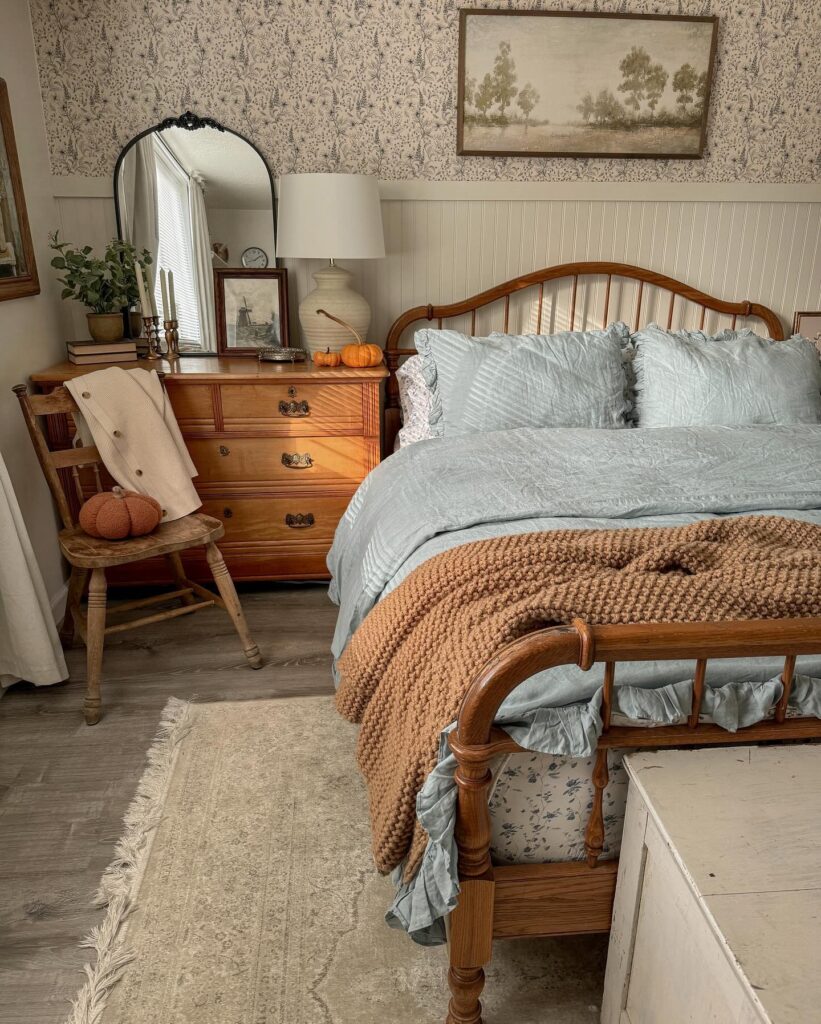
The dresser, the chair, the bed frame — all different woods, none of them matching, and it works better than a matched set would. Orange-toned oak next to a warmer honey pine, then that pale rustic chair. The trick is keeping the shapes distinct so the eye reads them as separate pieces rather than a failed attempt at coordination.
Spindle bed, turned chair legs, flat dresser drawers. If you’re nervous about it, tie things together through the textiles instead — that dusty blue bedding and the rust throw do a lot of work here, calming down what could feel busy. One thing I’d skip: the pumpkins on both the chair and dresser.
Pick one surface. Doubling up on seasonal props starts to look staged.
Beadboard with floral wallpaper
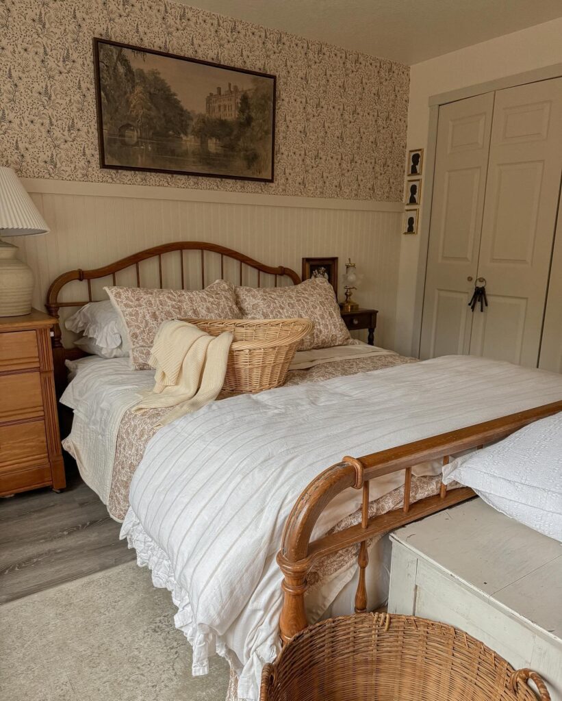
Half-wall beadboard does a lot of the work here. It gives the bed something to sit against, breaks up a busy floral print, and keeps the room from looking too sweet once you start piling on ruffles, baskets, and old wood tones.
Keep the lower paneling painted in an off-white, not bright white. That matters. Then use a small trailing wallpaper above it, preferably in a faded brown, olive, or dusty rose so it ties in with wood furniture instead of fighting it. The iron-and-wood bed frame suits this look because it feels lighter than a full upholstered headboard and still has some curve.
I’d skip anything too polished. A glossy lamp base or slick modern nightstand would throw this off fast. Stick with one framed landscape, a narrow bedside table, and maybe a wicker basket on the bed if you actually use it.
Mix Prints Without Matching Them
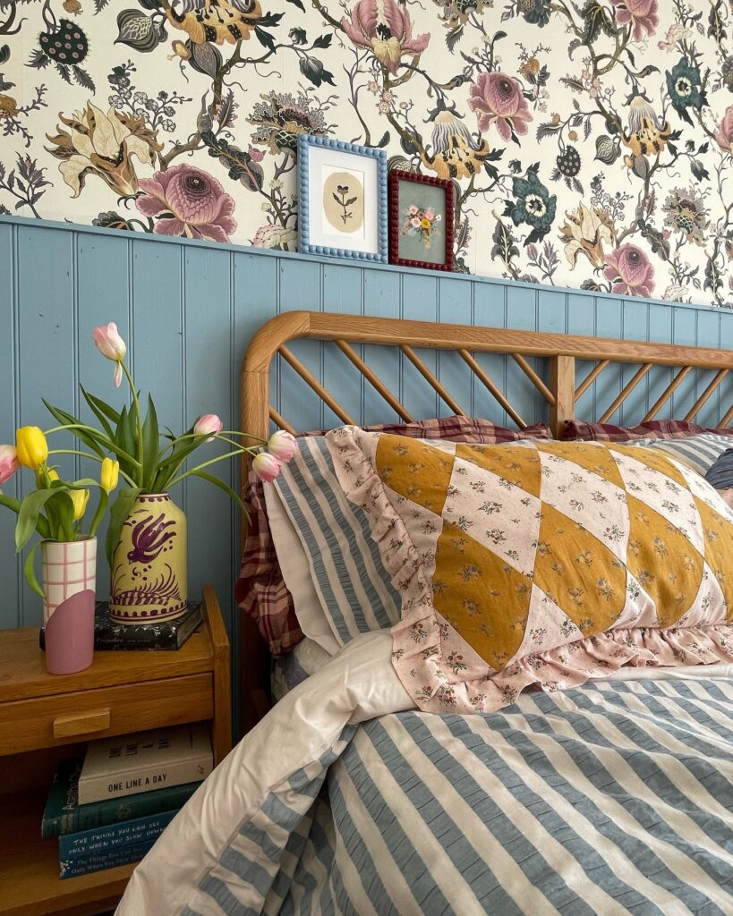
The patchwork pillow here is doing a lot — diamond-blocked mustard and blush florals sitting right against a blue-grey stripe duvet, with botanical wallpaper covering the wall above. None of it matches in the traditional sense, but the colours are all pulling from the same dusty, vintage range, which is what stops it from looking chaotic. That’s the actual rule: same tonal family, different patterns.
If you’re building this from scratch, start with the duvet and find a patchwork or quilt-style pillowcase that shares even one colour with it. The nightstand books stacked underneath the tulips are a small thing, but that kind of layering — objects at different heights — is worth copying. Personally, I’d skip the matching-frame ledge on the wainscoting unless you’ve got small frames that actually sit flat without sliding.
Layered Gingham Bedding
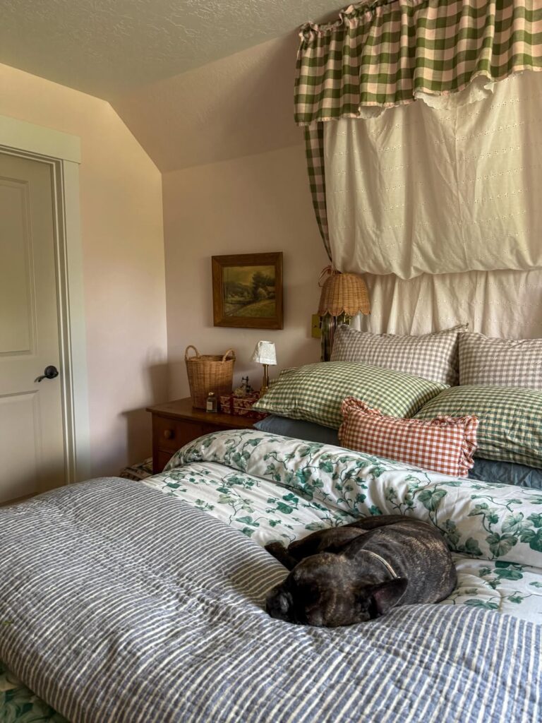
Start with the checked fabric above the bed, because that little valance does more work than a full canopy would in a small room. Hang it from a plain rod near the ceiling, then repeat the check on two pillows. Keep the duvet floral, not plain, if you want that old cottage bedroom feeling without buying much else.
The mix matters. A white sheet or eyelet panel behind the checks gives the eye a break when the bed is already carrying several patterns. I’d skip adding another print on the throw, though; a narrow stripe is enough and keeps the bed from looking like a fabric bin.
Layer a quilt with a rug pillow
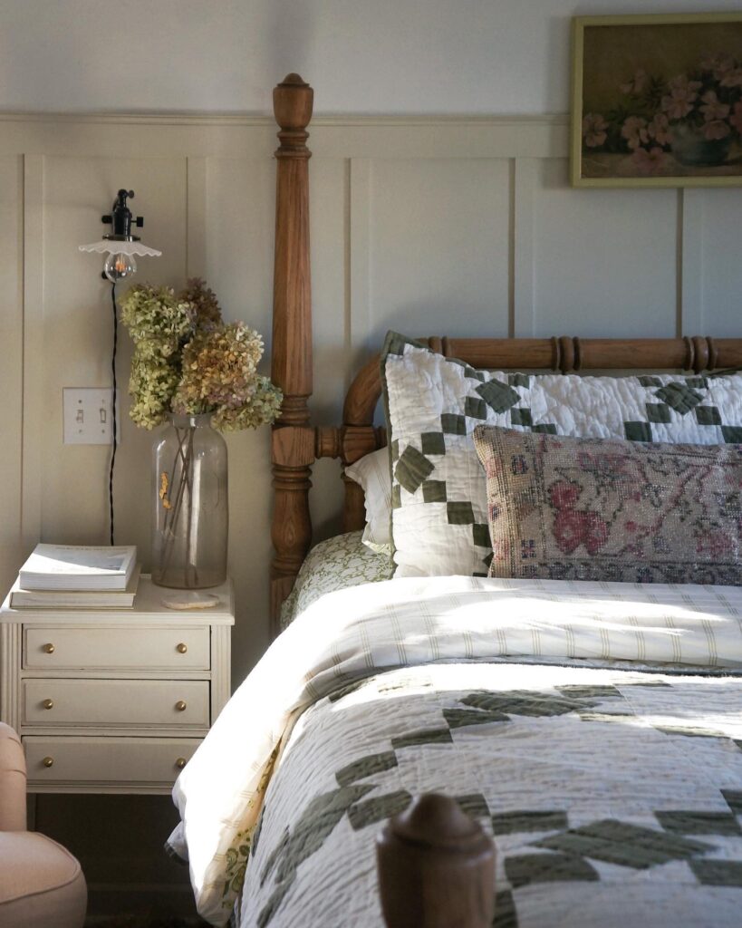
The green patchwork quilt and the faded rose rug pillow shouldn’t work together. Two different traditions, two different scales of pattern. But they do, because the rug pillow brings in the pinks and browns that the quilt is missing, and suddenly the bed has depth instead of just theme.
If you want to try this, start with the quilt as your base. Then hunt for one worn kilim or Turkish rug cushion in colors that aren’t already on the bed. Old, faded ones are better than new reproductions — the muddy tones sit down quietly next to cottage florals instead of shouting.
One thing I’d skip: matching shams. Let the euro pillow behind stay plain white or quilted, so the rug pillow reads as the one deliberate odd piece.
Mix brass with florals
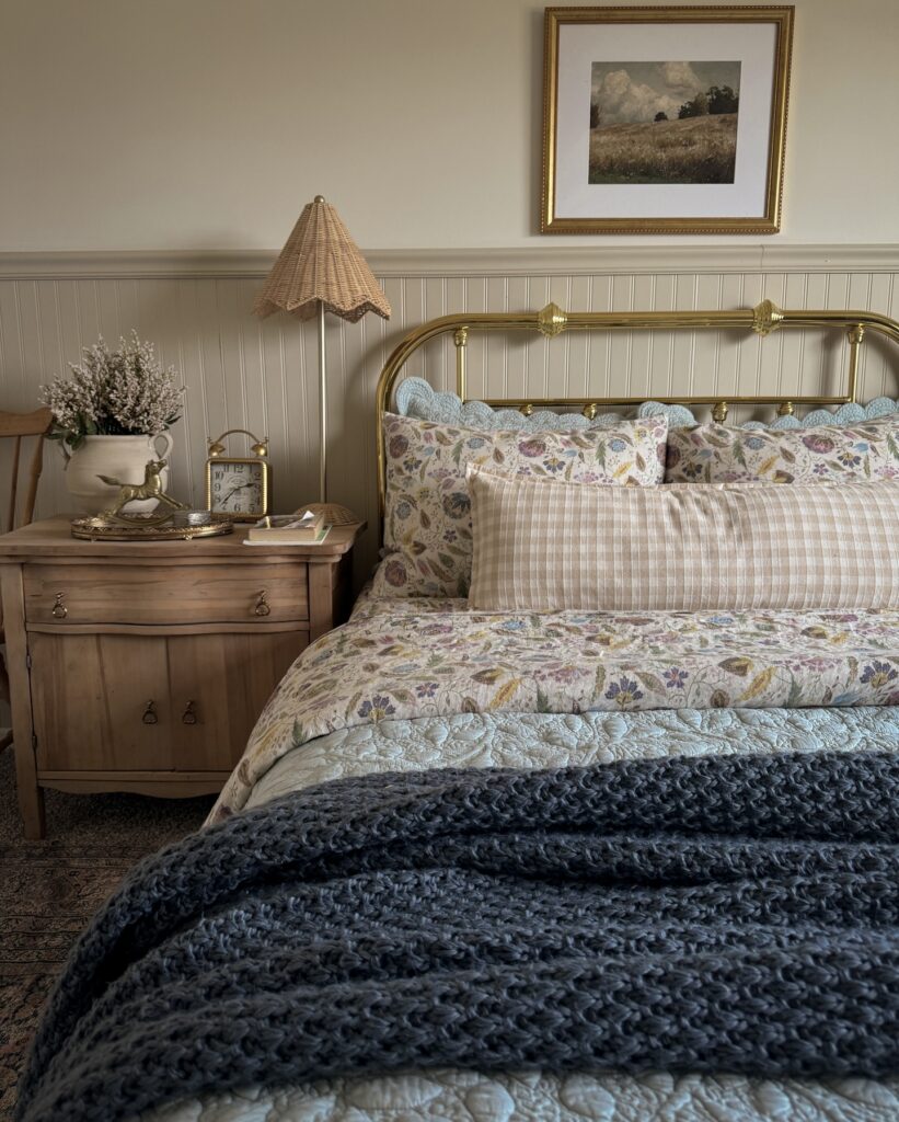
Start with the bed frame. A brass one gives the room that older cottage feel without needing carved wood everywhere, and it works especially well when the bedding is a little busy, like a small floral quilt with a faded look rather than a bright print.
Then soften the metal. The scalloped blue pillows here do that nicely, and they stop the brass from looking too polished or formal, which can happen fast if the rest of the room is plain.
Keep the bedside table simple. A light wood nightstand, a small clock, and a pleated or gathered lampshade are enough, especially when the wall paneling already adds texture from behind the bed.
I’d skip adding more patterns than this. Between florals, checks, scallops, and the knitted throw at the foot, one extra print could start feeling like you ran out of places to stop.
Hang Mismatched Plates as Wall Art
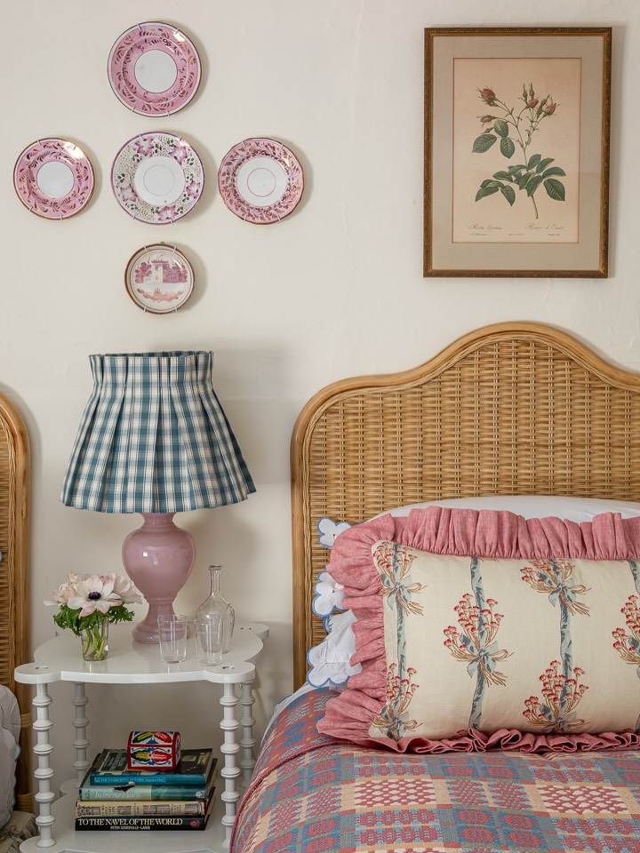
Plates don’t all have to match — that’s actually the point. The ones here are all pink-toned but different in pattern and size, arranged in a loose cluster rather than a grid. That slight randomness is what makes it read as collected rather than purchased-as-a-set.
Thrift stores and estate sales are genuinely the best source for this; you’re looking for a shared color family, not identical pieces. Plate hangers from a hardware store do the job fine. The botanical print nearby anchors the wall without competing, since it’s framed and sitting slightly apart from the cluster.
If your walls are already busy, I’d skip this — it needs a fairly clear stretch of wall to land properly.
Crochet Coverlet Bed
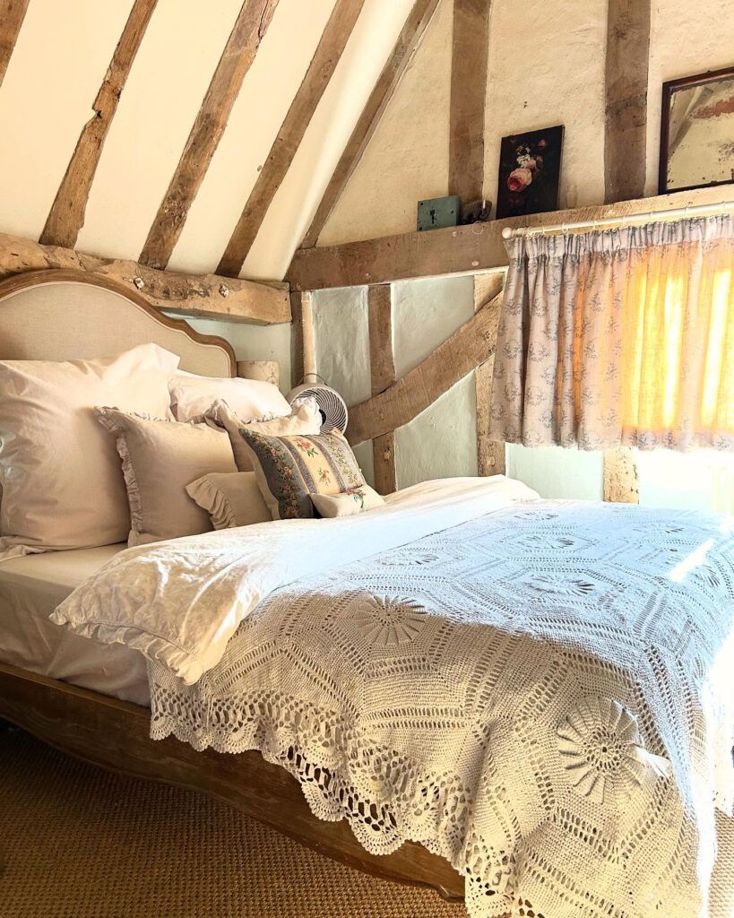
Right on the bed, the crochet cover does most of the work. Keep it visible. Let it sit over plain white bedding so the pattern can show, instead of fighting with printed sheets or heavy quilts.
If your room has exposed beams, an old wooden bed frame, or even one rough shelf above the headboard, this kind of coverlet makes the whole corner feel more collected without needing much else. A few ruffled pillows are enough. I would skip five or six cushions here, unless you enjoy removing them every night, because the lace edge already adds plenty of detail.
Floral curtains can stay pale, like the ones here, so the bed remains the main thing.