
27 DIY Cottagecore Decor Ideas
This site contains affiliate links. We may earn a small commission, at no extra cost to you. Article may contain some images for illustrative purposes only .
The pillowcase was cold. Not chilly—actively cold, the kind that makes you flinch when your cheek hits it at 11pm in January. That single detail is what sent me down a two-year rabbit hole of layered linen, warm-toned bulbs, and the strange science of why some bedrooms feel like a hug the moment you walk in while others feel like a hotel someone forgot to finish decorating. What follows are 27 ideas I’ve either tested in my own space or stolen shamelessly from rooms that stopped me mid-scroll: soft lighting tricks, textile pairings that actually work, a few thrifted-object rules, and the small architectural cheats that turn a plain rectangle into somewhere you genuinely want to spend the evening. Some cost nothing. A few will make you rearrange furniture at midnight. All of them lean into the same idea—that “aesthetic” and “cozy” aren’t opposites, and your bedroom shouldn’t have to choose.
Paint a Dresser and Add Florals
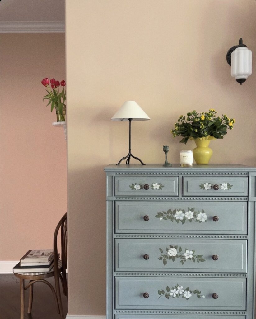
A dusty blue-green dresser with hand-painted white flowers on each drawer front is doing a lot of work here — mostly because the painted motifs replace the need for any other wall art nearby. If you’ve got an old chest of drawers sitting in a spare room, chalk paint takes well to wood and dries fast. The floral detailing looks like it was done with a fine brush and basic acrylic craft paint, nothing specialist.
Dark round knobs keep it from going too precious. Against a warm sandy wall, the muted blue reads surprisingly rich. I’d probably skip painting every single drawer and just do the two or three most visible ones — saves time and the effect is nearly the same.
Layered wall display
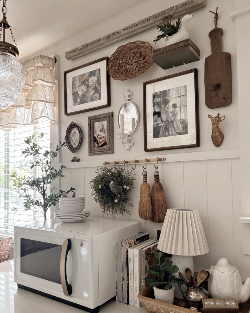
Start above a dresser or bedside cabinet, where you can mix framed prints with a small mirror, a woven basket, and one narrow shelf like the one holding the white pitcher. Keep the frames in wood tones so the wall doesn’t start looking too busy. Small things matter here.
A peg rail can hold a dried wreath, linen bags, or even a straw hat, which makes the wall useful instead of only decorative. I’d skip heavy objects over the bed, though, because this kind of layered setup works better where nothing can fall near your head. Add a pleated lamp and a few books below it, and the whole corner feels collected over time.
Built-In Shelf Styling
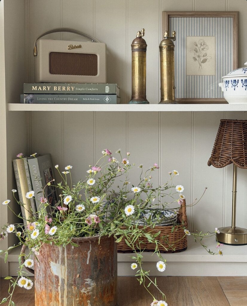
A recessed shelf like this works because nothing on it matches. Old brass pepper mills next to a cream Roberts radio, cookbooks stacked flat as a plinth, a rusted bucket spilling daisies onto the floor. The trick is letting height do the work — tall mills, a framed botanical, then the low softness of a wicker lampshade.
Skip the matching-set instinct. One vintage piece with real patina beats three new decorative objects from the same shop.
If you’re recreating this in a bedroom, swap the cookbooks for novels you actually reread. The rusted bucket is charming here but I’d worry about it marking a painted floor, so a saucer underneath. Keep one shelf mostly empty. Crowding every level flattens the whole thing.
Ottoman instead of table
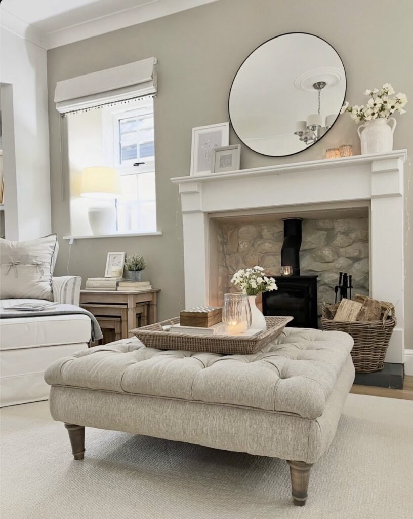
Try a large tufted ottoman at the foot of the bed or in the middle of the room if your bedroom has the floor space, then use a tray on top so it can still hold a candle, a small vase, or your night reading without everything sliding off. It works because the room gets one more soft surface instead of another hard table edge. Much better in bedrooms.
Keep the palette close. The pale upholstery, wicker tray, white flowers, and light rug all sit near each other, so the texture does most of the work and the room doesn’t start looking busy. If you want this look on less money, skip the deep button tufting and get a plain linen-look bench with turned legs. One thing I’d watch: oversized ottomans can eat up walking space fast, so measure the gap around the bed before you buy anything.
Mix Old and New Textures
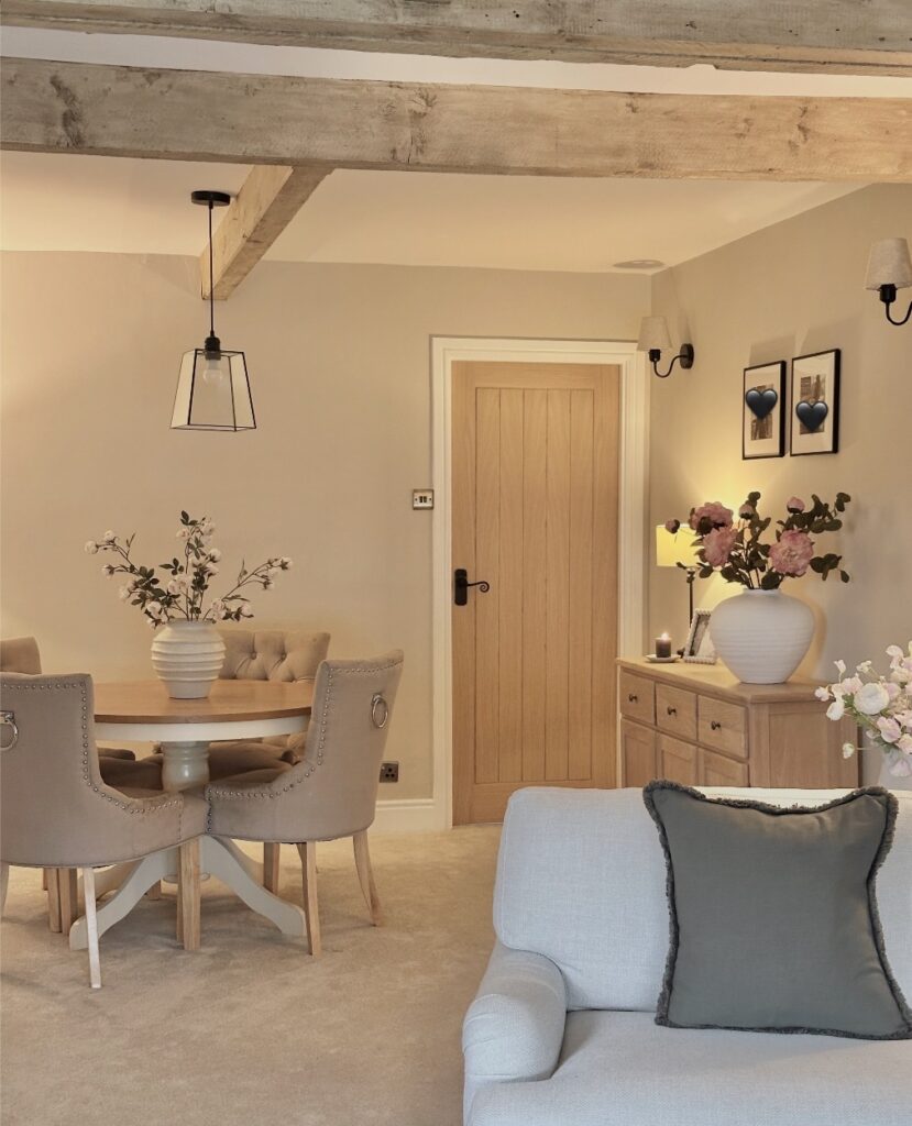
Those exposed ceiling beams do a lot of the heavy lifting here — rough, unfinished wood sitting above walls painted in the softest greige. The trick is pairing something that looks like it’s been there for decades with things that are clearly new. Upholstered chairs with ring pulls and stud trim, a round pedestal table in two tones.
Neither item is trying to match the beams; they’re just sharing a room with them. If your ceiling doesn’t have beams, a reclaimed wood headboard gets you close. The pendant light — black wire frame, bare bulb — is worth copying.
Skip the glass shade version. Simpler wireframe ones are cheaper and the shadow they throw on the wall at night is actually the point.
Checked bed canopy
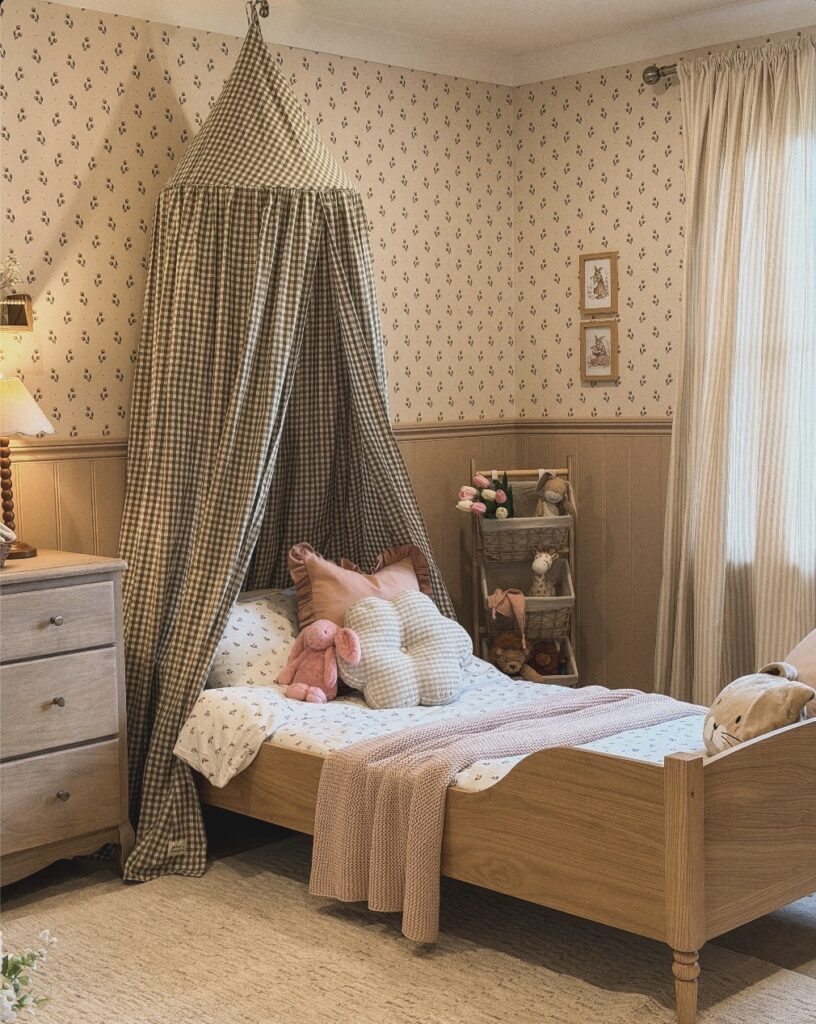
Right above the pillow line, the checked fabric starts doing the job. It gives the bed a small hideaway feeling without needing a large frame or heavy furniture. Keep it washable.
If the room already has floral wallpaper, pick a gingham or plain cotton canopy in one muted shade so the walls and fabric don’t start fighting each other. The tie at the top matters too, because a loose cone shape looks better than fabric pulled too tight. I’d skip shiny material here, it can make the whole thing look like party decor.
A pink throw or one shaped cushion is enough for the bed, especially when the canopy is already taking up so much attention.
Sage Green as a Neutral
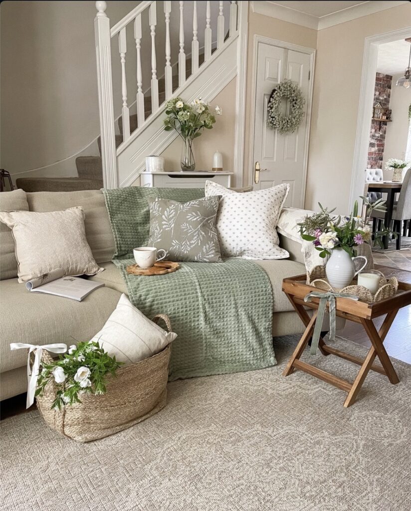
The waffle throw draped across the sofa is doing most of the work here. Sage sits somewhere between grey and green, so it plays nicely with the oatmeal cushions and the natural jute basket without fighting them for attention. If you want to try this in a bedroom, start with the throw at the foot of the bed. One botanical print cushion, one plain, one textured. That’s enough.
A tip. Don’t match the green exactly across every piece — the leaf-print cushion is a slightly different shade to the throw, and that’s why it looks collected rather than bought as a set. Skip the matching curtains. Bring the same green in through a small vase or a single stem on the nightstand instead.
Floral tea corner
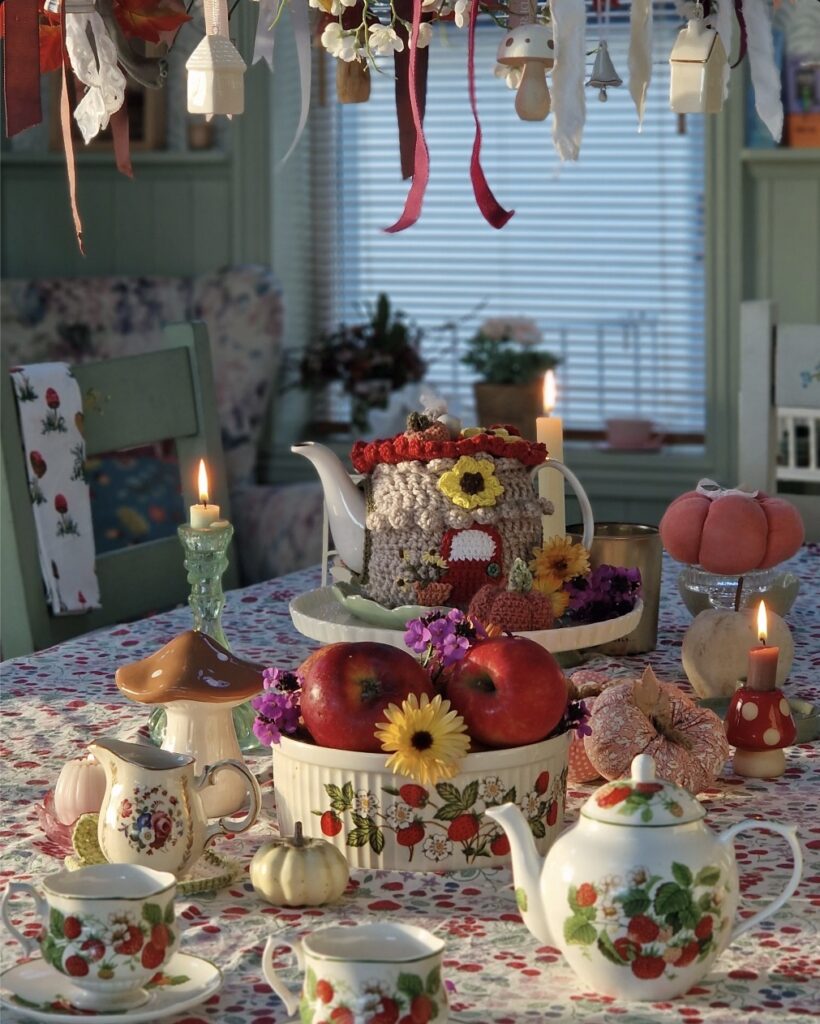
Start with one strong pattern. Here, the strawberry teapot and cups work because the same print repeats across pieces, so the setup looks collected instead of random, even with flowers, fruit, candles, and those little mushroom shapes all sharing the table. Keep the rest of the room quieter by echoing just one color from the set on bedding or curtains—soft green from the trim would do it.
Use a tray in the middle of a dresser or nightstand so the whole thing reads as one spot, not clutter. Fresh apples, a tiny pumpkin, and a short vase of flowers are enough. No need for ten props.
Candles help a lot. If this is for a bedroom, I’d swap real flames for battery ones unless you’re actually sitting there awake with tea.
Mix Patterns Without Overthinking It
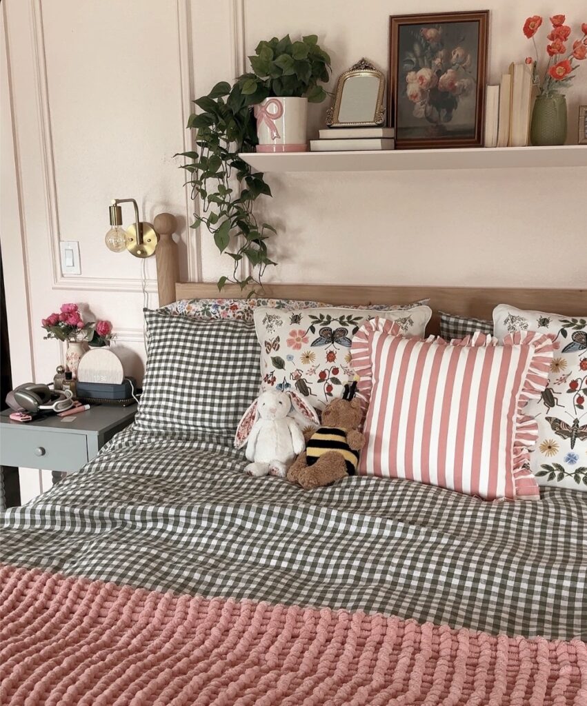
The gingham duvet does most of the heavy lifting here, and because it’s mostly dark green and white, the pink stripe pillow and the botanical print ones don’t actually fight with it — they just sit next to it. The trick is keeping one pattern as the base in a neutral-ish colorway, then letting the smaller pieces carry the louder prints. If you’re starting fresh, gingham bedding is probably the easiest base to work with because it reads as almost solid from a distance.
The chunky knit throw folded at the foot pulls the pink from the striped pillow down into the bed, which is what stops the whole thing from looking accidental. Skip the ruffle-edge pillows if that detail isn’t your thing — the botanical print ones alone would hold up fine.
Beams And Stone
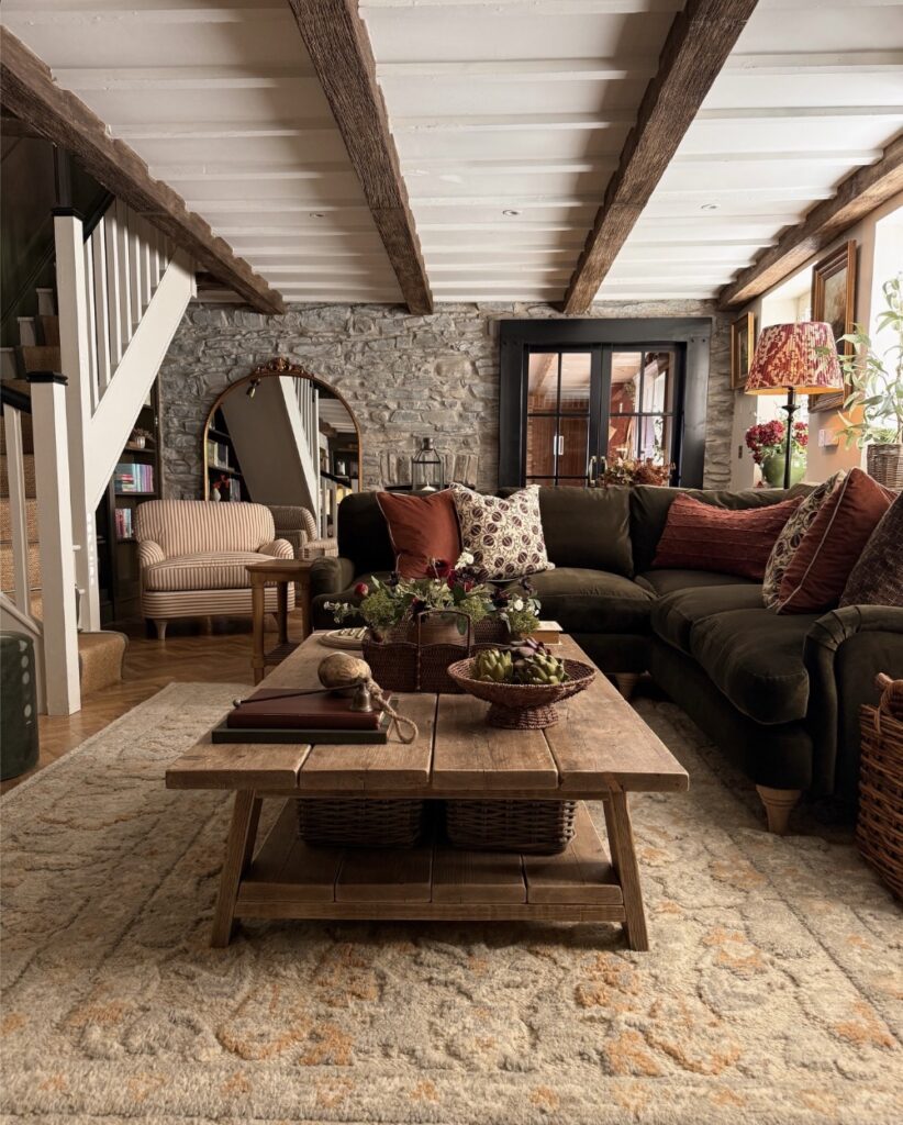
If your bedroom has old beams or a stone wall, let them do most of the work instead of covering every surface with art. Keep the bed low, use olive or deep brown bedding, and bring in a rough wooden bench at the foot like the coffee table here. It grounds the room.
A patterned rug with faded orange or beige tones helps soften the floor without making the room look too planned. I’d skip shiny bedside tables here, because they would fight with the rough ceiling and wall texture more than they help. A small lamp with a printed shade can add just enough pattern near the bed.
Two Shelves Above The Headboard
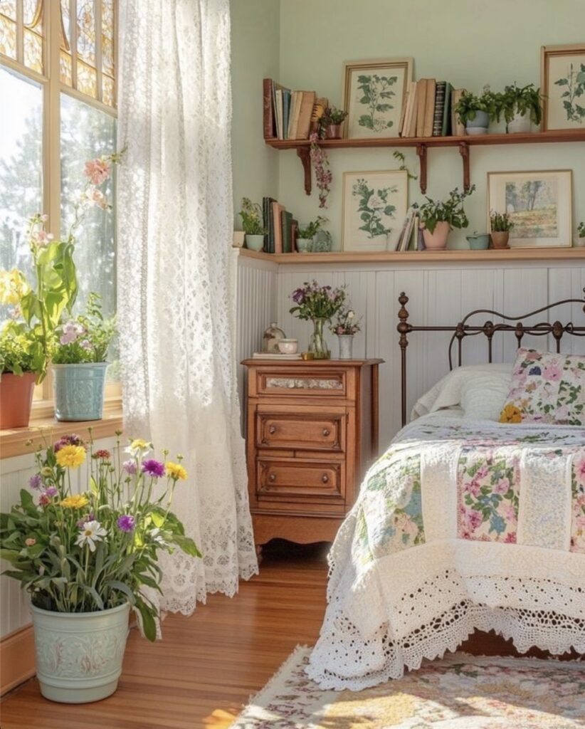
The trick here is stacking two narrow shelves above the wainscoting instead of hanging one big piece of art. Books laid flat, botanical prints propped up, small potted plants tucked between. It reads collected, not styled.
Keep the frames unmatched. Thin wood, gold, a little watercolour landscape on the end — the mix is what makes it look like it grew over time rather than arrived from one shop.
I’d skip putting real plants up there though. Watering something above your pillow gets old fast, and the light that high up is usually worse than it looks. Fake stems or a trailing pothos you can pull down easily works better.
This suits renters too. Two picture ledges, no commitment.
Scalloped cottage corner
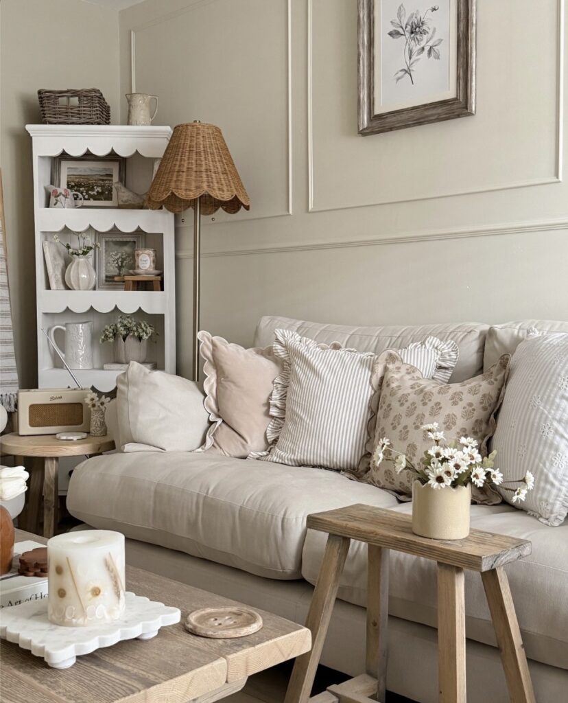
Start with one piece that has a bit of shape. Here it’s the scalloped shelf, and that edge does most of the work because the rest of the room stays plain—flat walls, straight panel moulding, a low sofa line. Very little needs matching.
Keep the shelf styling useful, not packed. A jug, a framed print, a small vase, maybe a basket on top for spare throws or bedtime bits, and stop there, because this look goes messy fast when every shelf gets three tiny objects. The wicker lampshade helps too. It brings in another texture without adding colour, which is handy if you want the room to stay in that chalky cream and beige range.
For a bedroom, swap the radio for a clock or book stack. I’d skip more than three frilled cushions, though. Too much shuffling at night.
Build a Reading Corner That Actually Gets Used
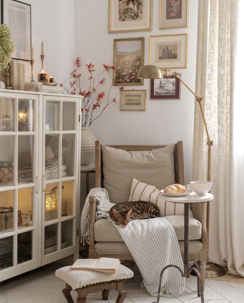
The brass arc lamp here is doing the real work — it’s positioned directly over the chair, which means actual usable light rather than just something that looks good in photos. That’s the part most people get wrong. They place a lamp for symmetry and then end up reading with their phone flashlight.
A small marble-top side table like this one earns its place too, because it holds a plate, a drink, whatever, without pulling your eye away from the chair. The glass cabinet with interior lighting next to it fills the wall without crowding the seat. For a bedroom corner, you’d want the same logic: one chair, one directed light source above it, one surface within arm’s reach.
The cat and the croissant are optional.
Floral Walls And Baskets
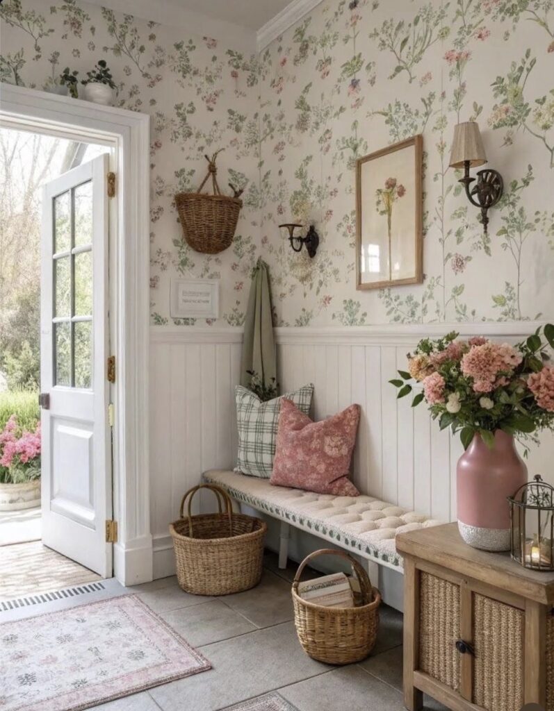
Above the bed, keep the floral wallpaper only on the upper wall. Keep the base plain. A half wall of white paneling, like this one, gives the pattern a stopping point so it doesn’t take over every corner of the room.
Add a narrow bench at the foot of the bed if you have space. Not a bulky one. Wicker baskets can sit underneath for extra throws, books, or chargers that usually end up on the floor.
I’d skip heavy matching floral bedding here, because the wall is already doing enough work. A pink cushion or vase is plenty.
Green Gingham and Eucalyptus
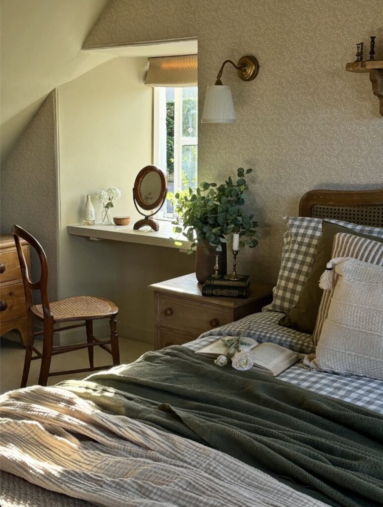
The green check pillows are doing most of the work here. Pair them with a plain olive cushion and something textured in cream, and you’ve got a pile that looks collected rather than matched. The eucalyptus in the pot is the other move worth stealing. It dries well, so you’re not replacing it every week like fresh flowers.
Skip the tasseled cushion if you have cats. They’ll destroy it.
What makes this bed feel lived-in is the open book and the loose stems tossed on top of the blanket, not the styling. Leave something behind when you make the bed in the morning. A paperback, a folded cardigan. The room reads warmer when it looks like someone actually sleeps there.
Layered mantel greenery
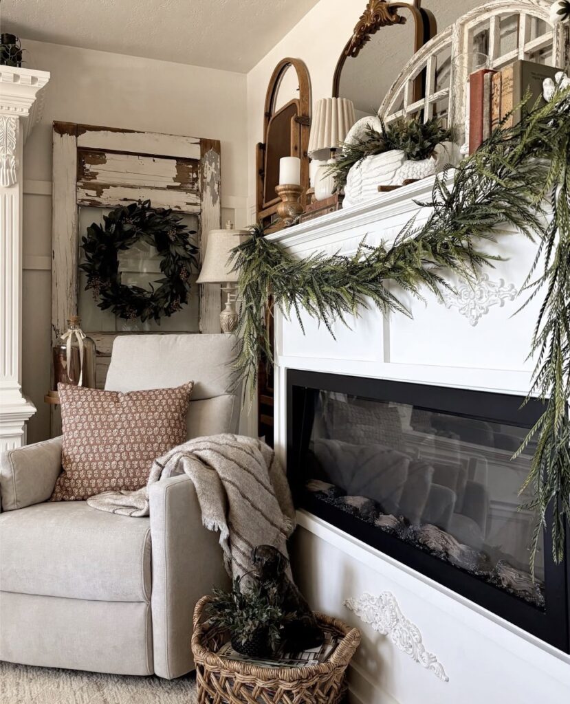
Start with the mantel, not the whole room. A long faux cedar garland draped a bit unevenly does most of the work here, especially when the fireplace itself is plain and the wall color stays light.
Then bring in one rougher piece nearby, like an old window frame or chipped shutter with a dark wreath on it, because that worn wood stops all the white upholstery and trim from looking too matched. That contrast matters.
Keep the rest low-key. A neutral throw, one printed pillow, a basket on the floor.
If you want this in a bedroom, it suits a corner with an electric fireplace or even a dresser top styled like one, but don’t crowd it with tiny holiday bits or it starts feeling fussy fast. Mirrors help too, particularly narrow arched ones that bounce light without taking over the wall.
Lean Into One Soft Color
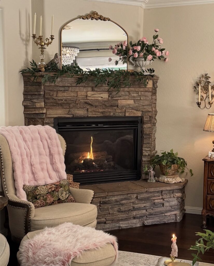
The pink here shows up in three places — the faux fur throw on the chair, the fluffy ottoman cover, and the roses on the mantel — and that repetition is doing most of the work. Pick one soft color, then find it in your textiles and one accent piece. Doesn’t need to be pink.
A dusty blue or warm cream reads the same way. What you want to avoid is spreading it too thin across five different shades that are all trying to be the same idea. The faux fur throw draped over the chair arm is the easiest entry point if you’re starting from scratch — cheap to swap out, immediate visual weight.
I’d skip the matching ottoman fur personally, one is enough.
Lace Curtains At The Window
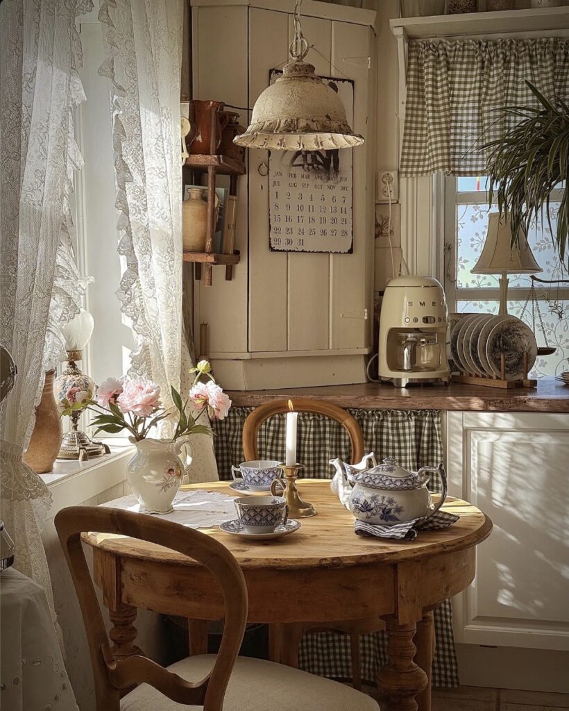
If your bedroom gets morning light, hang lace curtains close to the glass and let them sit a little uneven. A narrow table or stool beside the bed can hold a china cup, a candle, and a small jug of flowers without turning the corner into a full display. Keep it useful.
The gingham skirt idea also works under an open bedside shelf, especially if you need to hide chargers or books. I would skip a heavy pendant over the bed, though; a low lamp with a fabric shade is easier to live with. Leave some wood showing, because too much painted furniture can make the room feel like a set.
Two-Tone Striped Walls With Pom Trim
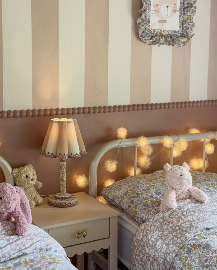
The striped upper half stops halfway down. Below it, a solid dusty pink takes over, and where the two meet, there’s a row of wooden ball trim painted to match. That little beaded border is doing most of the work here. Without it, you’d just have two paint colours awkwardly meeting.
You can buy half-round wooden bobbin moulding by the metre and glue it straight to the wall, then paint over it. Cheap, and it hides an uneven paint line. The stripes themselves are wide and soft, not sharp nursery stripes, which is why the room still feels like somewhere a child could grow into rather than out of by age six.
Skip the pom-pom fairy lights though. They shed, they tangle, and after one wash they look tired.
Window seat dressing
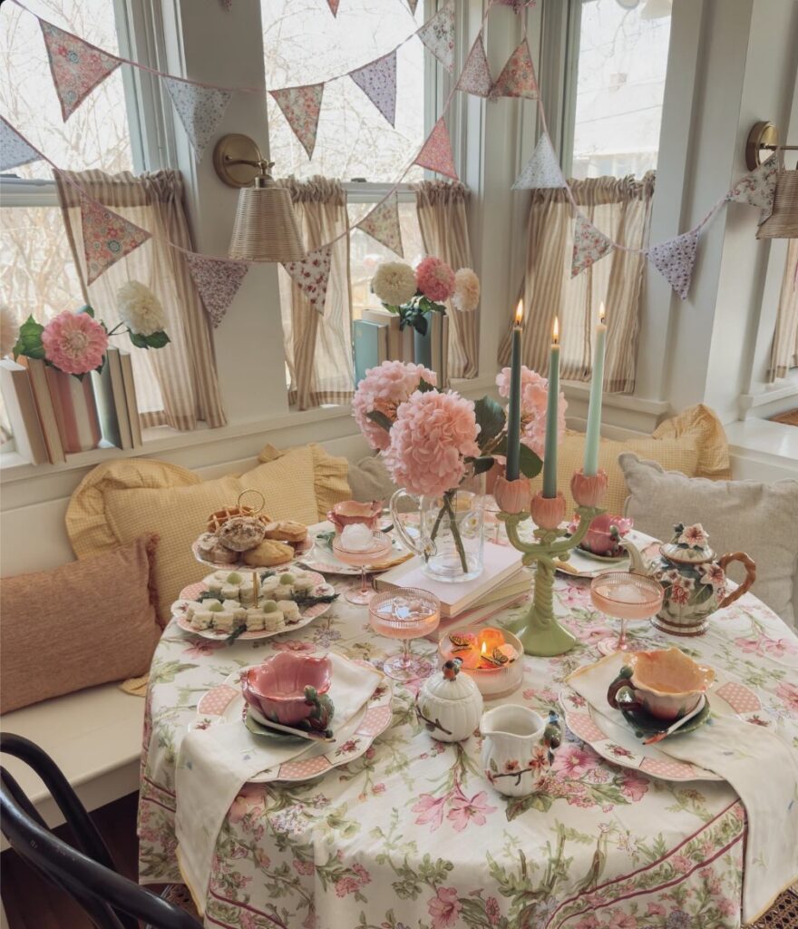
Start with the bench, not the bed. If your bedroom has a window nook or even just a deep sill with room beside it, line it with one long seat cushion and stack a few oversized pillows in washed-out yellow, blush, or oatmeal so the corner feels used rather than staged.
The fabric bunting matters more than people think. Hung high and a little loose across the windows, it breaks up plain trim and gives the room that homemade, collected look without needing new furniture, and it works best when the prints stay in the same soft family instead of turning into full-on patchwork chaos.
Keep the table idea smaller. A round side table with a floral cloth, one vase of full blooms, and a candleholder is enough for a bedroom reading corner; I’d skip the full tea spread unless you actually use it, because crumbs near cushions get old fast.
Layering Dark and Light Together
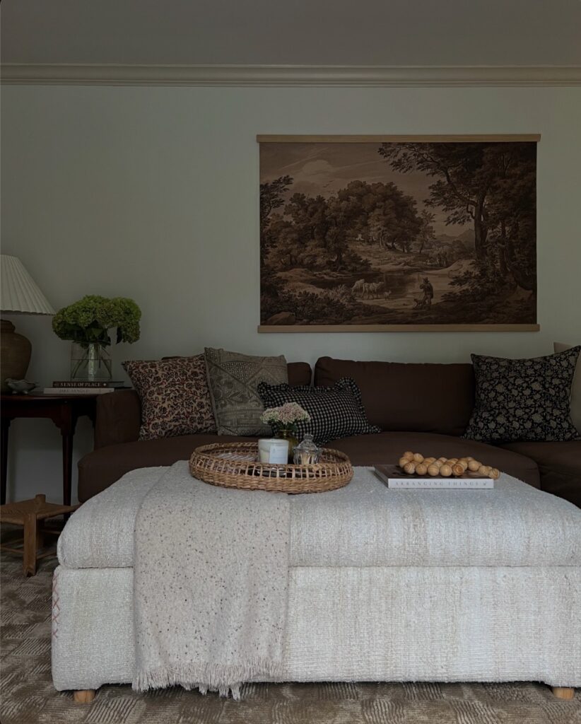
That chocolate brown sofa with a cream boucle ottoman sitting right in front of it — that gap between the two tones is doing a lot of work. If you’re going for this in a bedroom, the same logic applies: a dark upholstered bed or headboard paired with lighter textiles on top, like an off-white throw or a chunky knit blanket draped across the foot. The pillows here are all different patterns but they share a muted, earthy palette, so nothing fights for attention.
That’s the part people get wrong — mixing prints is fine, just keep the colors in the same family. A woven tray on the ottoman grounds it. Worth doing in a bedroom too, on a bench or low dresser.
Collected Shelf Styling
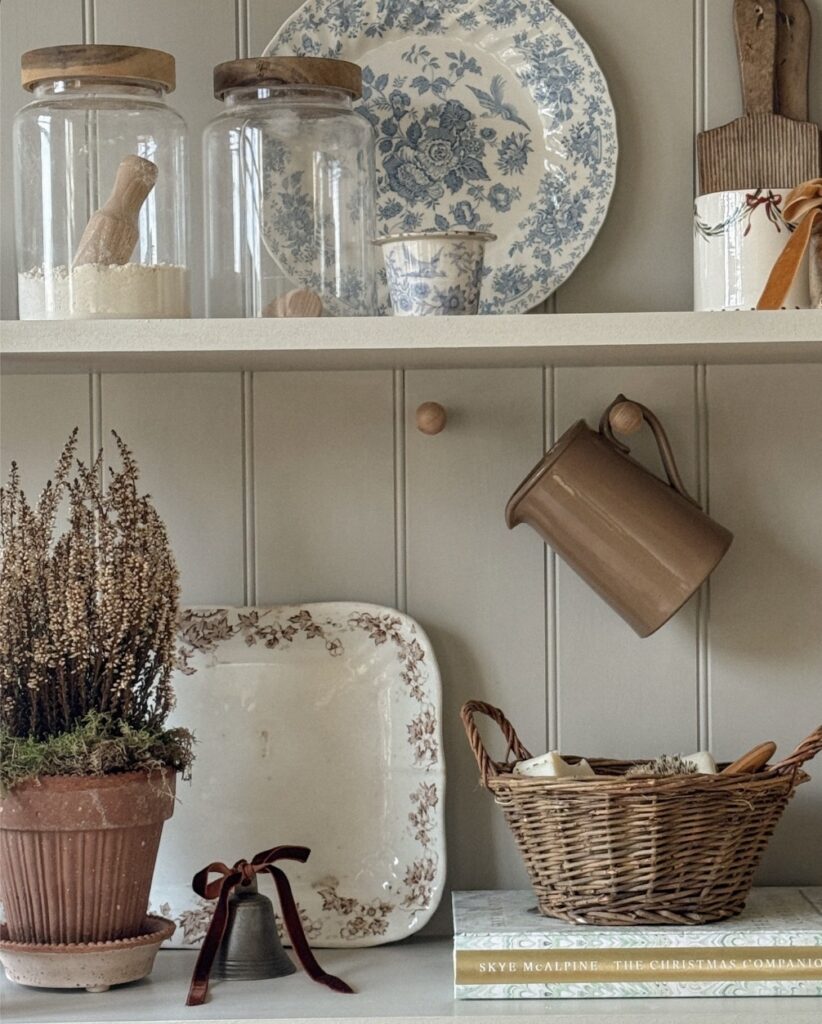
On a bedroom shelf, glass jars with wooden lids can hold spare buttons, sleep masks, or cotton pads without looking like storage. Keep the pretty plate at the back. It gives height.
A small basket can take hand cream, chargers, and the little things that usually end up beside the bed. I would skip dried flowers if your room gets dusty fast, because they look nice for a week and then become one more thing to clean. A mug on a peg works well for hair ties too.
Layer Florals Without Matching
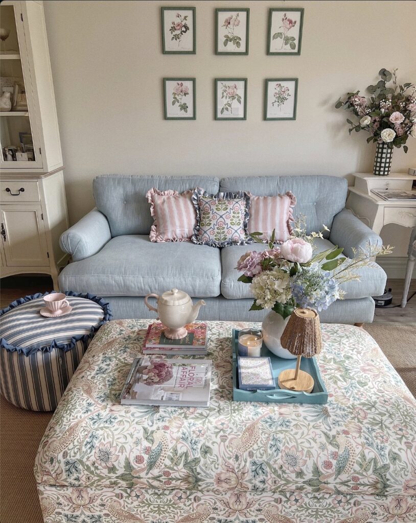
The William Morris-style ottoman does most of the heavy lifting here, and the trick is that nothing else on the ottoman tries to match it. Botanical prints on the wall, a striped pouffe, a small ikat-ish cushion between two pink stripes. All florals, none repeating.
If you’re doing this in a bedroom, put the busiest print on the largest soft surface — an upholstered bench at the foot of the bed, or the headboard. Then pull one colour from it (here, the dusty pink) and let that repeat in smaller things. Cushions, a teacup, the frames.
One thing I’d skip: six framed prints in a tight grid above the bed. Four is calmer and you’ll actually see them properly when you’re lying down.
