23 Dark cottagecore living room ideas
This site contains affiliate links. We may earn a small commission, at no extra cost to you. Article may contain some images for illustrative purposes only .
The velvet armchair in the corner is the color of crushed blackberries, and it’s the first thing anyone notices when they walk in. Not the fireplace. Not the moss-green walls. That chair. Dark cottagecore living rooms work like that. One heavy, brooding anchor, then a slow reveal of everything orbiting around it.
I am talking tarnished brass candlesticks, botanical prints gone slightly foxed at the edges, a wool throw that looks like it was dyed with walnuts. This isn’t the sunlit, daisy-chain version of cottage style you’ve seen a thousand times. It’s the shadowed cousin, the one that reads Brontë by candlelight and keeps dried mushrooms in apothecary jars.
Ahead, 23 ideas for pulling the look off without tipping into haunted-house territory, covering everything from moody paint colors and layered textiles to the small, strange objects that make the whole room feel lived-in by someone with excellent, slightly witchy taste (you ofcourse).
Paint Everything the Same Dark Color
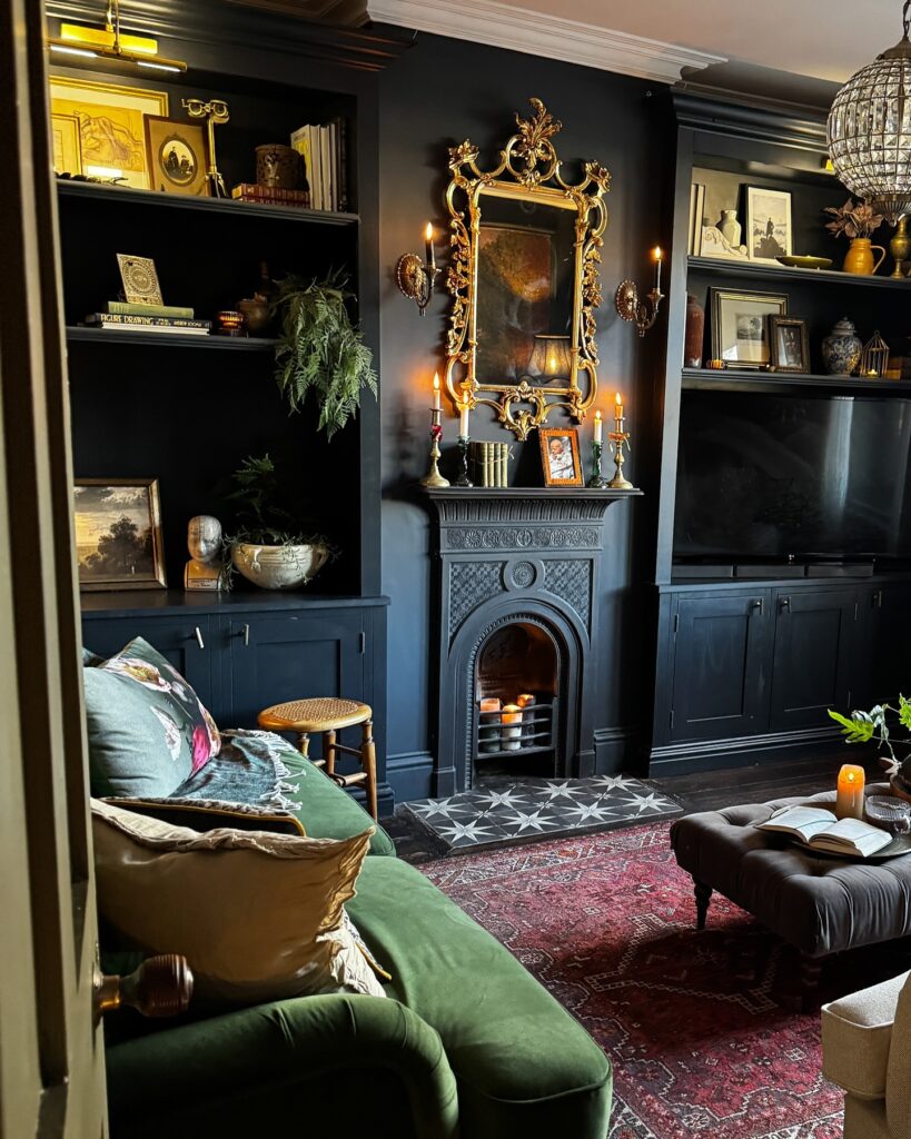
Walls, built-ins, cabinet fronts, fireplace surround all in the same near-black. What this does is make the individual objects on the shelves read louder, because there’s no contrast competition from the architecture itself. That gilded mirror and the framed paintings would look ordinary against a white or grey wall, but here they almost glow like in an ethereal way.
The trick is committing fully. One lighter panel or a different-toned shelf back will break the whole effect. If you’re renting or not ready to go all-in on walls, dark built-ins alone can get you most of the way there.
If going full cave-mode feels like too much, start with built-ins or the fireplace wall. And definitely add plenty of warm lighting. In a room this dark, candles and table lamps aren’t just pretty. They’re doing overtime.
Dark Wood Sideboard
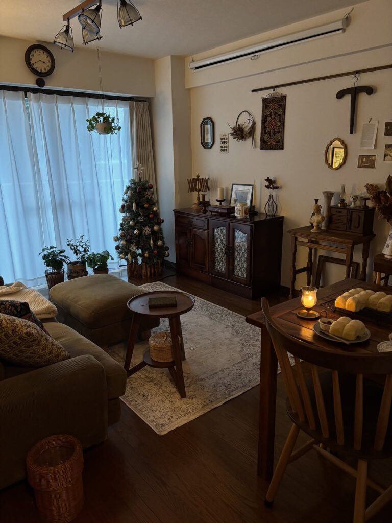
That long wall above the cabinet is doing most of the work here, especially with the small mirror, textile hanging, and odd little framed pieces spread out. Keep the curtain pale. If the room already has a dark floor, a heavy wooden sideboard can handle all your cottage bits without making the place feel like a storage corner.
Put your candles, old frames, dried flowers, and small lamps on it, but leave some bare top showing so the wood still matters. The Christmas tree works because it stays narrow. I’d skip a wide tree in this setup and use a slim one, or even branches in a pot, if your living room has the same sofa-to-dining-table squeeze.
Layer the mantel with garland
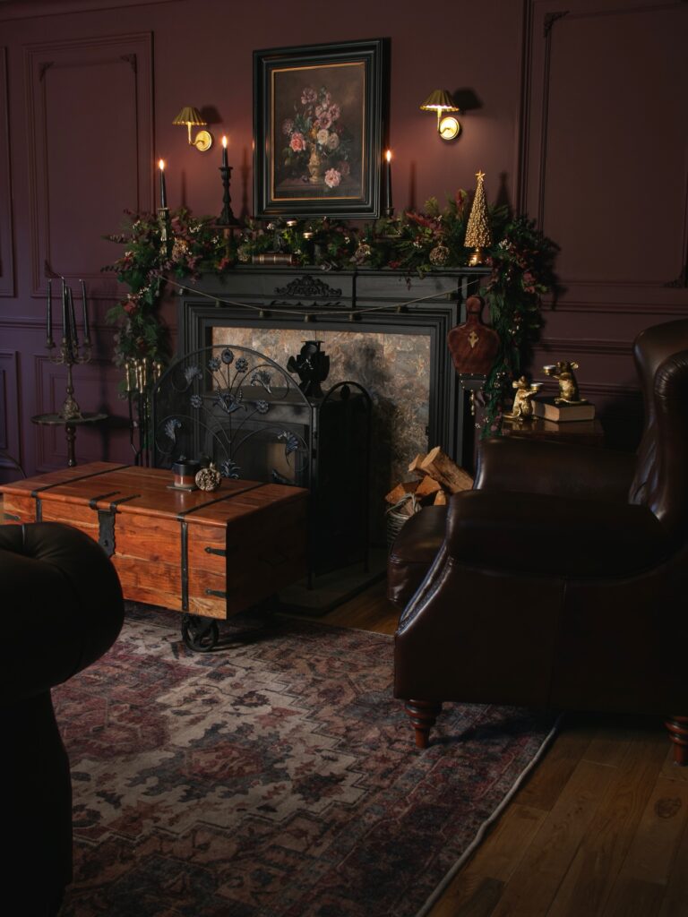
The garland here is doing most of the work. It’s thick, it drapes past the mantel edges on both sides, and it mixes evergreen with what looks like dried florals and small berries. That’s the trick. A thin store-bought garland laid straight across will look sad against a dark wall like this plum one — you want volume and something spilling over the ends.
Add black taper candles at different heights behind it. A framed oil painting of flowers propped against the wall ties the whole thing to the botanical stuff below.
One thing I’d skip: the little gold Christmas tree on the right. It fights with everything else. A brass candlestick or a stack of old books would sit better with the rest of the room.
Gallery wall with plaid
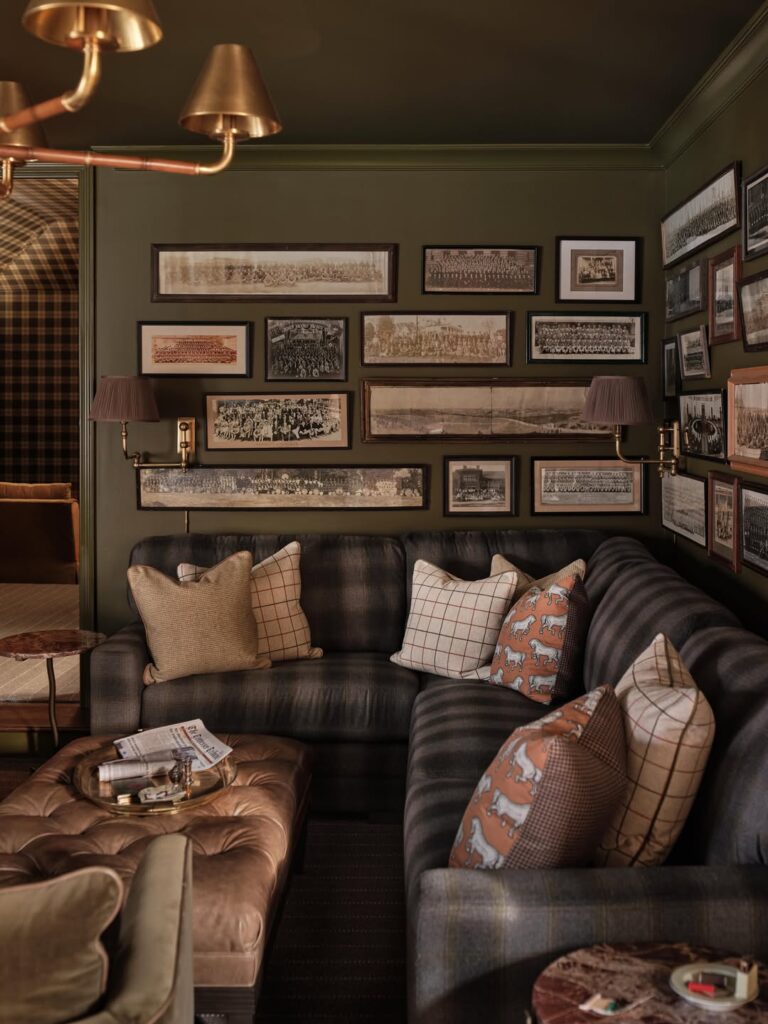
Start with the wall color first. That deep olive-brown is what lets all those old group photos, dark frames, brass lamps, and the charcoal plaid sofa sit together without looking busy. Keep the artwork tight and low over the seating so it reads like one collected block instead of lots of separate pieces.
The plaid matters here. A plain sofa would make the room flatter, but this one brings that old-country, slightly clubby feel dark cottagecore can handle well, especially when you break it up with checked pillows and one small print in a rust tone. Don’t add ten accent colors. Two is enough.
Brass swing-arm sconces are worth copying. They light the frames and the seat at the same time, which is useful in a room with this much dark paint. I’d skip overly distressed wood tables here. Leather works better.
Mount a Gallery Wall Behind Everything
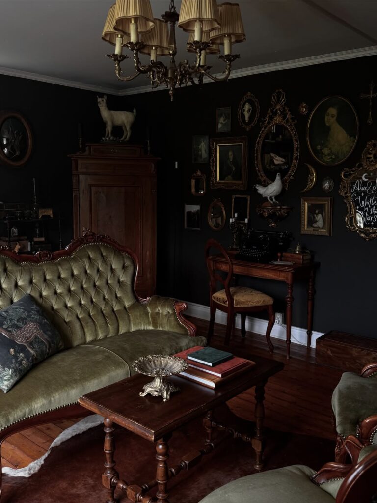
The wall here is doing most of the heavy lifting — oval gilt frames, dark portraits, a taxidermy bird mounted mid-wall, all packed together without much breathing room between them. That density is the point. To pull this off, start by leaning a few frames on the floor against the wall and shuffling them until the arrangement stops looking like a grid.
Mix portrait orientation with landscape, and don’t match the frames. Gold, dark wood, ornate, plain — the variation is what makes it read as collected rather than purchased as a set. Dark paint behind it all, something close to near-black, makes the frames pop without you having to do much else.
I’d skip the taxidermy if it’s not already your thing — the portraits and mirrors alone carry it.
Dark paneled walls
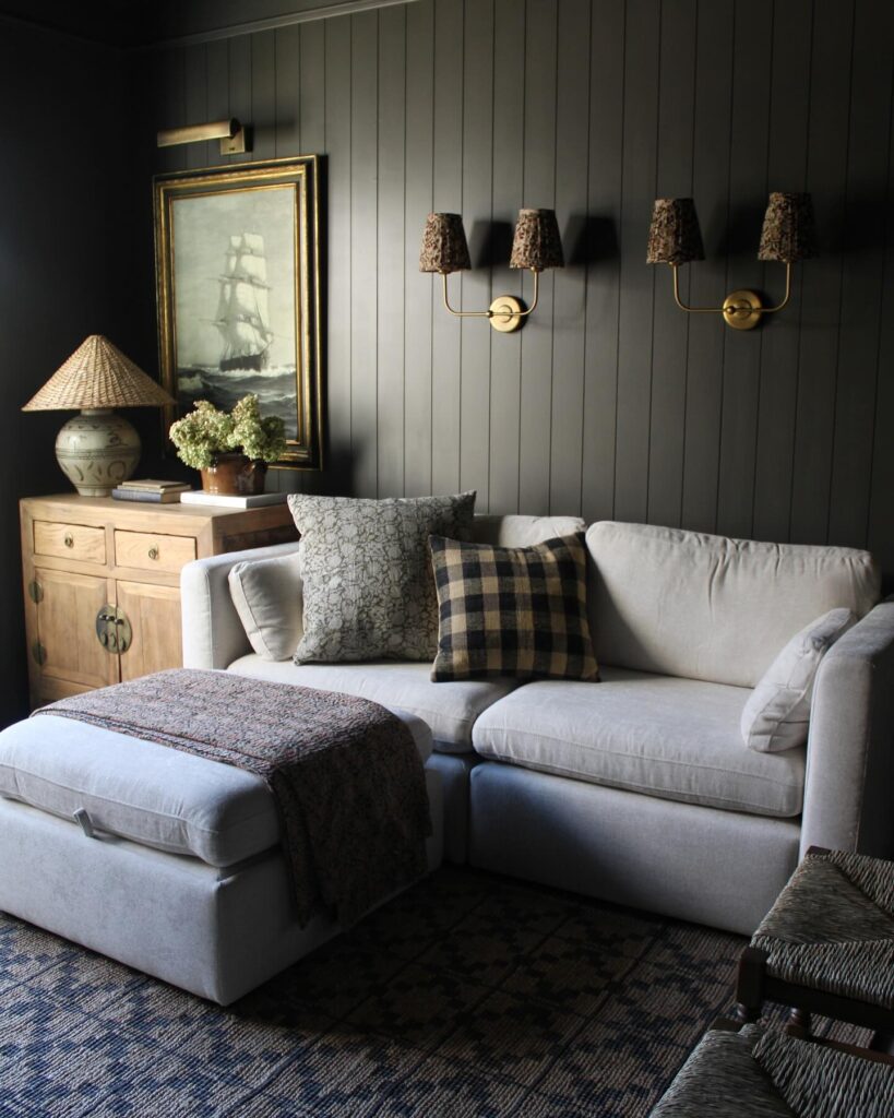
Behind the sofa, let the dark vertical paneling do most of the work. Keep the sofa pale. That contrast stops the room from turning into one heavy block, especially if you are using a large sectional or chaise.
The brass double sconces with patterned shades are a smart choice because they bring in cottage detail without filling the wall with too many small frames. A ship painting or old landscape over a cabinet works better than modern prints here. I’d skip bright white cushions and use checks, faded florals, or a grey pattern instead.
Much easier to live with.
Paint the Built-Ins Too
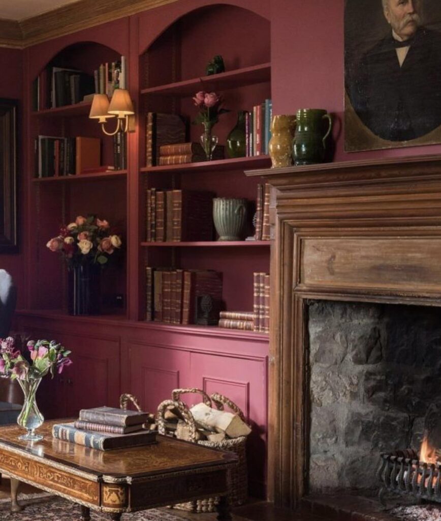
The bookshelves here are the same dusty raspberry as the walls. That’s the whole trick. Most people paint the wall a moody colour and then leave the shelving white or wood, which chops the room into pieces and kills the depth you were trying to build. Going one tone across walls, shelves, and panelling lets the wood mantel and the old leather book spines do the talking instead.
If you’re renting or nervous about commitment, start with the back of the shelves only — even that shift helps. One thing I’d skip: matching the ceiling. The warm wood trim up top here works because there’s contrast overhead. A fully pink ceiling would feel like a box.
Layered wood and print
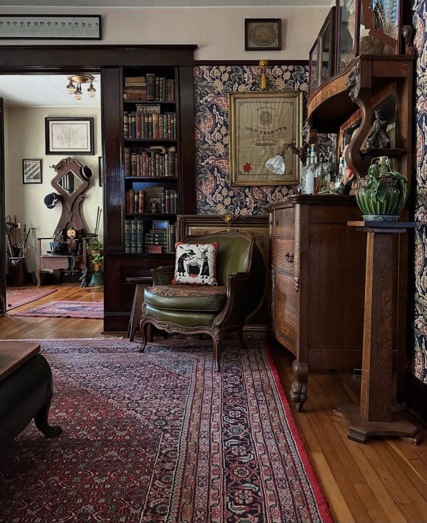
Start with the wall treatment here, because the dark floral paper and the tall wood trim are doing most of the work. If you want this kind of dark cottagecore living room, run the wallpaper above a chair-rail height panel or wainscot instead of papering every inch. It keeps the pattern from getting messy once you add bookcases, framed pieces, and a bulky chest.
The second move is old wood. Lots of it. A built-in bookcase, a curvy chest, even one substantial side table will ground all that print better than light painted furniture ever could, and the room will look collected instead of themed.
Keep the seat low. A deep green leather chair or an olive velvet one works especially well against red rugs and navy-heavy wallpaper.
I’d skip extra throw pillows. The one odd little accent cushion is enough once the shelves, rug, and paper are already busy.
Layer the Ceiling Into the Room
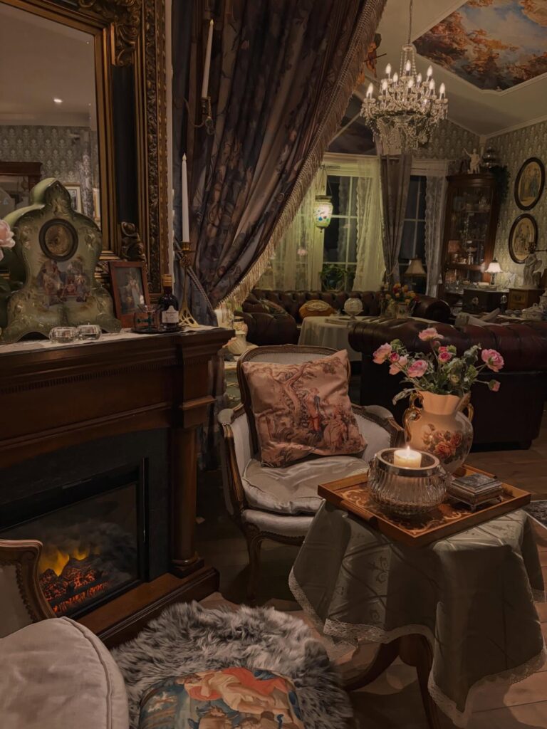
Most people stop decorating at the walls. That painted ceiling — a Rococo-style mural with figures and clouds — is doing a huge amount of work here, and it’s what keeps the crystal chandelier from feeling like it just got dropped in from a different room entirely. If a full mural isn’t happening, even a dark wallpaper pattern carried up onto the ceiling creates the same sense that the room closes in around you deliberately, rather than by accident.
The chandelier needs something above it to anchor to. Without that, it floats. For dark cottagecore specifically, the ceiling is where you can go a bit further than you think you should — and it usually pays off.
Dark Gallery Wall
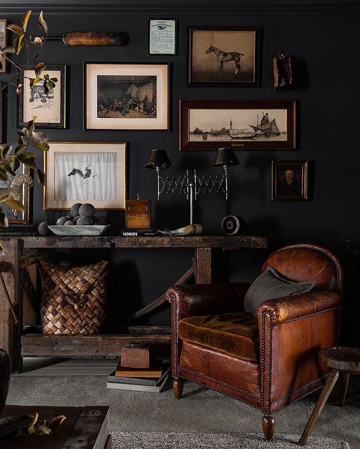
Start with a black wall and let the frames do most of the work, especially if you have old prints, horse sketches, small portraits, or anything that looks like it came from a trunk. Keep the spacing a little uneven, because a too-perfect grid can make this kind of room feel stiff. The leather club chair helps balance all that artwork, since its brown tone stops the wall from feeling flat.
Very important. I’d use one rough wooden console like this rather than a polished cabinet, because the worn surface gives you a place for books, a bowl, or a small lamp without making the room look too arranged.
Mix Gilt With Cast Iron
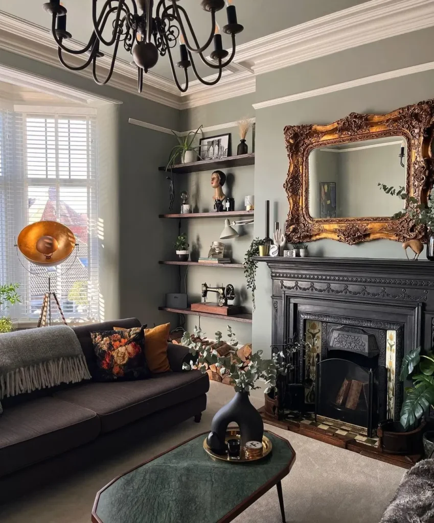
The gold baroque mirror over that black cast-iron fireplace is doing a lot of work here. Two very different eras, both a bit theatrical, sitting on a sage wall that stops them from shouting at each other. If you’re trying this at home, the trick is scale. The mirror needs to be almost as wide as the mantel, otherwise it looks apologetic. A smaller ornate frame would just read as an afterthought.
One thing I’d change. The gilt is heavy already, so I’d keep everything on the mantel matte and dark, the way it is here — no shiny brass candlesticks competing. Charity shop mirrors work well for this. Look for resin frames if real gilt wood is out of budget. Nobody can tell from the sofa.
Stone with painted shelves
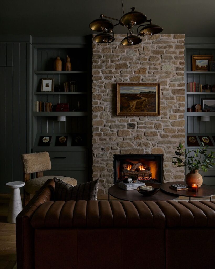
Start with the chimney breast. A pale, uneven stone like this gives you the cottage part straight away, and the dark painted shelving on both sides keeps it from turning rustic in a themed, overdone way. That contrast is the whole point.
Keep the wall color and built-ins in the same deep muted tone so the books, pottery and framed art sit back instead of shouting for attention. Then bring in one heavier piece in brown leather, preferably channel-tufted or ribbed, because the straight lines stop the stone from feeling too rough.
The low fire helps more than people admit. Even an electric insert can do the job if the surround looks convincing. I’d skip bright brass here unless it has some age on it, since the darker bronze ceiling light already covers that note.
Paint the Ceiling Too
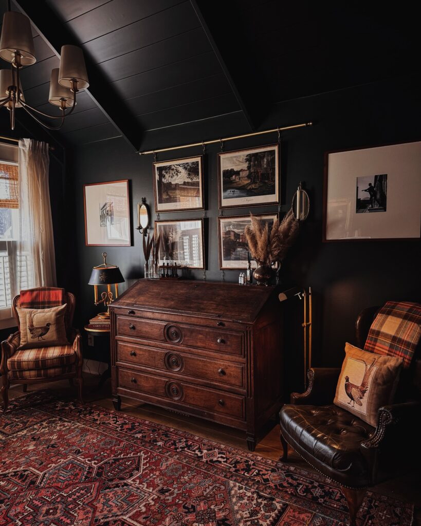
Most people stop at the walls. Painting the ceiling the same near-black shade is what makes a room feel fully committed rather than halfway there — you can see it here, how the sloped ceiling just disappears into the walls and pulls everything downward toward the rug and the furniture. The brass chandelier reads warmer against all that dark than it ever would against white.
For the pieces, mix textures rather than matching sets: the tufted leather chair, the plaid wingbacks, the carved wood secretary all come from different eras and it doesn’t matter. I’d skip the pampas grass personally — it’s everywhere right now — but dried botanicals in a dark glass vase would do the same job with less fuss.
Dark Walls With Lanterns
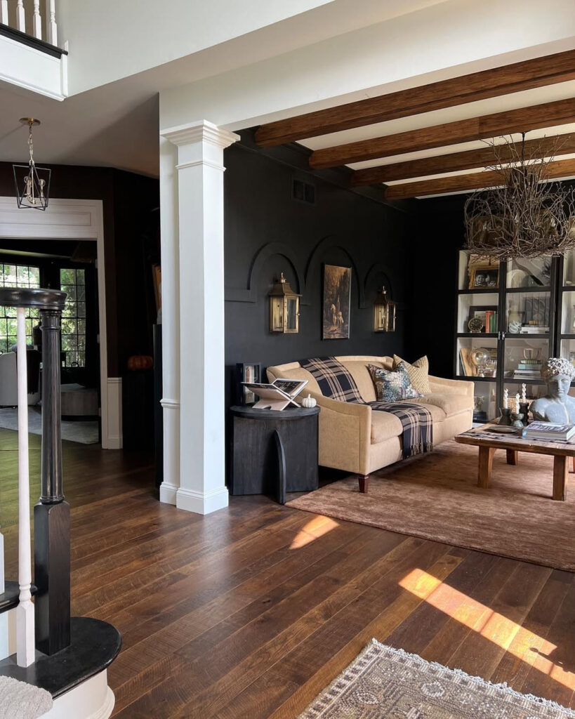
With a charcoal wall behind the sofa, the whole room starts to feel more old cottage than plain living room. Add lantern-style sconces on either side of a small framed print, and keep them a little higher than the sofa back so they look built into the wall, not randomly placed. The tan sofa matters here.
It stops the dark paint from swallowing every corner, especially when you add a plaid throw and a few patterned pillows. Keep the ceiling beams or wood furniture visible if you can, because that brown grain gives the black wall something to answer back to. I’d skip shiny metal lamps in this setup.
Too sharp. Use aged brass, black iron, or wood instead.
The Stacked Stone Fireplace
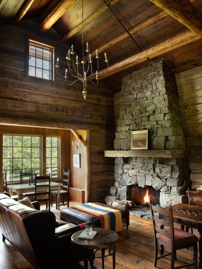
A floor-to-ceiling stone fireplace like this one is the whole room. Everything else just orbits it. If you’re building from scratch, ask your mason for uneven fieldstone rather than the flat cut stuff sold in panels — the lumpy, mismatched shapes are what make it feel old instead of new-pretending-to-be-old. The single slab mantel matters too. One thick piece of stone, not timber, keeps the whole thing quiet.
What I’d skip: the tiny framed picture propped on the mantel. On a wall this heavy, a small frame just looks lost. Leave the mantel bare, or lean something tall enough to hold its own against the stone. A dark oil painting, a big mirror with a tarnished frame. Let the fire do the talking below.
Black wall gallery
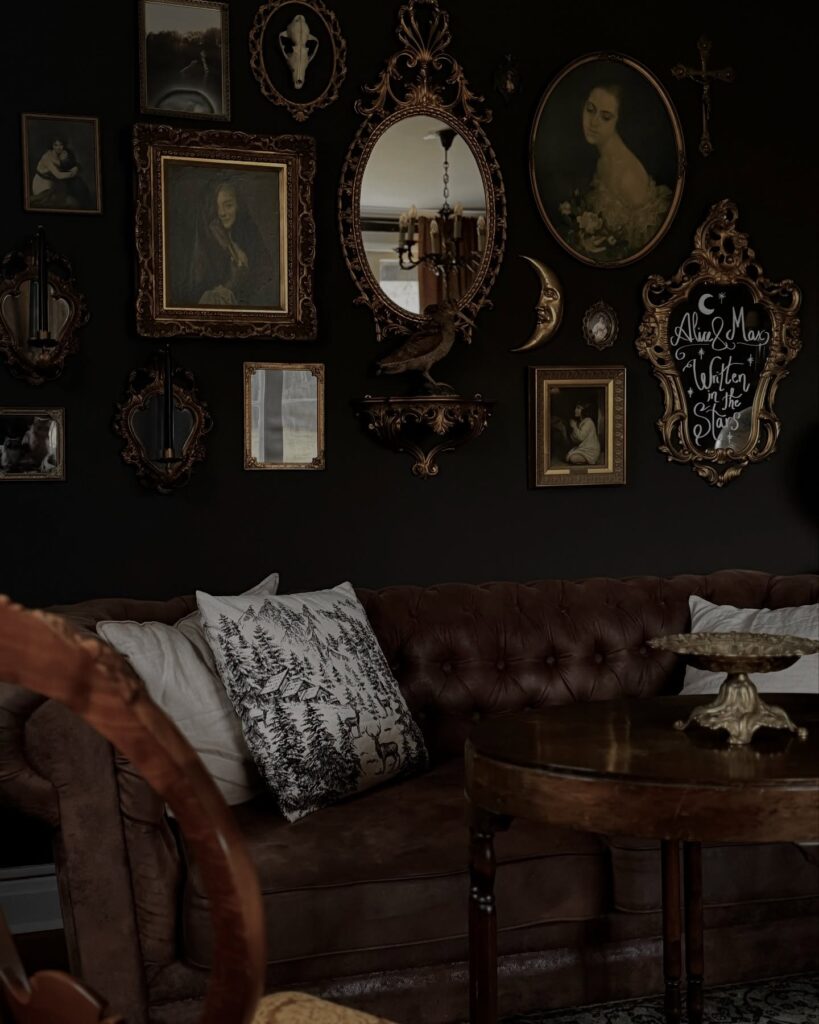
Start with the wall first. A flat black or near-black paint color makes all those gilt frames, small portraits, and odd little shapes like the crescent moon and cross read as one collected display instead of separate thrift finds fighting each other. Keep the art close together, and mix oval, square, and narrow vertical pieces so the whole thing feels layered rather than lined up.
Then bring in one heavy anchor. Here it’s the brown tufted leather sofa, which stops the wall from looking like stage set dressing and gives the room something plain and solid underneath all the ornament. The mirror helps too.
I’d skip anything too shiny. If every frame is bright gold, or the table is heavily polished, the room tips away from cottagecore and starts looking more formal than lived in.
Dark Walls With Exposed Ceiling Beams
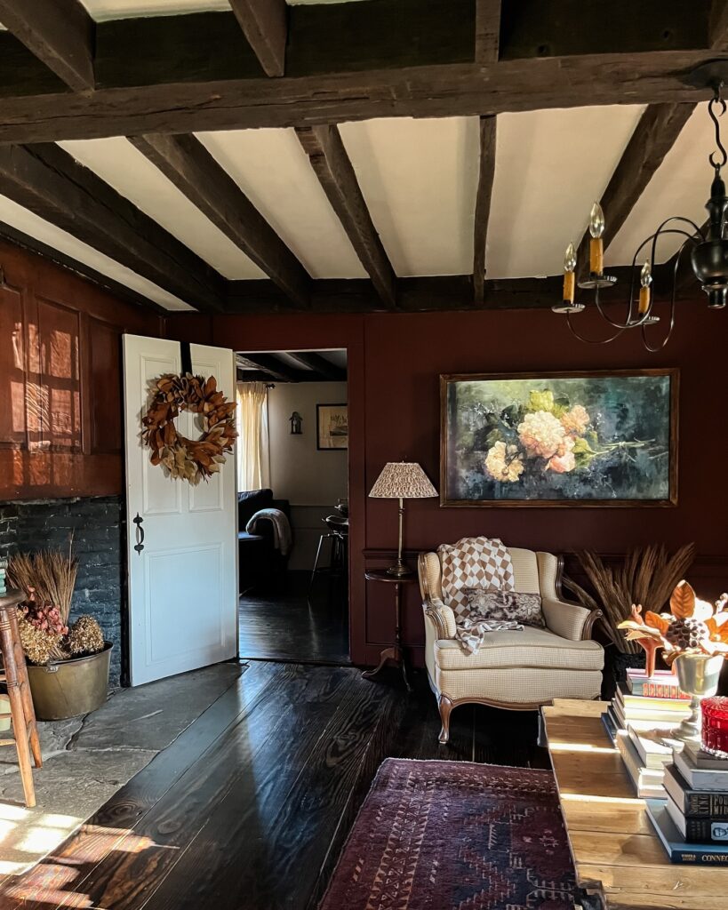
That deep oxblood red only works this well because the ceiling is doing something different — white plaster between dark wood beams pulls the eye upward and stops the room from feeling like a box. If your ceiling is plain drywall, paint the beams a near-black brown and leave the field white. Same contrast, less effort than sourcing actual timber.
The wingback chair here is in a small houndstooth, which is exactly the kind of pattern that doesn’t fight the wall color. Avoid anything with a lot of white or cool blue tones — they’ll look wrong against a warm dark red. A painting with a dark background, like the floral one here, sits almost flush with the wall color rather than jumping off it.
That’s the effect you want.
Red room lighting
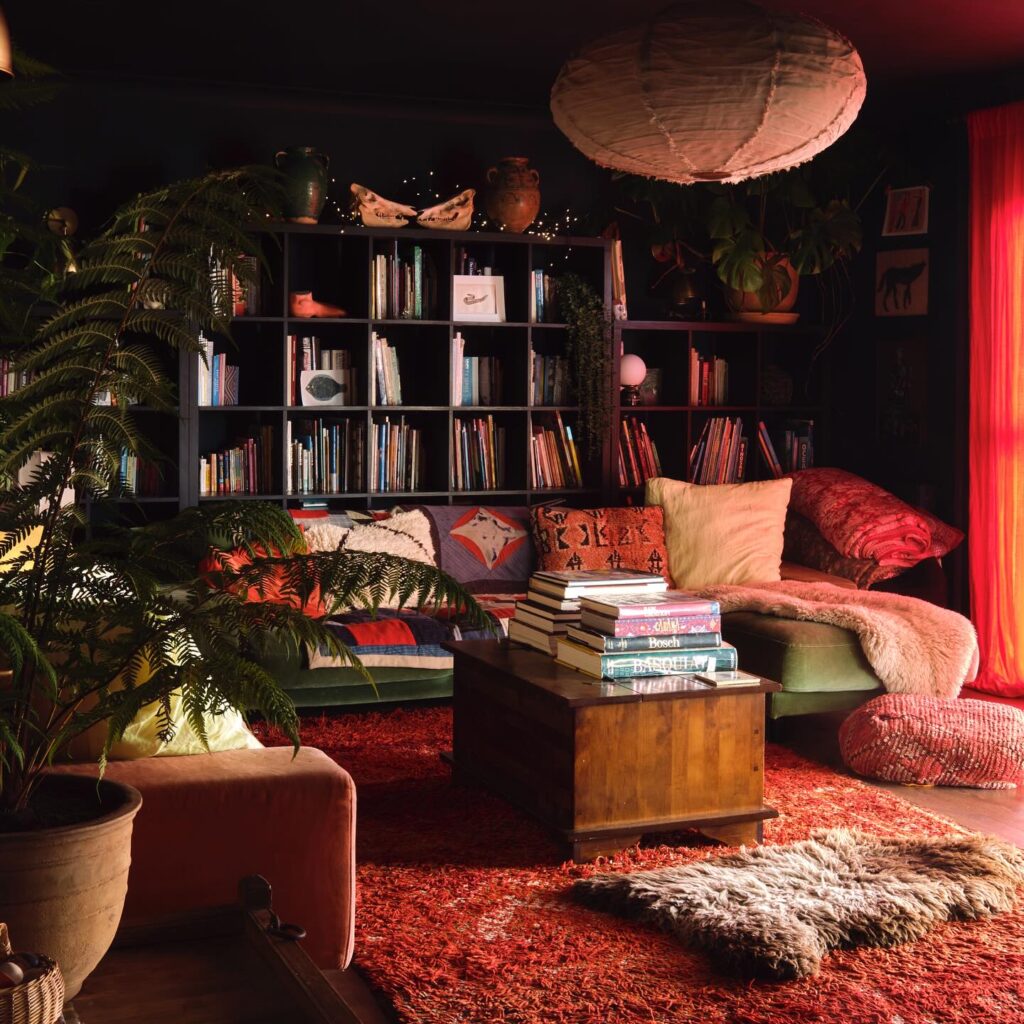
Start with the red curtain, because it gives the dark room its color before you buy extra decor. Keep it heavy. Against a black bookcase, even ordinary paperbacks and small pots start looking more collected, so you don’t need every shelf filled with antiques.
Leave some cubbies half empty. That big paper lantern is the trick I’d borrow, since it breaks up all the square shelving without adding another pattern. If your room is small, I’d skip the shaggy red rug and use one red runner instead; less dust, same idea.
Plants do the rest.
Build A Salon-Style Gallery Wall
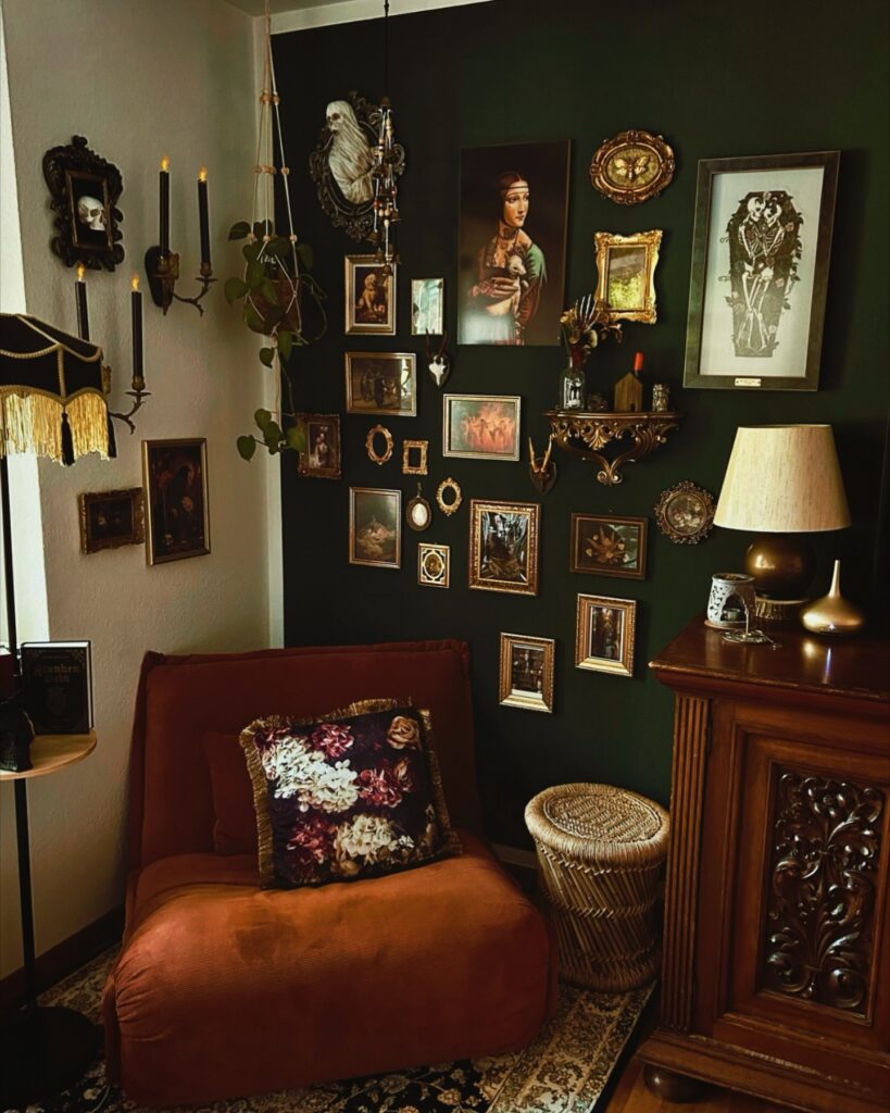
The wall behind the rust chair is doing the heavy lifting here. Portraits, tiny oval frames, a skeleton print, a little gilded shelf holding candles and curios — all packed close, no breathing room between them. That density is the point. A tidy grid would kill it.
Start with your biggest piece slightly off-center, then work outward with smaller frames in mismatched gold, black and brass. Mix subjects. Old portraits next to memento mori, a botanical beside something weirder. The shelf tucked into the arrangement is worth stealing — it lets you add objects without hunting for more art.
One thing I’d change: the plant trailing down feels like an afterthought against all that framed work. I’d move it to a corner where it can actually be seen.
Low beam fireplace wall
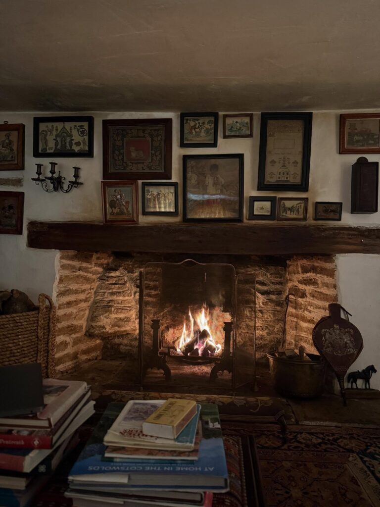
Start with the hearth. A deep stone fireplace with a thick, dark timber beam does most of the work here, because it gives the room weight before you add anything decorative. Keep the wall finish plain and slightly uneven if you can; dark cottagecore looks better with a bit of age showing rather than a perfect skim coat.
Then build upward with mismatched framed art, tucked fairly close to the beam and spread almost to the ceiling, so the whole wall feels collected over time instead of styled in one afternoon. Leave some pieces small. That helps.
A fire screen in black metal and a copper or brass log bucket are enough near the opening. I’d skip anything too polished. If your fireplace is fake, use stacked logs, a dark insert, and candlelight, but keep that heavy mantel line.
Stack the Shelves With Colour
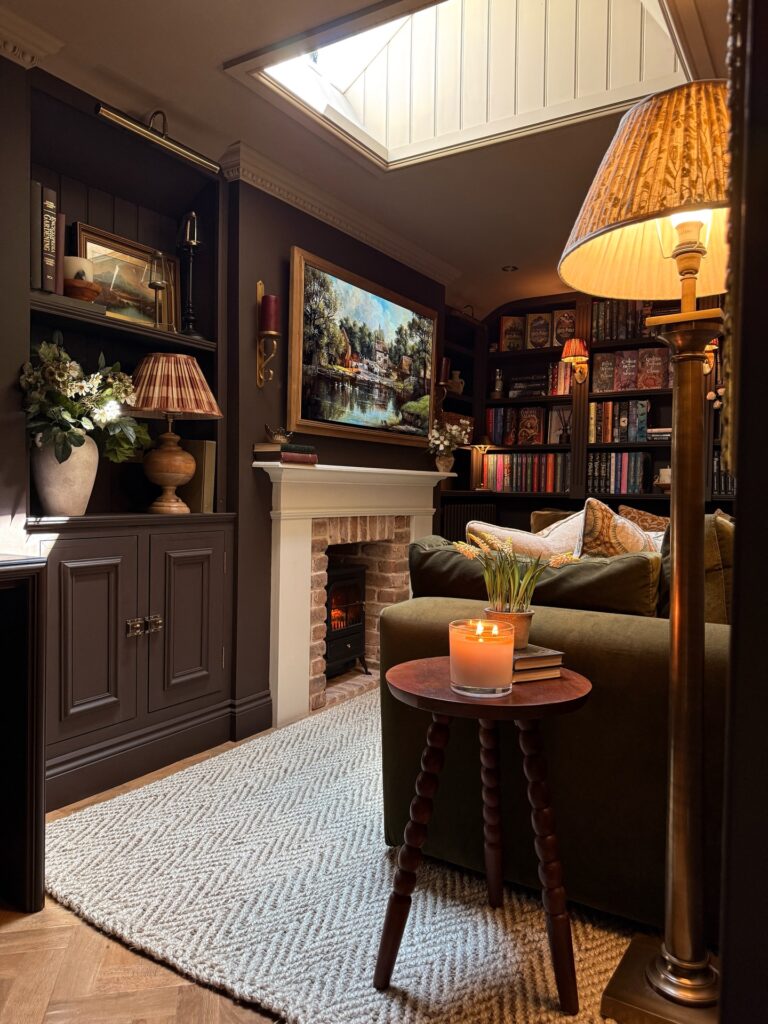
Those bookshelves work because the books aren’t treated as clutter — they’re the colour. Reds, burnt oranges, deep greens packed together across a full wall of dark shelving reads almost like a textile from a distance. If your collection is patchy, you can group by spine colour rather than author or genre, and it actually holds together better than you’d expect.
Cheap paperbacks with ugly covers face inward. The bobbin side table in the foreground is doing a lot — that dark turned wood against the olive chair keeps the whole corner from looking flat. One lamp at low height beats overhead lighting every time in a room this dark.
I’d personally skip the matching lampshade sets and let them be slightly mismatched instead. More considered that way.
Library Corner Seating
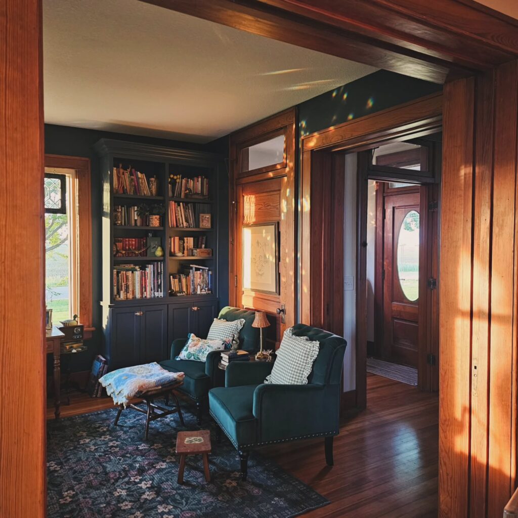
Paint the bookcase almost the same shade as the wall, then let the books do the work. Use lower cabinets if you can, because they hide paperbacks, chargers, throws, and all the small things that make open shelves look messy after two weeks. Keep the rug low.
Two deep green chairs work better than a sofa here, especially near a doorway, since they leave a path open and still give you a proper reading spot. Add one small table between them for a lamp and a stack of books, not a whole tray setup. I’d skip shiny new hardware; dull brass or dark knobs sit better with old wood trim and stained glass light.