23 Gallery Wall Decor Ideas Designers Don’t Want You to Know
This site contains affiliate links. We may earn a small commission, at no extra cost to you. Article may contain some images for illustrative purposes only .
I’ve stared at my blank living room wall for three months now, telling myself I’d “figure it out eventually.” The problem isn’t lack of ideas, it’s having too many and zero confidence they’ll look good together. That massive expanse of white has become a daily reminder of my decorating paralysis.
If you’re nodding along, you’re not alone. Gallery walls have this reputation for being effortlessly chic, but actually creating one feels like solving a puzzle where all the pieces are different shapes and you’re not entirely sure what the final picture should look like.
The good news? There’s no single “right” way to do this. Whether you’re working with family photos, thrift store finds, or a mix of pretty much anything that speaks to you, these approaches will help you finally turn that intimidating blank space into something you’ll actually want to show off.
Eclectic Bistro Poster Mix
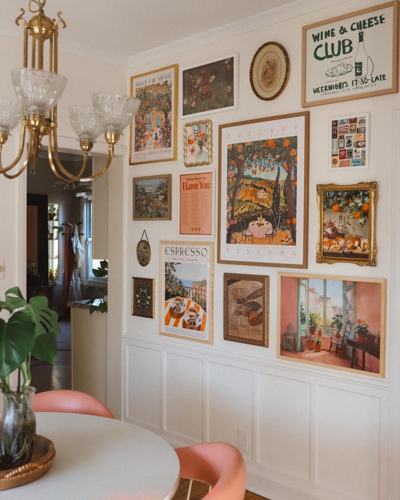
Warm, casual, and a little bit cheeky, a wall of food and travel prints makes a room feel like your favorite neighborhood café. I love how this setup mixes sizes and frames without trying too hard: bold “Tuscany” and “Wine & Cheese Club” posters anchor the wall, then smaller vintage-style pieces, oval plates, and a gilded still-life fill in the gaps. The secret is letting the colors talk to each other, oranges, greens, and creamy whites, so the whole thing feels collected, not chaotic. It’s especially good above wainscoting because the paneling acts like a built-in visual border.
Mix Vintage Plates for Old-World Charm
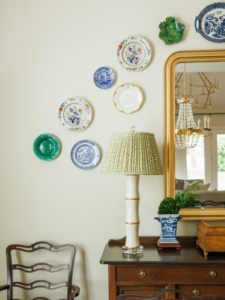
My grandmother had a wall of plates in her dining room, and I never understood it as a kid. Now I’d hang them in every room if my husband let me. The trick is mixing patterns that shouldn’t go together but somehow do. Blue willow next to a cabbage leaf majolica, a gold-rimmed Limoges beside a chunky transferware. Cluster them loosely around a gilded mirror or above a wooden chest, letting the shapes wander instead of lining up. Hit estate sales and your grandmother’s china cabinet. Use those flat disc hangers behind each plate, and don’t overthink the arrangement. The slightly imperfect spacing is what makes it feel collected over decades, not bought last Tuesday.
Ceramic Leaf Plates as Art
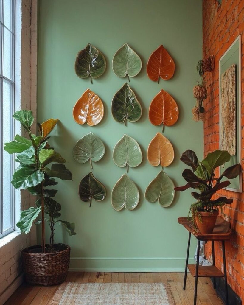
I picked up my first ceramic leaf plate at a craft fair three years ago, and now I can’t stop collecting them. These hand-shaped pieces work beautifully when you arrange them in a grid like this—the different glazes in sage green, burnt orange, and deep olive create this organic color story that changes with the light throughout the day. The glossy finish catches sunlight in the morning, which is honestly my favorite time to look at them. You can find them on Etsy or at local pottery studios (supporting small makers is a bonus). Mount them with plate hangers, and space them evenly for that gallery-worthy look. The texture variation between each piece adds depth that flat prints just can’t match.
Layered Botanical Metal Art
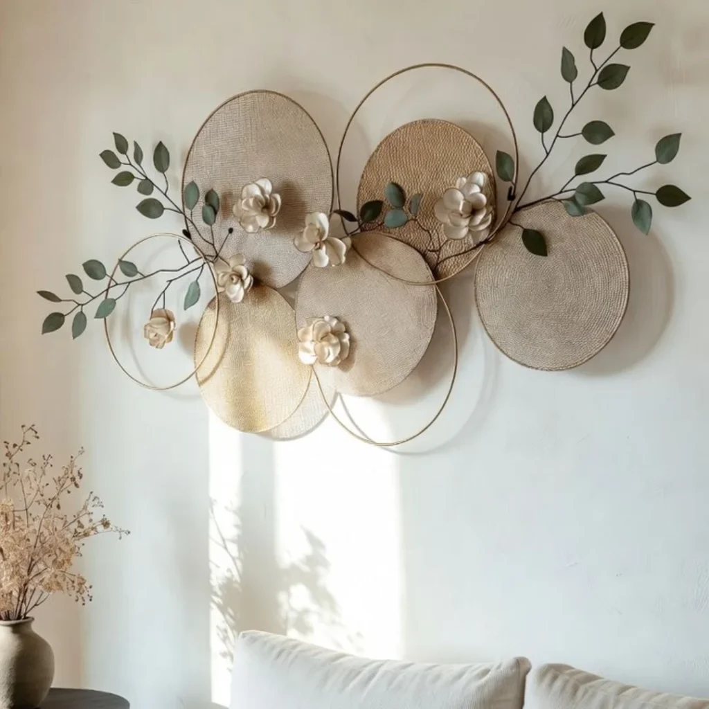
I love a gallery wall that feels airy instead of busy, and this layered metal arrangement gets that balance exactly right. The overlapping circles give it the rhythm of a collected gallery wall, but the soft woven textures, thin gold frames, and delicate branches keep it calm and quiet. Creamy ceramic-style flowers add just enough dimension without making the wall feel heavy. It works especially well in neutral rooms where you want interest without a loud color story. I’d use a piece like this above a sofa or console when I want the wall to feel finished, but still relaxed, organic, and full of light.
Quilt Panels as Wall Art
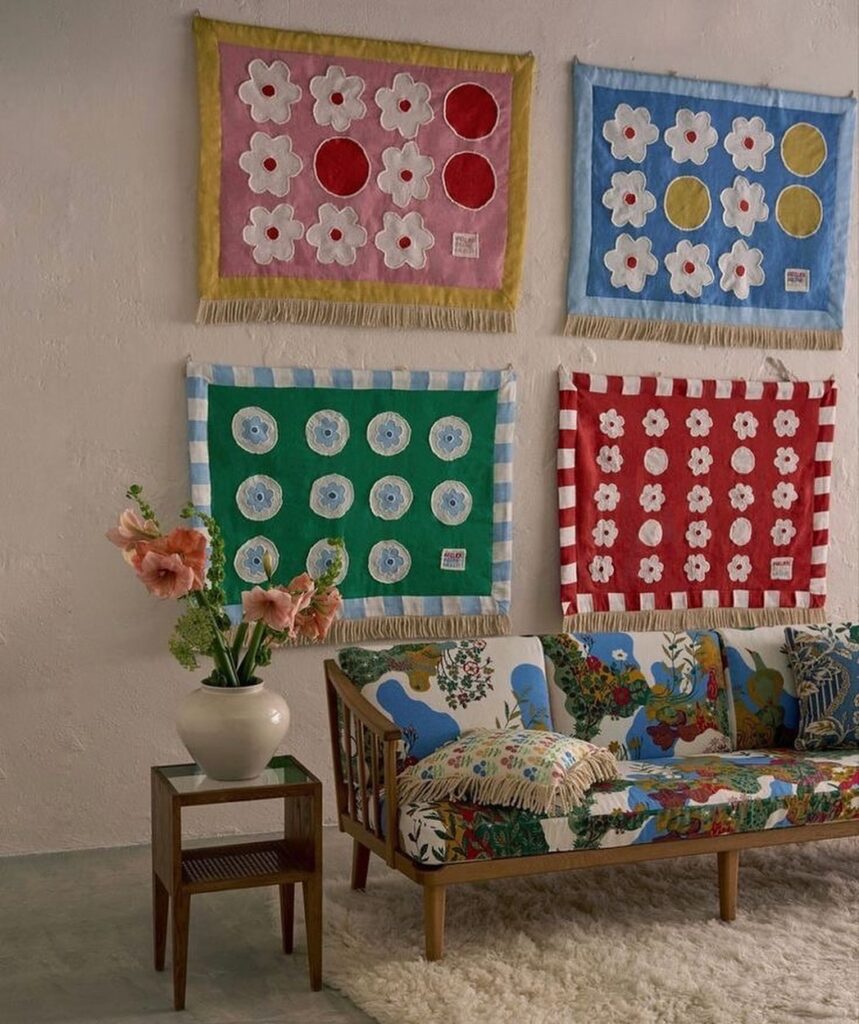
Hanging quilt-like panels in a tidy grid gives a gallery wall that feels warm, playful, and a little nostalgic. I love the mix of bold blocks of color with simple flower and dot motifs, plus the fringe along the bottom that adds soft movement when you walk by. In the photo, the four textiles act like oversized prints and they hold their own against a busy, patterned sofa, which is saying something. Keep the frames out of it and let the fabric edges be the “border.” It’s perfect for a cozy living room where you want art that feels lived-in, not precious.
Chain-Hung Botanical Prints on a Rod
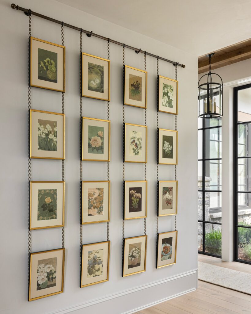
The first time I saw a setup like this, I genuinely stopped mid-sentence. Instead of nailing each frame to the wall, you mount a single brass or iron rod near the ceiling and let gold-edged botanical prints dangle from delicate chains in neat vertical rows. Mine ended up four across and four down in the dining nook, and the chains add this lovely old-library, conservatory-ish feeling that flat hanging just can’t match. Vintage flower illustrations work best here because the soft greens, blush pinks, and creamy backgrounds play nicely against the dark hardware. Bonus: swapping prints out seasonally takes about ten minutes since nothing’s actually drilled into drywall.
Seashell Wind Chime Wall Hanging
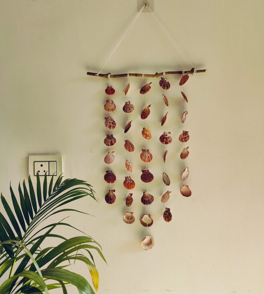
I made one of these after a beach trip left me with way too many shells, and it turned my bedroom into an instant coastal retreat. The setup is simple: a piece of driftwood or a thin branch hung horizontally with fishing line or twine, then individual shells strung at different lengths to create a cascading effect. The shells catch light differently throughout the day, casting subtle shadows that shift as the afternoon sun moves across the room. Mine makes the softest clicking sound when the AC kicks on or when I walk past. It works perfectly in corners that feel empty or above a bed where traditional framed art might feel too heavy. The best part is you can customize the spacing and arrangement to fit your exact wall dimensions.
Woven Basket Wall Cluster
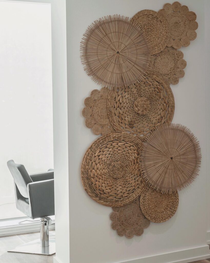
I love a gallery wall that leans warm and textural instead of framed and fussy, and a basket cluster does exactly that. Here, different woven pieces in mixed sizes overlap like a casual collage, which keeps the wall from feeling too stiff or symmetrical. The natural straw, rattan, and jute tones add softness against the plain white wall, and the round shapes echo each other in a really calming way. Some pieces have tight braids, others have airy spokes or scalloped edges, so the whole arrangement feels layered up close. It works especially well in a hallway, dining nook, or empty corner that needs character without adding visual clutter.
Sculptural Mini Mirror Grid
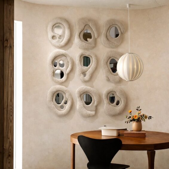
Nine small mirrors in a tidy grid can feel like wall art without needing frames or prints. I love the soft, organic shapes here, each one slightly different, with a chunky, textured edge that reads almost like handmade plaster. The irregular openings bounce light around in a subtle way, so the wall feels alive but still calm. Set against a warm, matte neutral wall, the whole arrangement lands somewhere between gallery wall and sculpture display. It pairs especially well with clean-lined furniture like a round wood table and a simple pendant, letting the mirrors be the main character.
A Flock of Birds in Flight
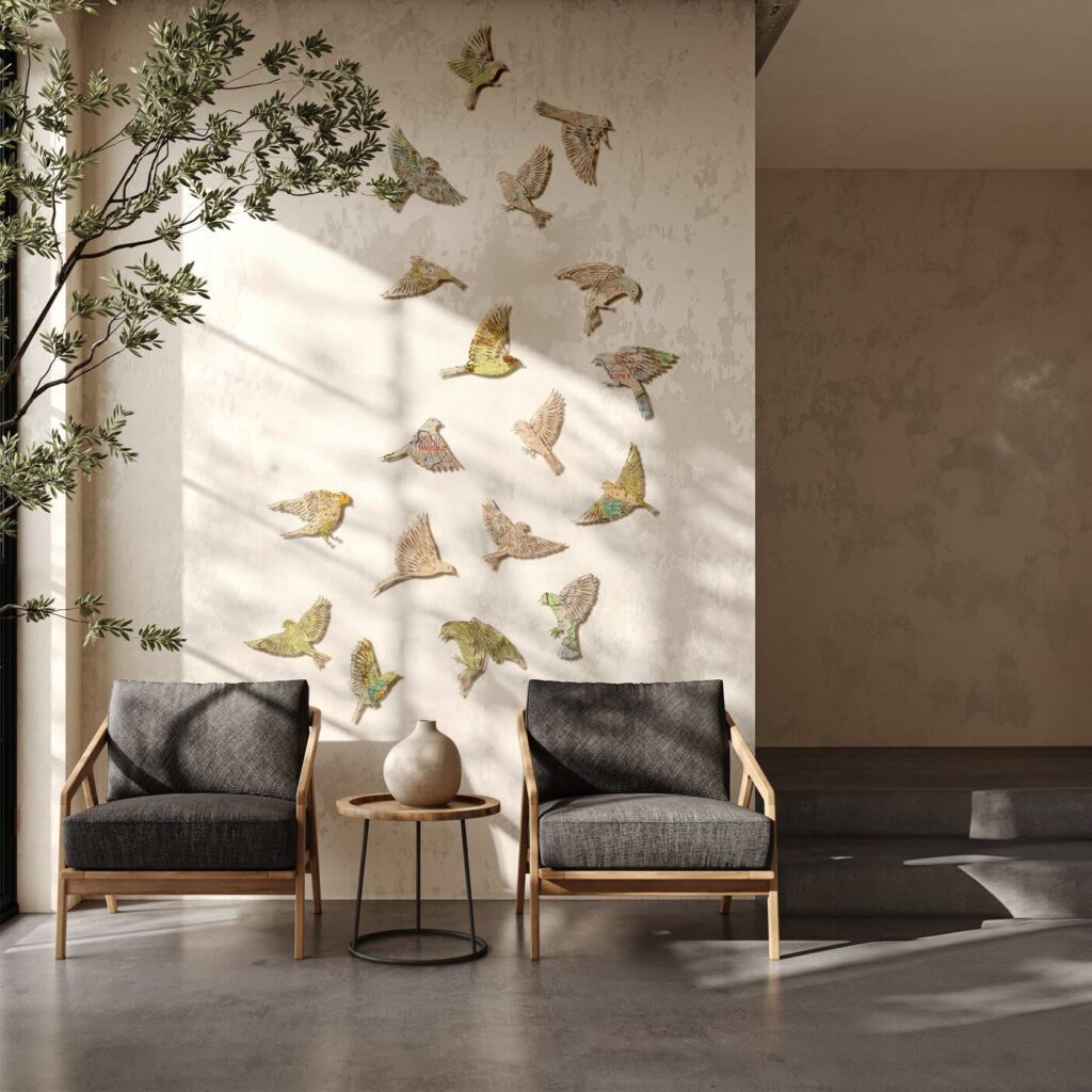
I stumbled across this idea while flipping through a friend’s design book, and it’s stuck with me ever since. Instead of framed prints, you scatter sculpted bird figures across the wall as if they’re mid-flight, swooping upward in a loose diagonal. The metal or wood birds catch the light differently throughout the day, casting little shadows that shift like the real thing. Pair it with a warm plaster wall, a couple of low chairs, and an olive branch nearby, and you’ve got something that feels less like decor and more like a quiet moment frozen in time. It works beautifully in entryways, reading nooks, or anywhere you want the eye to drift upward.
Vintage Trays as Wall Art
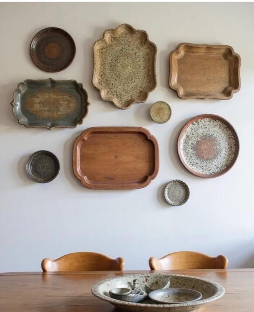
I started collecting old trays from estate sales and antique shops without any real plan, and one day it hit me that they’d look incredible on my dining room wall. The mix of wood tones, weathered metal, and different shapes creates this organic gallery that feels collected over time (because it was). I hung mine in an asymmetrical cluster above our table, mixing ornate brass pieces with simple wooden serving boards and a few ceramic platters with that speckled glaze I can’t resist. The patina on each piece tells its own story, and the varied textures catch light differently throughout the day. It’s functional art that I can actually take down and use when I’m hosting a big dinner party, though honestly, they look too good up there to move.
Oversized Botanical Cutouts
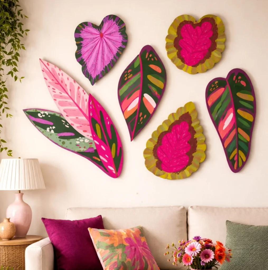
I love a gallery wall that doesn’t rely on frames, and these oversized painted leaves do exactly that. The mix of hot pink, plum, olive, and blush feels playful without looking childish, especially against a plain cream wall. Because each piece is large and organic in shape, the arrangement reads more like an art installation than a typical collage. I’d use this in a living room that needs color but not clutter. The soft sofa and simple lamp keep the wall from feeling too busy, while the floral pillow pulls the palette together. If you want a gallery wall with personality, handcrafted botanical panels like these feel fresh, bold, and a little unexpected.
Playful Prints, Clean Frames
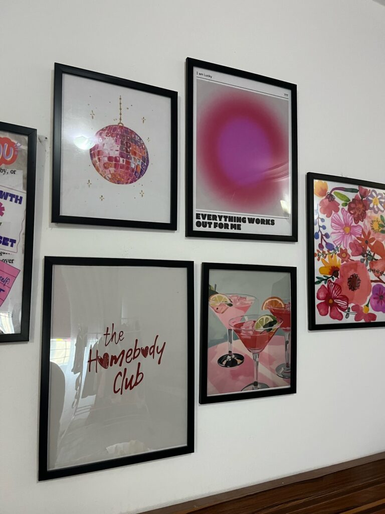
Black frames and bright, cheeky art is my favorite gallery wall cheat code because it looks intentional even when the prints don’t “match.” I love the mix here: a disco ball print for sparkle, a bold affirmation poster, a “homebody club” quote, and a set of pink cocktails that feels like a Friday night in. The white wall keeps it crisp, while the pops of magenta, coral, and watercolor florals add energy. Keep the spacing tight and slightly varied, like a casual grid, and let one larger piece anchor the whole cluster.
Woven Basket Cluster
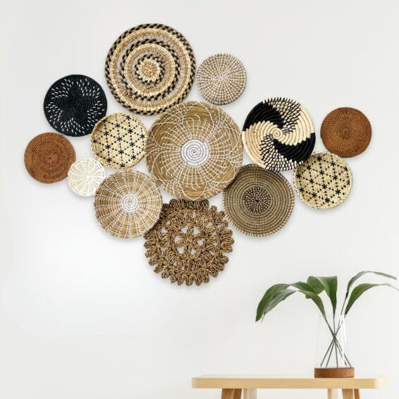
I stumbled onto this look at a friend’s place last summer and immediately copied it. A mix of woven baskets and flat seagrass plates arranged like a loose cloud on the wall. The trick is varying the sizes and tones, some deep black, some natural straw, a couple in warm cocoa brown, and one big statement piece in the center with a starburst pattern. The textures cast soft shadows when afternoon light hits them, which makes the whole grouping feel alive rather than static. It works beautifully above a console or sideboard, especially paired with a single trailing plant. Bonus: baskets are lightweight, so hanging them is genuinely a one-person job with small nails.
Gradient Chain Link Wall Sculpture
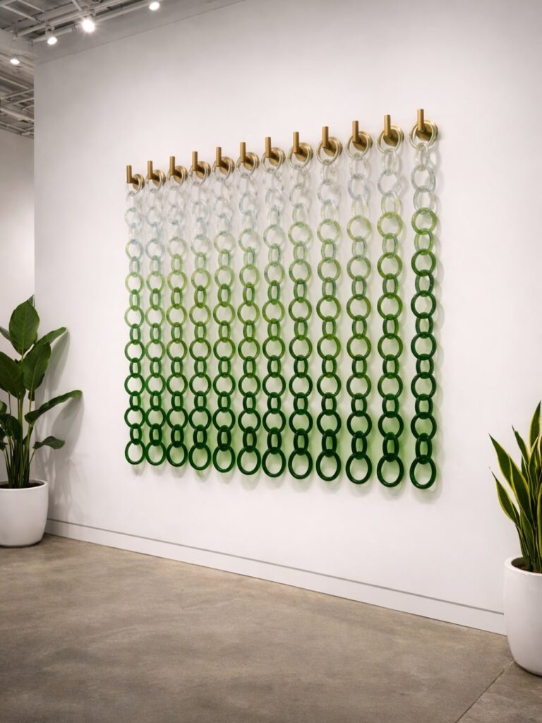
I’m obsessed with how this installation takes something you’d typically see on a hardware store shelf and turns it into actual art. The chains hang from brass pegs in perfect vertical rows, and here’s the genius part: they fade from clear at the top to deep forest green at the bottom. It’s like watching color dissolve down the wall. The ombre effect is so smooth you almost don’t notice where one shade ends and the next begins. What gets me is the movement potential. These aren’t rigid pieces locked in place. They can sway slightly, catch the light differently throughout the day, and create these interesting shadows on the wall behind them. The brass mounting pegs add a warm contrast against the cool greens, and the whole thing has this unexpected elegance that makes you rethink what gallery walls can be.
Earth-Tone Circle Grid
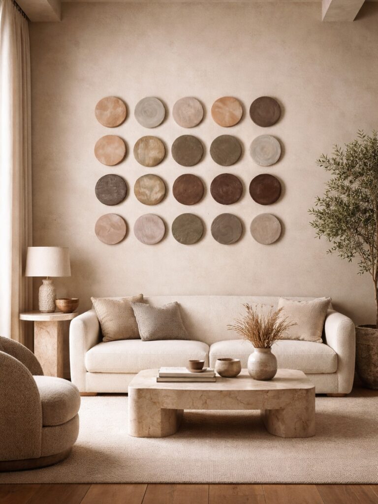
A gallery wall does not have to be a mix of frames and prints to feel layered. I love how a tight grid of round wall pieces brings in rhythm without making the room feel busy. The soft clay, sand, taupe, and cocoa tones here echo the sofa, stone coffee table, and woven textures, so the whole space feels calm and collected. The circular shapes also loosen up all the straight lines from the couch and table. If you want a gallery wall that reads subtle rather than loud, this is such a smart direction. Keep the spacing even, stick to a restrained palette, and let texture do the heavy lifting.
Gilded Hearts and Sunbursts
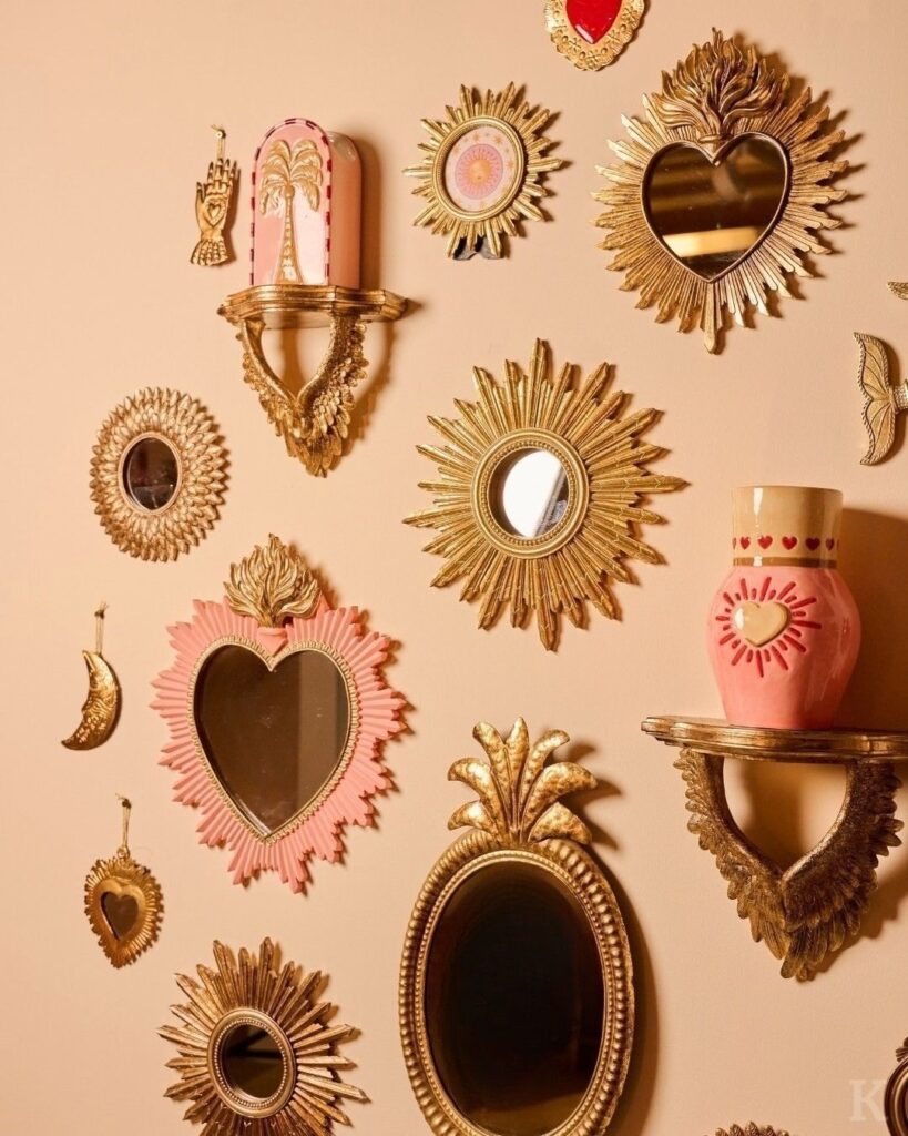
Gold-framed hearts and spiky sunburst mirrors give a gallery wall that antique-shop sparkle, like you’ve collected little treasures over time. I love mixing a few sizes so the wall feels playful instead of matchy, then tucking in tiny charms or mini plaques to fill the awkward gaps. The warm metallic finish bounces light around the room, especially at sunset, and the heart shapes keep it from feeling too formal. Pair it with a soft blush or creamy wall color and it turns into a cozy, romantic corner that still feels grown-up.
Capiz Shell Statement Frame
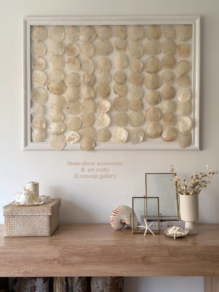
I stumbled on a capiz shell wall piece at a coastal market last summer, and it’s been my favorite gallery anchor ever since. The translucent shells catch afternoon light in this soft, milky way that feels almost lit from within. What I love is how the rows of overlapping discs create texture without shouting for attention. Pair it with a chunky white frame and style the console below with a conch, a few starfish, and dried botanicals in a creamy vase. The whole vignette leans coastal without going full beach-house cliché. If you’re working with neutral walls and oak furniture, this kind of organic, oceanic art feels collected rather than themed.
Arched Niche Display Wall
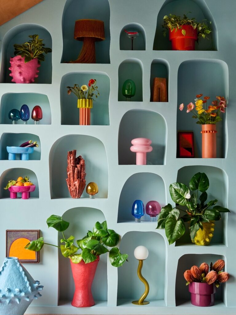
I’m obsessed with this approach because it feels like bringing Mediterranean architecture right into your living room. Instead of hanging frames, you’re creating dimensional alcoves that act as mini stages for each object. The soft, rounded edges give everything this organic, sculptural quality that flat walls just can’t match. Paint the back of each niche in different shades of sage, teal, or dusty blue to add depth. What really sells this look is the mix of heights and widths. Some niches barely fit a small vase, while others become proper display shelves. I love how it turns everyday objects into gallery pieces. A simple pothos plant or vintage candlestick suddenly looks intentional and curated. The shadows cast by the recesses add another layer of visual interest throughout the day as light shifts.
Plaster and Botanical Reliefs
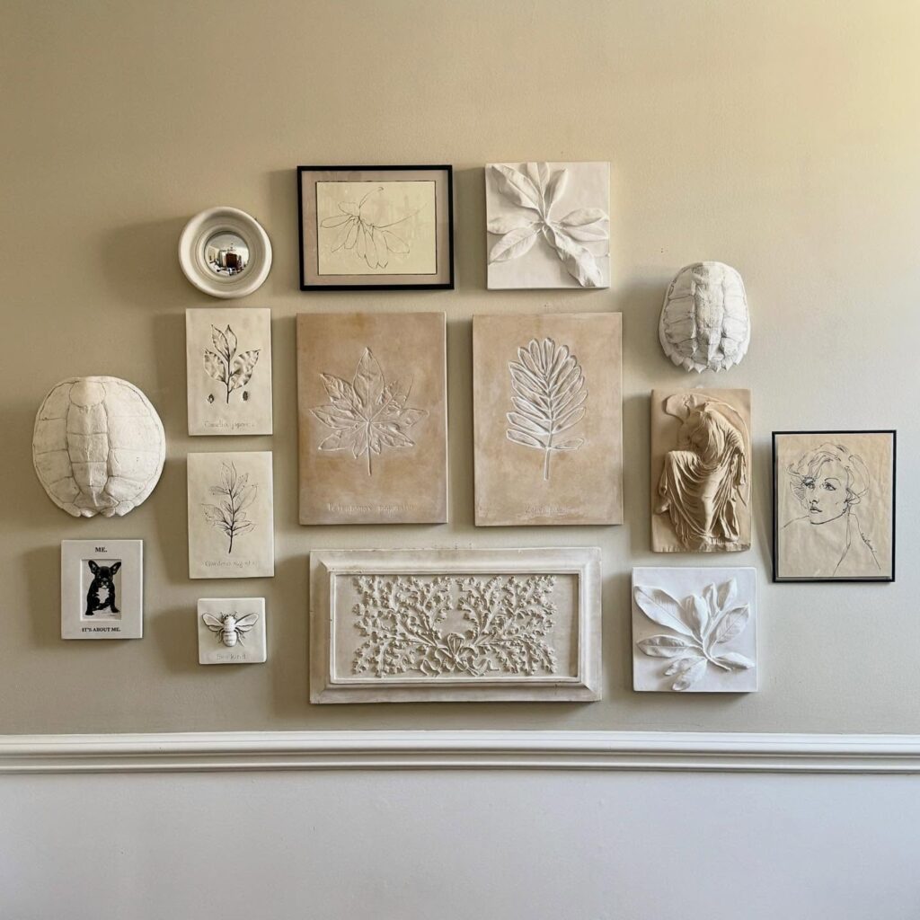
I love how a gallery wall like this feels collected without getting busy. The whole arrangement sticks to chalky creams, soft beige, and worn white, so the mix of pieces reads calm instead of crowded. Framed line sketches sit next to raised leaf plaques, carved panels, and sculptural forms that almost feel like found fragments from an old studio. There’s even a quirky little animal portrait tucked in, which keeps it from feeling too serious. The look works especially well on a warm neutral wall because every shadow and texture stands out. If you want a gallery wall with depth, this layered plaster-and-botanical mix feels quiet, earthy, and a little European.
Playful Art Over the Dining Table
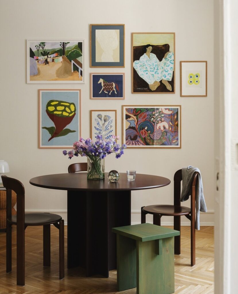
A gallery wall above the dining table sets the tone before anyone even sits down. I love the slightly offbeat mix here: a lounging portrait, a tiny horse, a bold botanical, and a couple of smaller graphic pieces, all in warm wood frames. The sizing feels collected, not matchy. Keeping the arrangement tight in the center makes the round table feel grounded, while the colorful art keeps the room from reading too formal. A simple vase of fresh stems on the tabletop ties into the painterly vibe and makes everyday meals feel like a mini occasion.
Woven Fiber Statement Piece
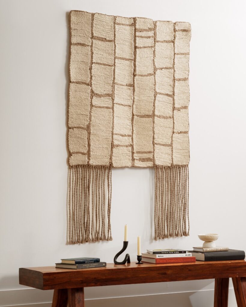
Sometimes a single oversized textile does what a dozen frames can’t. I fell hard for chunky woven wall hangings after seeing one in a friend’s entryway, and they bring this earthy, handmade warmth that feels collected rather than decorated. The piece in this photo has a grid-like structure with long fringed tails dropping below, and it pairs so naturally with a wood console, a few stacked art books, and a couple of sculptural candlesticks. If your gallery wall feels too busy or too symmetrical, swap a section for something fibrous like jute, raffia, or wool. The texture alone changes the whole mood, and you’ll get compliments every time someone walks in.
Playful Pop Art Gallery Wall
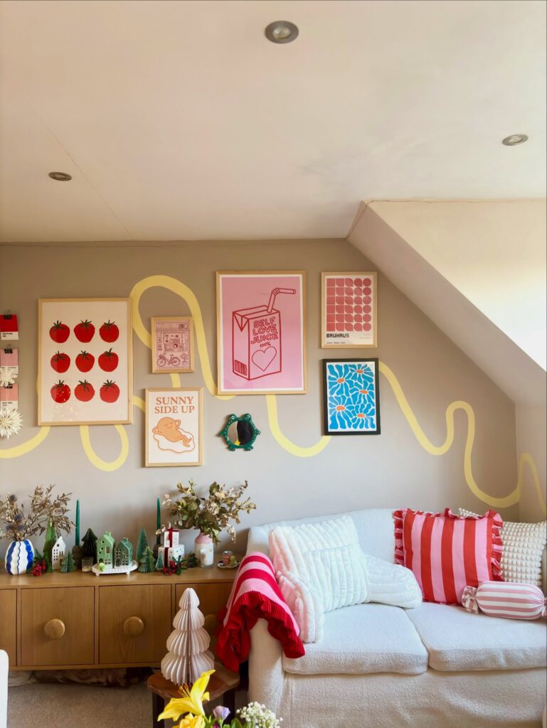
I’m completely obsessed with how this gallery wall brings serious personality to what could’ve been a boring slanted ceiling nook. The mix of graphic prints—those nine bright red tomatoes, the pink juice box with a straw, the retro calculator—feels like stepping into a cheerful diner from the 70s. That yellow squiggly line painted directly on the wall behind the frames? Chef’s kiss. It ties everything together without making the wall feel too structured. The color palette sticks to reds, pinks, yellows, and blues, which keeps it cohesive even though the prints are totally different styles. I love that they included a small vintage-looking wreath as a 3D element among the flat prints. It’s quirky without trying too hard, and perfect if you want your space to feel happy and lived-in rather than Instagram-sterile.