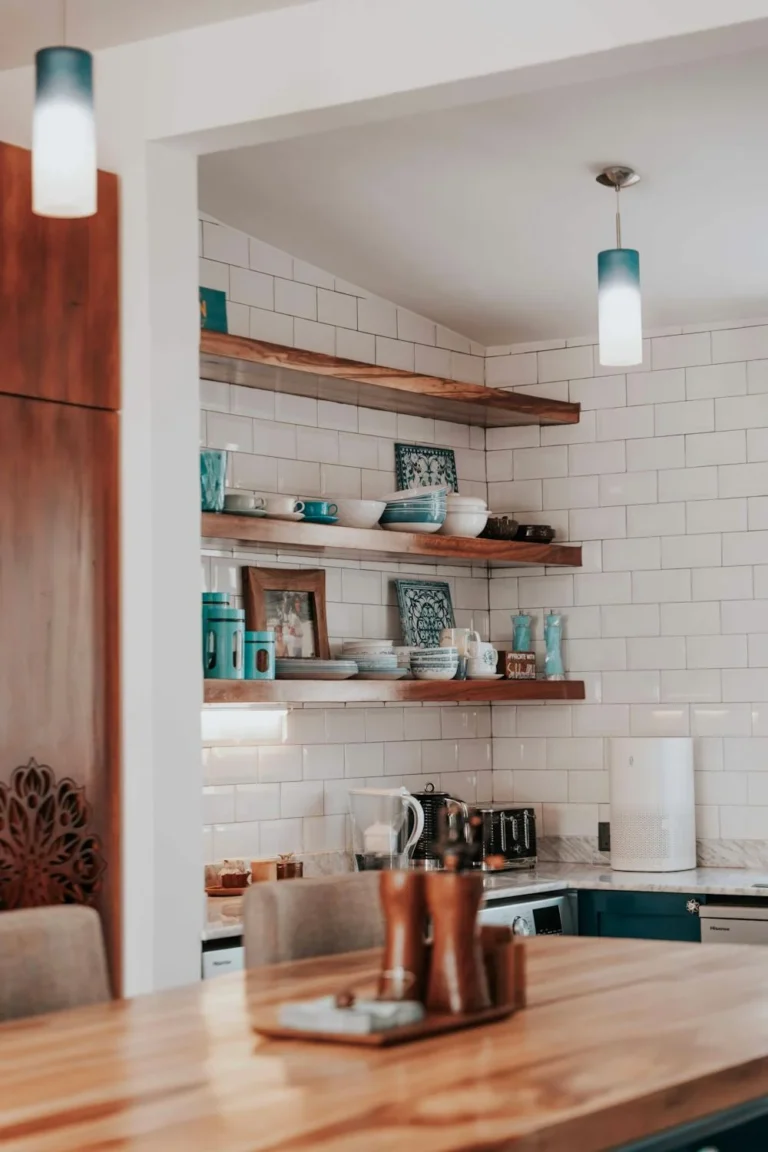
25 Kitchen Backsplash Ideas
This site contains affiliate links. We may earn a small commission, at no extra cost to you. Article may contain some images for illustrative purposes only .
This list has 25 kitchen backsplash ideas, and they are meant for different kinds of kitchens and different kinds of people. If you are planning a full remodel, use the list to compare options before you talk to a contractor. If you only want to change the wall behind the stove, look for something smaller and quicker to finish. Renters and anyone on a tight budget should watch for ideas that cost less and ask for less work. People who cook every day may care most about what is easy to wipe clean. Not every idea will fit your space. That is fine. Each one has its own image and a short note below it, so you can scan fast, save the ones you like, and skip the rest. Start at the top and work down, or jump to whatever catches your eye.
Blue Floral Ceramic Tiles
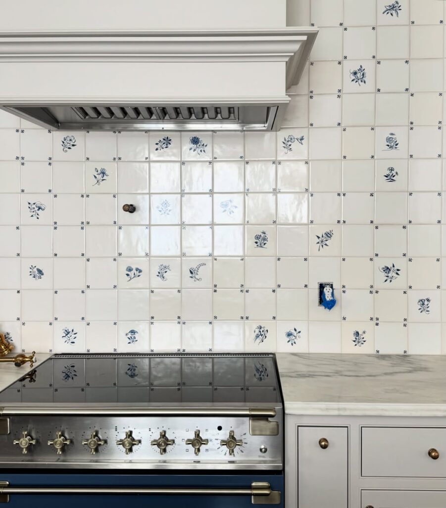
Blue floral ceramic tiles work for cooks who want the backsplash to carry pattern without adding another color across the room. Small flower designs scattered over white squares pair with painted cabinets, stone counters, and brass hardware. The surface has plenty to look at, so it may feel busy beside patterned floors or crowded shelves.
Anyone after a plain kitchen should choose solid tile or a slab.
Blue and White Tile Mural
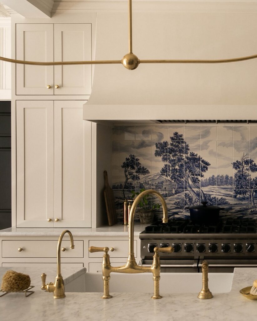
Plan a blue-and-white tile mural around the range before ordering, since a misplaced cut can take out a tree or leave the landscape awkwardly cropped. Dry-lay the full scene, mark the hood and counter lines, and check where outlets will land before any tile goes on the wall. Choose grout close to the pale background so the joints do not break the drawing into a grid.
Hand-Cut Mosaic Mural
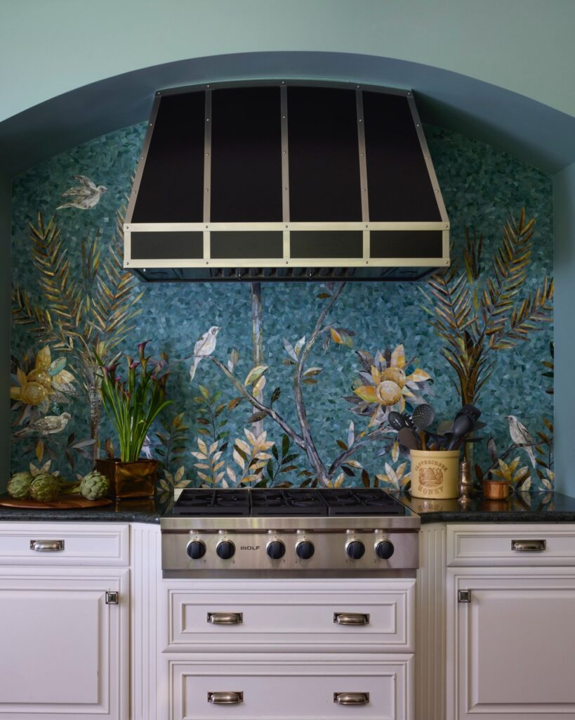
A mural like this one is built from small pieces of stone or glass, cut into slivers and set one by one in a pattern. Here the background is a mix of teal and green chips, and the birds, palm fronds and sunflowers are made from paler, warmer pieces in cream, gold and gray. Because the picture is only as wide as the space behind the range, the mosaic fills the whole arch and stops at the counter.
A custom mosaic like this takes a specialist, so it’s a big commitment. If that’s out of reach, I’d look for a printed or hand-painted tile panel in a similar blue-green, set behind the cooktop only, and use plain tile for the rest of the wall.
Botanical Tile Centerpiece
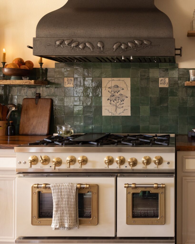
At the range, a pale botanical panel interrupts the run of dark green square tile and gives the backsplash a center. The flowers and border sit on a light ground, so the design stays legible against the glazed field around it. Smaller pale tiles with matching leaf drawings carry the motif farther along the wall without competing with the larger panel.
The green tiles have uneven faces and slight shifts in tone, which keep the broad areas from looking flat. That texture matters because the decorative panel is a single focal point rather than a repeating print. Without it, the backsplash would become an uninterrupted block of green, and the stove wall would have less definition. Keep the panel near the cooking area, where it relates to the range, and leave enough plain tile around it for the artwork to remain clear.
Cream Herringbone Tiles
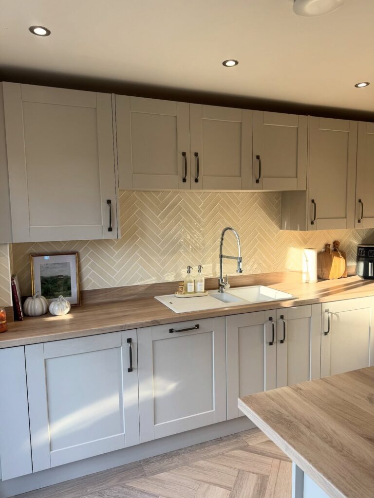
Run cream herringbone tiles from the worktop to the underside of the wall cabinets, including behind the sink. Along a long stretch of cabinets, the angled pattern adds detail without a second colour. Use it beside wood worktops for less contrast than you’d get with bright white tile.
Glazed Cobalt Tile Behind the Range
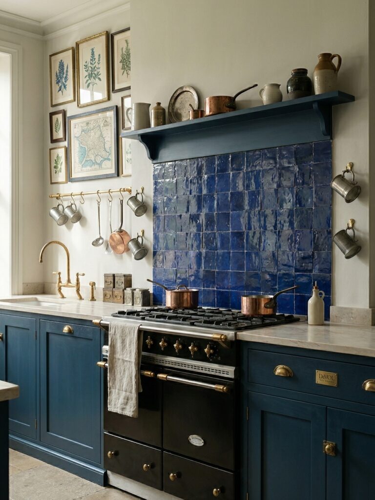
Handmade glazed tile in a deep blue works best when you pick the cabinet color first and the tile second. Hold a sample against the painted door in daylight and again at night, since the glaze shifts a lot under different light.
Lay out a few loose tiles on the counter before you commit. The glaze pools and varies from piece to piece, so mix tiles from several boxes as you set them, and don’t let a darker batch gather in one corner. Keep the grout line narrow and close to the tile’s own tone. I’d end the tile at a shelf, with a plain painted wall above it.
Pale Blue Herringbone
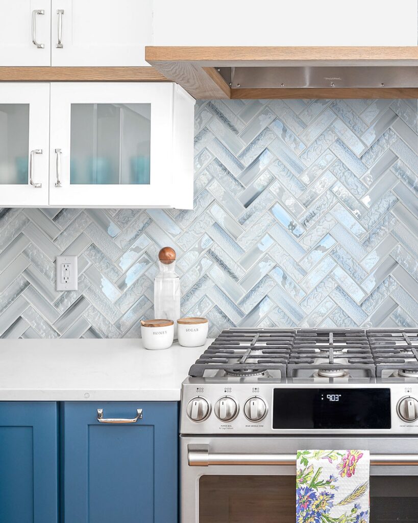
Narrow glass rectangles set in a herringbone pattern make a backsplash with plenty of movement. Their pale blue-gray color stays close to the white cabinets and counter, while the varied sheen and surface texture catch light across the wall.
A larger version of the same tile would give the pattern more open space and cut down on grout lines. That change makes the zigzag easier to read from across the kitchen, with less fine detail around the range. A mid-size format would preserve the direction of the pattern while leaving the wall less intricate. Smaller pieces, by contrast, make subtle shifts in color more noticeable. I’d keep the blue muted across a broad wall, since a stronger shade would draw more attention than the cabinets and range.
Onyx Look Tile Backsplash
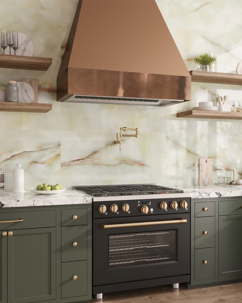
Run large onyx-look tiles from the counter to the ceiling, with thin grout lines that let the veining stand out. Before setting them, lay out the full pattern and check where each vein meets the next tile. That dry layout matters most, especially around the range, where breaks in the pattern will be easy to spot.
Vertical Stacked Ochre Tile
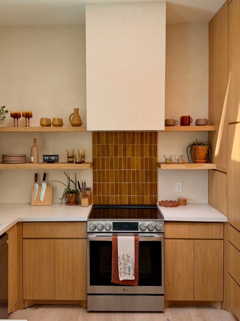
Narrow glazed tiles set in a vertical stack, kept to the space between the countertop and the range hood, give a kitchen one strong color without taking over the room. The glaze is uneven from tile to tile, shifting between honey and rust, which gives a flat wall some depth.
This is right for anyone with light walls, pale counters, and wood cabinets who wants the backsplash to be the one thing the eye lands on. It also works well if your hood is a plain plaster box, since the tile fills the gap beneath it.
If you want a backsplash that disappears, pick a different idea from the list. A saturated color like this stays visible every day. It’s also a poor match for cool gray cabinets or a blue-leaning white, where the amber will clash instead of settle in. And if you’re likely to repaint or redo the kitchen in a few years, I’d pick something quieter.
Blue-and-White Patterned Tile
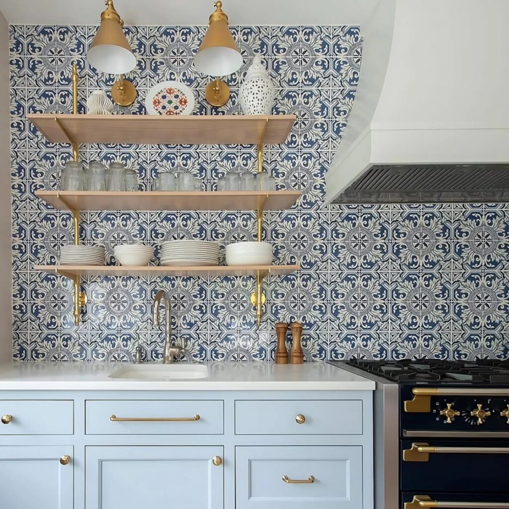
A larger-scale blue-and-white motif gives this backsplash a calmer rhythm than tightly repeated, intricate tiles. Each design has more space around it, so the wall feels less busy even when tile covers the full run behind the counter. The blue stands out against pale cabinets, while the white parts tie in with the countertop and dishes.
Carry the pattern across both the sink and cooking area rather than stopping at a short splash zone. An unbroken field lets open shelves sit against the tile without making the wall feel crowded. With a larger motif, grout lines draw less attention, but cuts at corners and around outlets become easier to spot, so plan the layout before installation. Brass shelf supports and lights add small notes of color without competing with the pattern.
Patterned Tile Behind the Range
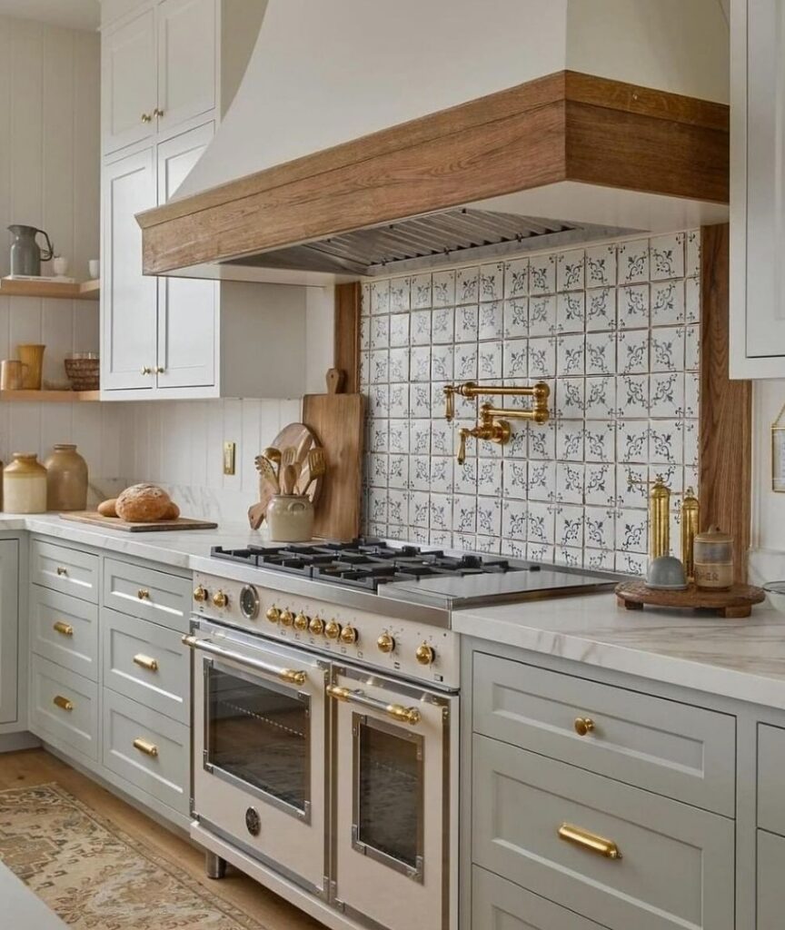
Run small patterned tiles from the back of the range to the underside of the hood, rather than across every wall. This gives the cooking area its own border in a kitchen with plain cabinets. Wood trim along the sides frames the pattern without adding another tile design.
Vertical Stacked Taupe Tile
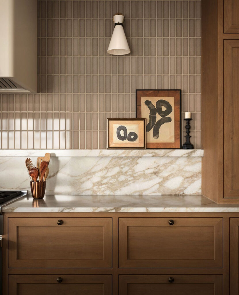
Narrow rectangular tiles set upright in a straight stack, with no offset between rows, give a wall a ruled, paper-like look. These look like glazed ceramic in a muted taupe, and the grout is a close match, so the color stays even and the glaze does the talking. Each tile is about one inch wide and a few inches tall.
If you can’t find a tile this slim, standard subway tile turned on its end and stacked works well. Pick a grout within a shade of the tile. I’d run the tile up to the hood and stop the stone slab at a ledge, as here, so the art and candlestick have somewhere to sit.
Pale Vertical Tile
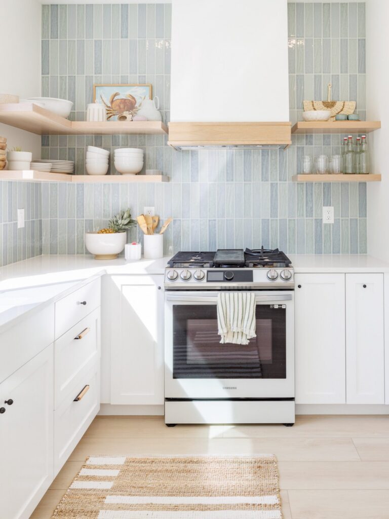
Narrow, vertically set tiles give this backsplash a different rhythm from the usual horizontal subway layout. The pale blue-gray glaze shifts slightly from tile to tile, so the long runs do not look like a flat sheet of color. That variation matters: without it, the strong vertical lines could feel rigid, especially across a large wall.
The tile reaches from the counter to the shelves and range hood, where the light wood edges break up the field without cutting it into small sections. A soft mix of blue, gray, and green keeps the color quiet beside white cabinets and pale counters. I’d use narrow grout lines in a close shade so the seams support the vertical pattern rather than forming a second grid. This layout also draws the eye upward, making the backsplash feel taller than a horizontal arrangement would.
Patterned Tile Range Alcove
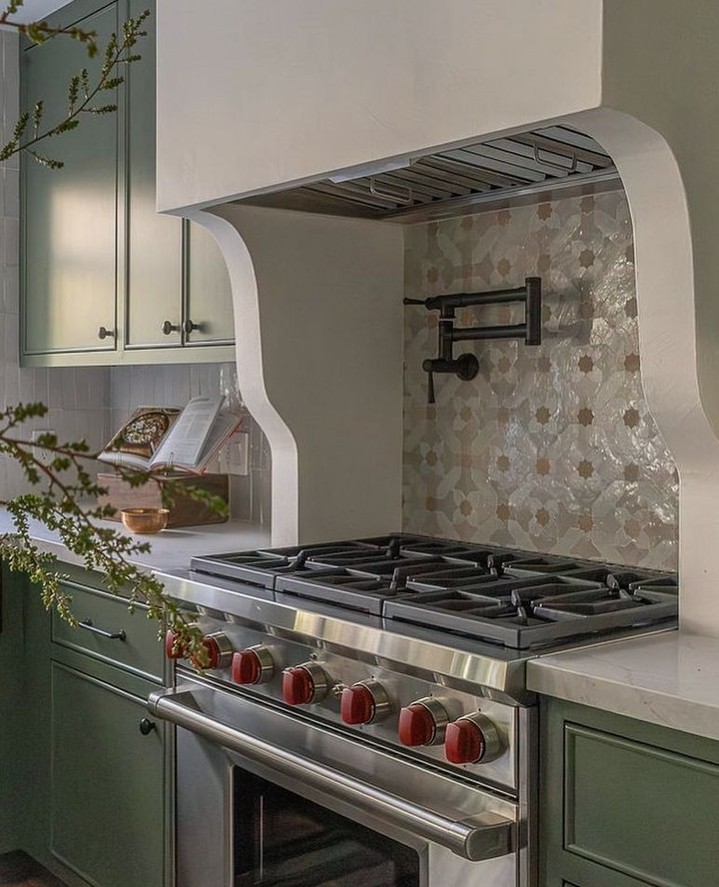
Run a small repeating tile pattern behind the range, with plain walls around the recess so the pattern has a clear stopping point. Cream shapes with tan centers give you detail without a sharp contrast, though even a pale pattern can look crowded if the cuts land badly.
Before setting any tile, lay out a full repeat and mark the center of the cooking area. Work outward from that line, checking the cuts at both sides and beneath the hood. Narrow slivers along a curved surround can distract from the pattern, so adjust the layout before committing.
With glossy tile, grout color needs a test board rather than a guess from a sample card. A close match lets the shapes connect; dark joints can break them into a grid. Choose a tile rated for backsplash use, and check its cleaning guidance, since grease will collect behind the burners.
Geometric Tile in Neutrals
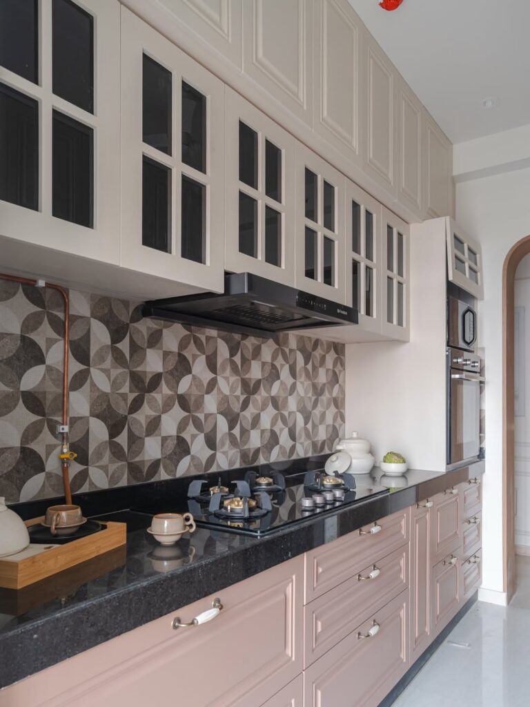
A patterned backsplash in browns, greys and cream works best in a galley kitchen like this one, where the cooking wall is the one you see first. The overlapping circle print runs from the counter up to the bottom of the hood, so it fills the one open stretch between the cabinets without needing anything else on the wall.
I’d pick this where the cabinets are plain and pale. Here the cream uppers and dusty pink drawers stay quiet, and the black granite counter picks up the darkest tiles in the print. If your counter is busy, use this tile somewhere else.
Gray Gingham Tile
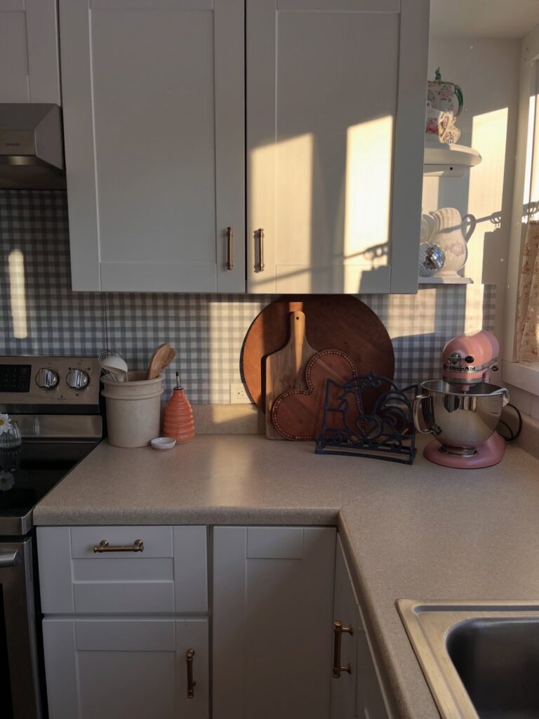
Small gray-and-white checks give the backsplash a clear pattern without making the narrow wall feel busy. The repeat sits between the counter and upper cabinets, forming a band behind the work surface rather than competing with the cabinet fronts. Its muted contrast matters: sharper black-and-white squares would draw attention from the wood boards and cabinet hardware, while a plain wall would let the pale cabinets and beige counter run together.
Use a fine check and grout close to the tile colors. Strong grout lines can turn each square into a separate grid and make the pattern feel harsher.
Sage and White Checkerboard
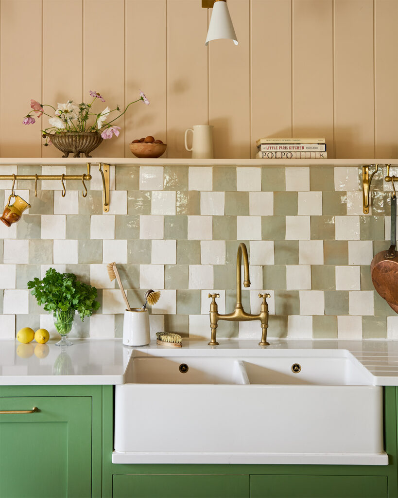
Alternate pale sage tiles with white squares for a checkerboard with less contrast than black and white. The green still gives the pattern a clear shape, but it lets a brass tap stand out rather than compete with a grid of dark squares.
Choose sage a few shades lighter than green base cabinets so the backsplash connects with them without becoming one solid band of color. A glossy finish adds another layer, since light catches the uneven tile faces and makes some squares look paler than others. Use pale grout to let the tile colors define the checks, rather than outlining every square.
Large Geometric Glazed Tile
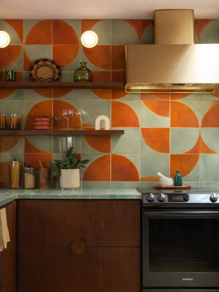
Big square tiles with a quarter-circle pattern cover the whole wall here, in burnt orange and pale sage green. Each tile is glazed, and the orange has a mottled, uneven finish that shows brushwork and variation from tile to tile. Rotating the squares so the curves meet is what makes the half and full circles appear across the wall. The sage also shows up on the countertop as small square tiles.
If you can’t get handmade tile, look for plain glazed squares in two colors and a pattern you can lay out by turning them. Pick a matte or satin glaze if you want some of the uneven look. I’d keep the grout close to the sage so the curves stay the focus.
Vertical Charcoal Tile
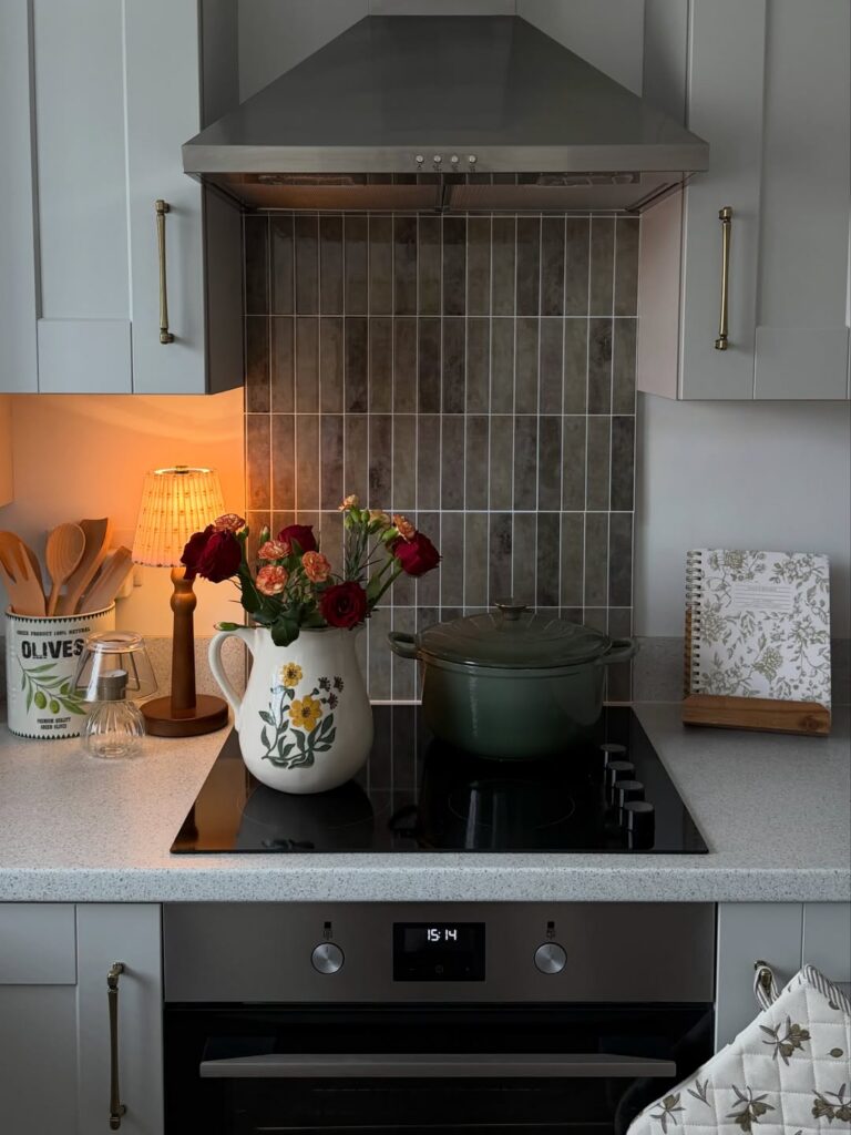
Narrow charcoal tiles set upright make a clear grid behind the range. This works for someone who wants the backsplash to stand apart from pale cabinets and counters. If your kitchen is already dim, or you prefer a quieter background, choose lighter tile with less contrast.
Patterned Tile Behind the Range
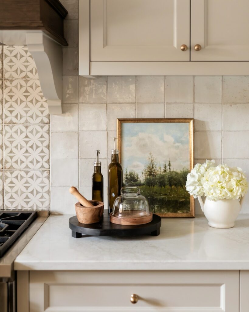
Pair a patterned panel behind the range with plain square tile nearby. Uneven thicknesses can leave a raised edge at the join, so compare samples before ordering. Match the grout color across both areas, and plan the layout so the panel ends on full tiles.
Pale Green Square Tile
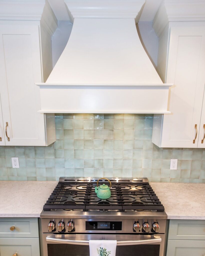
Square tiles with a glossy, uneven glaze look best when you pick the color before anything else is final. Take a sample home and hold it against the cabinet paint and the countertop in daylight, because green shifts a lot between a showroom and a kitchen.
Start the layout at the range, not at a corner. Mark the center line on the wall, then dry-fit a few rows so you can see where the cuts land under the cabinets and around the outlets. Centering the pattern on the hood keeps the cut tiles even on both sides.
That layout step matters most. Handmade-style tile varies in size, so I’d use a slightly wider grout line and pull tiles from several boxes as you set them.
Slim Multicolor Tile
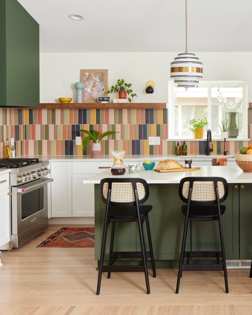
Between the counter and the wood ledge, slim vertical tiles run in close rows, with each strip carrying a different muted color. That narrow format gives the backsplash a steady up-and-down rhythm, while the mix of rust, green, blue, cream, and pink keeps the wall from settling into a single block of color. The wood ledge creates a clear stopping point above the tile, so the varied pattern stays contained instead of taking over the upper wall.
A limited palette helps the colors relate to one another; repeating a few shades across the full run also makes the design feel deliberate. A grout color close to the lighter tiles would keep the seams from competing with the strips. This approach adds color behind the range and sink without a large-scale pattern.
Garden Mosaic Backsplash
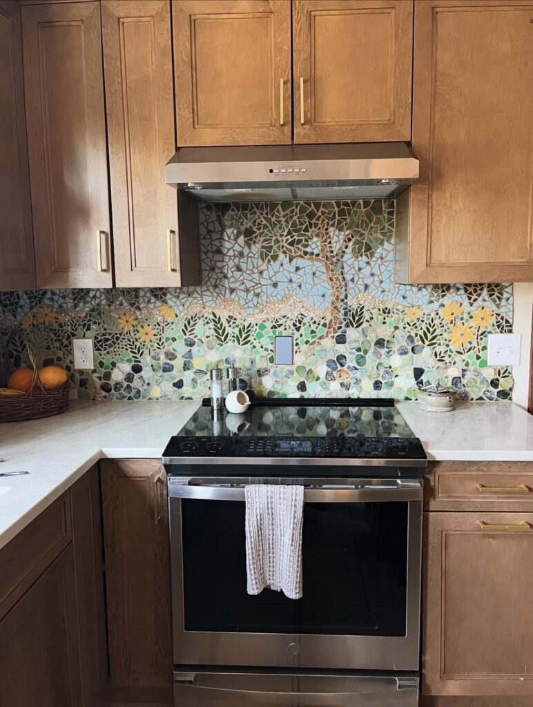
Build a garden mosaic around a few clear shapes, then fill the gaps with broken tile. A tree rising behind the range gives the small pieces a larger pattern to follow, while flowers spread along the counter instead of competing for the same spot.
Without those outlines, the mix of colors and fragments could look like a jumble rather than a garden. Leave enough contrast between the leaves, trunk, and background for each shape to hold together from across the kitchen; the tiny pieces should add texture without making the scene hard to follow.
Hand-Painted Tile Mural
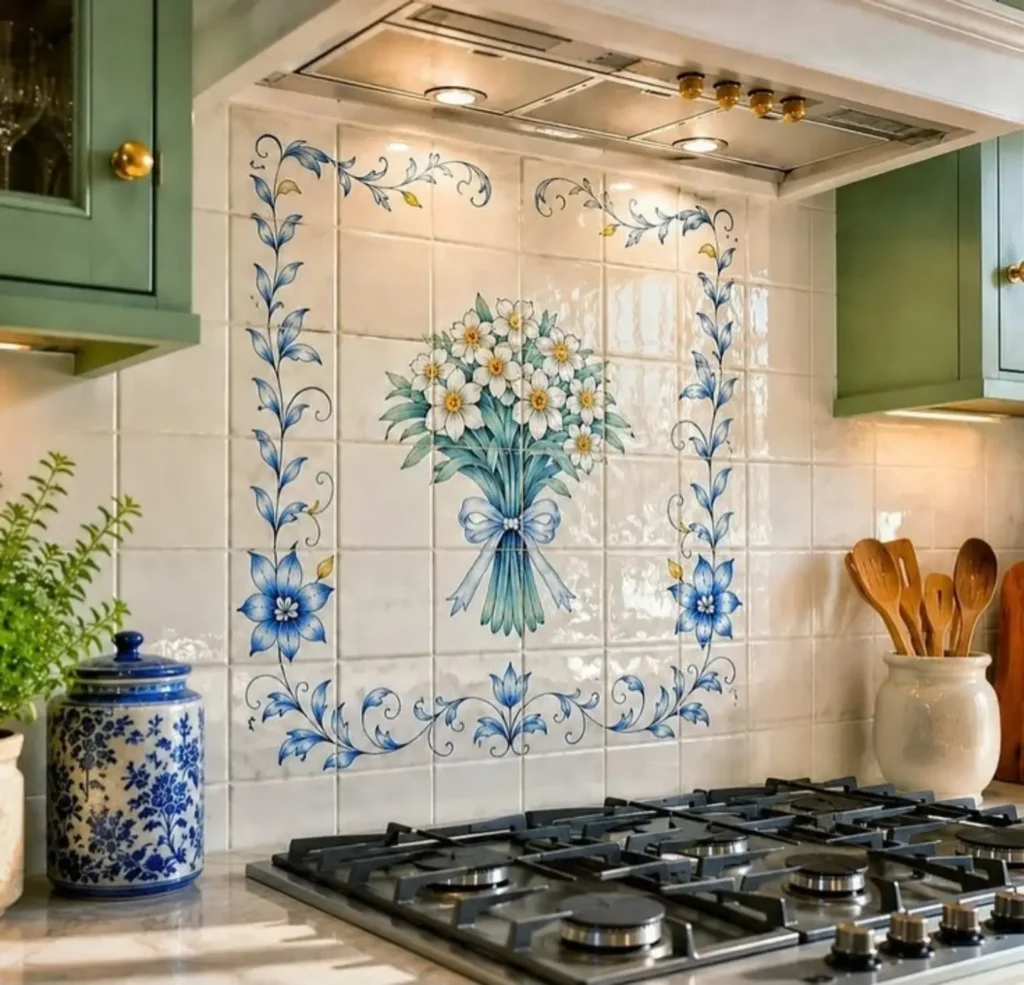
A painted mural behind the range works best when it has a clear edge. Here the flowers and vines sit inside a frame of plain white tiles, so the picture stays contained and doesn’t fight with the cabinets or the hood.
The usual problem is scale. A bouquet this size needs a wide stretch of wall, and on a narrow one it gets crowded by the vent and the shelves. Measure the space between the burners and the hood first, and size the design to fit it.
Keep the colors to a few. Blue and a little green here match the jar and the cabinet paint, which is why nothing clashes.
Vertical Green Tile
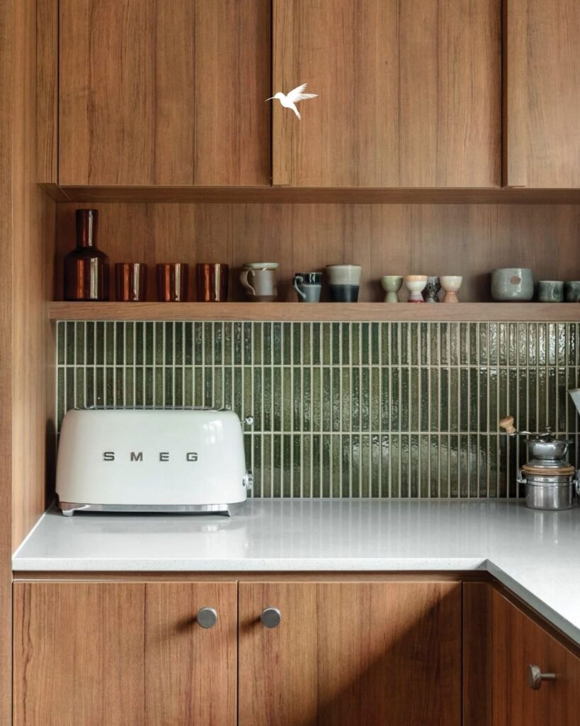
With each narrow green tile set upright, the backsplash draws the eye along the wall without adding a large block of color. The glossy finish catches light, while the dark green gives the wood cabinets and pale counter a clear contrast.
This idea is for someone who wants color and surface texture but prefers a repeated shape over a busy pattern. It also works well when the backsplash is a main feature and the rest of the counter can stay fairly clear. The many grout lines need regular attention, though. If you want a wall that looks nearly seamless or has very little upkeep, a large-format slab or broad tile from another idea may be a better fit.