13 Bathroom Paint Colors Ideas
This site contains affiliate links. We may earn a small commission, at no extra cost to you. Article may contain some images for illustrative purposes only .
The tile grout in my bathroom is the color of wet cement, and no amount of scrubbing will change that. So I stopped fighting it. Instead, I started asking a different question: what wall color makes cement-gray grout look intentional? That single pivot cracked open a rabbit hole of swatches, sample pots, and late-night Pinterest scrolls — and it turns out the right paint can do more heavy lifting than a full renovation. Ahead, 13 bathroom paint colors worth considering, from moody deep greens that flatter brass fixtures to chalky off-whites that quietly rescue small, windowless spaces. Some are safe. A few are not. All of them earn their place on the wall.
Sage Green With White Tile
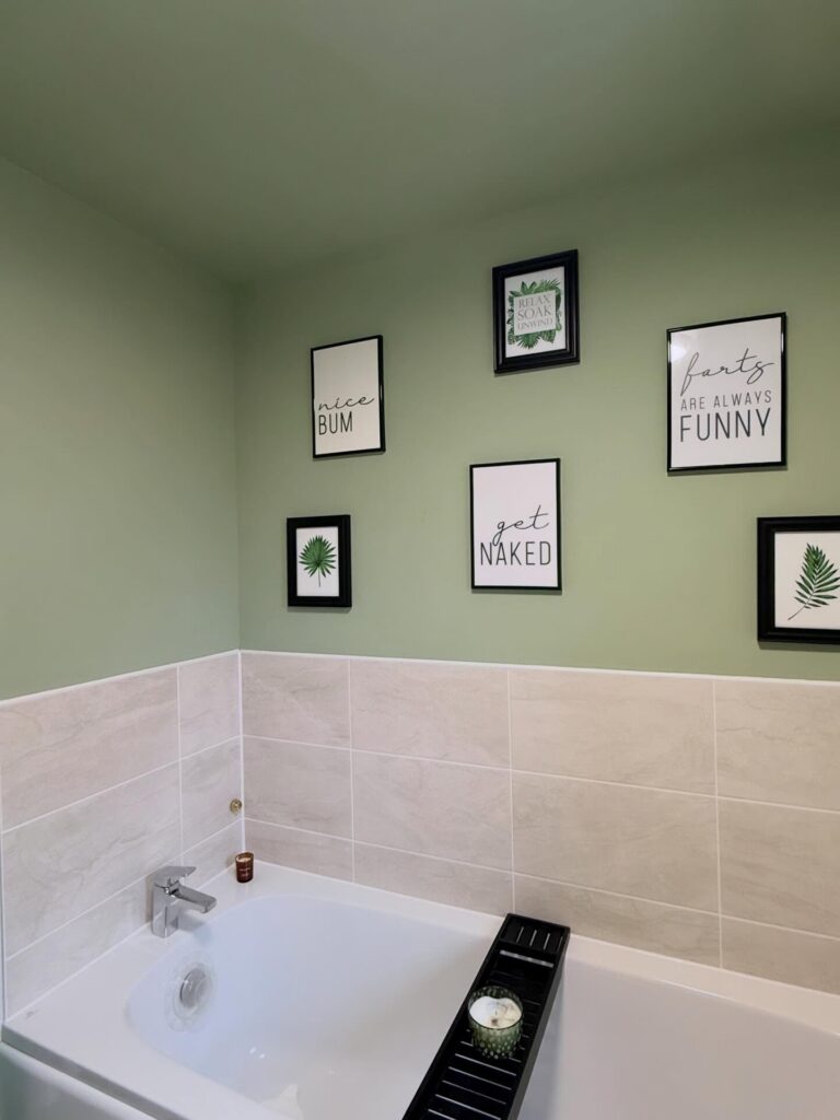
Painting the upper half sage and leaving cream or white tile below is doing a lot of the heavy lifting here. The tile already breaks up the wall, so you’re not committed to painting a full room — just the section above it. Sage works particularly well if your bathroom gets decent natural light; in a darker room it can read more grey than green.
The black frames on these walls actually help, because without some contrast the whole thing can go a bit flat. So if you go this route, don’t rely only on the paint. One small thing — ceiling in the same colour is worth trying if you’ve got a low bathroom ceiling, since it makes the room feel taller rather than cut off.
Deep Blue Walls
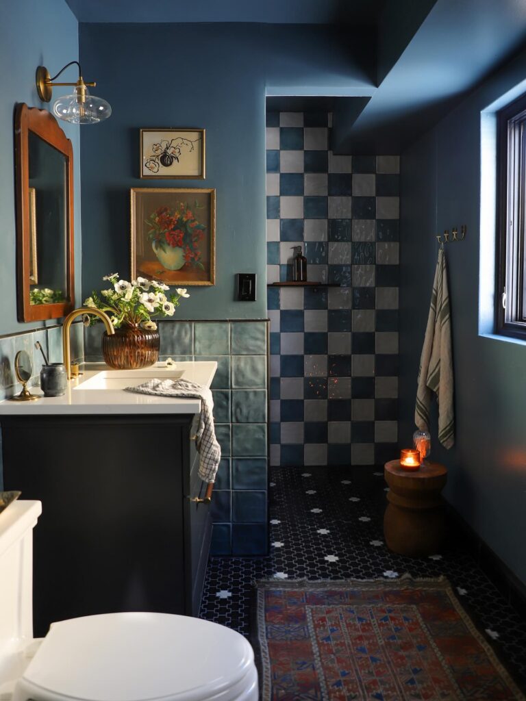
With this much blue on the walls, the bathroom can handle a few older-looking pieces, like a wood-framed mirror or a brass wall light, without feeling too dressed up. Keep the ceiling in the same paint if you want that wrapped-in look, especially in a narrow room. It works.
The trick is to break it with white where you actually use the space, like the sink top, toilet, or a bit of trim around the window. If you are adding patterned tile, copy the shower here and keep the colors close to the wall shade instead of going for high contrast. I would skip a very glossy paint on every wall, though, because dark blue already shows water marks more than people expect.
Muted Burgundy Walls
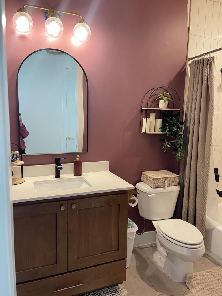
Burgundy sounds risky until you see it paired with a warm wood vanity and matte black fixtures. It reads more like a dried rose than a wine bottle. That’s the key — you want the dusty, slightly brown version, not anything that leans purple or bright.
This shade suits small bathrooms without windows, or ones with only a sliver of natural light. The color absorbs light instead of bouncing it around, so the space feels enclosed on purpose rather than dim by accident.
Keep the counter and tile pale. White quartz and off-white tile do a lot of work here. If everything went dark, you’d lose the contrast that makes the wall color feel intentional.
One thing I’d change: the greenery. A real trailing pothos would earn its spot. Faux leaves against a color this specific look flat.
Blue stripes with ochre
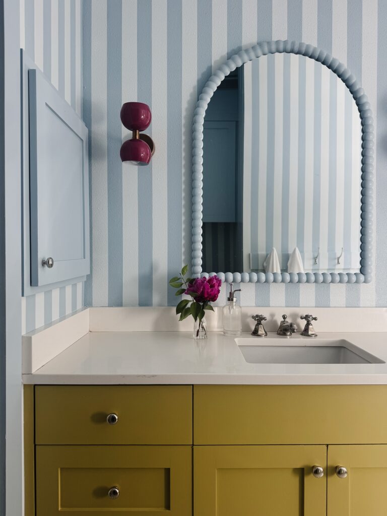
Start with the walls here. A pale blue stripe works because it keeps a small bathroom from feeling boxed in, and the vertical line quietly pulls the ceiling up a bit too. Then bring in one heavier color lower down, like this ochre vanity, so the room doesn’t drift into looking washed out.
The trick is keeping the sink top and trim plain white, otherwise the stripes, mirror frame, and cabinet color start competing for space all at once. Very easy to overdo.
If you want this look without committing to full stripes, paint just one wall behind the mirror and leave the others solid. I’d also keep the hardware silver or nickel, since black would land too hard against these lighter blues.
Dusty Pink With a Dark Anchor
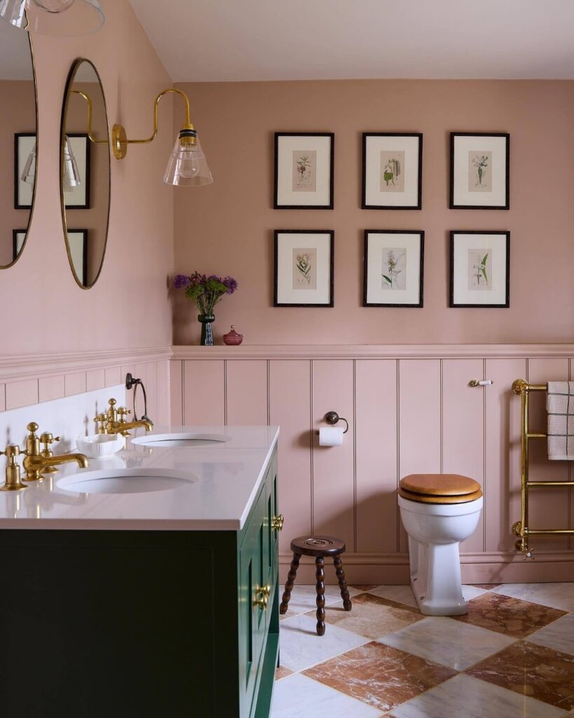
The pink here reads more muted than bold — closer to a blush that’s had some grey mixed in. That’s worth noting because a lot of people pick a pink that ends up looking too candy-sweet on a full wall, then regret it. What keeps this from going that direction is the dark green vanity sitting below it.
One strong, dark piece of furniture does a lot of work. If you don’t have built-in cabinetry in that colour, a painted freestanding unit gets you there. The tongue-and-groove panelling painted the same pink as the wall also helps — it removes the visual break and lets the colour read as one continuous decision rather than an afterthought.
Worth it for rooms with enough natural light. In a north-facing bathroom, this shade could go muddy fast.
Mustard Yellow Walls
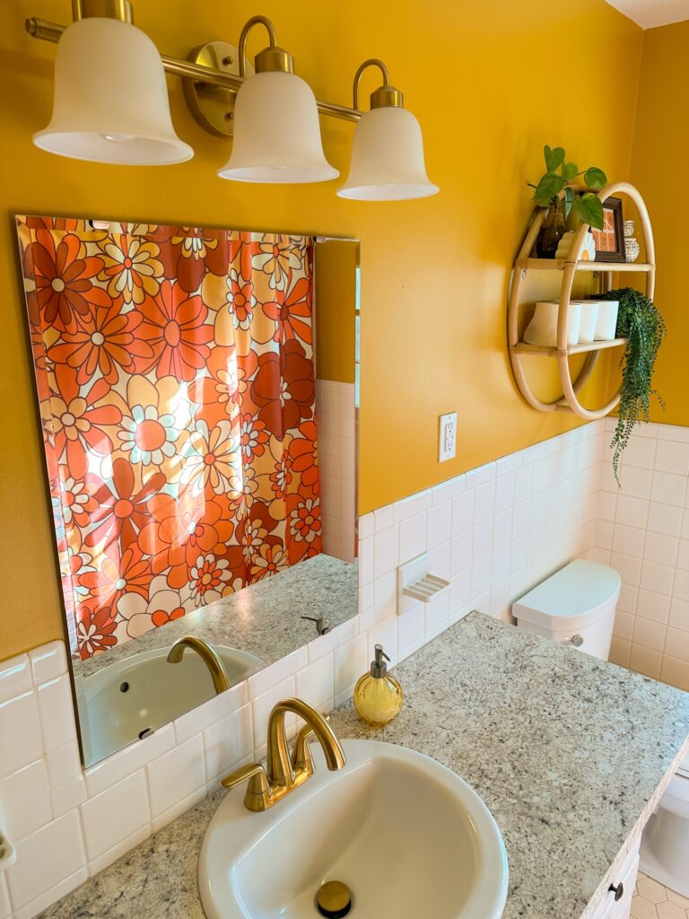
Above white tile, mustard yellow has room to breathe. It works best when the lower half of the bathroom stays plain, like square white tile or a pale counter, because this color can get heavy if it runs everywhere. Keep the metal finishes close to brass or aged gold if you want the wall color to feel intentional, especially around the faucet and light fixture.
A floral shower curtain in orange or cream can sit with it without looking too matched. Small room, big color. I would skip dark shelving here, since it would cut into the wall too much and make the yellow feel boxed in.
Deep Navy with Wall Molding
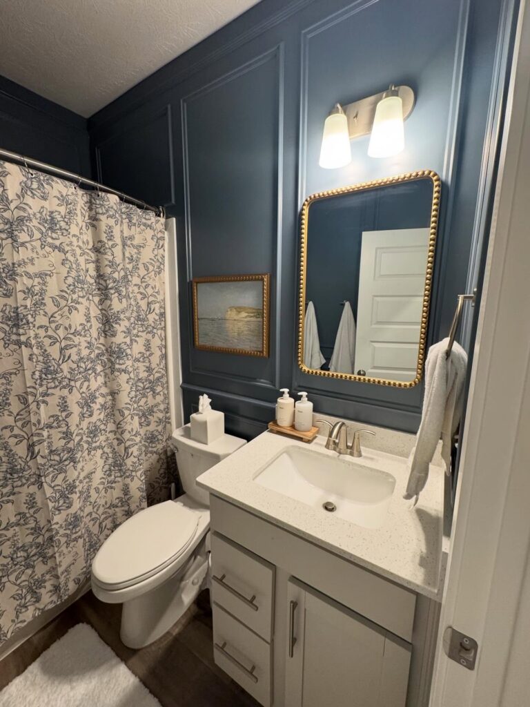
Navy gets more interesting when you add picture-frame molding to the wall behind the vanity. Notice how the raised panels catch shadow at the edges? That’s what keeps a dark color from flattening the room. Without that trim work, you’d just have a dark box.
Pair it with warm metals. The gold beaded mirror and the small framed landscape are doing a lot of work here — they stop the navy from feeling cold. Brushed nickel taps and sconces are fine, but I’d argue the gold accents are what make this specific palette land.
One thing I’d change. The vanity is a pale grey, which reads a bit hospital next to the wall. A creamier off-white, or even a wood tone, would sit better against navy this saturated.
Sage with floral walls
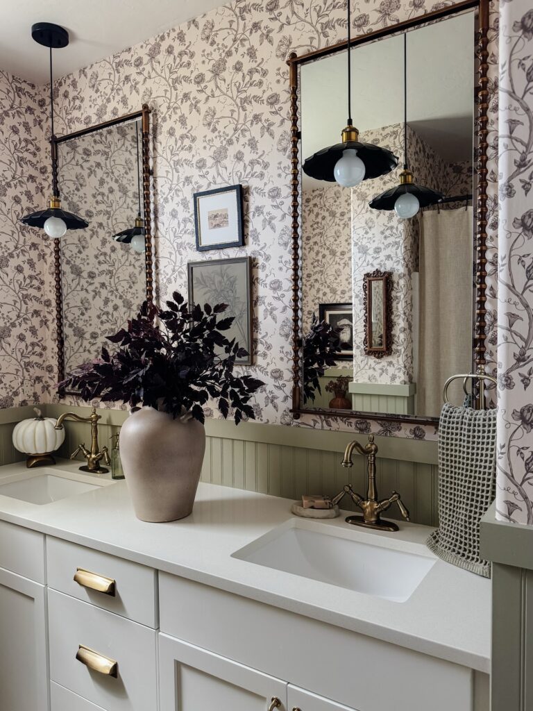
Start with the lower half of the room. That muted sage beadboard is doing a lot of work here because it gives the wallpaper a stopping point, so the floral print can climb without making the whole bathroom feel busy. Good move in small baths.
Keep the paint gray-green rather than mint, and carry it onto trim or a narrow ledge if you have one, because that little repeat makes the color read intentional instead of random. Then bring in aged brass on the faucet or mirror frame to warm it up; chrome would make this feel sharper than it needs to.
The white countertop matters too. It cuts through all the pattern and keeps the paint color from looking muddy under bathroom lighting.
I’d skip a bright wall color here. With a detailed paper and dark framed mirrors already in the mix, a loud paint shade would start arguing with everything else.
Sage Green With Warm Brass Accents
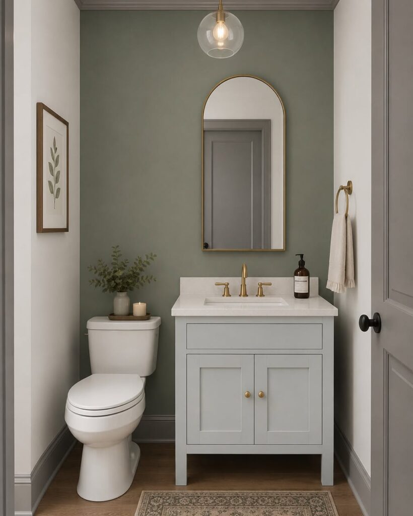
The sage on the accent wall only reads this well because everything else — the vanity, the door trim, the ceiling — stays close to white or a cool gray. That contrast is doing most of the work. Brass is the thing that keeps the green from going cold; without it, this palette can start to feel a bit clinical.
The arched mirror frame and the faucet are both brass here, and that’s really enough — you don’t need to pile on more. One thing worth noting: sage picks up a lot of blue in low light, so if your powder room has no window, test the paint in the evening before committing. A single pendant like the globe one shown keeps the ceiling feeling open rather than heavy.
Dusty Gray Paneling
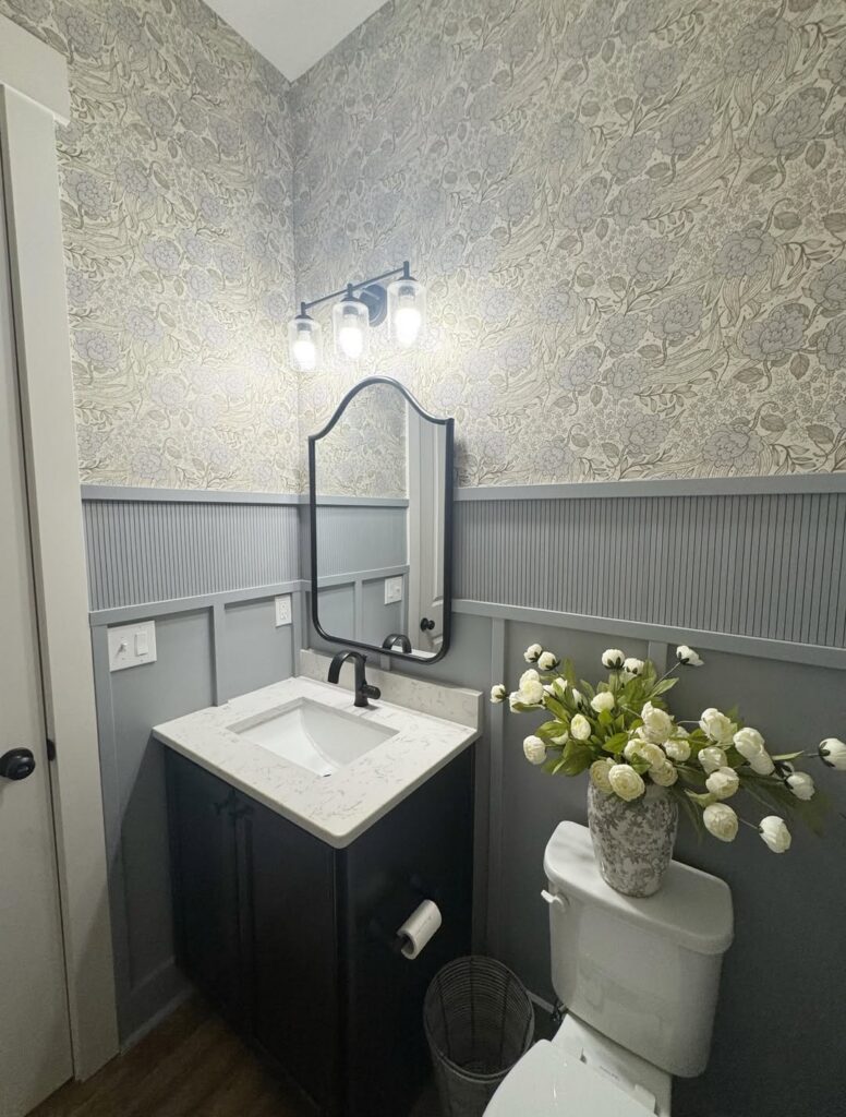
Halfway up the wall, this kind of muted gray paint gives the bathroom some weight without making the room feel boxed in. Keep the darker paint on beadboard or trim, then let wallpaper or a lighter wall color sit above it so the eye still travels upward. The black mirror, faucet, and vanity help the gray feel planned, not leftover from another room.
Small rooms can handle this. I’d skip a glossy finish here, since every bump in the paneling will show; satin is usually enough for bathroom walls and easier to wipe than flat paint.
Warm Brown For Small Bathrooms
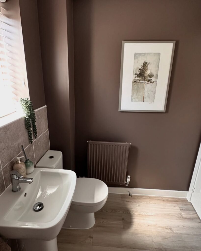
Brown gets skipped over in bathrooms and I’m not sure why. This one leans mauve, almost like milk chocolate that’s been sitting in the sun. Works because the room is small. In a larger space it might feel heavy, but here the walls just wrap around the white sink and toilet and let them stand out.
The stone tile splashback is doing a lot of work too — it stops the brown from meeting the sink directly, which would’ve been too much contrast. If you’re copying this, keep your sanitaryware bright white. Cream or off-white against this shade tends to look dingy. One thing I’d change: the radiator painted to match. Fine in theory, but it disappears into the wall in a way that looks unfinished to me.
Deep blue paneling
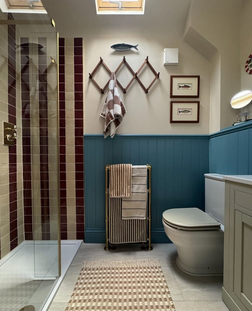
Take the paint only halfway up. That blue paneled section does a lot of work in a bathroom because it gives the room weight, and it also takes the edge off all the hard white surfaces around the toilet, vanity, and shower tray.
Keep the upper wall pale.
That split matters more in a narrow bathroom with a sloped ceiling and rooflight, since the lighter top half keeps daylight moving around instead of letting the color close in overhead. The timber rack, brass towel stand, and framed fish prints stop the blue from feeling too flat or cold, so bring in a few brown or brass pieces if you try this.
Matte or eggshell is enough. I’d skip taking this shade onto the ceiling unless your bathroom gets much more natural light than this one.
Dusty Pink With Wallpaper Above
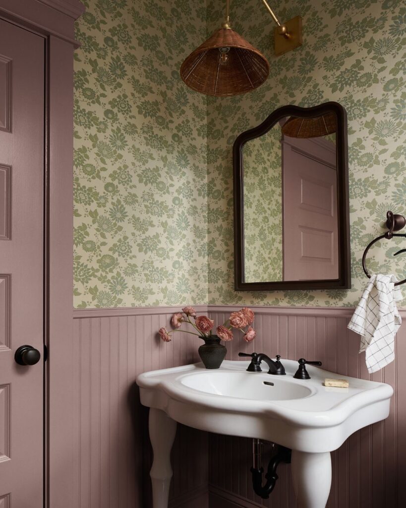
Painting only the bottom third of the wall — the beadboard section here — gives you a way to use a strong color like this muted mauve without it taking over completely. The wallpaper does the heavy lifting above the rail, and the paint just anchors it. What makes this work is that the pink in the paint is already sitting inside the wallpaper’s color palette, so nothing is fighting.
Pull a secondary color from your wallpaper, not the dominant one. The pedestal sink with dark hardware keeps things from reading too sweet, which is worth thinking about if your wallpaper already leans floral. I’d probably skip the matching door paint — one less thing to coordinate.
This setup suits a powder room more than a full bath.