
21 Cottagecore bedroom ideas
This site contains affiliate links. We may earn a small commission, at no extra cost to you. Article may contain some images for illustrative purposes only .
The linen curtains won’t stop moving. There’s a breeze coming through the cracked window, and it’s carrying the smell of something green and slightly damp, the way old farmhouses always smell in late spring. A bee thuds against the screen. On the nightstand, a chipped enamel pitcher holds three stems of cow parsley, the kind you’d pull from a ditch on a walk home. This is the feeling cottagecore bedrooms are chasing.
It’s soft, a little untidy, stitched together from wildflowers and hand-me-downs. And the 21 ideas below will help you build it, from four-poster beds swagged in gauzy canopies to reading nooks tucked under sloped ceilings, floral wallpaper that looks a hundred years old, and the small, strange objects (a pressed fern, a beeswax candle, a single blue-and-white teacup) that turn a room into somewhere a novel might happen. Are you excited? Because I am.
Layer a Crochet Throw Over White Bedding
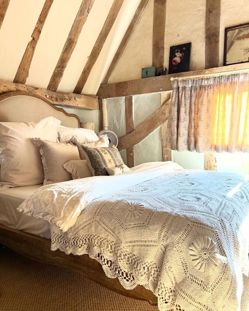
A crochet throw at the foot of the bed is one of those little things that instantly makes a bedroom feel more cottagecore. The big stitched patterns and scalloped edges make it look handmade, while the plain white bedding underneath keeps everything from getting too busy.
And you really don’t need exposed beams or a 200-year-old farmhouse for this to work. Even in a rental or small apartment, you can get the same collected, old-fashioned feeling with a few clever cottagecore apartment decor ideas. The blanket is doing most of the work. If you can’t find a vintage one, there are decent reproductions on Etsy, though the cotton tends to be thinner. Worth checking estate sales first.
Pile the pillows loosely, and the ruffled ones here are a good call, but even plain Oxford pillowcases in off-white would do the job.


Ditsy Florals for the Win
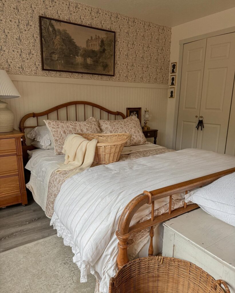
Whenever I imagine remotely anything related to cottagecore, my mind specifically adds a ditsy floral detail somewhere in the imagination. And if you’re carrying that same cottagecore mood into the rest of your home, these cottagecore living room decor ideas are a good place to start.
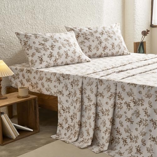
Well, take a look at this, and you’ll understand why. Here, ditsy florals have been beautifully embedded into the look with wallpaper and bedsheets. Personally, I am not a big fan of too much print going on, but somehow even with florals on florals, this looks super subtle and hits the sweet spots.

Layer a Chunky Knit Throw
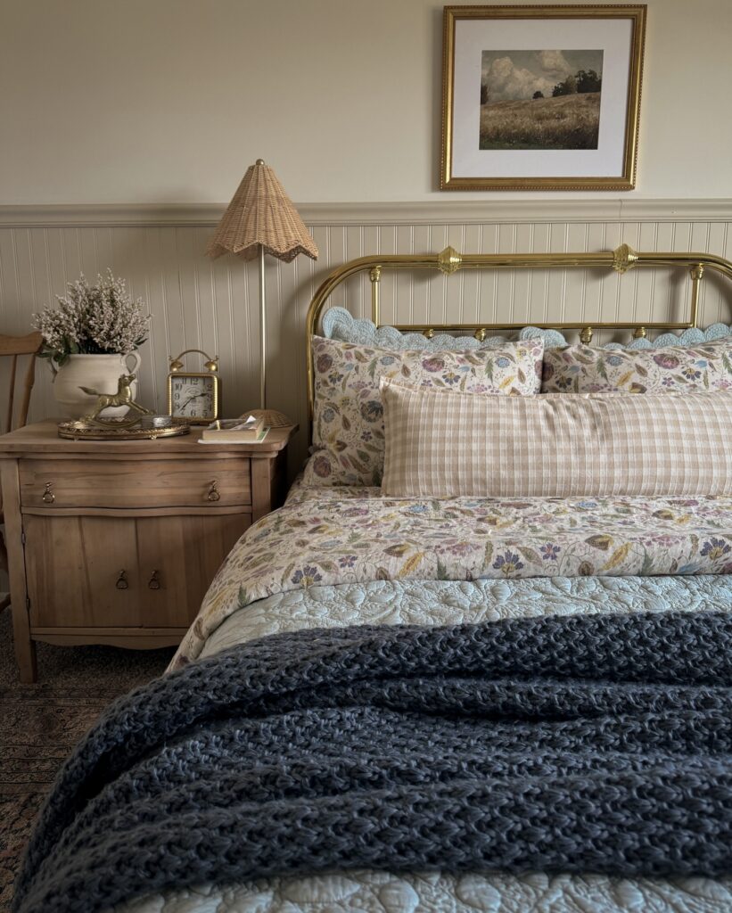
The heavy charcoal knit at the foot of this bed is doing a lot of work. It weighs the whole arrangement down, visually, so the floral quilt and the small pillows don’t float off into pastel territory. That’s the trick. A dark, textured throw grounds a bed that would otherwise read too sweet.
If you’re going cottagecore with florals and a brass frame, you need one heavy thing. Chunky wool, waffle cotton, even an old wool blanket folded thick. Skip the thin cotton throws in matching tones because they might disappear.
I would change one thing here, though. Instead of covering so much of the quilt, I’d fold the throw loosely across the bottom of the bed. You still get the cozy texture without hiding the pretty bedding you probably spent forever choosing.

Mix Gingham in More Than One Scale
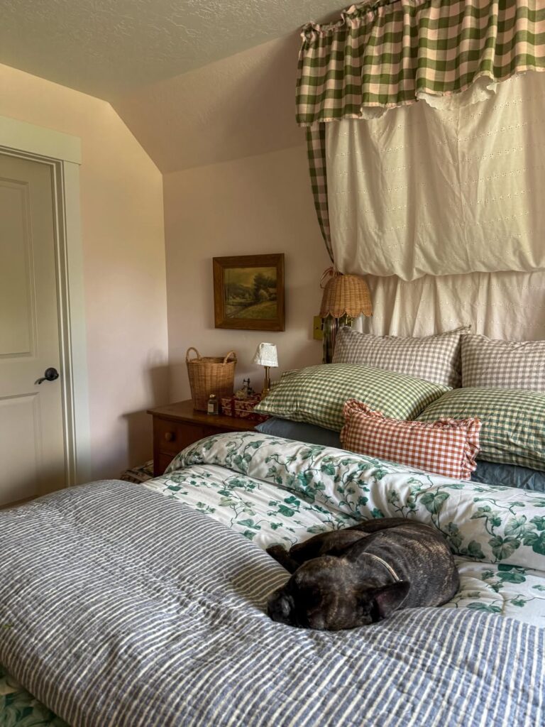
Yes, you can absolutely use more than one gingham pattern in the same bedroom. The trick is to keep the colors related.
Here, the different green checks work because they’re different sizes rather than completely different colors. Add a little rust or warm brown if you want some contrast, but you don’t need another five colors joining the party.
The white eyelet fabric behind the bed is another easy cottagecore win. It adds that slightly old-fashioned, handmade feeling without requiring much effort.
If you’re trying this yourself, start with one color and play around with different check sizes. It’s much easier than trying to coordinate three completely different patterns and hoping for the best.
Wooden Furniture
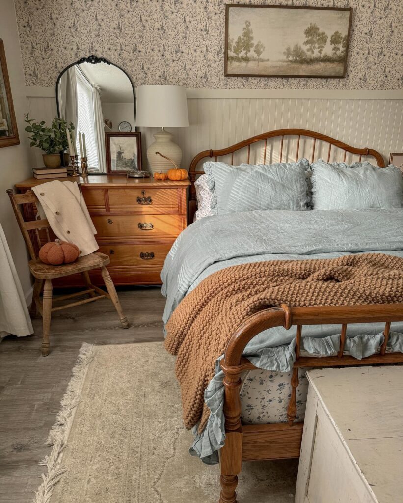
Wooden furniture has to be one of my top cottagecore tricks. Slightly weathered and that one perfect shade of wood (you know what I am talking about) is what we’re aiming for. We can see a mix of shades here, like the weathered chair perfectly going with the warm wood of the bed and the dresser.
I’d 100% suggest you look for such pieces in thrift stores or vintage furniture stores, or, for the fun of it, why don’t you DIY one, and that way you’ll have a sweet sentimental value attached to it. And if you’re the kind of person who would rather make the piece yourself, these DIY rustic farmhouse decor ideas have plenty of projects that fit right into this look.

Layer a Big Old Beam
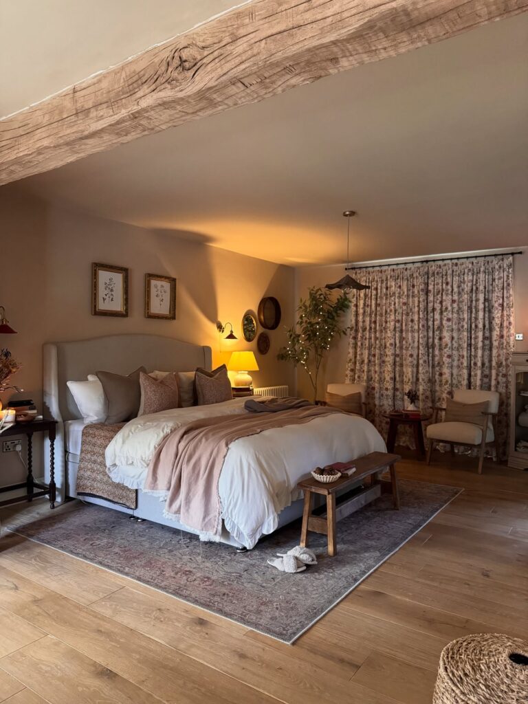
A chunky wooden beam instantly gives a bedroom that old farmhouse feeling, and honestly, it’s doing most of the decorating here. Because the timber is so strong and rustic, everything else can stay soft: floral curtains, a slipcovered headboard, pretty bedding, and a faded pink throw.
If you don’t have original beams, faux ones work. Reclaimed oak looks better than the pine boxed beams you see at big box stores. Those read fake fast, so just make sure you’re mindful when you’re picking one.
Paint the ceiling around it in something warm, not stark white. The walls here are a muddy beige, and the beam almost glows against it under lamplight. One thing I’d skip is a tiny pendant disappearing beside a massive beam. If you’re going to make the ceiling the star, give the light fixture some confidence too.

Mix Patterns Without Matching Them
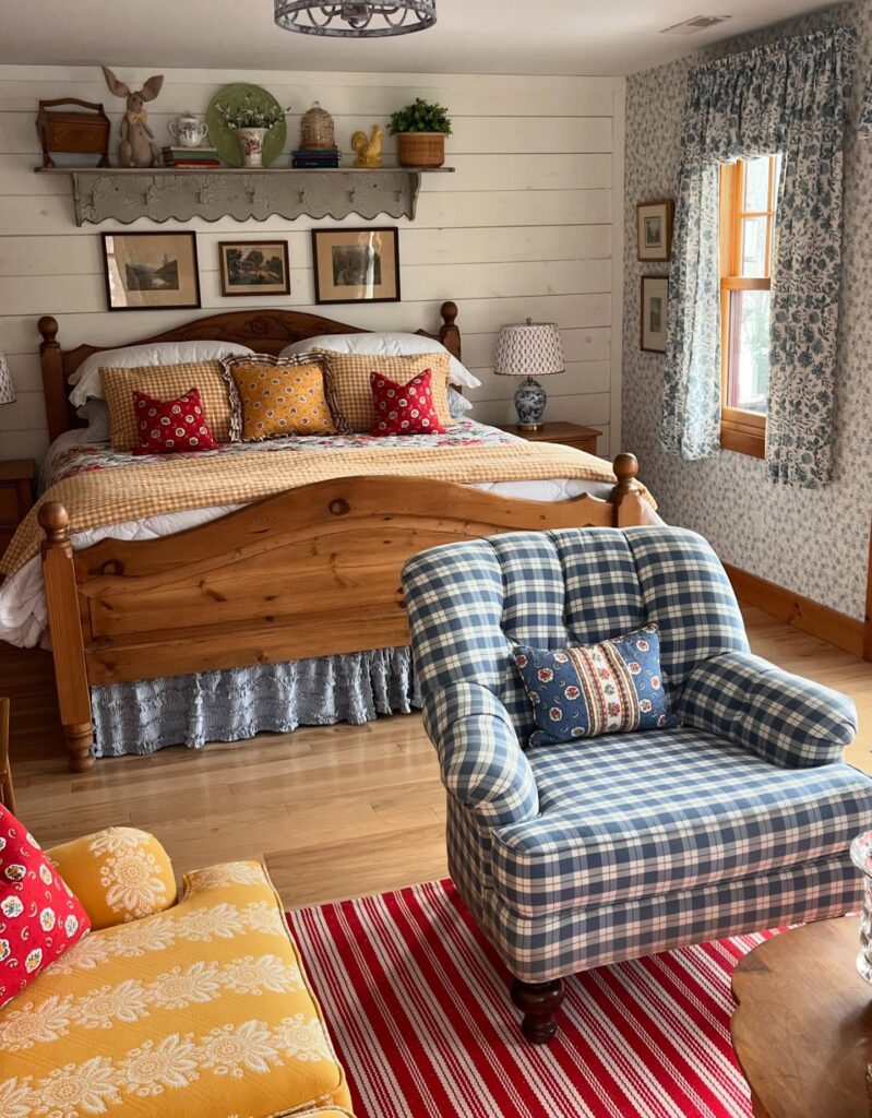
The blue plaid armchair, the mustard gingham pillows, the red floral accents, the striped rug, all of which sound chaotic and feel like none of them matches, and that’s exactly why it works. Trust me. Cottagecore rooms like this one tend to collect patterns the way a drawer collects things you’re not ready to throw out. The trick is keeping a consistent color family running through everything, so the eye has somewhere to land.
Red shows up in the rug, the small pillows, and the curtain print. That repetition does the organizing. If you’re starting from scratch, pick three colors and let your patterns fight it out within those.

A Fun Mix of Metal and Wood
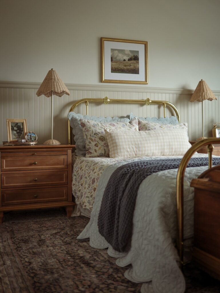
This genuinely feels like a fun collab between mid-century modern and cottagecore. Is it just me, or do you guys feel the same too? I really like how the gold complements the wood, and the wainscoting might as well be a cherry on top.
The woven lamps are also an adorable detail that brings the whole look together. If I were you, I would recreate this look exactly like this and maybe add a few more wall decor pieces for a personal touch. Once you’ve got the bedroom feeling this cozy, you might as well carry the look into the bathroom with a few cottagecore bathroom touches there too.

Layer Wallpaper Over Panelled Wainscoting
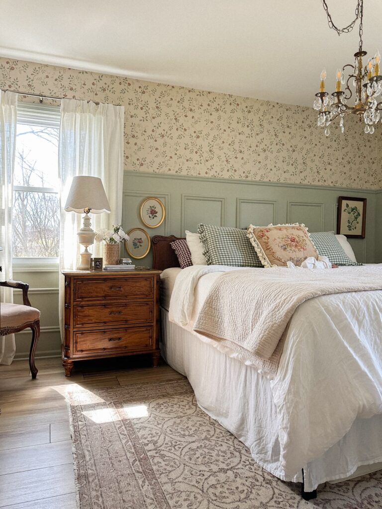
This is such a smart way to use floral wallpaper without letting it completely take over the room. The sage-green paneling covers the lower half of the wall, while the floral print gets the upper section.
That split gives your eyes somewhere to rest, which is especially helpful if you’re working with a tiny bedroom.
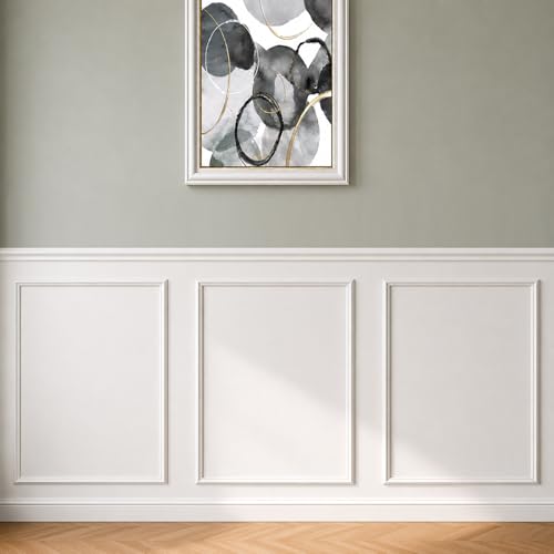
You don’t even need expensive custom paneling. Simple trim pieces painted in a soft sage or cream can create a similar effect. And if you’re renting, peel-and-stick wallpaper can give you the floral moment without committing your security deposit to it.
One warning, though: think about where your light fixtures hang before copying the whole setup. Pretty chandeliers are great until someone walks directly into one.

Wallpaper the Ceiling Too
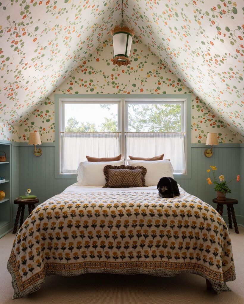
Running the same floral wallpaper up the sloped walls and across the ceiling is what makes this room feel like it does; I mean, contained, demure, a bit like being inside something. Most people stop at the wall and leave the ceiling plain, which is fine, but here the pattern continuing overhead is the whole point.
If you’ve got an attic bedroom with that pitched shape, this approach suits it particularly well because the angles already draw the eye up.
The sage beadboard below acts as a visual stop so the wallpaper doesn’t take over completely. It’s worth doing if your pattern is busy. Block print bedcover, small dog optional (we know it’s mandatory).

Gingham Bedsheets for the Win
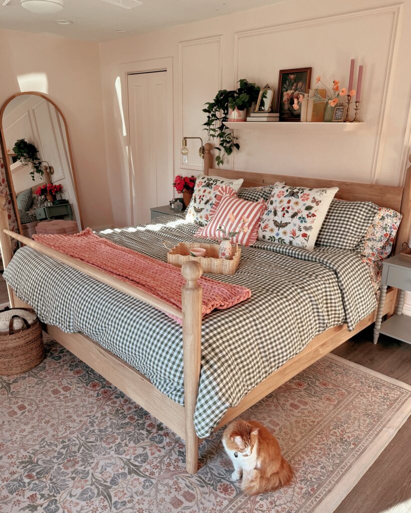
Will I die preaching on the gingham for cottagecore hill? Yes. Take a look at the bedroom and tell me what’s the first thing that draws your attention. If it’s the bedsheet, we have a winner, and that’s our gingham bedsheet.
It’s subtle but also not afraid to make a statement. That paired with some pink chunky throw and a striped pillow can feel like a bit much, but somehow they all work together so, so well.


Match your curtains to bedding
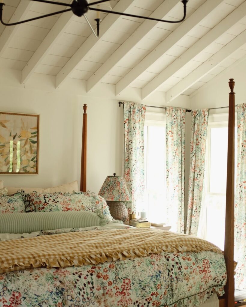
The same floral runs across the curtains, the pillow shams, and the bedskirt here. It sounds like a lot. In practice, it calms the room down, because your eye stops hunting for what goes with what. The gingham throw and the green ticking bolster break it up so it doesn’t tip into costume.
If you try this, pick one print and let it do most of the work, then bring in two supporting patterns in solid-adjacent territory like a check, a stripe, a plain linen. Stick to prints that share a background tone so they read as a family.
Personally, I’d stop before matching the lampshade. Once the bedding, curtains, and lampshade are all wearing the same print, we’re getting dangerously close to showroom territory. Let at least one thing in the room have its own personality.

Layer Florals With Solid Blues
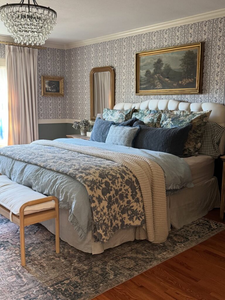
This is such an easy formula if you love floral bedding but don’t want your bedroom to look like a garden exploded.
Start with a plain blue or soft grey duvet, then throw a floral quilt or blanket over the top. Add a couple of solid navy pillows behind it, and you’re done.
The wallpaper here is already doing plenty, so keeping the bedding within the same blue-green family stops everything from fighting for attention. If your walls are plain, you have more room to push the contrast.


Patchwork bedding layers
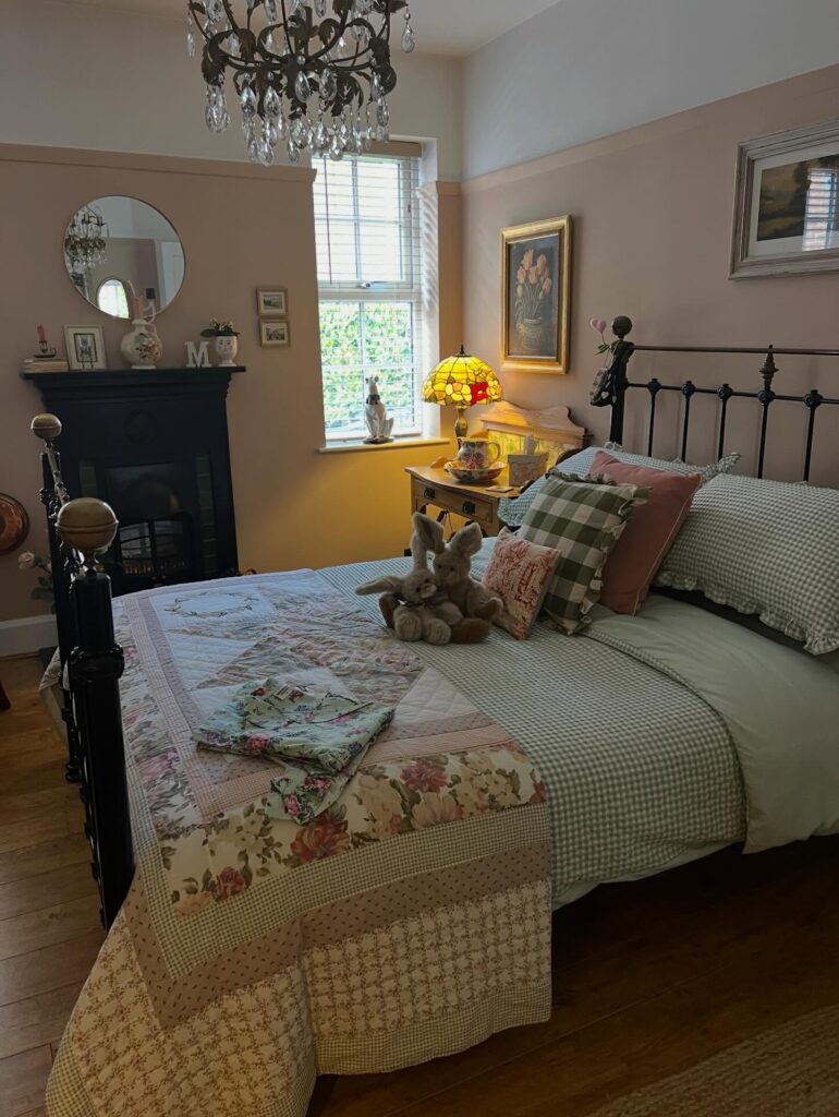
Start with the quilt before buying anything else, because that one piece sets most of the room’s direction. A patchwork cover with faded florals, gingham blocks, and a plain sheet underneath gives the bed that collected-over-time look without needing too many extras.
Keep going with pillows, but stop before it turns into a pile you have to move every night. Three is enough. A gingham pillow, one dusty pink cushion, and maybe a small embroidered one will do the job. The iron bedframe helps too, since it keeps all those soft patterns from looking too sugary.
And if you can find a vintage quilt at a thrift or estate sale, grab it. The little imperfections are what make cottagecore bedding feel authentic. If you love this faded, feminine, slightly vintage side of cottagecore, you’ll probably fall for these shabby chic bedroom ideas too.

Mix Two Checks With Stripes
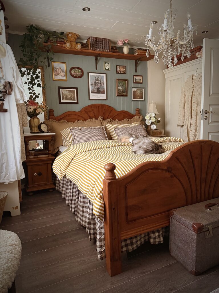
Here’s another pattern-mixing trick that’s much easier than it looks. Use two different sizes of the same check, then add one stripe in a related color. That’s it.
The brown gingham and mustard stripe work here because they’re connected through the warm wood tones in the room. Nothing is identical, but nothing feels completely random either.
If you’re nervous about using this much pattern, start with plain linen pillows and build from there. You can always add more later. I’d also consider using a slightly smaller check on the bedskirt. The large pattern is pretty, but it competes a little with the duvet. Cottagecore should feel collected, not like the bedding is arguing with itself.

Layer Patterns Without Matching Them
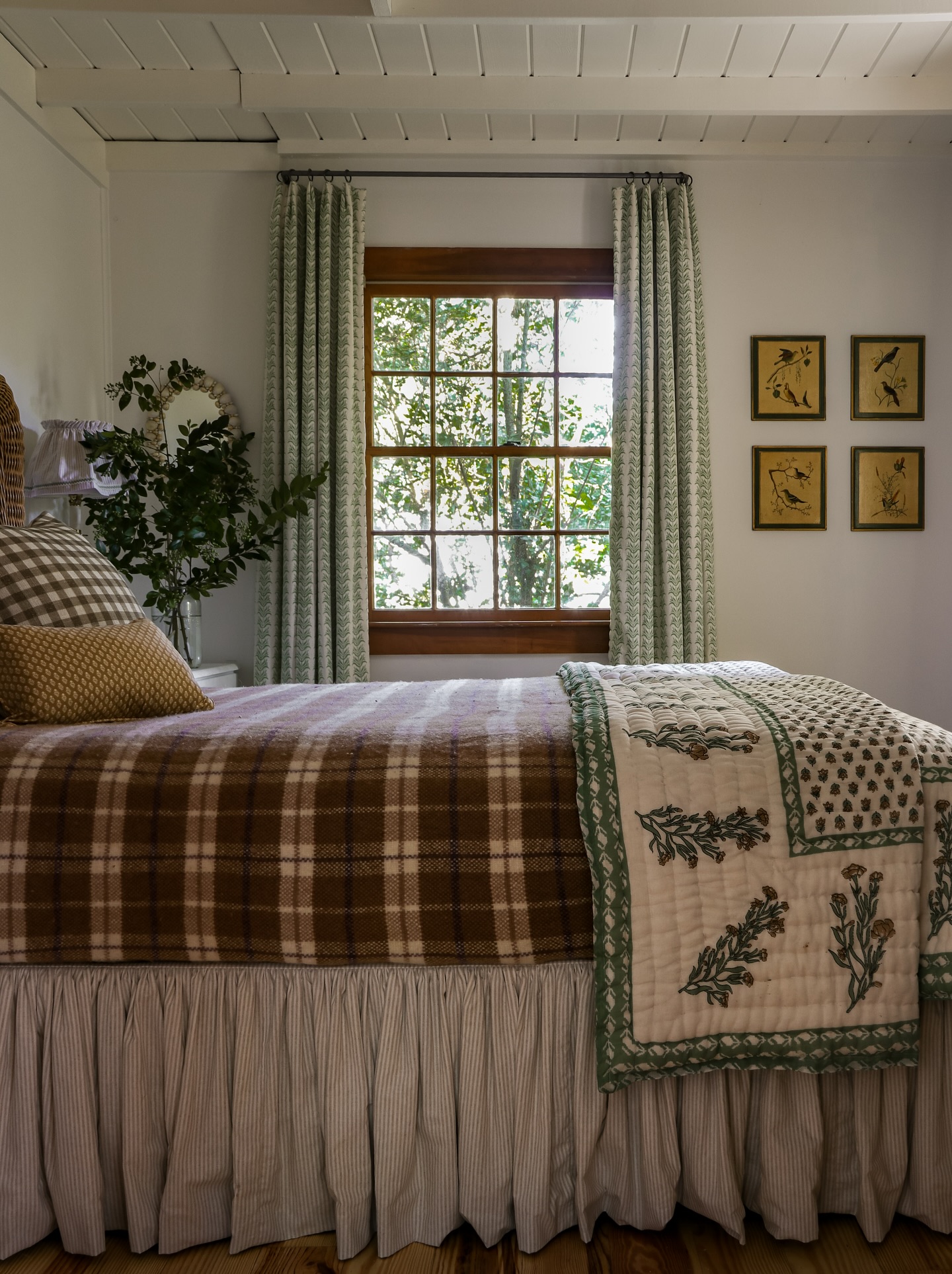
Okay guys, if I’m being totally honest with you, plaid kinda scares me. It can come off a little too strong, but hey! We never shy away from a challenge, do we? So the plaid wool blanket, the block-print quilt folded at the foot, the ticking stripe on the bed skirt, all together working seamlessly with such strong personalities.
Cottagecore bedding works because the patterns share a color family rather than a print. Here, it’s browns, greens, and off-whites doing the connecting work. I also love repeating this idea on the walls. Four bird prints in similar frames feel collected and organized even though the pictures themselves are different.
It’s basically organized chaos. Cottagecore’s favorite kind. Because the best cottagecore bedrooms never look like someone bought the entire collection from one store. They look like someone found things they loved over time and somehow made them work together.

Mixed Gingham Bedding
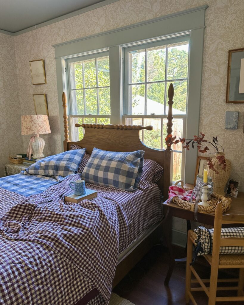
Start with the checks, because that is what carries this room before any flowers, candles, or framed prints get involved on the walls. Keep the next check larger, maybe on the pillowcases. The trick is letting one color repeat, like the blue cup, blue pillows, and blue bedding here, so the pile of patterns still feels related.
Do not overthink it. A spindle bed helps too, because the wood gives all that fabric a plain place to stop. I would skip extra patterned curtains here; the bedding is already doing enough, and bare window trim keeps the room from going fussy.


The Four-Poster Without the Canopy
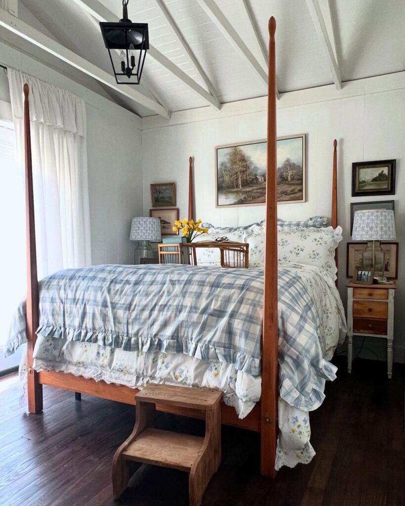
Tall posts, no fabric on top. This is the version of a four-poster that works in a room with sloped ceilings and exposed beams, where a full canopy would just fight the architecture. The wood tone on the bed here matches nothing else exactly, and that’s the whole point of it because it stands on its own against the white walls and pale plaid bedding.
If you go this route, keep the posts slim. Chunky turned posts start looking colonial fast. A little wooden step stool at the foot is a nice touch when the mattress sits high, though honestly I’d skip it if you don’t actually need it. Layer the bed with a ruffled floral sham underneath a plaid coverlet so the softness sits at the edges where you see it most.

Layer Prints Without Matching Them
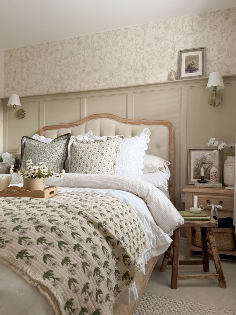
The secret here is incredibly simple, and I keep saying this over and over again. It’s the same colors, different prints.
The botanical quilt and smaller patterned pillow don’t match exactly, but they’re both working with olive and cream, so they feel like they belong together. The darker green pillow adds another layer without introducing a completely new color. That’s what keeps the bed interesting without making it chaotic.
If you’re building your bedding from scratch, buy the quilt first. It’s much easier to find pillows that work with your favorite quilt than to find a quilt that magically works with six pillows you already bought.
Learned that one the expensive way.

Red Gingham Bedding
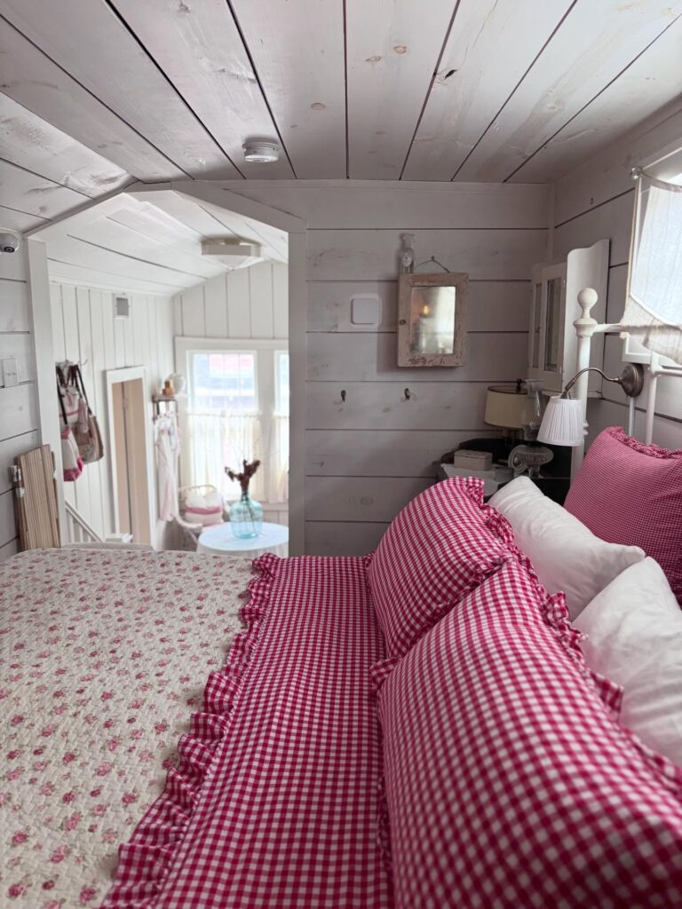
Wasn’t aiming for strawberry shortcake with this one, but I’m not mad that it’s giving that vibe. Start with the pillows if you don’t want to redo the whole room. Red gingham brings in that old cottage look fast, especially when it sits against white plank walls and a faded floral quilt. Keep the rest of the bedding mostly plain, or the room can begin to look like a fabric shop.
The ruffled edge helps. It makes the checked fabric feel softer without needing extra cushions piled everywhere. If your walls are not white, try cream or pale wood tones around it, because dark walls can make this much red feel heavy.
A small wall lamp beside the bed, like the one here, also keeps the pattern from taking over because it gives the eye another place to land.

Layer Quilts With Bench Storage
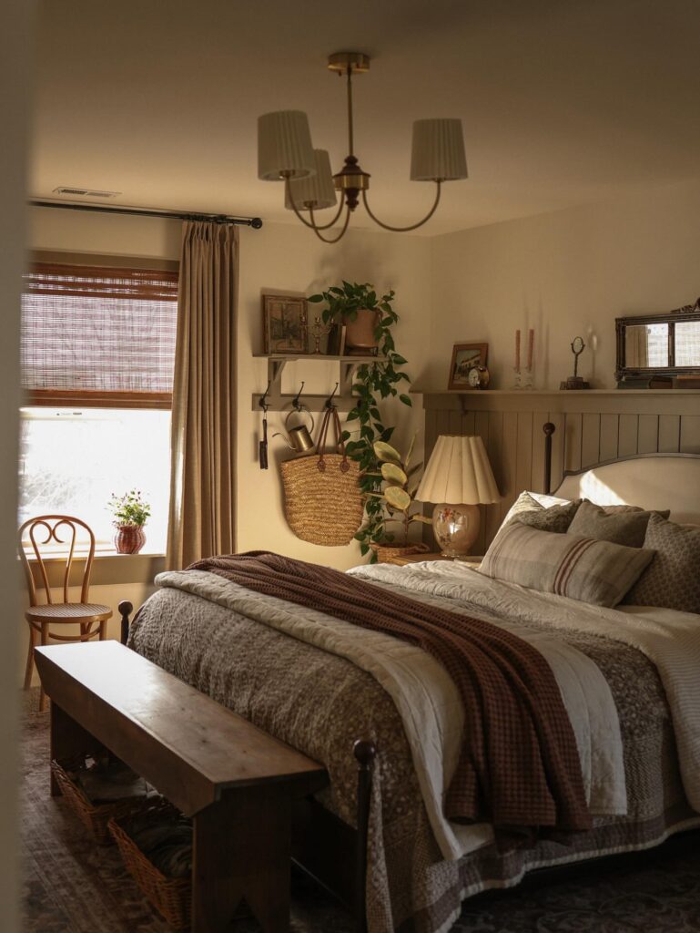
A bench at the end of the bed is one of those pieces that looks decorative but can actually earn its keep. Use it to stack extra quilts, toss a throw over the top, or hide baskets underneath for things you don’t want sitting around. Suddenly you’ve got cottagecore charm and storage. We love a multitasker.
The trick with the quilts is to mix the textures and keep the colors related. Fold one neatly, drape another casually, and let a third one look slightly rumpled.
And please don’t feel like you need a matching quilt set. Vintage and thrifted quilts often look much better because they already have that faded, collected character cottagecore is trying to fake.
No bench? No problemo! Use an old wooden trunk, a low stool, or even a sturdy little storage chest. The bedroom police are not coming.

A cottagecore bedroom really doesn’t need to look like it came straight out of a period drama. The charm is in the layers, the slightly mismatched patterns, the soft quilts, the old-fashioned details, and all those little things that make the room feel collected rather than decorated in one afternoon.
Start with what you already have, then add texture, a pretty print, a vintage-looking piece, or even just a gingham throw. You don’t need to get everything perfect. In fact, a little imperfection is kind of the whole point.
Because at the end of the day, the best cottagecore bedroom is the one that makes you want to get under the covers, ignore your phone for a while, and pretend you have absolutely nowhere to be tomorrow.
