
21 Nursery Color Schemes That Are Trending Now
This site contains affiliate links. We may earn a small commission, at no extra cost to you. Article may contain some images for illustrative purposes only .
Most nursery advice tells you to choose one color and build the room around it. That is too narrow. A nursery is a small room that changes fast, and a single color leaves you few ways to adjust. Start with a full color scheme instead, a set of shades that work together, and let it guide every choice from the walls to the blanket. This list gives you 21 color schemes that are trending now. Each one has its own image, so you can see the shades side by side before you buy any paint. Look through them all. Save the two or three you keep returning to. Take your time. Then pick the one that fits your space and your plans.
Blue Gray with Circus Red
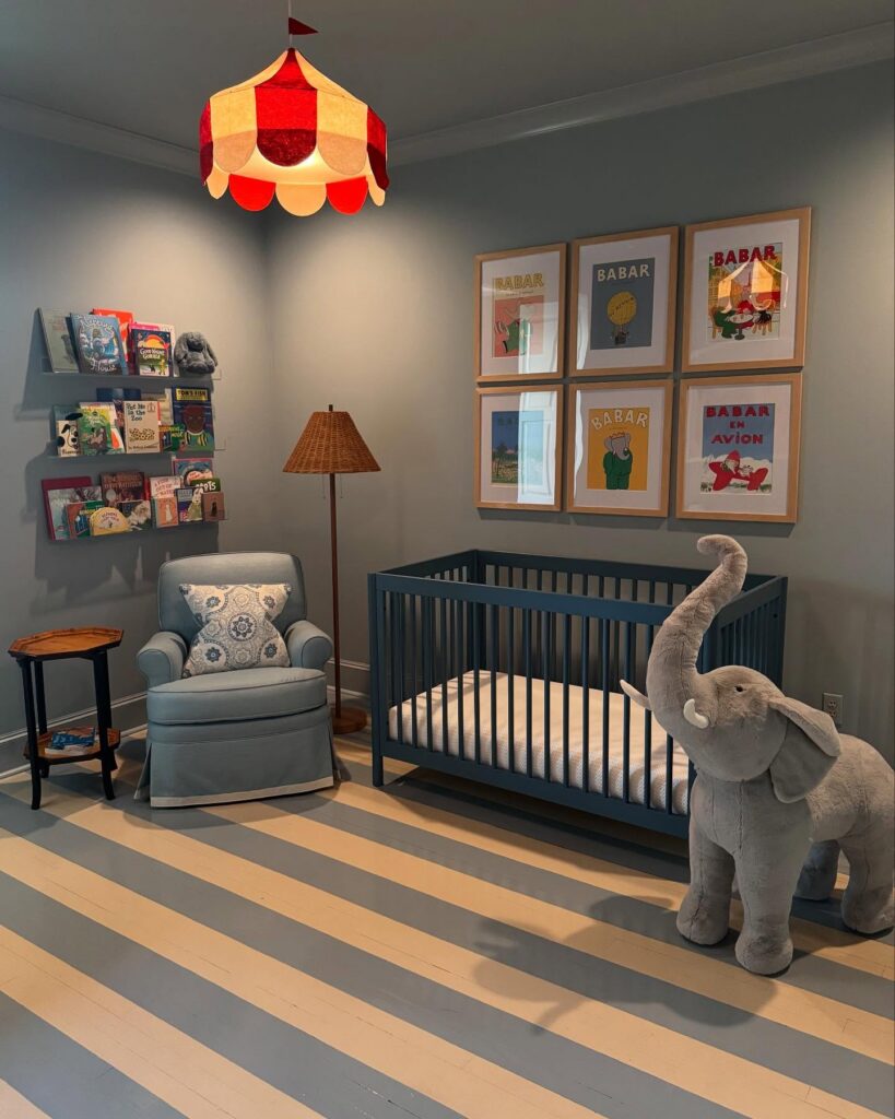
Families who want a nursery with a storybook note may like this mix. Blue-gray walls and a dark blue crib give the room a steady base, while red and yellow add energy. A striped pendant or a small group of picture frames can carry the brighter colors without spreading them across every surface.
This approach is for parents who enjoy bold color overhead and on the walls, and who are happy for the room to feel lively even when the toys are put away. If you prefer a quiet palette, or want decor that can change without repainting or replacing large pieces, a softer scheme may be easier to live with.
Butter Yellow and Dark Brown
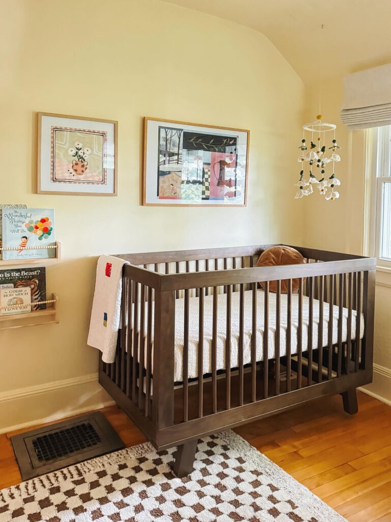
Carry butter yellow across the walls of a small nursery, then use dark brown for the main furniture. This is a good direction when you already have wood floors and want color without painting the trim or replacing the larger pieces. A dark wood crib gives the pale walls some contrast, while cream bedding leaves room for yellow to be the main color.
In a room with a sloped ceiling, take the yellow up over the angled section rather than marking every change in height with white. Near a window, test the paint on both the bright wall and the corner farthest from the glass; pale yellow can look quite different between them. Choose a shade that stays close to cream if the room gets strong afternoon sun.
Dusty Rose With Brown Wood
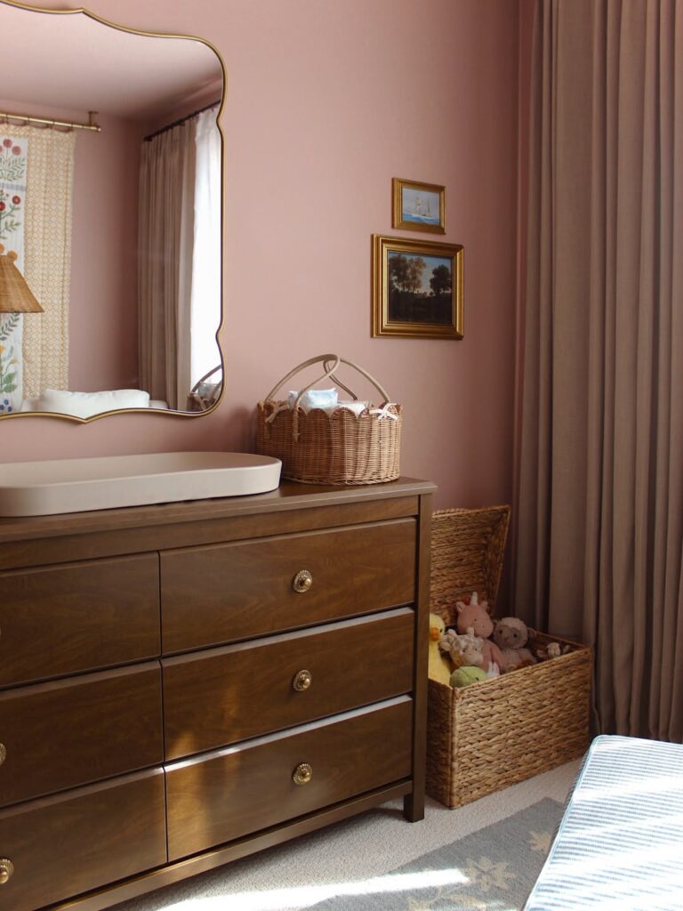
A dusty rose wall needs something darker next to it, or it drifts toward candy. The walnut-toned dresser does that here, and the brass knobs and gold picture frames pick up the same warmth.
Taupe curtains in nearly the same value as the wall keep the room quiet. With a white dresser, I think the pink would feel much sweeter.
Blue Gray and Dark Wood
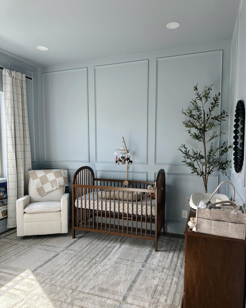
Blue-gray walls gain depth when the panel molding is painted to match. Start with one shade across the walls and trim, then add a dark wood crib and ivory upholstery for contrast. The key is checking the paint in daylight before covering every panel; blue-gray can shift cooler beside pale fabrics.
Dusty Mauve and Cream
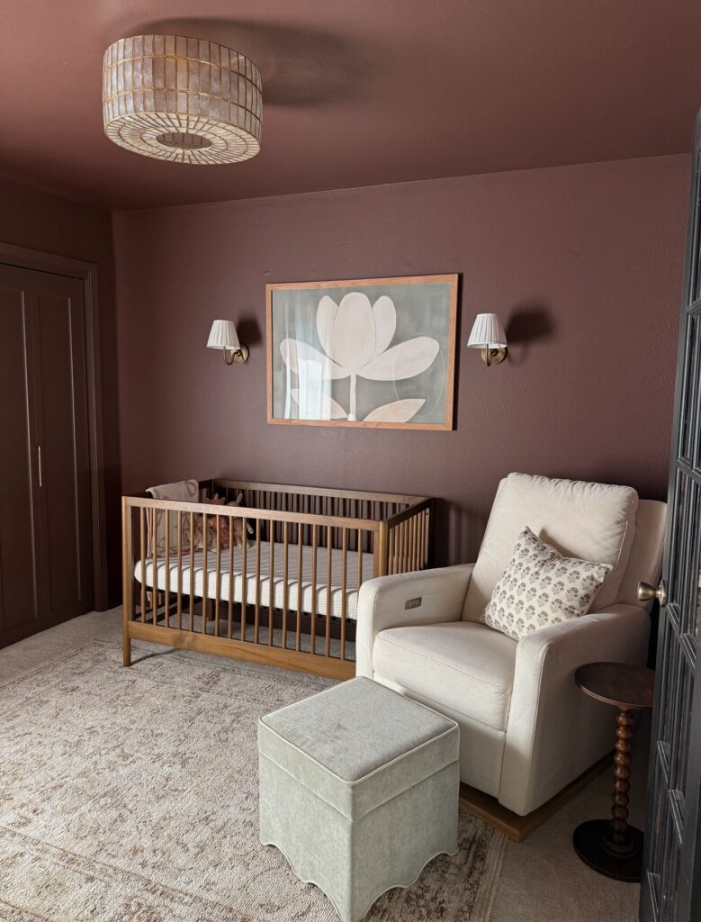
Choose a brown-based mauve for the walls, then carry it onto the ceiling if you want the color to wrap around the room. Look for a shade closer to cocoa than lilac; cream fabric and wood will stand out against it without a sharp contrast. If painting the ceiling is too much, use an off-white with a pink undertone rather than a bright white.
Bring in cream through the largest fabric pieces, such as a nursing chair and rug, and use a wood crib to bridge the light fabric and darker paint. Oak or a medium brown finish will work; if you already own a white crib, repeat that white in the bedding. For smaller accents, use muted sage or a floral print with a pale background.
Two-Tone Blue and Cream Walls
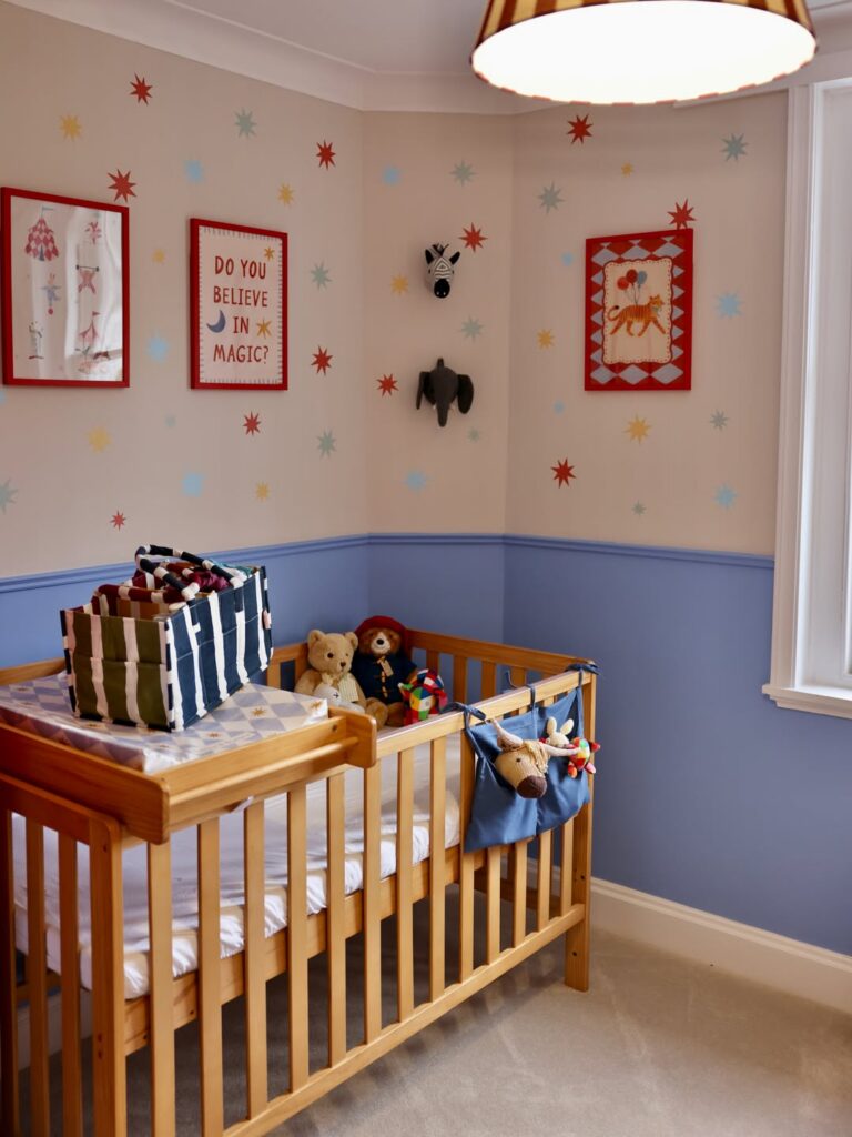
A painted band of blue running up to chair rail height, with cream above it, gives a nursery color without putting it all around the baby’s eyes. The blue here is a dusty periwinkle, and the line where the two colors meet is a thin raised molding, so nobody has to tape a straight edge.
The variation I’d try is the shade of the lower half. Periwinkle sits between sky blue and navy, and it holds up next to the red and gold in the small stars on the cream wall. A paler blue would fade against the cream and the white trim. A deeper navy would make the corner feel smaller, since the crib and the window frame already take up a lot of it.
Mint, Sand, and Cream
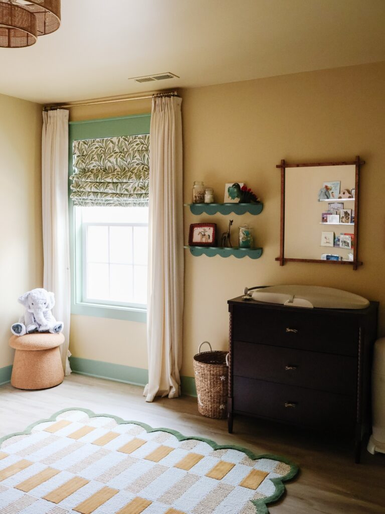
Mint and sand can drift toward nursery pastel if every surface gets the same pale value. On the wall and trim, mint has enough color to hold its own, while sand keeps the room from feeling chilly. The trouble starts when the beige leans too yellow or the green turns blue; beside each other, the undertones can make both look dull.
Use a warm cream for curtains and bedding, then repeat the mint in one or two smaller places rather than painting every piece of furniture. A botanical print can connect the colors, but several competing patterns quickly make the palette hard to read. Keep the larger surfaces quiet and choose a print with a light ground.
Dark wood adds useful contrast, though too much can pull the room away from the pale palette. One dresser or basket is enough. Before committing to paint, check the green and beige in daylight and at night; artificial light can shift their undertones.
Cream Brown and Blush
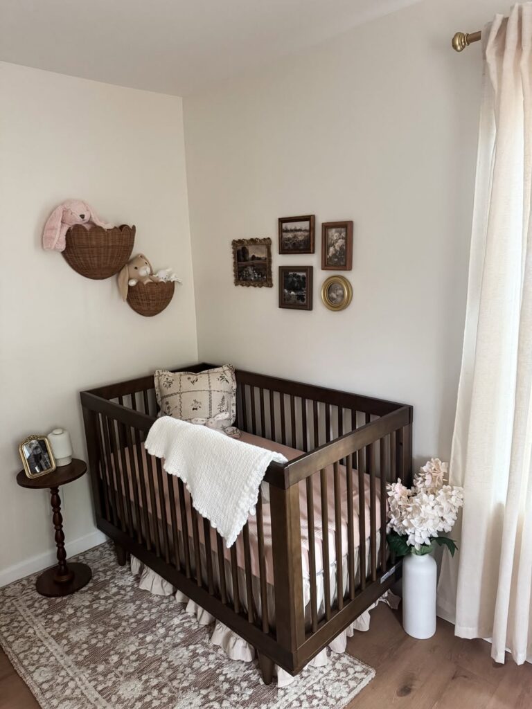
Pair cream walls with dark brown wood and pale blush if you want pink without making it the main color. The dark wood crib gives the pale shades some weight, so this is a good choice if you prefer older furniture to an all-white nursery.
If you already have brown furniture, you can build around it rather than paint it, with blush kept to a fitted sheet or curtains. Choose another palette if you want crisp white walls or bold color across large areas; this combination leaves most surfaces pale. I’d also go in a different direction if you want the furniture to blend into the walls, since the brown crib will remain the strongest shape in the room.
Pale Blue With Red Trim
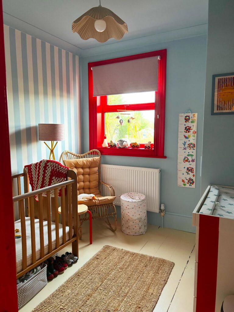
Decide how much red the room gets before you paint anything, because the window frame sets the limit. Once the frame is red, I’d put soft blue on the walls and stripes on one wall only, in blue and cream so they stay quiet next to it.
Then repeat the red in two or three small places, like a stool leg or the front of a dresser, and stop there. A jute rug, honey-colored wood and a pale floor give the red room to sit without crowding the cot.
Lilac, Blush, and Sage
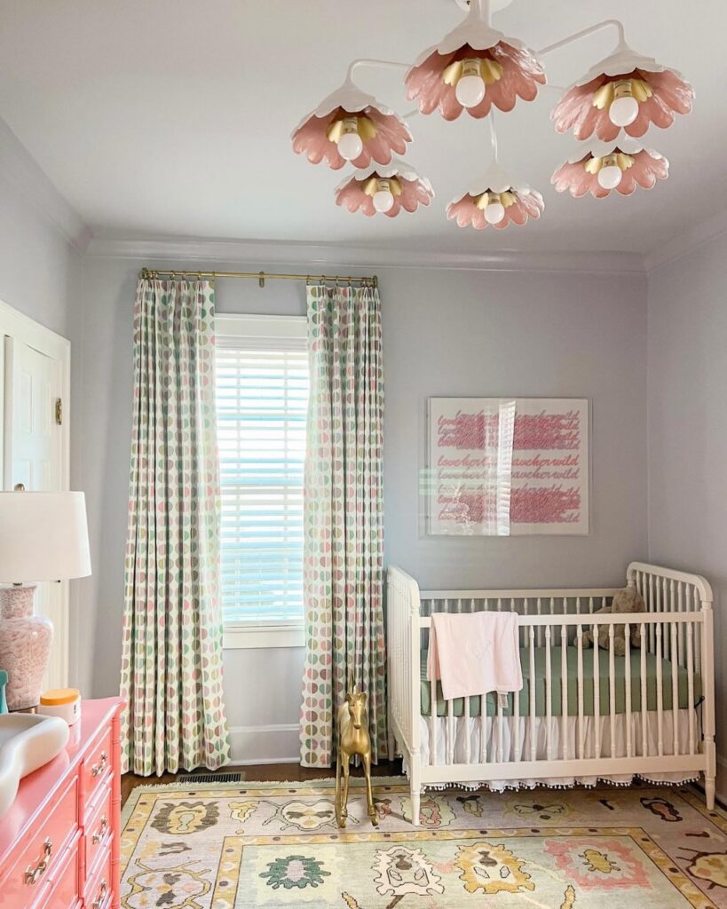
Against pale lilac walls, blush pink and sage can carry the larger nursery accents without crowding the room. Use sage for a crib skirt or bedding, then bring blush to the curtains, a small dresser, or a throw over the crib rail. Cream keeps the palette from feeling too sweet, while a little mustard in a rug or small decor adds contrast.
This mix works well in a nursery with good window light; in a darker room, I’d put lilac on one wall and use a warm white elsewhere.
Butter Yellow and Green
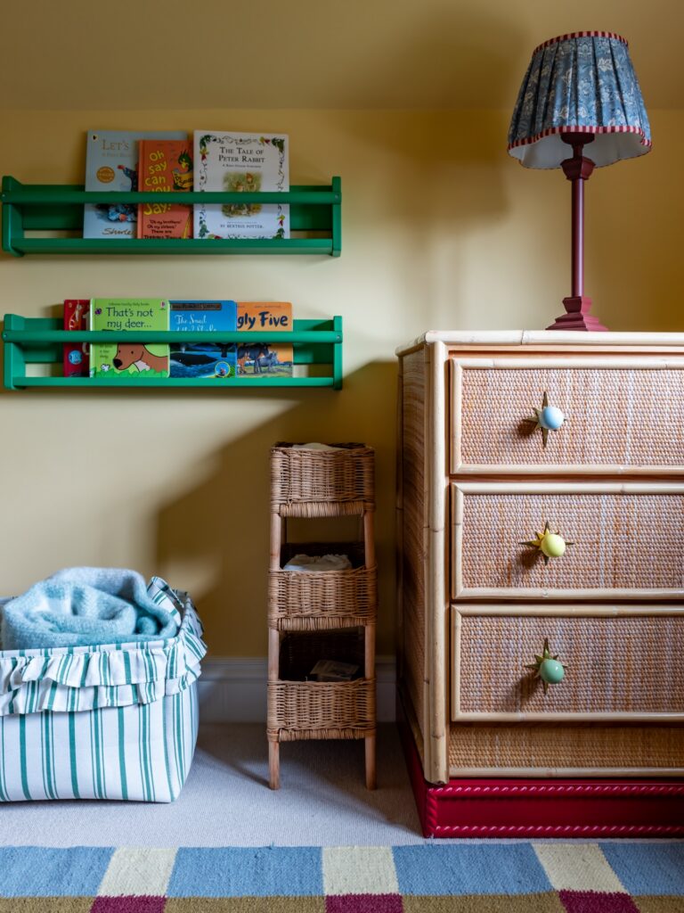
Use butter yellow rather than mustard on the walls, with green for the book ledges and berry red near the floor. The lighter wall color gives the green a sharper outline and leaves room for blue in smaller amounts. A blue lampshade is enough; carrying that color onto the furniture would give it a much larger role.
Deep Red Wainscot Below Pink Wallpaper
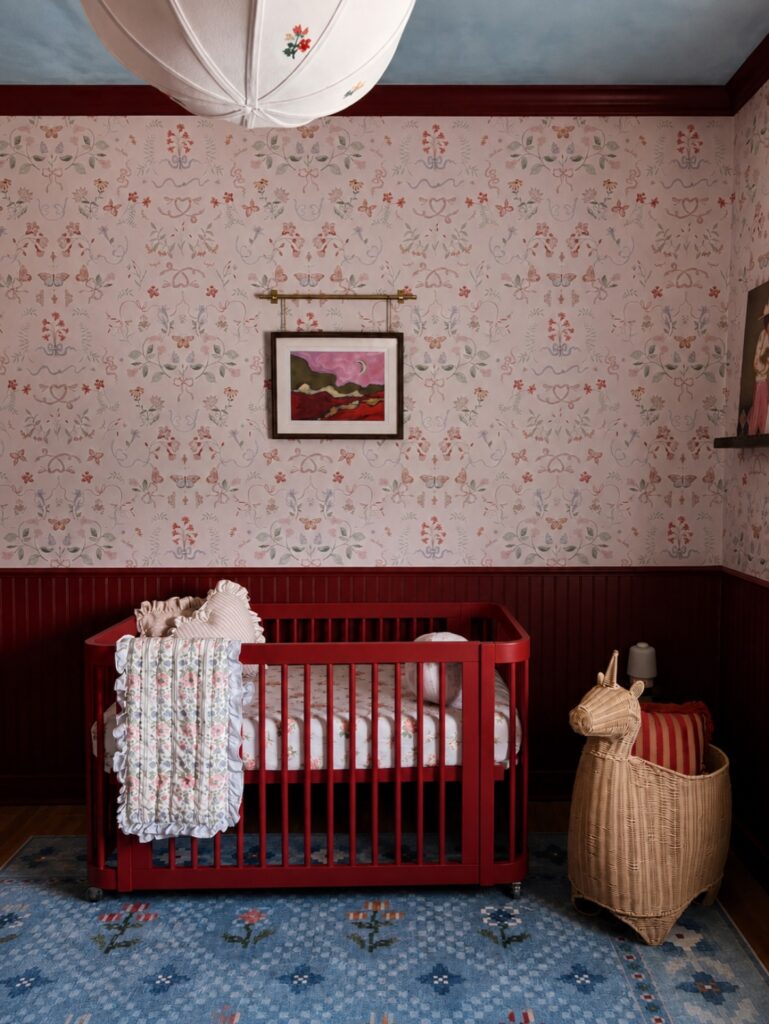
The dark red paneling on the lower half of the wall is what keeps the pink wallpaper from going sugary. The paper is a small floral print on a pale blush ground, and on its own it would be sweet and not much more. The red wainscot, with the matching trim at the ceiling, gives it a heavy base and a firm edge, so the flowers have something to sit against.
Without it, I think the room would feel flat and a little washed out, especially with a blue ceiling overhead. The red also ties in the crib, which is painted nearly the same shade and sits right against the paneling. That makes the crib look like part of the room instead of something placed in front of it.
I’d match the crib to the paneling the way this one does, or go clearly lighter. A red that is close but off would look like a mistake.
Blue Gray and Red
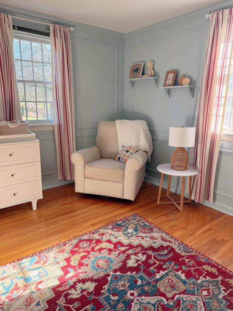
A red stripe in a curtain can look much louder beside a large red rug. Blue-gray walls give the color a clear backdrop, so leave some space around red instead of repeating it across every surface. Cream upholstery and pale furniture can cover the larger areas, while red stays in textiles that are easy to change.
The scheme can feel busy when the curtains, rug, cushions, and bedding all have strong patterns. Choose one main pattern, then use smaller marks or solid fabric elsewhere. Check the paint beside the red in daylight and lamplight, since some blue-grays shift toward green or violet as the light changes. A rug with pale areas between its red shapes can link the bold color to the walls without adding another dominant shade.
Sage Green and Blush Pink
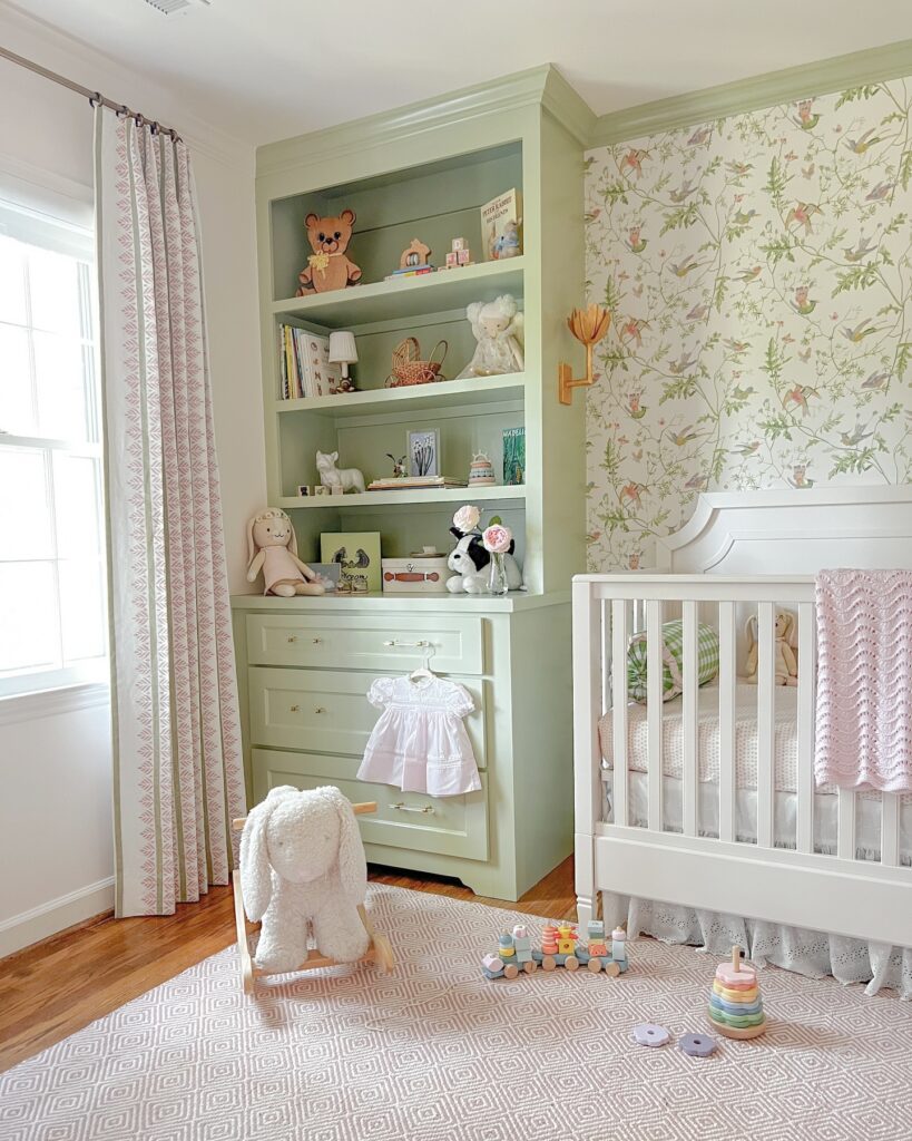
With sage green covering the shelving and blush pink running through the fabrics, cream gives both colors room to show. Use a muted green paint on a dresser or bookcase, then repeat the pink in curtains or a knitted blanket. An ivory wallpaper with fine green branches carries the palette onto the wall without another large block of paint.
If wallpaper is beyond the budget, cream walls and a botanical print in a pale wood frame will carry the same colors. Without built-in shelving, a painted chest gives you that green base, while a white crib leaves room for the smaller pink details.
Mustard Yellow With Green Accents
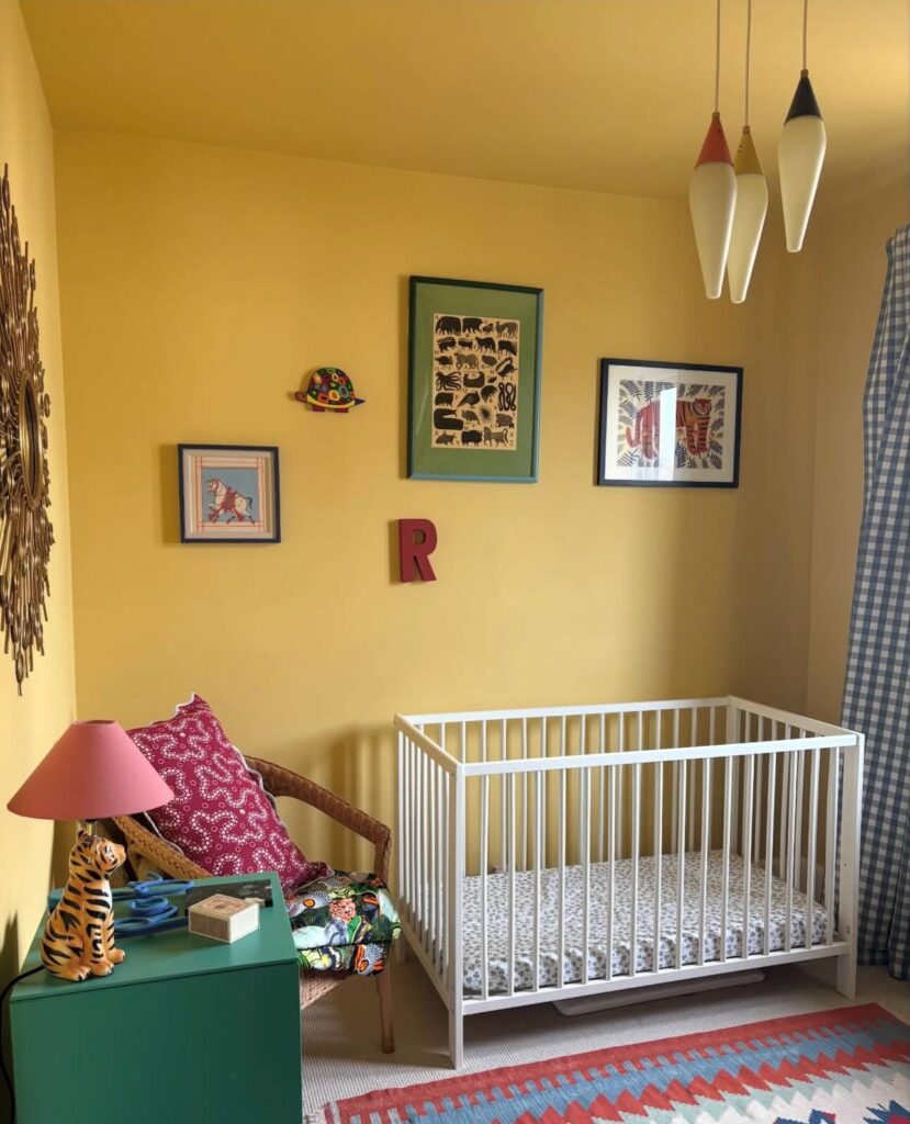
Paint comes first, and it goes on the ceiling as well as the walls. A single mustard yellow carried overhead makes the corner feel wrapped rather than boxed, and it hides the line where wall meets ceiling. Do this before anything gets bought.
Next, pick one deep green and use it on a single solid piece, like the small cabinet here. Green sits opposite red-pink on the color wheel, so a pink lampshade and a berry pillow can join it without any extra planning.
The step that matters most is the crib. Keep it white so the yellow has somewhere to rest. Then let the rug, pillow and framed prints bring in the other colors, and hang the prints in a loose cluster at different heights. I’d stop at four or five colors in total, because the yellow already fills so much of the room.
Cobalt and Marigold
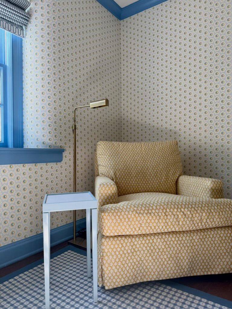
Cobalt trim against marigold upholstery gives a nursery a clear color scheme, but repeated small-scale patterns can make the room feel busy fast. The trouble starts when wallpaper, chair fabric, rug, and curtains all carry similar-sized motifs; the eye has nowhere to rest, and the colors blur together.
Let one pattern lead, then give the others a quieter role. A small floral wall print can sit beside a larger upholstery motif, while a plain blue window frame and baseboard repeat the strongest color without adding another print. If the rug is patterned too, choose one with plenty of open space and keep its colors close to the walls. A solid crib textile or shade can provide another pause.
Blue Gray and Olive
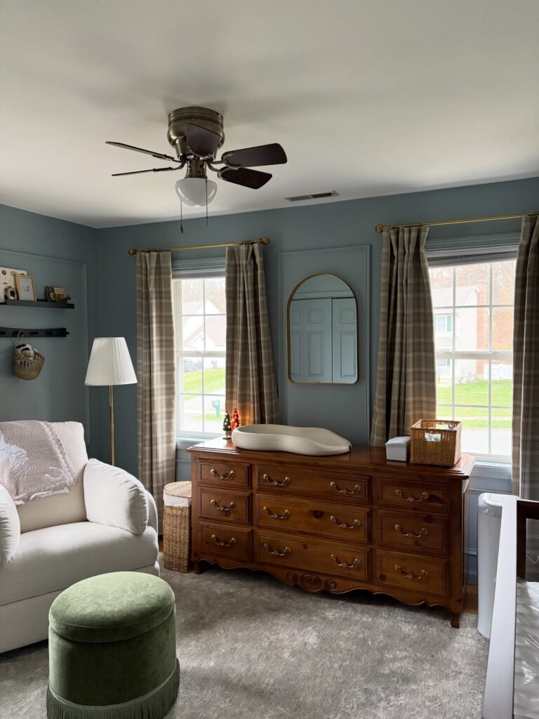
Pair blue-gray walls with olive green fabric and brown wood, then use cream for the larger upholstered pieces. The green can stay small; a velvet footstool is enough against a cream chair. Beige plaid curtains bring in another shade of brown without needing to match the dresser.
For the wood, look for a finish with some depth rather than a pale wash. If you already have white furniture, bring brown into the scheme through woven baskets and curtain fabric instead. Choose a blue-gray paint with a muted cast so the olive doesn’t feel too sharp beside it.
Mint Walls, Pink Curtains
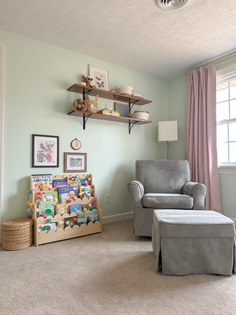
Pale mint on the walls works because the curtains next to it are a dusty pink with a little gray in it. A bright pink would fight the green, and the two would stop looking like they belong together. The soft pink panels hang from a rod near the ceiling, so the color runs the full height of the window and balances the wall beside it.
Without that second color, the room would lean on the gray glider and ottoman alone, and the mint would look flat and a bit cool. The wood shelves and the woven baskets add a warm brown. I’d keep the pink in the fabric only and let the books supply the brighter colors.
Sherbet Stripe Palette
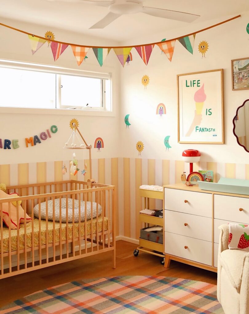
Against warm white, pale yellow and blush stripes give the lower walls their color, while mint, coral, and turquoise appear in smaller details. Keeping the strongest shades on the bunting, rug, and wall decorations leaves the crib and dresser from competing with the room’s pattern. A checker or plaid rug can gather those colors in one place; a solid rug would make the stripes feel more prominent.
For a quieter version, use wider bands of cream and pale mint instead of alternating yellow and blush. That shifts the color across a larger area but lowers the contrast, so the room feels less busy. Keep coral or orange in just one or two small pieces, such as a wall decal or toy, rather than repeating it across every surface. The palette still has several colors, but the larger areas stay light. A wood crib also gives the stripes a clear edge without adding another painted color.
Blue Cream and Honey Wood
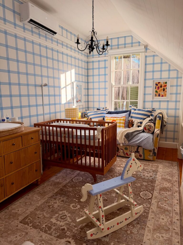
With blue checks on cream walls, this palette leaves room for yellow accents and honey-colored wood. Choose it if you like pattern enough to live with it on every wall; the striped cushions show how another blue pattern can join in without adding more colors. If you prefer large areas of plain color or plan to use lots of different prints, choose a scheme with solid walls instead.
Painted Ceiling, Mural Walls
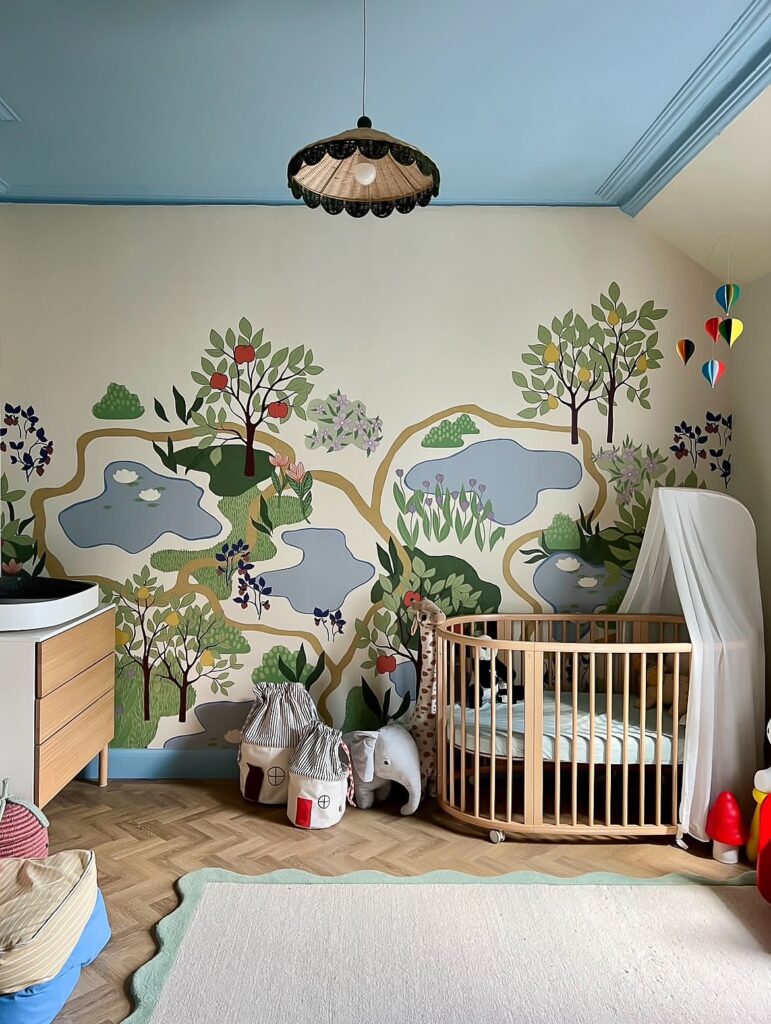
A ceiling painted sky blue with a cream mural wall below it gives a nursery two colors to work with and leaves the rest to the artwork. The mural here uses soft greens, dusty blue ponds and a few red apples, so everything else in the room can stay pale.
This works best in a room with a wall that has no windows or doors, since the cot can sit against it and the painting stays visible from the floor. I’d paint the ceiling and the crown molding the same blue so the edge looks deliberate. Light wood furniture and a cream rug keep the mural in front.

