21 Moody Powder Room Ideas
This site contains affiliate links. We may earn a small commission, at no extra cost to you. Article may contain some images for illustrative purposes only .
The powder room is the only space in your house where you can go full drama without consequence. No natural light to fight. No morning routine to accommodate. Just four small walls, a sink, and permission to do something wild—like drench the whole thing in oxblood lacquer or paper it in a print your spouse would never let past the foyer. That’s the secret these 21 moody powder rooms are built on: deep jewel tones, matte black fixtures, moody florals, candlelight sconces, and ceilings that refuse to stay white. Ahead, the walls get darker, the brass gets warmer, and the mirrors get stranger—room by room, idea by idea.
Dark Green Walls With Brass Details
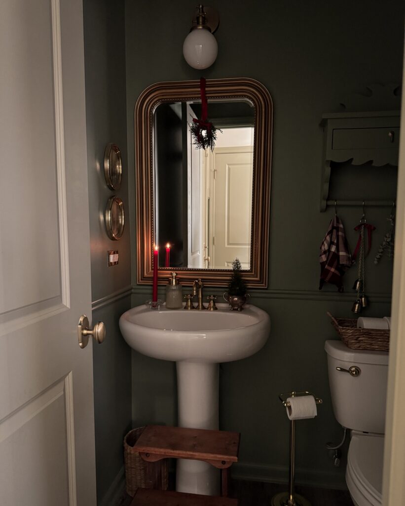
The wall color here is doing most of the work. A deep muted green like this reads completely different from standard bathroom neutrals — it pulls the gold mirror frame and the brass faucet into the same visual conversation instead of letting them sit there looking mismatched. If you’re going this route, the paint needs to go all the way to the ceiling, not just below the chair rail.
The wainscoting here stays the same green rather than switching to white, which is the detail most people get wrong. One lit taper candle on the sink ledge is enough. I’d skip the mini Christmas tree personally — the wreath on the mirror already handles the seasonal note without crowding the basin.
Dark Olive Walls
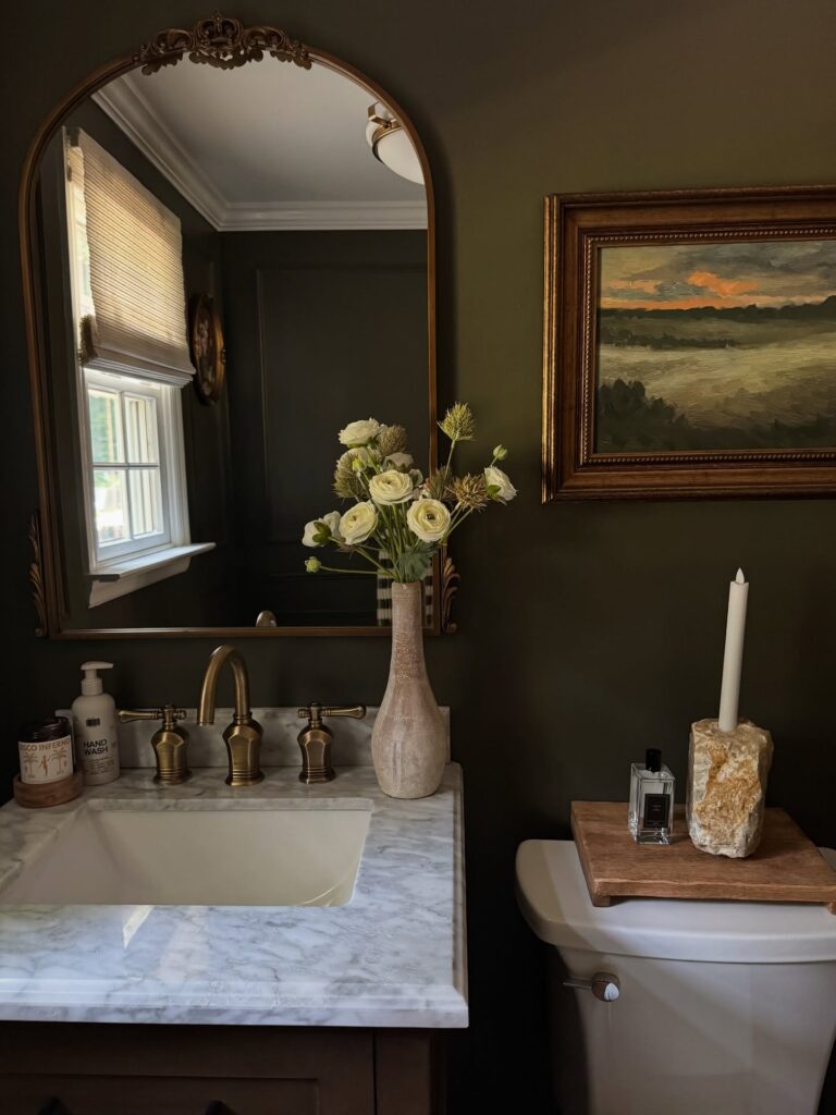
Behind the mirror, that deep olive paint is doing most of the heavy lifting. Pair it with aged brass taps, a carved mirror, and one framed landscape if you want the room to feel collected rather than newly decorated. Keep the counter quiet.
Marble already has movement, so a soap bottle, one vase, and maybe a candle holder are enough. If your powder room has a small window, use a woven shade or linen blind so daylight hits the wall without making the color look flat. I would skip extra art here; one moody piece beside the mirror gives the eye somewhere to rest.
Zebra Wallpaper Goes All In
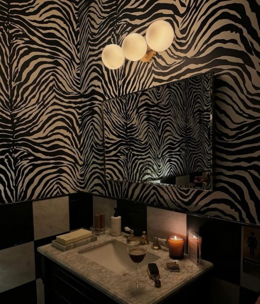
Zebra print on every wall of a small bathroom sounds like a bad idea until you see it done in black and cream with no other pattern competing. The scale here matters. Big stripes, not tight little ones, otherwise the room starts to vibrate. Everything else stays quiet — checkerboard marble below, a plain rectangular mirror, three frosted globe lights clustered together. That’s the trick. You commit to the wallpaper and let the rest do almost nothing.
A powder room is the right place for this because nobody’s spending an hour in there. If I were doing it, I’d skip the checkerboard base and run a solid dark stone instead. Two graphic patterns in one tiny room is a lot to ask of anyone brushing their teeth.
Dark vanity brass accents
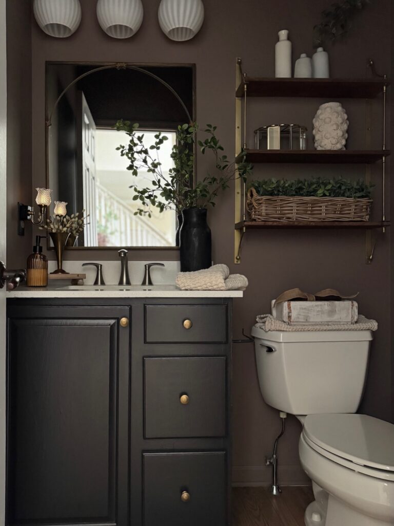
Start with the vanity, because that black-painted cabinet and the round brass knobs do most of the heavy lifting here. Against brown walls, the contrast stays low, which is why the room feels moody instead of chopped up. Keep the countertop pale though. That strip of white stops the whole thing from getting too heavy at eye level.
The other part worth stealing is the shelf hardware and faucet finish. Repeating brass in small spots makes the room look thought through, even if the vanity is just a basic cabinet repaint.
Don’t overfill it. One tall vase by the mirror, a basket on the shelf, maybe folded hand towels on the toilet tank, and then stop, because powder rooms get cluttered fast and every extra item starts reading as storage overflow.
Wallpaper Above the Dado Rail
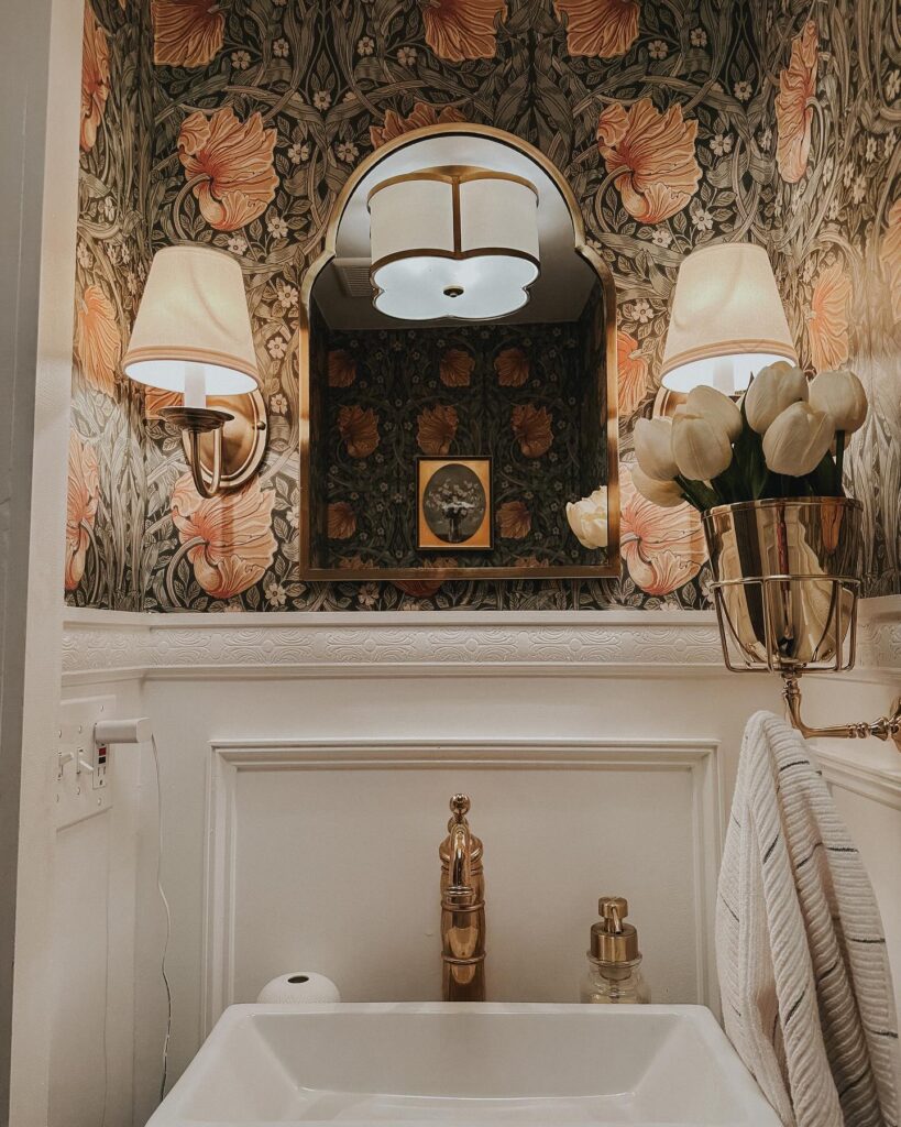
Running bold wallpaper only on the upper half is doing a lot of the heavy work here. The white panelling below keeps it from feeling overwhelming, which matters with a pattern this dense — Morris & Co. Pimpernel, or anything close to it, has a lot going on.
Powder rooms are one of the few spaces where that’s actually fine, because nobody lingers. The arched brass mirror is a good call too; a flat rectangular one would have fought the organic shapes in the print. If you’re sourcing the wallpaper and it’s running expensive, just do the upper section.
You’ll use maybe a third of the rolls and the effect reads the same.
Glossy Green Walls
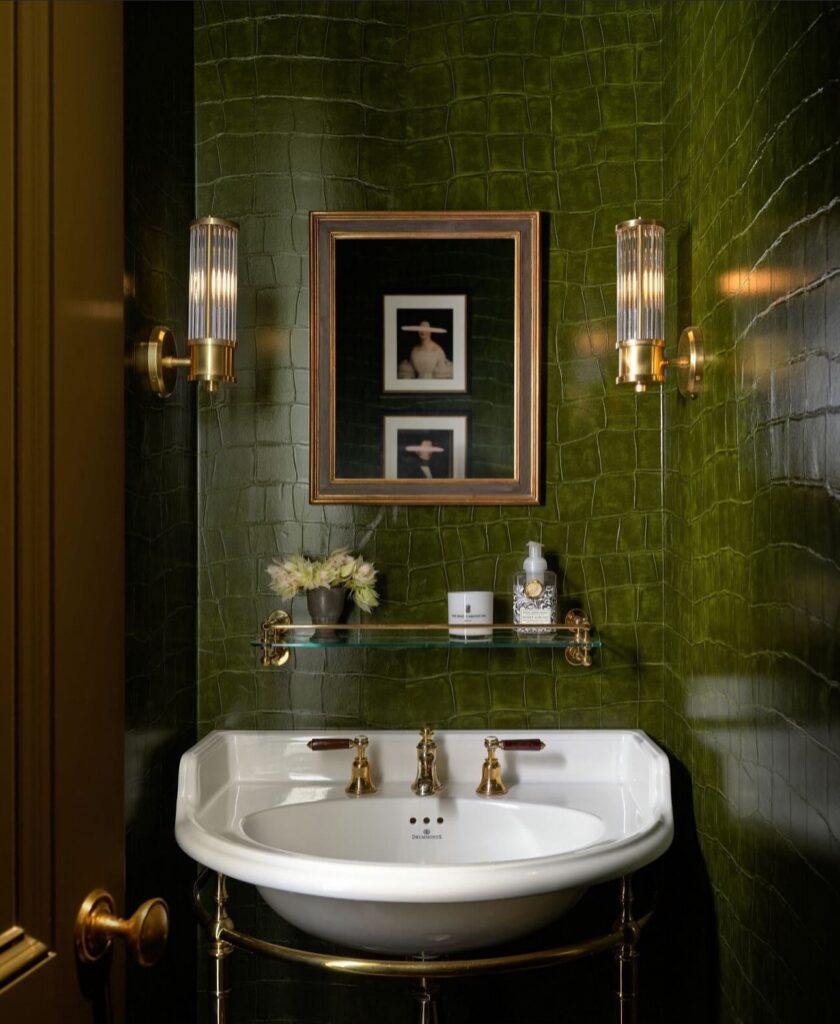
Start with the walls first, because that crocodile-style green finish is doing most of the work here. Keep the rest tight. A white basin gives the eye somewhere to rest, and brass taps, brackets, and ribbed sconces make the green feel intentional instead of like a dare.
If real textured tile is out of budget, look for embossed wallpaper with a wipeable coating, but use it above areas that won’t get splashed every day. I’d skip a big vanity here; the open legs and thin glass shelf are why it works.
Dark Florals Above the Wainscoting
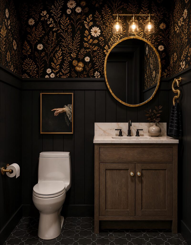
Splitting the wall works. Black vertical panelling covers the bottom half, and the wallpaper — cream and rust florals on near-black — takes over up top, which keeps the pattern from swallowing the room whole.
The trick is committing to the dark base. If you papered from floor to ceiling in something this busy, the vanity and toilet would disappear into it. The panelling gives your eye a resting place.
I’d keep the accessories restrained the way they’ve done here. One small framed painting, a brass mirror, a vase with a couple of stems. Any more pattern on the counter and it starts fighting the walls.
Good for a windowless powder room where you’re not trying to fake daylight anyway. Lean into the dark instead of working against it.
Black walls, pale floor
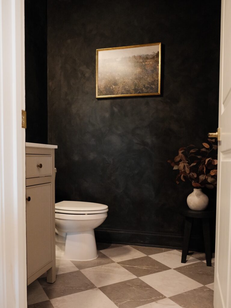
Start with the contrast. A powder room can handle near-black walls because the floor is doing a lot of work here, with those large light-and-taupe checks keeping the room from feeling flat or boxed in. If you want this look, don’t stop at paint alone. Bring in one lighter surface at floor level, then repeat it on the toilet, sink cabinet, or trim so the dark walls have something to push against.
The wall finish matters too. A slightly cloudy, plaster-like paint treatment reads better than a hard solid black in a small room, since it catches light and shows some movement across the surface.
Keep the art small. One brass-framed piece hung with plenty of empty wall around it looks calmer than a gallery wall here. I’d skip anything too glossy, though. In a room this dark, glare shows up fast.
Paint the Trim the Same Color
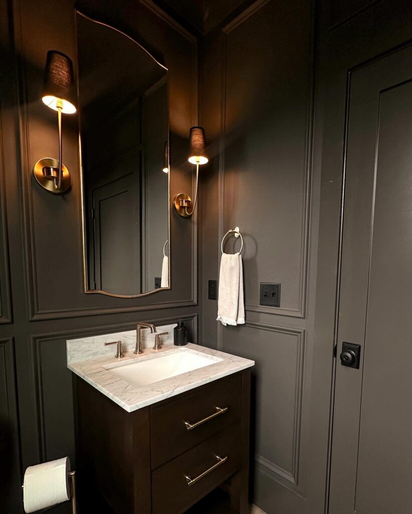
The wall paneling here only reads as paneling because of the shadow lines between the molding — not because it contrasts with the wall. Everything is the same dark charcoal, trim included. That’s the thing most people get wrong; they paint the trim white and suddenly the whole effect flattens out.
Match them. The brass sconces and the gold mirror frame do enough visual work on their own without the molding competing. One thing I’d actually reconsider is the towel ring placement — it sits right between the sconce and the outlet and looks slightly squeezed in.
If you’re planning this from scratch, leave more wall between those elements. Small bathroom. Every inch of clear wall matters more than you’d think.
Brown Paneling With Florals
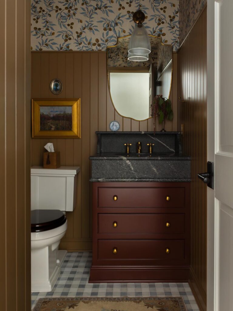
Start with the wall split if you want the room to feel darker without making every inch heavy. Take the paneling up to about shoulder height, paint it brown, then let a leafy wallpaper sit above it so the pattern has somewhere to breathe. This matters.
In a small powder room, that lower band hides splashes and fingerprints better than wallpaper would, while the print overhead gives you the old-house feeling people usually try to fake with accessories. A burgundy vanity works well here because it sits between the brown walls and the black stone top instead of shouting for attention. I’d skip a bright white mirror frame; brass or an antique finish keeps the whole thing from looking too newly done.
Shelves Above the Toilet
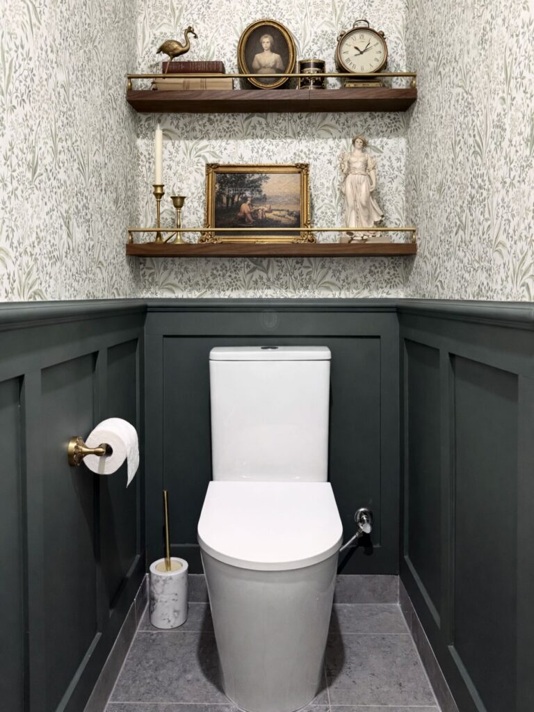
The wall behind a toilet is dead space in most powder rooms, and two floating shelves fix that fast. Walnut works here because the wallpaper is busy and green — you need something with weight to anchor all that pattern. Look at what’s on those shelves: a small bronze bird, an oval portrait, a mantel clock, brass candlesticks, a gilt-framed landscape, a little classical figure. Nothing matches. That’s the point. Hunt estate sales and your grandmother’s basement rather than buying a curated “set” online.
One thing I’d change — the brass gallery rail on the lower shelf reads a bit fussy against the panelling. A plain edge would let the objects do the talking. Keep the top shelf taller than the lower one so the clock has breathing room.
Botanical wallpaper contrast
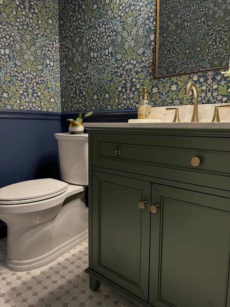
Start with the wall treatment. A dense botanical wallpaper like this works best in a powder room because you only need a few rolls, and the small footprint lets you go darker and busier than you probably would anywhere else. Then break it with a painted lower wall in a deep blue or charcoal so the pattern doesn’t swallow the room from floor to ceiling.
The green vanity is what makes this feel thought through instead of random. Pull one color straight from the wallpaper and use it on the cabinet, then repeat the metal finish on the faucet, knobs, and mirror frame so the whole thing links up without much effort.
Keep the floor pale. Small hex tile does that job nicely.
I’d skip adding more decor here, because the wallpaper is already doing most of the talking.
Match Your Tiles to the Wall Paint
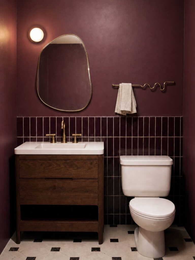
Running the same deep burgundy across both the painted upper wall and the glossy vertical tiles below it is what makes this room read as intentional rather than just dark. The tile stops at about counter height, which is the right call — any higher and you lose the contrast that makes the tile worth noticing. Brass fixtures are doing a lot of work here against all that red-brown, so if you go this route, don’t mix metals.
The wavy towel bar is the one place this room takes a small risk, and honestly it earns it. If your powder room is this small, a dark floor-to-ceiling color like this only works if your light source is warm — that globe sconce on the left is exactly the right call.
Antique Dresser Vanity
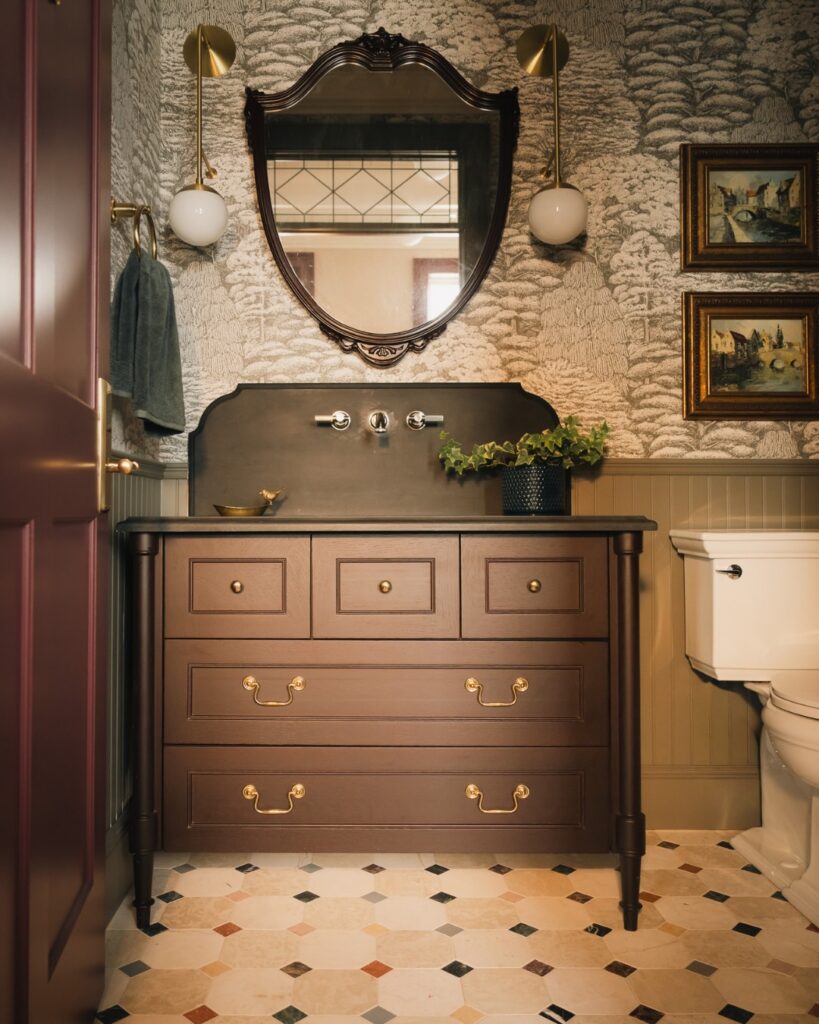
Start with the dresser-style vanity if you want the room to feel collected rather than freshly installed. The dark wood, raised panels, and brass pulls do most of the work, so keep the sink wall tight with wall-mounted taps and a low backsplash. Patterned wallpaper can go above it; a tree or landscape print gives the mirror something to sit inside.
Keep the lights slim. Those globe sconces work because they hang high and don’t fight the carved mirror frame. I’d skip open shelving here; it would break the furniture look and give you one more place for dust, extra rolls, and tiny bottles.
Marble Sink Against Black Tile
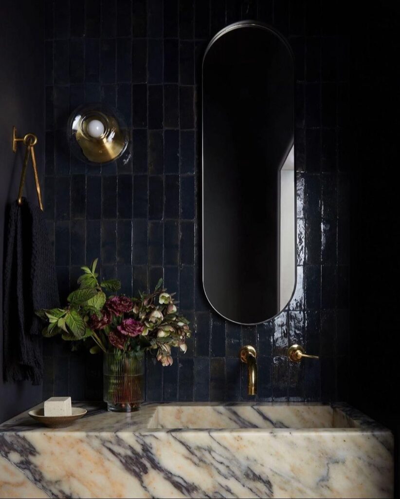
The chunky marble basin is doing all the heavy lifting here. Veined stone against those glossy dark zellige tiles — that contrast is the whole idea, and it only works because the marble has enough movement and warmth in the veining to fight back against all that black.
Wall-mounted brass taps are the right call. A deck-mounted faucet would eat into the basin and break the line of the stone.
If you’re copying this, spend on the sink. A thinner marble vanity top with an undermount bowl won’t land the same way. The handmade tiles matter too — flat matte black would just read as a dark wall. You want that uneven glaze catching the sconce. Keep everything else quiet: one small dish, a jar of stems, done.
Botanical mural wall
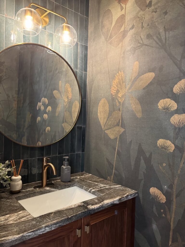
Start with the wall treatment here, because the whole room hangs on that dark floral mural and the narrow blue tile behind the mirror just backs it up without fighting for attention. If you want this look to land, keep the mural oversized and low contrast, then bring in only two or three supporting finishes: a brushed brass light, a thin round mirror frame, and a stone top with some movement in it.
Less is better.
A powder room can handle this much pattern because you are in and out, and the plain white sink keeps the middle of the vanity from feeling too heavy. I’d skip a busy faucet shape though; the simple curved one works because the wallpaper and stone are already doing enough.
Dark Wallpaper Above the Wainscoting
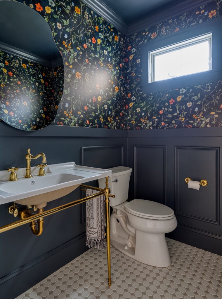
The panel molding does a lot of work here — it gives the dark paint somewhere to stop, so the floral wallpaper above it reads as intentional rather than overwhelming. If you’re nervous about committing to a print like this on every wall, the wainscot line gives you a natural break to work with. The brass console sink and exposed pipe underneath are worth noting too, because open-leg vanities read much better in small rooms than a full cabinet would.
Less bulk. For the wallpaper itself, a dark ground with small-scale scattered florals will hold up in low light better than large botanical prints, which can feel busy once the door closes. I’d probably skip the round mirror here in favor of something with a harder edge — the curves compete a little with the wallpaper’s detail.
Patterned Walls With Brass
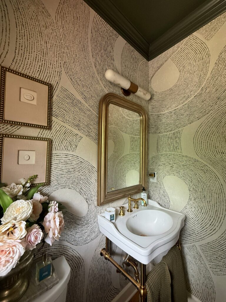
Start with the wallpaper if your powder room is small enough to handle a full wrap. The broken circular lines give the walls movement without needing art on every side, and the dark ceiling keeps the pattern from feeling loose. Keep the sink traditional.
A brass-framed mirror and bridge faucet make the paper feel more settled, especially with a white basin doing very little. I’d skip extra shelves here; they would fight the lines and collect dust in a room this narrow. One sconce is enough.
If you rent, try peel-and-stick paper on the largest wall first, then paint the ceiling olive or charcoal only after you know the pattern doesn’t annoy you.
Marble Sink on Black
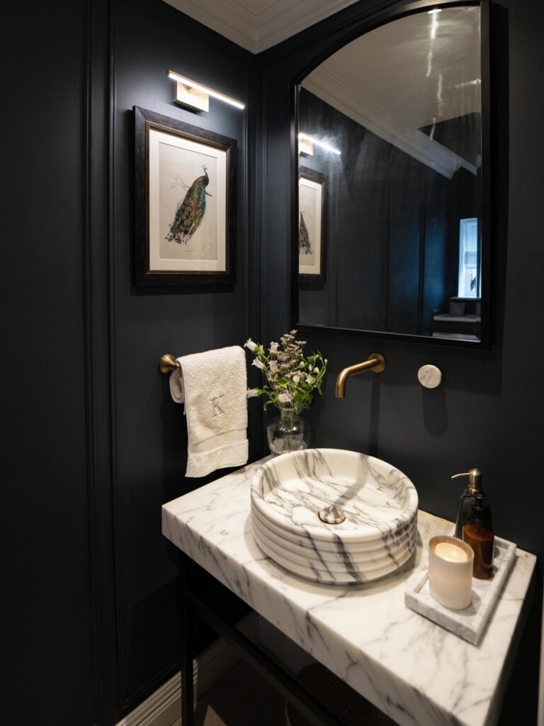
The move here is contrast. A veined marble basin sitting on a matching marble slab, against walls so dark they almost swallow the corners. Without that white stone, the room would feel like a cave. With it, your eye lands exactly where it should — the sink.
If you’re copying this, don’t skimp on the marble. A cheap resin vessel with fake veining will look wrong immediately next to real stone. Better to do a plain white ceramic bowl than a bad marble lookalike.
The brass tap and towel ring pull everything together. Peacock print, monogrammed towel, small candle on a tray — that’s the whole styling list. I’d probably skip the monogram personally. Feels a bit hotel-gift-shop. But the rest of it works.
Black walls, white trim
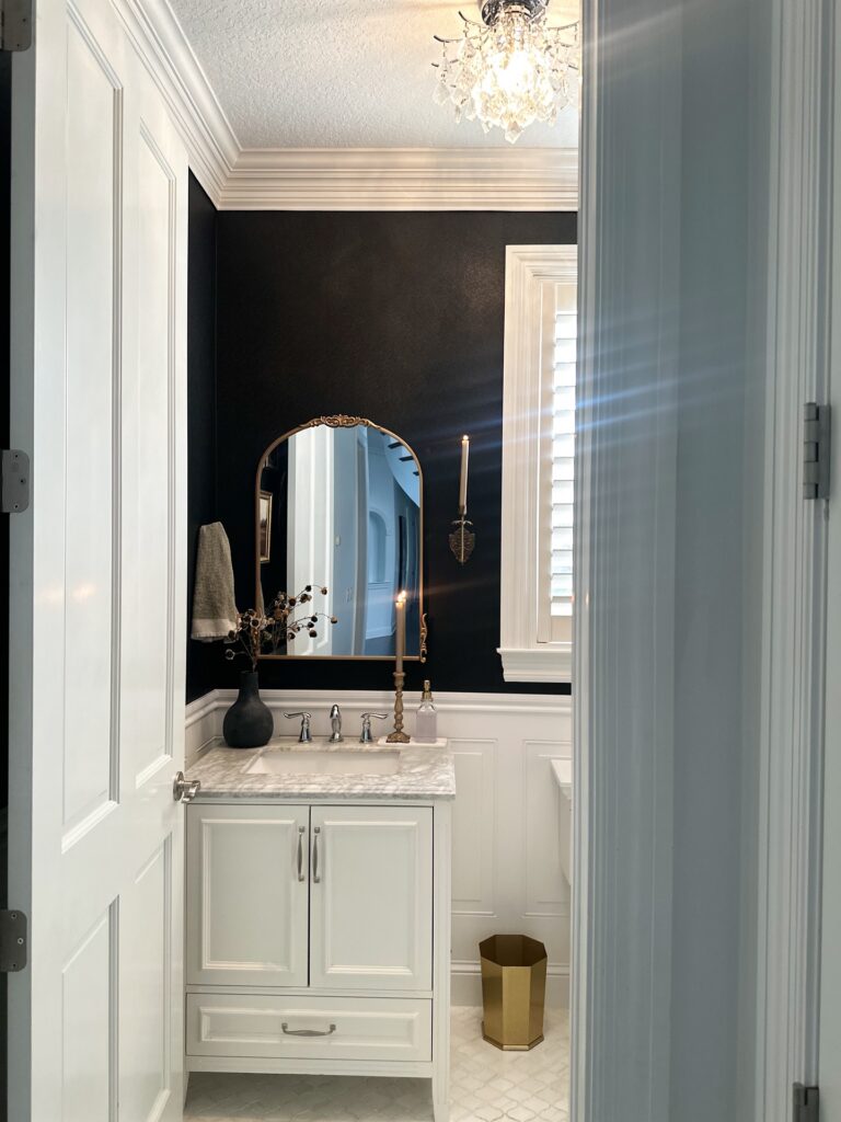
Start with the contrast. The reason this powder room works is that the black wall color stops at the chair rail, while the thick white crown, window casing, vanity, and paneling keep the room from turning into a dark box. In a small bathroom, that matters more than people think.
The arched brass mirror helps too. Against a flat dark wall, that outline gives the eye one softer shape, and the metal ties in with the candle holder and waste bin without needing matching everything.
Keep the counter simple. One vase, one soap bottle, maybe a hand towel.
I’d skip anything too modern here, especially matte black hardware, because it would fight with the more traditional trim and that slightly dressy light fixture overhead. This suits older homes, or newer ones trying to borrow some of that look.
Paint the Panelling One Colour
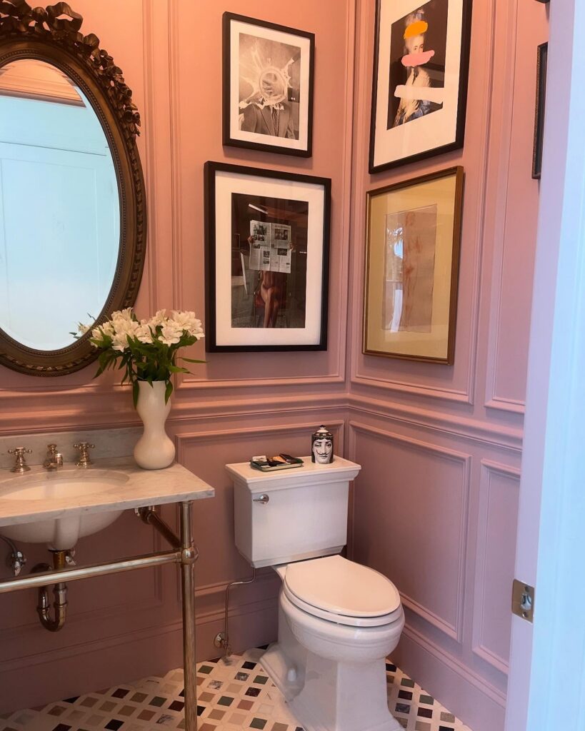
Matching the wall panelling and the wall itself to the same dusty pink — no contrast, no break — is what makes this room feel deliberate rather than decorated. The moulding still reads clearly because of shadow and depth, not because it’s a different shade. If you’re doing this, pick a colour with some grey in it.
Pure pink goes juvenile fast. The console sink with exposed legs works here because it keeps the floor visible, which matters when the walls are this saturated. Framed art stacked above the toilet is a good call in a powder room — it’s a wall people actually look at.
I’d probably skip the one with the gold frame; it reads slightly warmer than the rest and pulls your eye for the wrong reason.