21 Moody Bathroom Ideas
This site contains affiliate links. We may earn a small commission, at no extra cost to you. Article may contain some images for illustrative purposes only .
The matte black clawfoot tub was the first thing I bought. Everything else came later—the ink-blue plaster walls, the smoked mirror, the single brass sconce that throws light like a candle in a wine cellar. It shouldn’t have worked. My contractor said I’d regret it inside a year, that dark bathrooms feel like caves, that resale would tank. Two years in, it’s the only room guests photograph. Turns out moody bathrooms aren’t about darkness at all; they’re about restraint, texture, and knowing exactly where to place a shadow. Below, 21 ideas pulled from real spaces—deep green tile, unlacquered brass, checkerboard slate, a chandelier dripping over a soaking tub—each one a small argument for treating your bathroom less like a utility closet and more like the last room in the house you turn the lights off in.
Go All In On One Dark Color
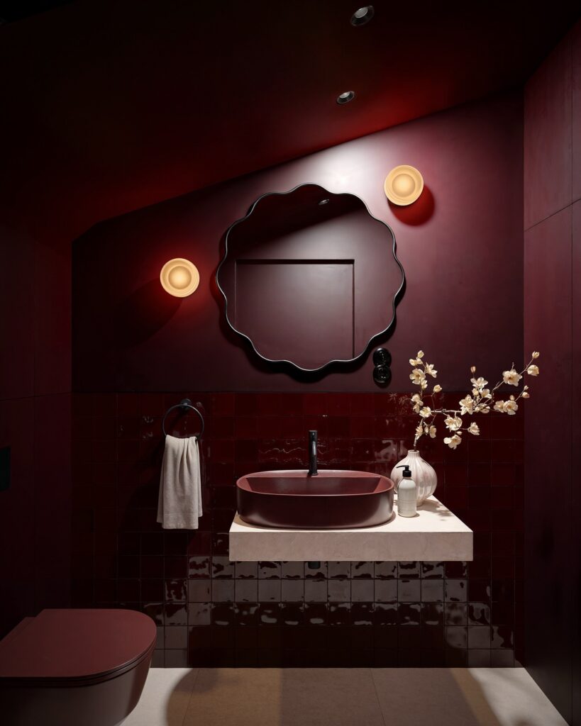
Burgundy on every surface — walls, ceiling, tiles, even the basin — is what makes this bathroom feel like a deliberate choice rather than an accident. The cream countertop slab and the two wall sconces with their warm, pale glow are doing a lot of work here; without something light breaking through, the whole thing would just feel like a cave. If you’re trying this at home, pick one shade and buy enough to do the ceiling too.
That’s the part most people skip, and it’s actually the most important step. The scalloped mirror frame is a nice detail but not essential — a plain black circle would still hold up. This works best in a powder room or guest bath, somewhere small enough that you’re not painting 40 square meters of deep red.
Deep Green Walls
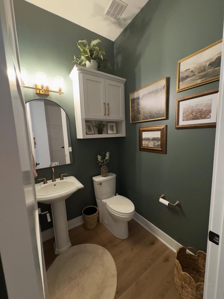
With a green this dark, keep the rest of the room disciplined. The white pedestal sink, toilet, trim, and wall cabinet give the eye enough breaks, so the bathroom does not feel like a painted box with nowhere to land. Brass hardware works well here because it shows up against the wall without looking too shiny.
Keep the frames thin. A group of landscape prints is a good move, especially if the colors stay a little faded instead of bright. I’d skip a busy shower curtain or patterned rug in a room like this, since the wall color is already doing most of the work.
Small room, big color. That’s the point.
Candles Over Overhead Lighting
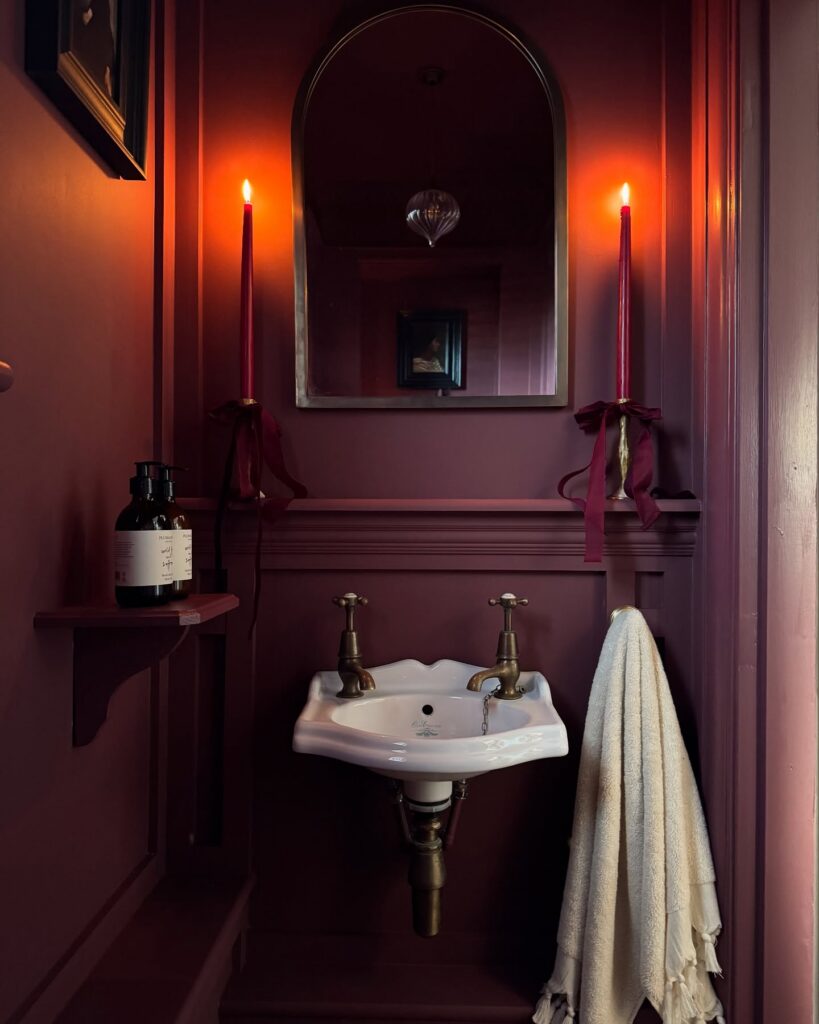
Two taper candles on the shelf, tied with burgundy ribbon, doing more for the mood than any sconce could. This is the move if your powder room has terrible overhead light or none at all. Deep oxblood walls swallow light, so you need small flames at eye level, not a bulb blasting from above.
Skip scented candles here — you’re already in a small room, and the smell fights with the hand soap. Unscented tapers, brass holders, and a lighter kept in a drawer nearby. The ribbon detail is nice but honestly optional.
What matters is the height: candles level with the mirror bounce flicker back into the room twice. Best for a guest loo you only use in the evening. Not practical for a family bathroom where someone’s brushing teeth at 7am.
Black paneling with brass
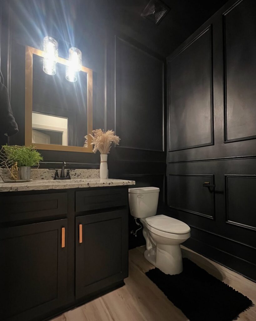
Skip the fear around painting a small bathroom dark. What makes this one work is the wall molding first, color second, because those panels keep the black from reading like one flat box and give the light something to catch. The brass-framed mirror matters too, especially with black faucets and cabinet fronts nearby, since it breaks up all that dark paint without needing extra decor.
Keep the countertop lighter. A speckled stone like this does a lot of the balancing on its own, and the white toilet helps more than people admit.
Use only one or two soft pieces. The dried stems are enough.
I’d probably swap the black rug for a lighter runner, mostly because in a room this dark the floor can disappear a bit, especially at night.
Dark Walls With a White Marble Counter
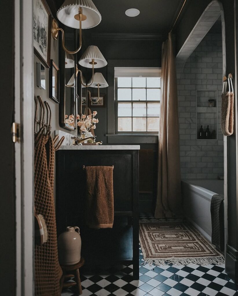
Painting the walls, ceiling, and vanity the same dark color is what makes this work — it reads as one mass rather than a bunch of separate things competing. The white marble countertop then has somewhere to land. Without that contrast, the whole thing can start feeling like a cave.
A brass fixture with pleated shades is doing a lot here too; the warm metal keeps the dark from going cold. If you’re renting or not ready to paint, a dark-stained freestanding vanity against a lighter wall gets you partway there. The checkerboard floor is worth mentioning — black and white against near-black walls sounds like too much, but it grounds the room instead of fighting it.
This suits people who don’t mind a bathroom that takes some commitment.
Deep Red Walls
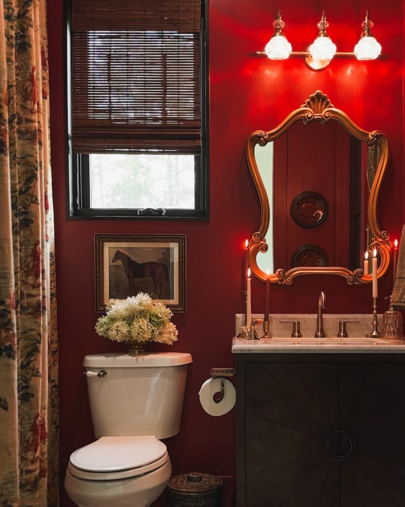
On a wall this red, the rest of the bathroom has to know its place. The gold mirror helps. Keep the vanity dark, the counter pale, and the lighting close to the mirror so the color looks planned rather than like leftover paint.
Candles make sense here. If the room is small, paint only the sink wall and repeat the red with a framed print, a curtain edge, or even a dark floral fabric. I would skip too many tiny accessories; the candles and carved mirror already give the wall enough to carry.
Emerald Wainscoting With Black Above
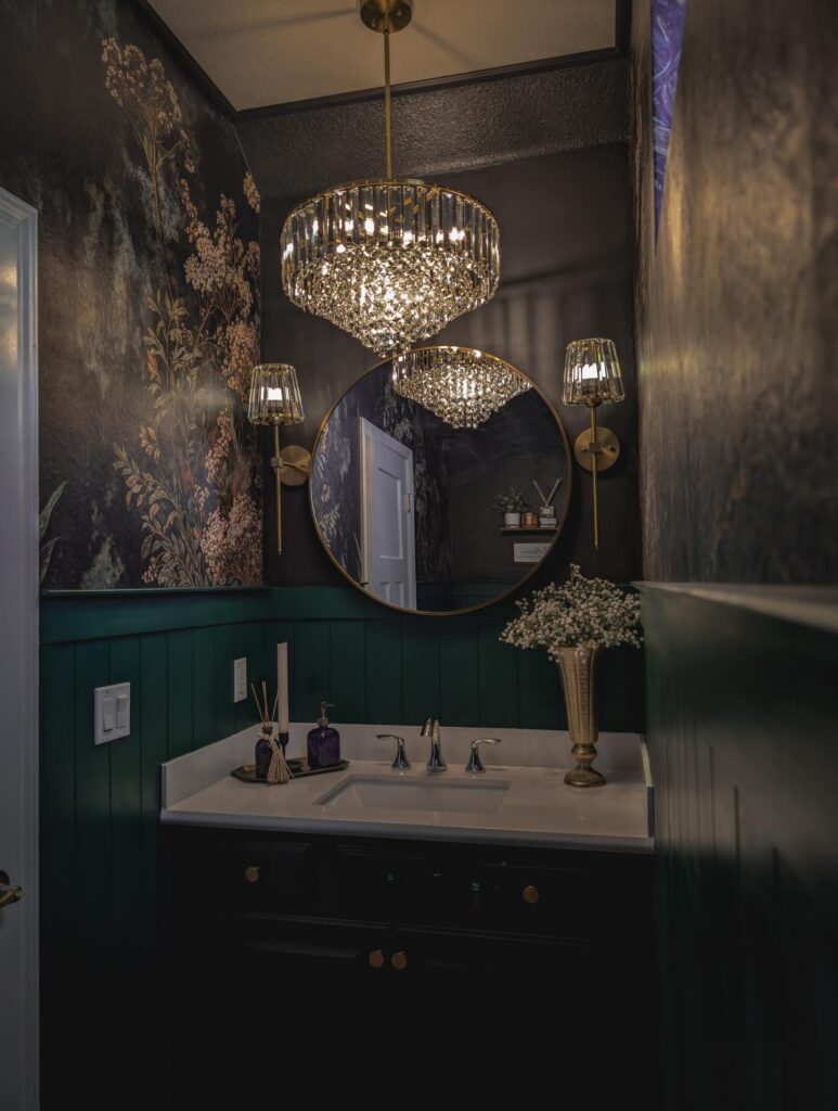
The split here is the whole trick. Deep green paneling runs to about chair-rail height, then everything above goes near-black — textured wall on one side, a smoky floral mural on the other. Without that green anchor the room would feel like a cave. With it, the darkness reads as intentional.
Keep the paneling vertical if you can. Shiplap or beadboard catches light along the ridges, which matters in a room this dim.
For the top half, pick one wall for the mural and let the others stay quiet. Two patterned walls would fight the chandelier. I’d skip the crystal sconces flanking the mirror, honestly — the ceiling fixture is already doing that job, and one of them would’ve been enough. Brass hardware on the vanity ties it all back down.
Black Walls With Wood
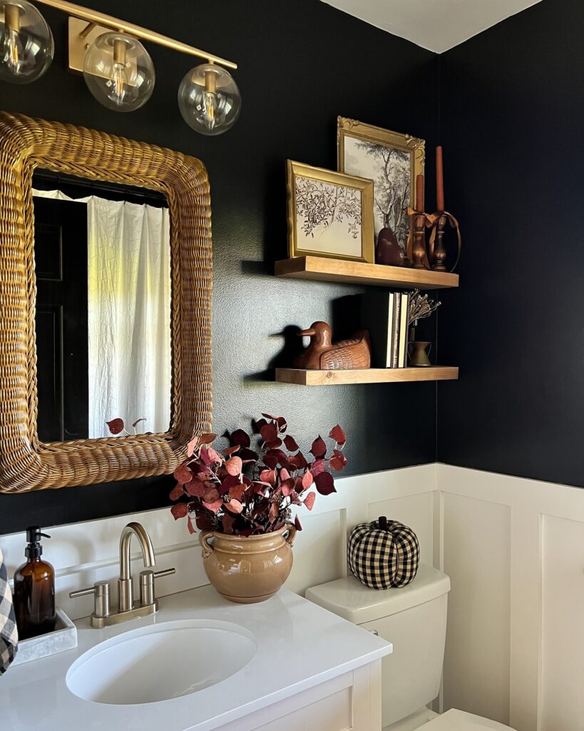
Start with the wall color. A near-black paint gives you the moody part straight away, but the reason this one doesn’t feel flat is the contrast from the white lower paneling and the medium-tone wood shelves. That break at chair-rail height matters more than people think.
Keep the shelving simple. Two floating wood shelves are enough for a small bathroom, and they look better when you lean a couple of framed prints instead of trying to fill every inch with decor. Leave some wall showing.
The woven mirror helps. Something with texture keeps black walls from reading too hard, especially once you add a brass light above it and repeat that finish at the faucet.
I’d skip anything too glossy here, though, because the whole setup works best when the finishes have a little softness to them.
Split the Wall Into Two Jobs
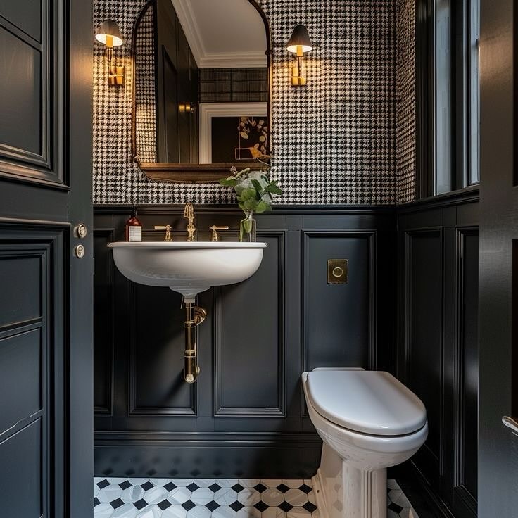
The houndstooth wallpaper only works here because it’s confined to the upper half — below the chair rail, everything is flat black panelling. That division is doing a lot. Without it, patterned wallpaper floor to ceiling in a small powder room would be genuinely hard to be in.
The rail gives your eye somewhere to land. For the lower panels, paint matters more than material — MDF with a satin or eggshell finish in near-black reads just as well as real wood once it’s on the wall. The brass fixtures and wall sconces are what stop the whole thing from feeling heavy.
One metallic finish, repeated consistently. If you only have budget for one upgrade here, it’s the faucet.
Black Tile With Marble
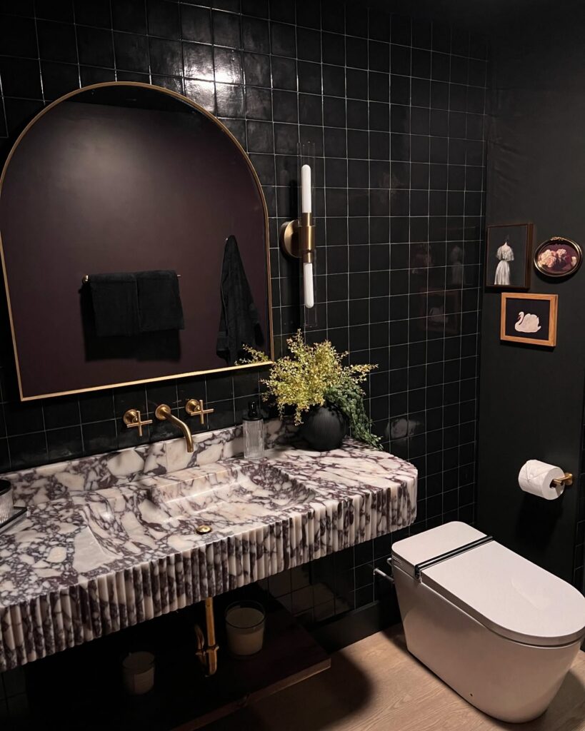
With black tile on the wall, the counter has to do some of the lifting, otherwise the room can start looking flat. A veined marble vanity works well here because the pattern breaks up all that darkness without bringing in another color story. Keep the grout thin.
Brass taps, a slim wall light, and a mirror with a narrow rim are enough metal for this look, so I would skip extra hardware where you can. The fluted edge on the stone is worth noticing too, since it gives the vanity some shadow and makes the whole thing feel more built-in than a plain slab would. A small framed print beside the toilet is also a good move if the wall feels too bare.
Beadboard in Oxblood
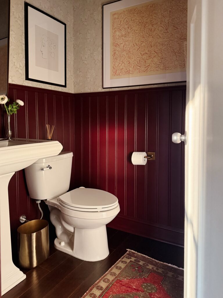
The beadboard here does most of the heavy lifting. Painted in that deep oxblood, it stops about two-thirds up the wall, and above it the wallpaper reads almost cream by contrast. This is the move to steal. Full-height dark walls in a powder room can feel like a closet, but capping the color at chair-rail-plus height keeps the ceiling breathing.
A few things I’d pay attention to if you’re copying it. Use satin or semi-gloss, not matte — the vertical grooves need to catch light or the whole wall goes flat. Pick a wallpaper with warm undertones so it doesn’t fight the red. And keep the metals in one family. The brass wastebasket and toilet paper holder do that job here. Chrome would’ve killed it.
Wallpaper with dark paneling
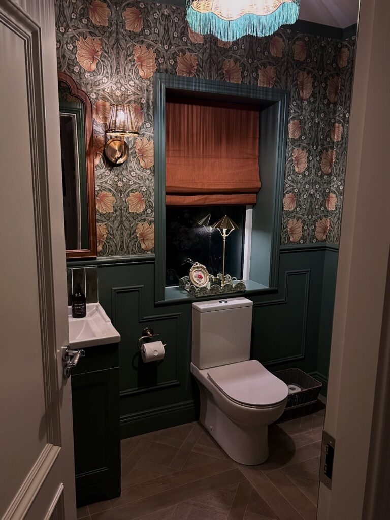
Start with the split wall. Taking the paneling up to about waist height in a deep green or blue-black gives the room its weight, then the floral wallpaper above keeps it from turning flat and boxy. That pairing works especially well in a small powder room, where you only need a few rolls and one tin of paint to make the whole thing feel considered.
The window recess matters too. Painting the trim the same dark color as the paneling makes that opening read as part of the joinery, and a Roman blind in a rust or tobacco tone ties back to the wallpaper without needing more pattern. Keep the sanitaryware plain. A standard white toilet and a small angular sink are enough here.
I’d skip extra decor. The walls are already doing plenty.
Paint the Beadboard the Same Color
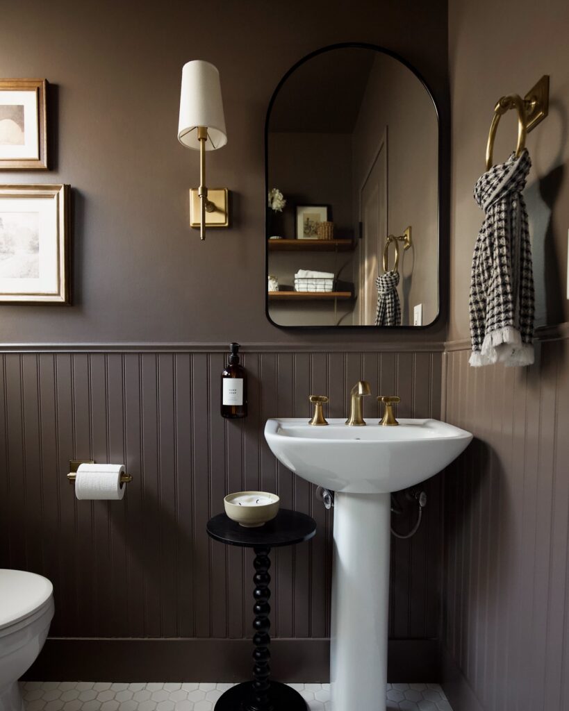
Most people paint beadboard white. That’s fine, but what makes this bathroom work is that the wainscoting, the wall above it, and everything in between is the same deep brown — so the paneling reads as texture rather than a dividing line. The arch mirror with its thin black frame and the brass sconce both sit against that flat dark backdrop without competing.
If you’re trying this, pick one paint color and commit it to all surfaces below the ceiling. Warm-toned browns in the espresso or mushroom range tend to hold up better than grays under brass hardware, which can pull slightly greenish otherwise. The bobbin side table here is doing a lot quietly — small surfaces like that give you somewhere to put things without adding a vanity.
Burgundy With Striped Tile
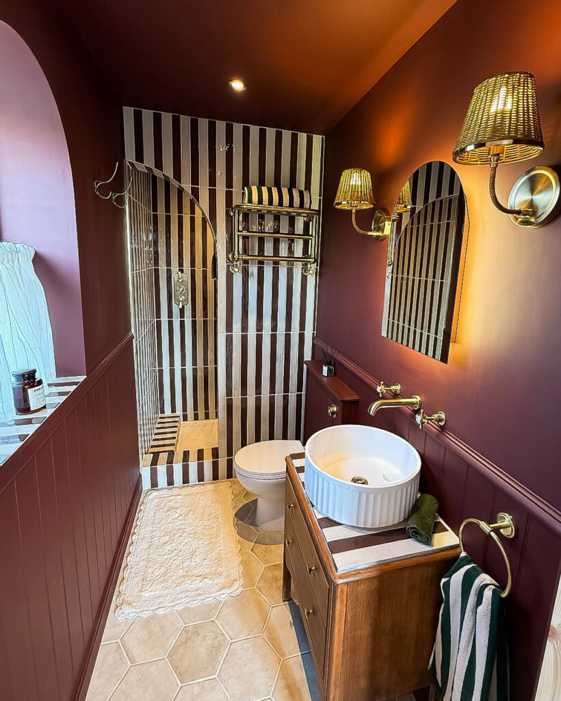
If you are going with burgundy walls, carry the color onto the trim so the room does not look chopped up halfway. The narrow striped tile in the shower is what keeps the deep wall color from feeling flat, because it gives the eye a hard vertical line to follow. Keep the ceiling plain.
Brass fittings work well here because they show up against the paint without needing much else around them. I’d skip wicker shades if your bathroom has poor ventilation, since steam will not be kind to them. A metal shade would do the same job with less worry.
Dark Walls With Skylight
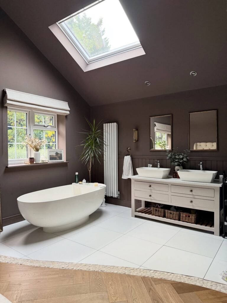
The skylight is doing most of the heavy lifting here. Without it, the deep brown walls would swallow the room by mid-afternoon, and you’d be flicking the lights on to find your toothbrush. So if you’re set on a colour this dark in a bathroom, plan the light source first, then the paint. A single roof window over the bath area is enough.
The white tub and vanity keep the brown from closing in. Same with the tile floor. I’d probably skip the matching brown panelling below the dado — it doubles down on the darkness where a paler wainscot would give your eye somewhere to rest. The dracaena near the window is a good call though. Something tall and green breaks up all that flat wall colour without fighting it.
Floral wallpaper focus
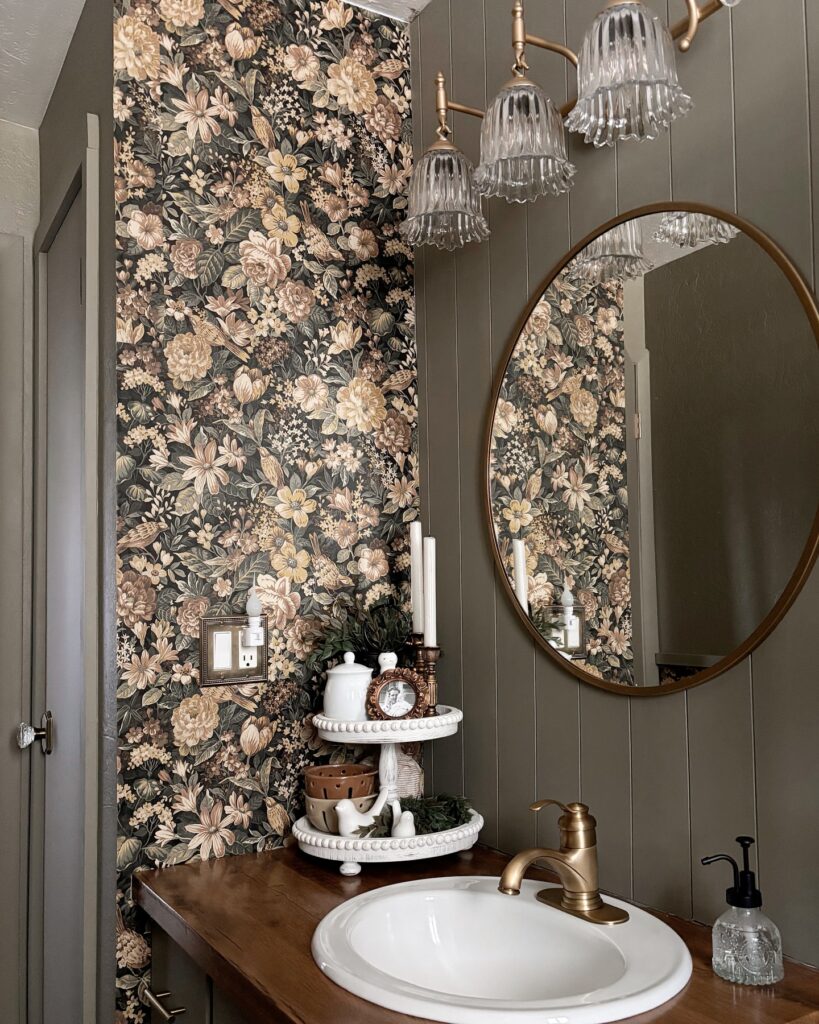
Put the drama on one wall and let the rest stay quieter. That’s why this works. A dark floral paper with this much movement can take over a small bathroom fast, so pairing it with painted vertical paneling keeps the room from feeling busy while still holding onto that heavier, moody look.
Match your metals on purpose. The aged brass faucet, mirror frame, and light fixture pull the wallpaper together because they repeat the same yellow-brown note instead of introducing another finish that would fight for attention.
The ribbed glass shades help too. They break up the darker wall treatment and bounce light around without looking shiny or stark.
I’d skip adding more decor than this. In a powder room especially, the wallpaper is already doing most of the work, so a wood counter, one round mirror, and a small tray or tiered stand is plenty.
Dark Walls With Panelling Below
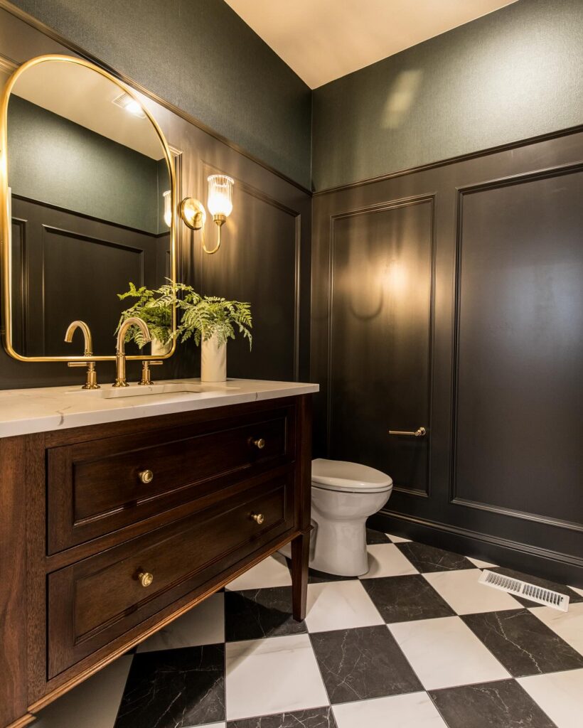
The wainscoting here is doing more than decoration — it breaks the wall into two distinct zones, which keeps all that dark paint from feeling like one flat slab. Upper walls in a textured dark green, lower panels in near-black. The contrast is subtle but it’s there.
For this to work, both finishes need to be high-sheen; matte paint on panelling this dark just looks flat and a bit sad. The brass hardware on the vanity and the sconce above the mirror are pulling a lot of weight against all that darkness — without something that warm-toned, you’d lose the whole effect. A checkerboard marble floor like this one is a commitment.
If that’s too much, plain white tile works fine. The fern on the counter is a nice touch, though I’d skip it — one more thing to keep alive.
Brown Walls With Brass
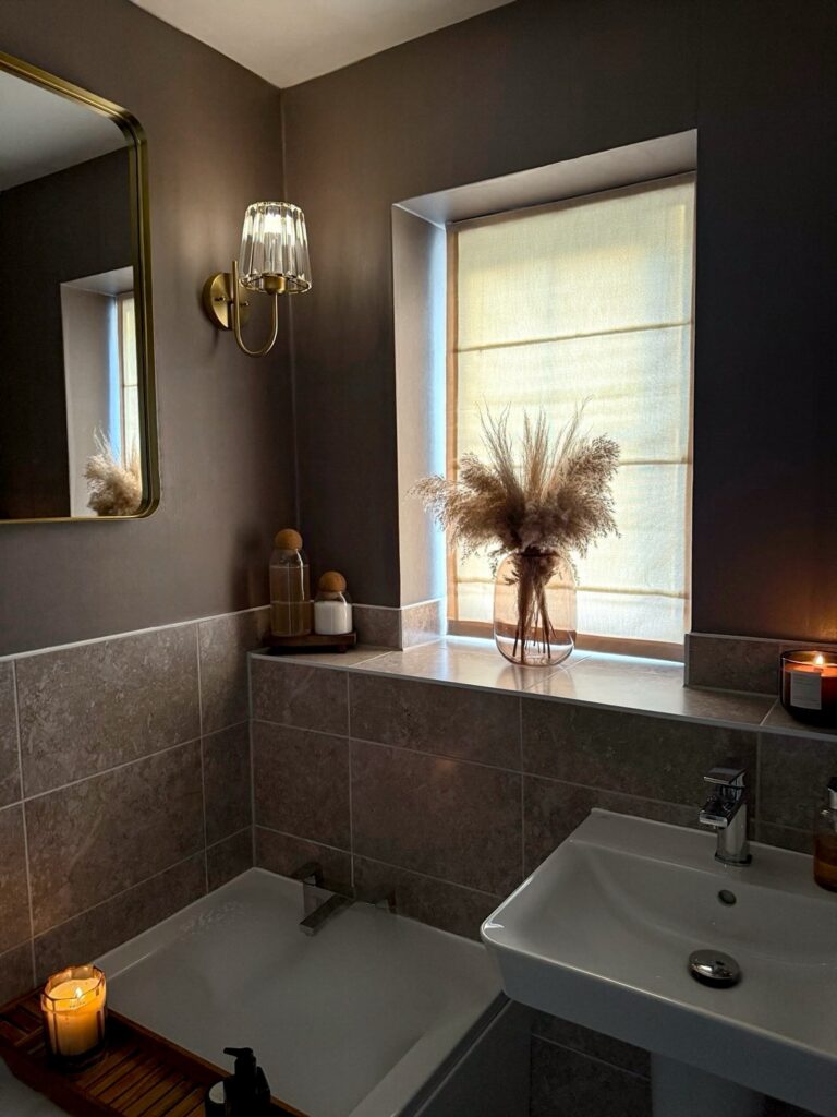
With brown walls this deep, the smaller finishes start doing more work. A brass sconce beside the mirror gives the room a bit of shine without bringing in a bright metal that fights the wall color. Keep the lower half in stone or grey tile, because plain painted walls right down to the tub can feel heavy after a while.
The window shade matters too. That soft fabric filter keeps daylight from looking too sharp against the dark paint. Very simple.
Add one tall vase with dried grass on the ledge if you have a sill, but I’d skip real pampas in a bathroom that stays damp, as it can shed and look tired quickly.
Black Board and Batten with Brass
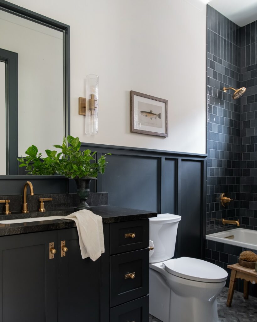
The board and batten going halfway up the wall is doing a lot of work here. It grounds the black without making the room feel like a cave, because the top half stays white and the ceiling stays bright. If you try this, keep the batten proportions tall and narrow like these — squat panels read more colonial than moody.
The brass matters. Sconce, faucet, drawer pulls, showerhead, tub filler — all the same warm finish. Mixing in chrome or matte black hardware would kill it.
One thing I’d rethink: the little framed fish print. Feels like a placeholder. Something larger, or a small grouping, would hold the wall better. Everything else — the fluted glass sconce, the honed black counter, the zellige-look shower tile — is already pulling its weight.
Blue tile contrast
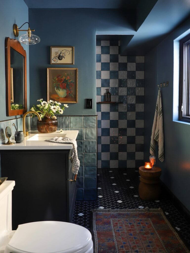
Try this if you want a dark bathroom that still reads clearly in the evening. The trick is keeping the palette tight. Here, the deep blue walls, the blue wainscot tile at the vanity, and the checkerboard shower tile all stay in the same family, so the room feels layered instead of busy.
The metal finishes matter too. Brass on the faucet and sconce breaks up all that blue and keeps it from going flat, especially when the light is low and most surfaces start blending together.
Keep the floor quieter. A small-scale black tile with a light dot or cross pattern does the job without competing with the shower wall. I’d skip adding more wall art than this, though, because between the tile changes, dark paint, and mixed textures, the room is already doing quite a lot.
Paint the Wainscoting the Same Color
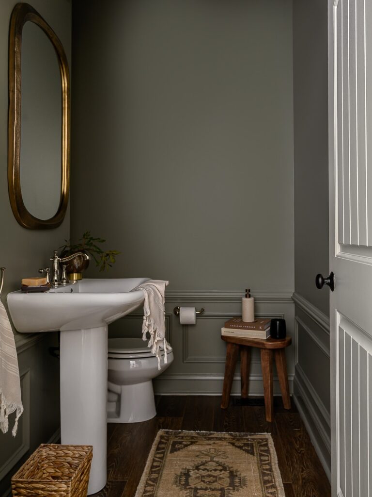
Most people stop at painting the walls a dark shade and leave the wainscoting white, which cuts the room in half visually. Here, the paneling, walls, and even the trim between them are all the same muted olive-grey, so the room reads as one continuous thing rather than two competing halves. That’s what makes the small space feel finished rather than cramped.
The pedestal sink helps too — no vanity cabinet means the floor stays visible, which matters a lot when you’re working with dark paint and limited square footage. If you’re going to do this, get a sample pot and paint a full panel before committing. Dark colors shift a lot depending on which wall the light hits.
Olive Paneling
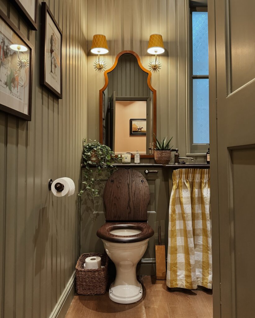
With vertical paneling painted in a muddy olive, even a narrow bathroom starts to feel more considered without needing much else on the walls. Keep the gloss low. A shaped wooden mirror helps break up all those straight lines, while the yellow checked sink skirt adds pattern in a place where a cabinet might feel too heavy.
The trick is to keep the palette a little dirty, not bright, so mustard, brown wood, cream porcelain, and brass lamps all sit together without fighting. I’d skip open shelving here, since the wall detail and fabric already do enough. A plant trailing near the sink is fine, though.
Just don’t let it take over the mirror.