21 Cottagecore Wall Decor Ideas
This site contains affiliate links. We may earn a small commission, at no extra cost to you. Article may contain some images for illustrative purposes only .
There’s a pressed fern in my kitchen. It’s flattened between two panes of glass, hung with a scrap of jute twine, and it cost me exactly nothing to make on a rainy Sunday last October. That single frame changed the whole wall. Suddenly the blank plaster above my breadbox felt like a windowsill in some crumbling English cottage, and I was hooked. What follows are 21 wall decor ideas in that same spirit — dried botanicals, thrifted oil paintings, hand-stitched samplers, chipped enamelware, and a few surprises involving vintage seed packets and antique butter molds — for anyone chasing that soft, lived-in cottagecore feeling without gutting the budget or the drywall.
Peg Rail With a Shelf Above
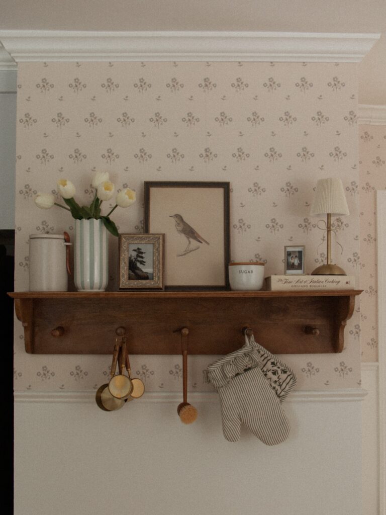
The brass measuring cups hanging from the wooden pegs are doing more work than any framed print could. A rail like this earns its place on a wall because it holds actual kitchen things — oven mitts, small utensils — while the shelf above carries the quieter stuff: a bird print, a sugar bowl, two family photos tucked in mismatched frames. That layering is what makes it read as collected rather than purchased-as-a-set.
Look for peg rails at architectural salvage shops; the worn wood finish matters more than the style. Wallpaper with a small repeat floral behind it pulls everything together without competing. I’d skip the tiny lamp personally — it’s not near a socket in most kitchens — but the book spine leaning against the back of the shelf is an easy detail worth copying.
Floral Wallpaper Above Paneling
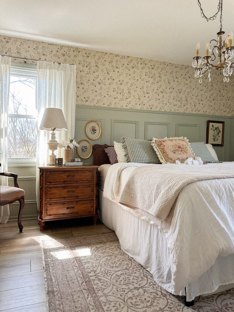
Above the bed is where this idea earns its keep, because the floral paper has a clear stopping point at the green wall paneling instead of running over every surface. Keep the pattern small if your room already has framed flowers, gingham pillows, or carved wood nearby, since a large print can start fighting with all those little details. The trim matters here.
Paint it in a muted green, cream, or dusty blue so the wallpaper feels tied to the room rather than pasted on later. I’d skip peel-and-stick paper behind a tall headboard if the wall gets much sun, as the edges can lift and look tired sooner than you’d expect.
Mixed frame gallery wall
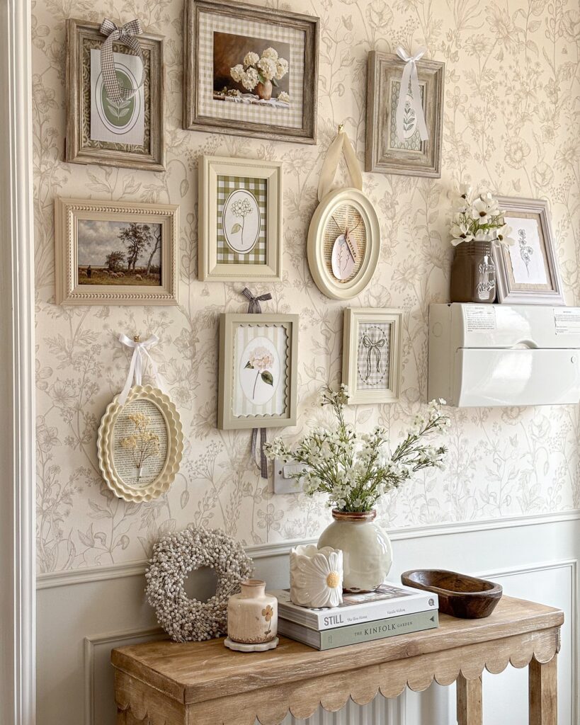
The trick here is the mismatch. Distressed wood, cream ovals, gingham mats, a scalloped hoop with pressed botanicals — nothing matches, and that’s the point. If everything were the same finish, you’d lose the collected-over-years feeling this style depends on.
Pick a loose palette. Cream, sage, soft brown. Then hunt frames at charity shops rather than buying a set. Fill some with pressed flowers, some with old book pages, one or two with a moody landscape print like the little pastoral scene on the left.
The ribbon hangers are optional. I’d skip them on every frame — it starts to look fussy. Use them on two or three pieces max, and let the rest hang flush against the wallpaper so the eye has somewhere to rest.
Mixed frames above seating
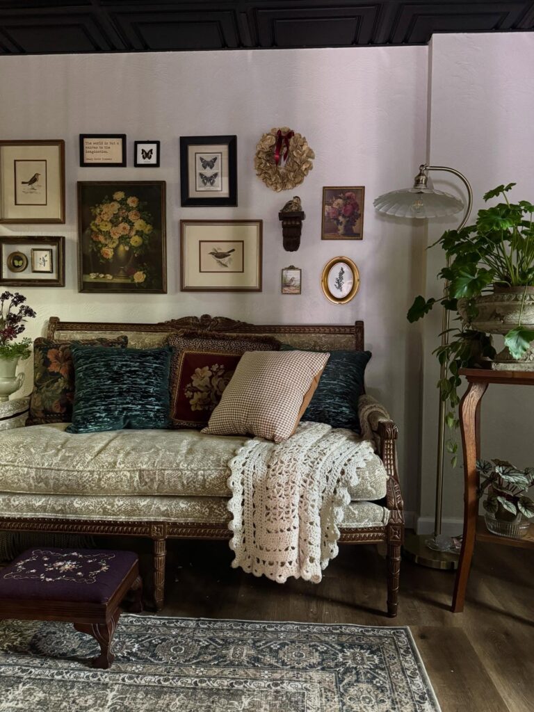
Start with the wall, not the sofa. This kind of cottagecore setup works because the frames aren’t matched too neatly: a bird print, butterflies, a floral painting, a small oval piece, even that dried wreath up near the top. Leave some gaps. If every piece touches the next in size or spacing, it starts looking planned within an inch of its life.
Anchor the arrangement with one larger artwork first, then build outward using smaller pieces in darker wood or black frames so the whole wall doesn’t drift. The wreath helps break up all the glass and rectangles, which is worth copying if your gallery wall feels flat. A bench, settee, or daybed underneath makes sense here because it keeps the display from floating awkwardly on a tall blank wall.
I’d skip anything too glossy. Cottagecore walls look better when the finish stays a little quiet.
Staircase Gallery Wall With Old Frames
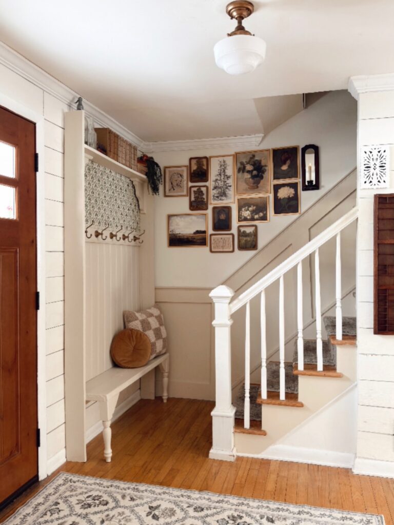
Mismatched gold and wood frames work here because nothing is trying to match — botanicals, portraits, landscape paintings, all different sizes, just climbing the wall alongside the stair rail. The trick is sourcing frames from thrift stores or estate sales rather than buying a matching set. Old frames already have the slightly worn finish that makes this look feel accumulated rather than arranged in an afternoon.
Stick mostly to muted subject matter — florals, old portraits, dark landscapes. Bright or graphic prints will pull you out of the mood fast. If you can’t find enough originals, printed reproductions in aged frames do the job.
One thing worth knowing: the more frames you use, the less precise the spacing needs to be.
Small Shelf Display
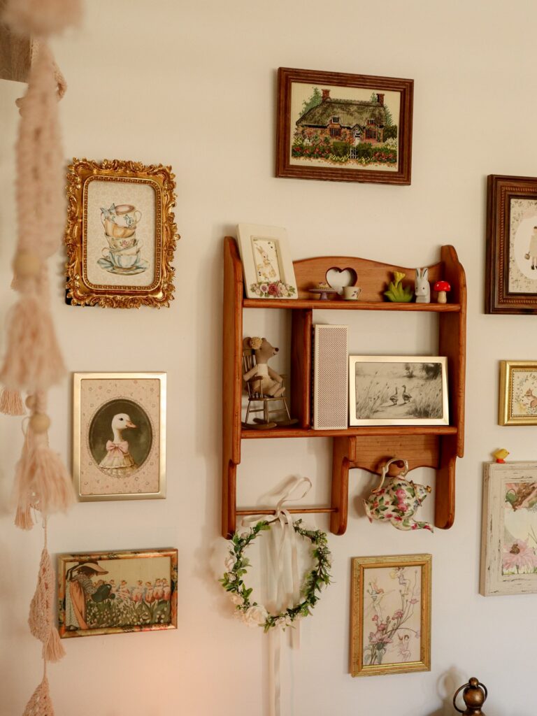
On a narrow wooden shelf, a teacup, a floral teapot, and one little framed print can do more than a full row of wall art. Keep it light. The trick is to treat the shelf like a pause between frames, so the wall gets some depth without turning into a storage spot.
A small wreath tied underneath works well if the rest of the room already has dried flowers, lace, or old wood in it. I’d skip heavy ceramics here, mostly because they look risky on a shallow shelf and pull the eye down too much. Use one cup, one picture, and one odd little thing.
That is enough.
A Wall Of Mismatched Plates
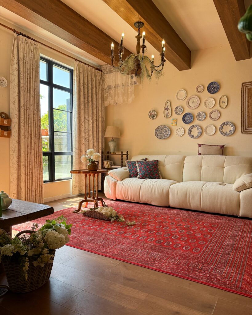
Seventeen plates, none matching, arranged above a sofa. That’s the whole idea. Blue and white transferware mixed with pink florals, a few oval platters thrown in to break up the circles.
The trick is spacing — you want them clustered tight enough to read as one shape on the wall, not scattered like an afterthought. Lay everything out on the floor first and shuffle until it looks right. Disc hangers on the back are cleaner than wire, and they sit flush.
Charity shops and car boot sales are where you find these for a pound or two. I’d skip anything with gold rims unless the rest of your room can carry it. Works best on a pale wall, above a low piece of furniture, in a room with some age to it already.
Half wallpaper, half paneling
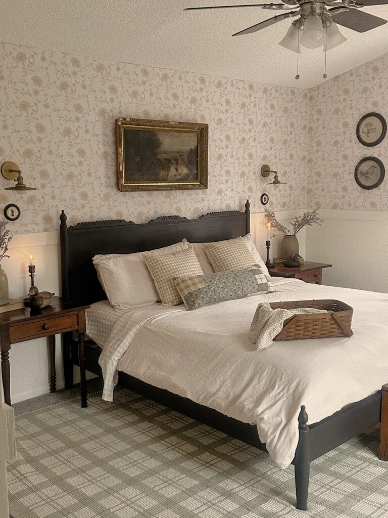
Start with the wall split. Running floral wallpaper only on the top half and finishing the lower portion with plain painted paneling keeps a cottagecore room from feeling too busy, especially if you also want patterned bedding, framed art, and small bedside pieces in the mix.
The trick is keeping the wallpaper faded-looking rather than sharp or high contrast. Soft beige florals work because they sit back a bit, while the dark headboard and wood nightstands give the room some weight so it doesn’t drift into looking overly sweet. Very useful balance.
Add one larger vintage painting above the bed instead of filling the wall with lots of little frames. I’d also keep the sconces in aged brass or a rubbed finish since anything too polished starts to fight the old-house look.
Mix Frames Not Subjects
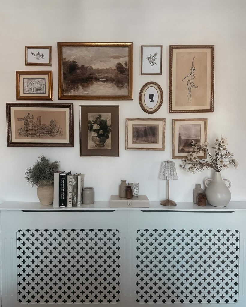
Frames are doing most of the work here — gold, dark wood, oval, rectangular, all on the same wall without any of them matching. That’s actually the point. What ties them together is the palette: every print is brown, sepia, or cream, so the frames can disagree on style without the whole thing falling apart.
A silhouette, a landscape, a figure drawing, a botanical — wildly different subjects, same tonal range. Pull prints from old books, charity shops, free printable sites. The radiator cover below is handled well too, because the styled shelf in between gives the eye somewhere to land before it travels up.
Without that kind of break, a gallery wall this dense can feel like a lot. Works best for someone who already has a few mismatched frames sitting around doing nothing.
Ornate mirror gallery
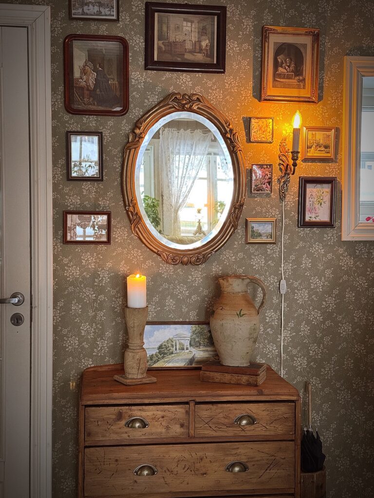
Around the mirror, let the little frames sit closer than you first think. The oval frame gives the wall a proper center, so the smaller paintings and prints can look collected instead of randomly hung across floral wallpaper. Leave breathing room.
A candle sconce beside the mirror helps break up all the rectangles, especially if most of your thrifted pieces are small landscapes, portraits, or faded flower prints. Stick to brown wood, brass, dull gold, and dark red frames so the group feels old without needing everything to match. I’d skip plastic frames here, because they usually look too flat next to carved wood and a heavy dresser.
A Framed Pastoral Landscape
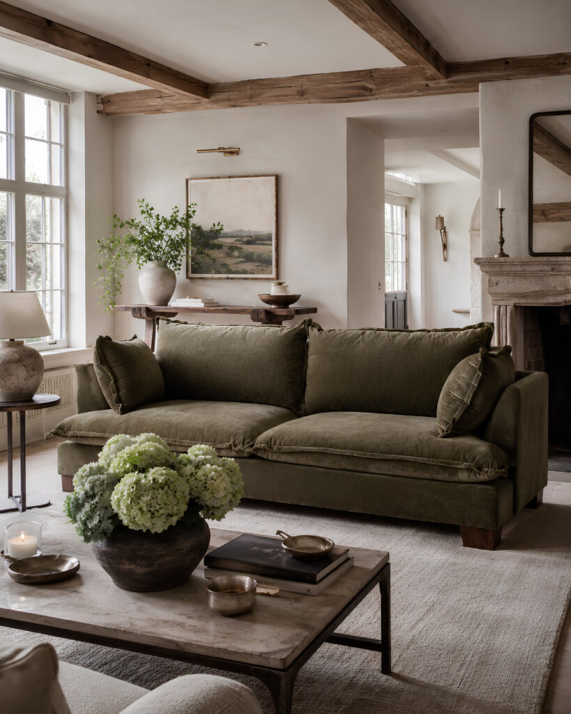
The painting above the console does most of the work here. Rolling hills, muted greens, a sky that’s gone soft with age — the kind of thing you’d find at an estate sale for not much money. Hang one big piece rather than a gallery wall. It reads quieter.
Look for oil paintings with visible brushwork, or good prints on textured paper. Skip anything glossy. The frame matters as much as the art, so a plain wood one in a warm tone works, and gilt works too if it’s tarnished rather than shiny.
One thing I’d change. That picture light is nice but a real pain to wire in later. If you’re not ready to cut into the wall, a battery-operated one clipped to the frame does the job.
Sporting wall mix
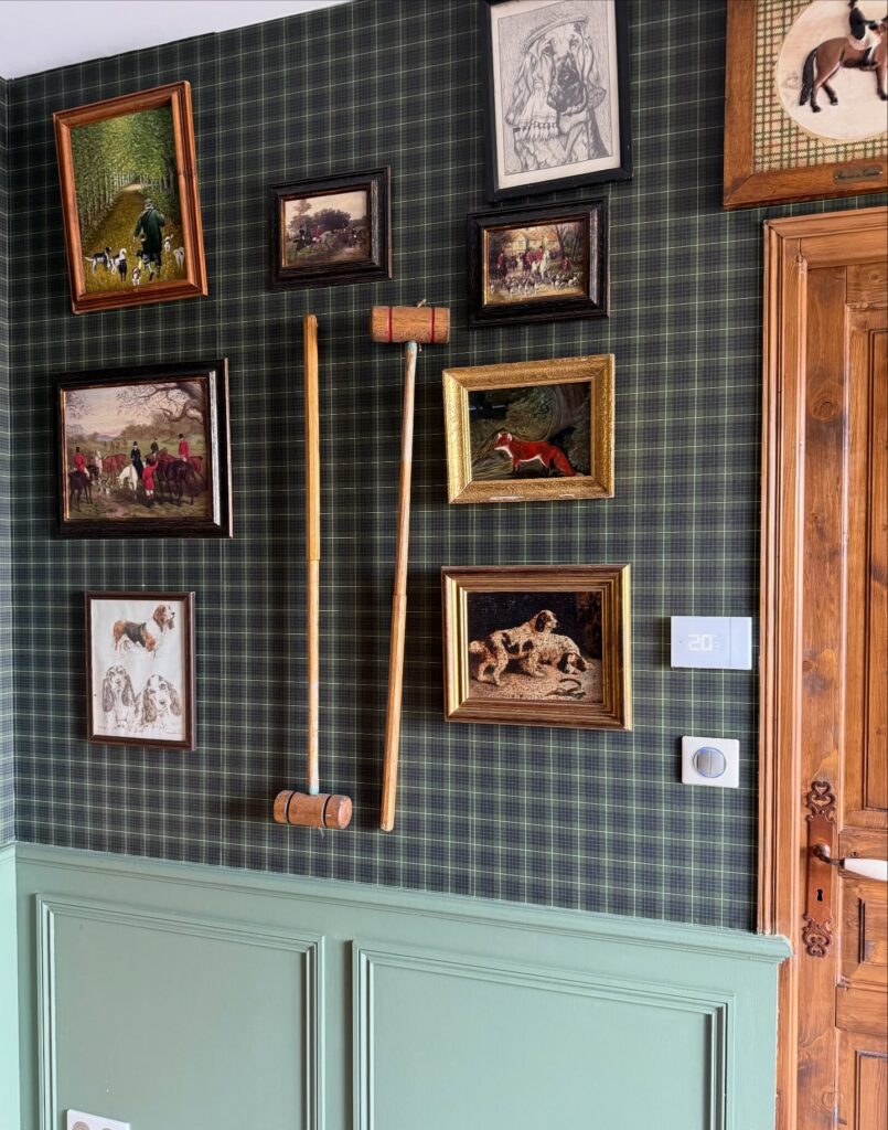
Start with one anchor. Here, the tartan wallpaper does most of the heavy lifting, so the little hunting prints and dog sketches can stay mismatched without looking scattered or fussy.
Hang a pair of old croquet or mallet sticks vertically between the frames, then build the gallery around them with dark wood and gilt pieces in different sizes, keeping the spacing fairly tight so it reads like one collection instead of spare bits you found later. Very English-country-house.
This suits a hall, boot room or study more than a bedroom. If you don’t want the hunting angle, swap in botanical etchings, horse sketches, pressed leaf studies or even old landscape postcards, and keep the same plaid-and-paneling backdrop. I’d skip anything too polished here; a sleek black frame would look a bit lost.
Plaid Wallpaper Above Board and Batten
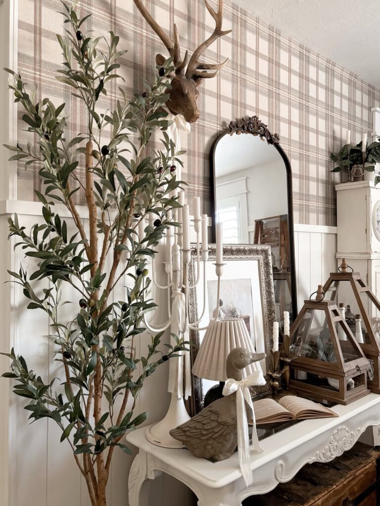
Running wallpaper only above the chair rail — like the pink plaid here — keeps it from feeling like too much, and the white paneling below grounds it. It’s a good move for anyone renting or nervous about committing to a full wall. The pattern reads clearly even with a lot going on in front of it, which is the real test.
Busier vignettes, taxidermy mounts, tall faux olive trees — none of it fights the wallpaper because the plaid stays in its lane. If pink isn’t your thing, the same treatment works in a dusty sage or cream tartan. Just keep the wallpaper matte rather than glossy so it holds that softer, older-looking quality that makes the whole style land.
Nature Print Gallery
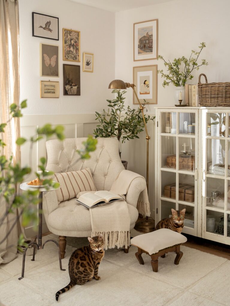
Above a reading chair, start lower than you think. The lowest frame can sit near the chair back, while the rest climb up in a loose block around it, the way these bird and butterfly prints do. Leave breathing room.
Use one repeated detail, like thin gold frames, then mix in a black frame or a darker print so the wall doesn’t look too planned. Old postcards, thrifted book plates, pressed flower prints, and faded landscapes all work well here. I would skip glossy new prints, since they can look a bit too sharp for this kind of wall.
A few uneven gaps are fine.
Ditsy Floral Wallpaper Above Panelling
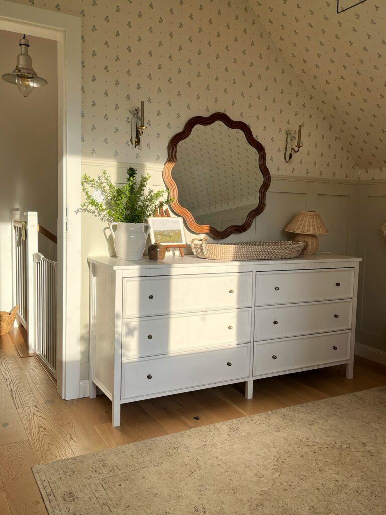
The tiny scattered flower print here does the heavy lifting. It’s busy up close but reads almost like a texture from across the room, which is why it works above the sage panelling instead of fighting it. Half-height panelling matters. Without it, the pattern would swallow the whole space and you’d feel it the moment you walked in.
Pick a ditsy print with a muted background — cream, oat, soft ochre — and small motifs spaced apart. The bigger and bolder the flower, the harder it is to live with.
One thing I’d change. Those brass sconces are pretty but they disappear against the pattern. I’d have gone with a darker finish, or hung something with a proper shade to break up the wall.
Plate wall above mirror
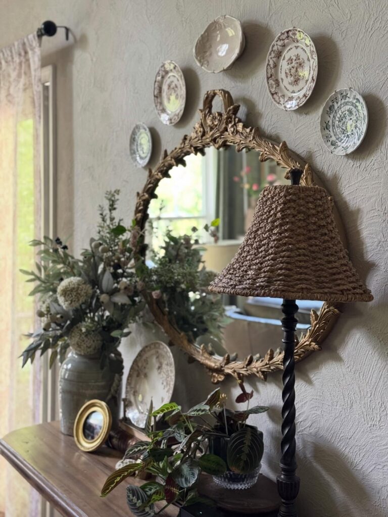
Start with one good mirror. An ornate gilt frame does a lot of the work here, especially against a plastered wall where the little shadows around the carving actually show up instead of getting lost.
Then build a loose ring of mismatched plates around it, not a strict grid, because cottagecore looks better when the sizes shift a bit and the spacing is slightly uneven. Floral china works best for this. A few brown transferware pieces, one pale green plate, one plain cream dish near the top — that kind of mix keeps it from looking bought in one set.
Keep the table styling lower. If you already have a woven lampshade or a stoneware vase with gardeny stems, let those be the heavier pieces and leave some bare wall so the plate arrangement can breathe. I’d skip anything too shiny here.
Framed Vintage Prints With Fairy Lights
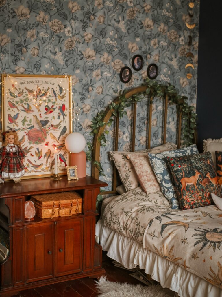
Draping a string of fairy lights directly over a large framed print — like that French bird chart in a gold frame — does more for a wall than hanging the print alone ever would. The lights sit loosely over the frame rather than being tucked behind it, which keeps the whole thing feeling accidental rather than installed. Look for old natural history prints, botanical charts, or anything with small detailed illustrations, because busy prints hold up better under the extra visual noise of the lights.
Taxidermy charts, seed catalogues, antique maps. A frame with some weight to it helps — thin frames make it look like a dorm room. I’d skip battery packs and just run a short plug-in strand; easier to actually turn on.
Floral wallpaper strip
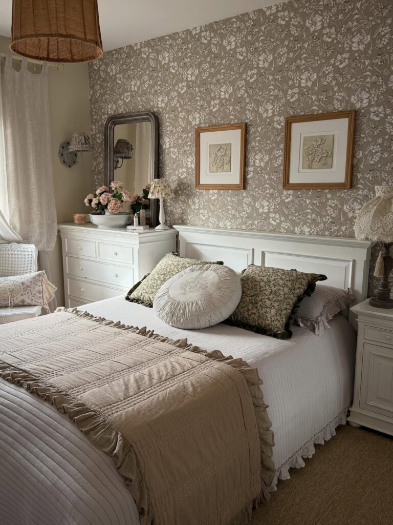
Behind the bed is where this works best, especially when the floral paper stops at a white rail instead of covering every wall. Keep the frames quiet. A pair of botanical sketches in wood frames is enough.
They give the pattern somewhere to land, so the wall feels collected rather than busy. If your room is small, use wallpaper only on the headboard wall and choose prints with plenty of blank mat around the art. That mat matters because it breaks up all those leaves and little flowers before your eye gets tired.
I would skip glossy frames here; they can make the paper look too new.
The Dense Salon Hang
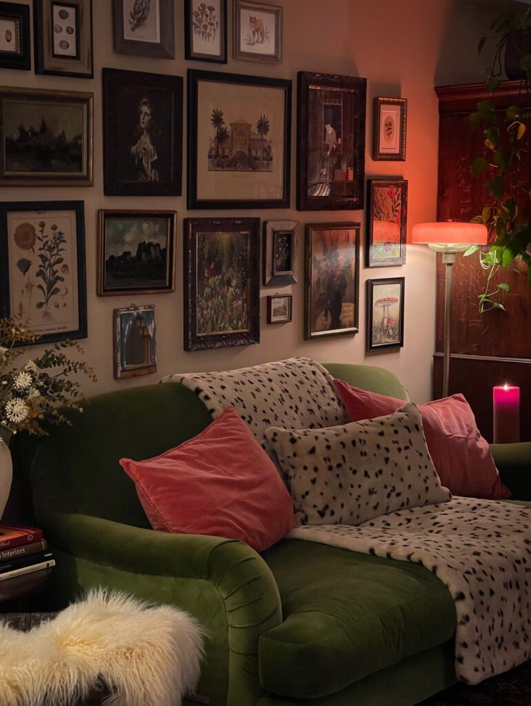
Count the frames on this wall. Somewhere north of twenty, botanical prints sitting next to portraits sitting next to a small landscape in a chipped gilt frame. The trick with a hang this dense is committing. A shy version with six frames spaced evenly looks like you gave up halfway.
Mix the frame finishes on purpose — dark wood, tarnished gold, one painted black. Matching frames kill the whole cottagecore thing instantly. Pull prints from old book fairs, thrift shops, your own botanical sketches if you have them.
One thing I’d change here: the frames run right up to the ceiling line behind the sofa, which works in this warm lamp light but can feel heavy in daylight. Leave yourself four inches of breathing room at the top if your room gets bright morning sun.
Layered frames on florals
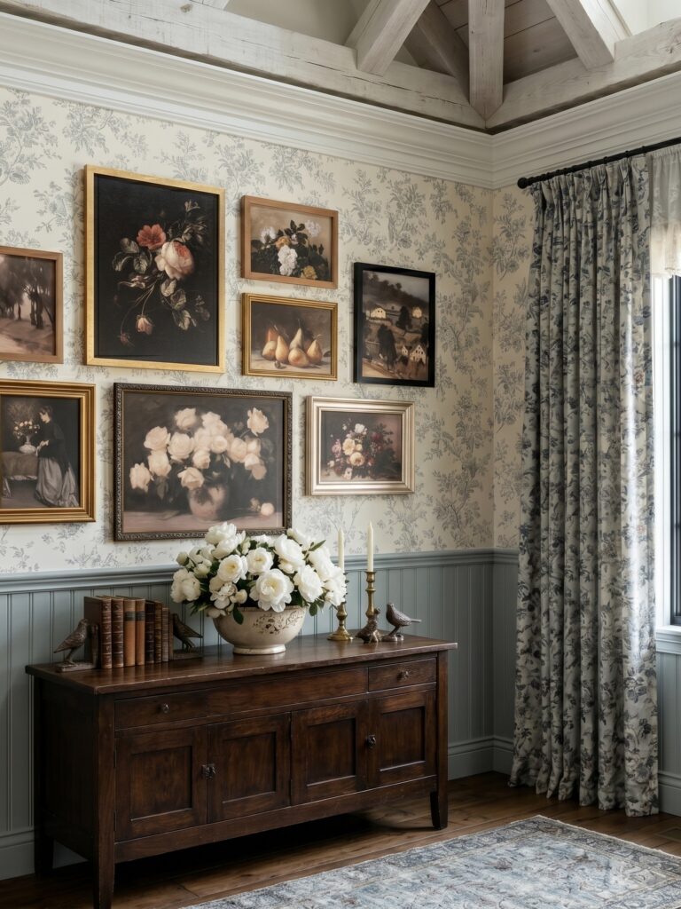
Start with the wallpaper. A small trailing floral print gives you a built-in backdrop, so the gallery wall doesn’t need perfect spacing or matching frames to look pulled together. Use mostly dark, muted art like botanical paintings, old portraits, or a dusky landscape, then mix in two or three frame finishes — gold, black, and pale wood all work here because the print underneath already ties them together.
Keep the arrangement a bit dense. That’s the point.
What makes this setup work is the line across the bottom: the sideboard, flowers, candlesticks, books, all sitting under the art and giving the wall some weight so it doesn’t look like frames drifting upward. If you don’t have wallpaper, fake the same effect with beadboard and a narrow picture ledge. I’d skip anything too bright though; one loud print would break the whole faded look.
Botanical Print Gallery Wall
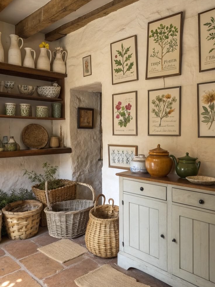
Framed botanical prints grouped close together like this work well because each one carries enough detail to hold attention on its own, but together they read as a single collected thing rather than random decoration. The thin dark frames here keep everything consistent without looking matchy. Handwritten Latin labels on the prints add to it — that’s the kind of specific detail worth hunting for when you’re sourcing these.
Thrift stores, old books, even printable files online. Seven or eight prints at varying heights beats a rigid grid for this look. I’d leave a little more wall breathing room between them than shown here, only because the textured plaster wall is doing a lot and deserves some space.
Good fit for anyone with a spare wall and patience for hanging.